Assignment 3 | Group Animation – Group 5 Prison Break
Group Members: Darren, Ben, Rory, Cathair and myself
Initial ideas:
For assignment 3 of the animated narratives module our class went into group and were tasked with making our own thirty second animation. Right off the bat we began discussing various different ideas of what our animation would be about, since the theme had to be centred around adventure we came up around with the idea of something like an Indiana Jones type escape from a temple, and a pirate themed adventure. However after some further discussion Cathair came up with the idea for a prison break which we all really liked the sound of doing so from then on we started work on the project.
We already knew that we wanted our characters to be simple shapes so we weren’t too worried about designing characters after being inspired by a short called “This is a Ball” by Jeff Starr who uses a simple sphere, cubes and prisms as characters. Instead we jumped straight to the narrative and began working on storyboarding, however Cathair did come up with a sort of mock-up of what they might look like, to help visualise scenes and characters.
Storyboarding:
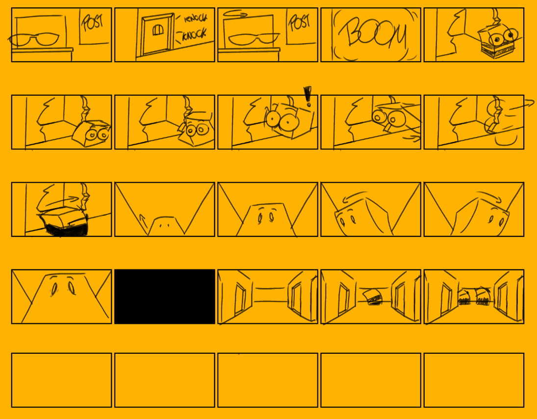
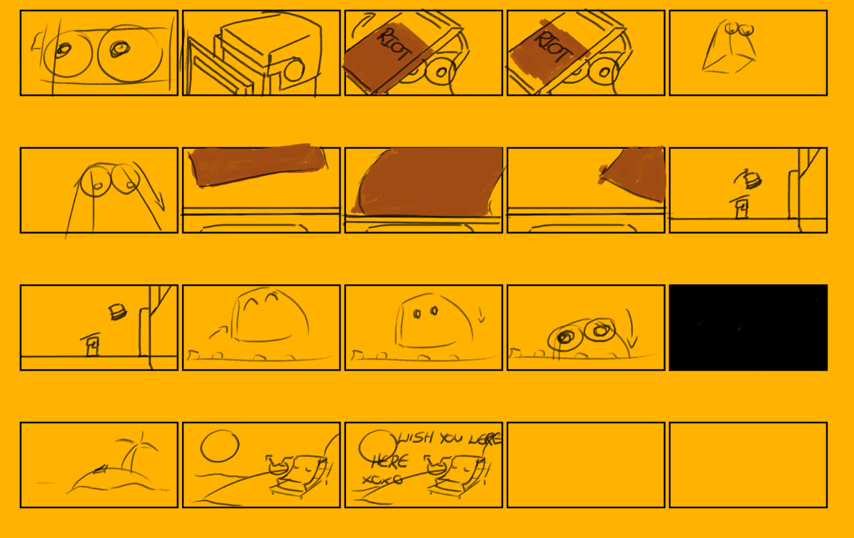
Ben, Rory and Darren started off with the initial storyboards so we all could pick elements that we like and use them to make a refined storyboard and narrative to work on for the animation.
Rory’s Boards:
Ben’s Boards:
We all really enjoyed the beginning of Ben’s storyboards so much wasn’t done with that in terms of changing the shots, however we were thinking that maybe we should change the later half of the story, and so I came up after Ben and refined his storyboards in addition to developing and expanding on them. In order to help make the storyboard more coherent to an outside audience I decided to add a part where the Main Character (MC) jumps in fright seeing the guard after breaking out of his cell and showing the guard chasing him before moving onto the part where the camera is stuck up in front of the MC. I knew early on that I wanted to find an alternate and more dynamitic way of the MC actually escaping the prison and so I came up with the idea of him jumping over the wall after being inspired by Rory’s boards where his characters climbed over the wall. Of course the wall shouldn’t be able to be jumped over normally so I added in a new group of characters, the Riot guards holding Riot shields. I changed the sequence of the MC running towards the gate by first introducing the Riot team all stacked up in front of the gate, next when the MC is running towards the gate he jumps up in the air doing so forcing a Riot guard to raise his shield as a platform for the MC to use to jump over the wall, and so with that I was able to find a way to explain the MC jumping up and over the wall, both providing the audience with a solid explanation to why everything is happening and adding some further entertainment value with a more action orientated sequence.
Character Designs:
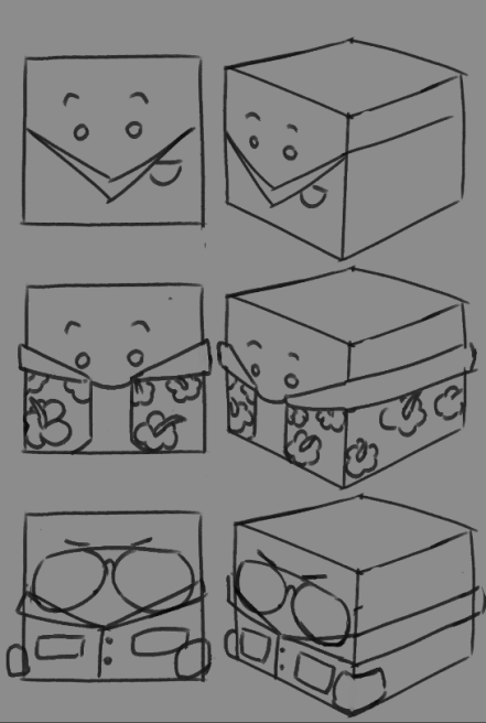
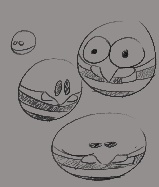
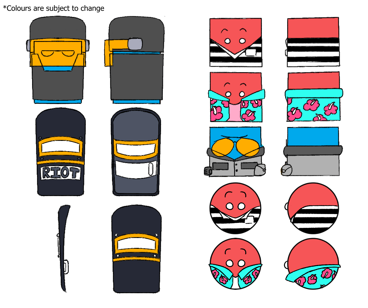
When it came to doing the character designs I was mostly in charge of that with some input from Rory with some of his designs. Overall for the character designs as stated before we wanted to go with more geometric shapes so I started off doing designs with Cubes and Prisms as the base of each of these characters. First off with the main character I needed to make two different outfits, one for the prison jumpsuit and another being a shirt for when the MC escapes and decide on what shape he should be. In the beginning I decided to try making some sort of costume and put them on both types of shape, since they didn’t have legs I had to try and figure out how these kinds of characters would wear clothing, and so after doing some research I took some inspiration from the orange jumpsuits used in American prisons taking elements such as their collars, white shirts and shirt pockets in order to help try and break up symmetry in what is an already basic character wearing very simple clothing. In addition to this unlike the other characters I also gave our MC cute beady eyes to help try and make the audience feel a connection towards the character. After all of this we first settled on making the shape of our MC a cube, however some time later we thought it might be a better idea to have him be a sphere due to the shape language conveyed by the sphere. Rounder shapes in characters make them seem more approachable and innocent which we wanted to take advantage of in order to get the audience to root for his escape.
We used the cube body type instead for the guards instead, their shape language making them strong, reliable and dependant. As for their outfits they’re based off of a typical prison guard uniform, in addition to that I also gave them a pair of sunglasses, not only to help with animation, giving less work for the animators without sacrificing style but also because I wanted to try and imprint the psychological effects when a person wears sunglasses. When a person wears sunglasses it blocks out the eyes so people looking at them have less visual information to work off of that person when it comes to emotion and expression, this in turn may make them more intimidating, which I wanted to try and apply to the Guards.
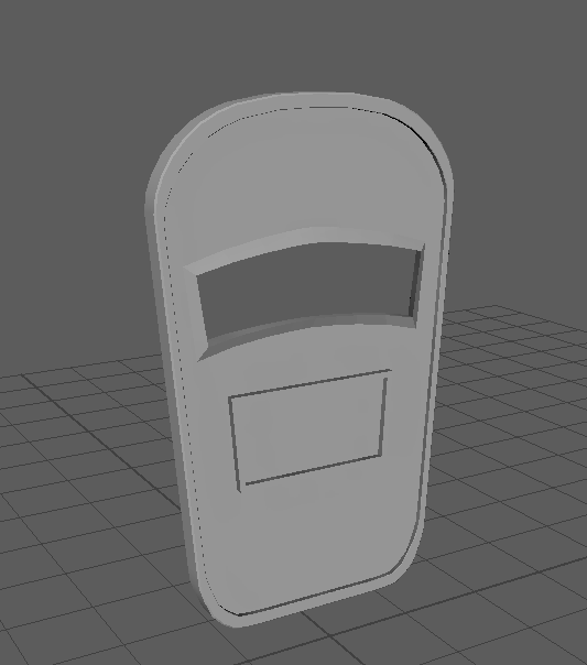
Finally there is the Riot Control. For these characters I went ahead and used a cuboid shape as the base for their body, much like the guards the shape language suggests them being strong, reliable and dependant. When designing them I wanted their Armor to be large and bulky to give them an imposing figure, or as imposing as you can get for a cuboid. For the design I simply just referenced a few different kinds of riot gear and took aspects I liked and adapted them to my cuboid character. In addition to the armour I also gave my Riot control character a riot shield, I noticed that the majority of different riot shields are transparent, however I felt like making a shield that’s transparent wouldn’t look too good for camera so I went for a more bulky metallic design akin to a ballistics shield.
Character Designs:
References:
Guards:
Prisioner:
Riot:
Shirt
Environment design:
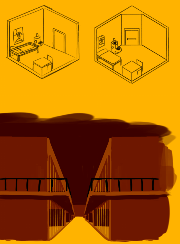
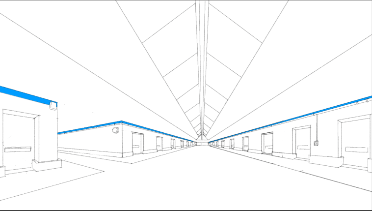
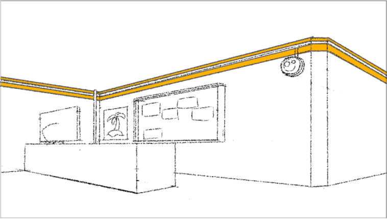
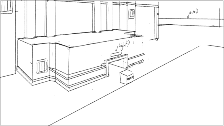
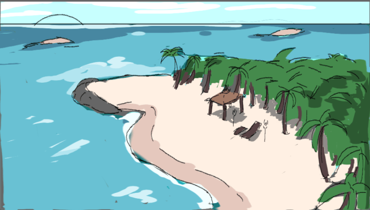
When it came to designing environments I first started off with looking towards the storyboards and making designs based off of them, however I felt it would work out better for the team if I went and designed various environments and let the team of modelers use them as a reference / guideline when making our scenes, in a couple of cases the modelling team had already blocked out their scene and so I went and designed some of the finer details you might see in those environments. In some of the interior designs there are parts on the top parts of walls, for that I was inspired by the game mirrors edge, in that game it uses different coloured environments to dictate different kinds of districts and I felt that I could use that concept for my own designs but instead of marking districts I’m instead used them to distinguish between the guard areas and the person areas. As for my beach design I went and referend beaches in places like Hawaii and La Digue, with very beautiful tropical aesthetics.
References:
Modelling / UV Mapping:
For the UV mapping part I was helping out Ben with the Riot Shield, the rim around the visor had some non-manifold geo and we couldn’t map out the UV’s properly, after some trial and error I couldn’t find any non-manifold geo anywhere and so I had to go back delete the entire rim, however, luckily enough it was an easy fix, all I had to do was extrude the inside of the visor part and pull some of the vertices out to the front of the model and from there the UV’s mapped out themselves, the non-manifold geo wasn’t fixed somehow, but I was still able to make a clean UV map to be textured later on.
Environment Modelling:
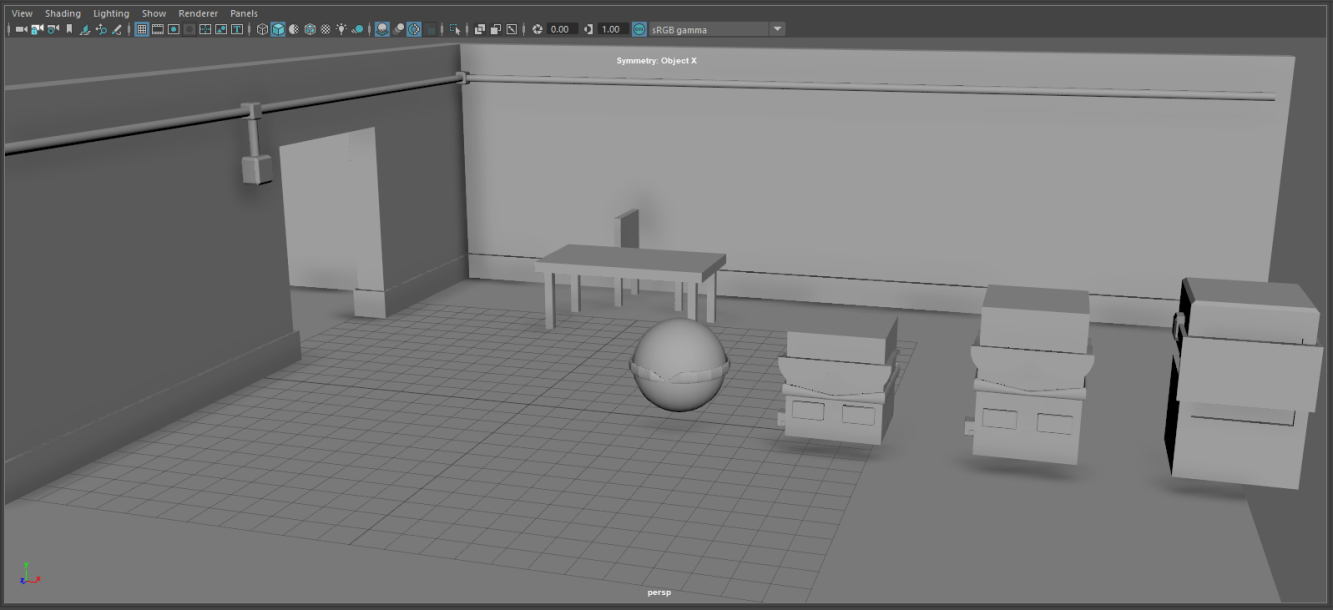
When it came to the environment modelling, I went and took Ben’s model for the first scene environment and noticed that it didn’t match up with the storyboard, so with his permission I went in and began to make some changes. One of the very first things I did was take the wall on the left side with everything on it and flipped it around to the other side. Once that was done I decided to delete his table and chair, the table itself didn’t match up with the design work I did so I remade it more so in light of my 2D design work. I had also noticed that the table itself was pretty barren so I also modelled up a PC monitor, keyboard along with a mug in order to make it feel more like an office desk. In addition to this I also added a some further details to the room, for example a security camera and the the rim part around the ceiling, I had originally planned for the top part around the ceiling to just be textured a colour however I felt that making an extrusion might make the room look a bit less empty. I had made some changes to floor as well, I added a cube, flattened it down and pressed it up against the wall, in an attempt to make the floor not look so empty. Finally the bed matrass and pillow, for that I simply just took a cube, bevelled the edges and set it on top of the frame previously made by Ben, for the pillow I simply just took the mattress and shrunk it down and flattened it down to be the simple shape of a pillow, after which I set it on top of the mattress.
My Models:
Ben’s Model:


