This is the Personal creative development pitch project, used to help develop a pitch idea for the summer project.
The first thing done for this project was researching Pitch bibles as they help grasp the starting point for the whole project, Pendleton Ward’s Adventure time pitch bible helps the foundation of the research as it chaotic style with coherent understanding of story, character and setting building help figure out a rough starting point to the project. Pendleton’s work helps illustrate the loose nature of Pitch bibles, however it isn’t about just throwing sketches onto a page and hoping it makes sense.


Illustrations of characters, their personality and what they do in the story are essential especially for understanding the project as a whole, audience and style are also an important factor as they drive the intent of the content.


After researching some Pitch Bible’s the next thing was to establish an understanding of styles and goals to figure out for the summer project, the goal was to focus on 3D animation and creating an acting piece that would help boost up portfolio work as well as creating something in a similar style to a company that might help push the work to being a strong fit within the company. Job prospects and a stronger portfolio are end goals.
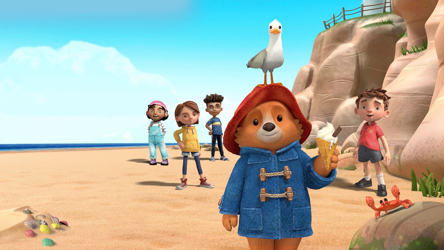
Blue Zoo was the goal, focusing on 3D works and understanding their style and what would make a project that could potentially match their interests was the goal. However the plan was to make something simple and aimed at younger audiences which is what a majority of Bluezoo’s work is, but an aspect of this was changed slightly the goal was to aim for slightly older audiences as the concept wanted to try and talk about more adult themes like mortality and loss rather than younger children problems. That being said some shows such as bluey have had discussions about the idea of death and what’s best to help someone in a younger audience understand and cope with the reality of the end.
The rough goal for an audience was around 8-12 as the age bracket allows for a lot of nuisance in the subject matter and aspects of death can be a fairly daunting task to handle. The goal is to potentially approach the subject with someone who might not understand help them understand the concept.


https://gist.ly/youtube-summarizer/creating-a-3d-animation-a-step-by-step-guide

After figuring out the rough idea and audience for the concept the next was putting together a rough timeline of the pipeline, this was put together in a gantt chart showing the potential process and timeline on a weekly schedule. The pros of this are establishing rough estimates on how much each part of the project will take to put together, how much time might be needed and where things need to be at certain stages. A pipeline helps put into categories the parts of the project needs and what to do for each part. The issue comes from the underestimation of figuring out the time needed for parts, project aspects can change and areas can fall apart so potential overestimation of time works best for situations like this.

Once the rough idea of a schedule was establish the next was working on concept work, originally the idea was an undergraduate rough idea that was only sketched out but this concept was later taken and refined for this project. The building blocks for it were crafted, early concepts had already been done however more research was needed, looking at different styles of characters, environmental work and other horror concepts were the end goal. A mind map would typically be the starting point of the idea however this concept had already been roughly drafted and needed more adjustments.
Firstly the rat concept, looking at both stylistic rats and movie rat designs were analysed, a rat was used as a symbol of the idea of death or a grim reaper like character as they’re closely associated with death. And the ghost was kept in a simplistic design both as a stylistic choice to have some appeal relating to the character but also for animating as a rig for the character wouldn’t be as complicated as that of the other character.
Environments were another aspect, the stylistic goal was to have a gloomy moody atmosphere to match a horror vibe but not with a horror story, looking at stylistic versions of grave yards, moody tones and vibes relating to the concept. Blues were that gloomy appeal were the focus of the colour pallet too.
The concept’s helps reach the goal due to the character acting and designs not feeling too overwhelming ugly, appeal is a standard and important animation principle. However the concept itself might not experiment enough with design elements as it might lean too harshly towards my own style and not the style of another to help push the work into the end goal. That being said design elements were considered with the strict goal in mind to be about character acting.


The original concept images of the character, had the character with a more humanoid body-type as the goal was to have a normal body while also making the appearance with age easier to achieve, aspects of the design stayed in later iterations but the general concept stayed the same. The overly small frame of the body had an over reliance on being thin and a lot of exposure to the ribcage and the appeal of that felt a bit off so it was later adjusted. However concepts like the ear, eyes, general colour scheme and fuzz were all kept. The original design felt too standard for a design and too “human with animal head on top” so the process was resumed and adjusted. The benefits of having such a body-type would of made human body language easier to understand however the potential style might end up too uncanny and over detail with this body type can create some unwanted unappealing designs.


What was done with the design next was bringing it back to the drawing board (literally) and reworking the design, finding different body shapes and styles to help figure out the structure of where the character’s look was going. some concepts took the original design and further pushed elements but was quickly realised is that a bit more stylisation would help change the tone of it, as originally the concept had it be fairly dark and gloomy with not light hearted elements but was later adjusted, this meant fixing the character’s design to have him be less grotesque in the sense of being human-like. Shorting his body, adjusting limbs and making his snout larger were done to try and soften the edge of the original and create a slightly friendly design. The benefits of this help create a more appealing character for the age range, however there is potential that due to the character anatomy not being standard human or not similar to that to an animal it might not achieve similar results of acting, same with the eyes.
The ghost was mostly kept the same as its design with no limbs and a shape help keep the appeal of the design, simple is best. What was considered was the potential for emotion and the adjustment for animal elements to reflect the main character however what was done was keeping the design as is, as comments relating to the design ensured its appeal was strong. Ghoul and more human appearance was also considered to allow for full body acting. This ghost’s design strong appeal helps give it a relatability towards it, however the lack of details make it hard for people to empathise with it unless the emotionals are clear and are understood.


Environmental concepts were studied, using reference images and a focus on a blue tone to help create atmosphere with the goal of having a tone that reflects a rainy night, cold, silent but a strange sense of comfort with a mix of horror elements to help add a potential haunting feeling. Blue is a calming colour and its heavy use tries to reflect a calm but empty feeling, some yellows could be use to contrast with the blue to help give warmth in a cold place similar to that of the graveyard image. The aesthetic overall tries to replicate the idea of being in a dense forest surrounded by trees and a small woodland creature burying itself deep within.
The concepts help in establishing a cold, haunting tone however the over use of blue without a contrast in some of them give its a slightly flat look and makes certain elements of the backgrounds harder to understand whats going on, a contrasting colour for the interior might help adjust the idea of cold exterior, warm interior.

An adjustment of one of the backgrounds of the interior shots this was a more heavy use of warmer colours which helps give a cabin in the woods vibe which works better to help understand both the world and mood but the character itself as the environment reflects their personality.


Some extra emotions of the characters


The final character designs for both characters, these are the final character designs for both the ghost and the rat (now named duncan). Duncan’s design has elements from real rats, with haunches and some exaggeration to the design with his snout and tail size being increased to hopefully appeal to the younger audience, the ghost was kept with similar intentions as his simple shape design is perfect for anyone to recreate. Wrinkles and fur were left as it’d help keep him fairly soft and old looking with the hope being able to add these details in on the model itself.
These designs help create a softer tone towards the project as original the design had rather harsh overly detailed human-like proportions that might of not appealed with the audience it was aimed for, younger audiences needing a more approachable character in mind. However certain design elements may of needed to be pushed further such as body shape, as there are still a fair amount of human and not enough shape language to push the character’s personalities and appeal.
After these were created a rough script has been created following the plot, were its about a ghost that emerges from its eternal slumber and has a conversation with the main character duncan about the ideas of death and the potential of being alive in the future. The concept focuses heavily on death and the idea as well as the idea of comfort before the end-of-life a real situation people may have to face in real life. Comfort is the intent of the story, however there might be more useful elements when it comes to the idea of coping with loss and understanding of death that might make it easier for a younger audience member to understand the concept.