Animation Production – Personal Creative Development : Pre-Production Pitch

This is the Personal creative development pitch project, used to help develop a pitch idea for the summer project.

The first thing done for this project was researching Pitch bibles as they help grasp the starting point for the whole project, Pendleton Ward’s Adventure time pitch bible helps the foundation of the research as it chaotic style with coherent understanding of story, character and setting building help figure out a rough starting point to the project. Pendleton’s work helps illustrate the loose nature of Pitch bibles, however it isn’t about just throwing sketches onto a page and hoping it makes sense.

Escape Studios Animation Blog: What Goes in an Animation Bible?

Illustrations of characters, their personality and what they do in the story are essential especially for understanding the project as a whole, audience and style are also an important factor as they drive the intent of the content.

Pip and Posy (TV Series 2021– ) - IMDbPip and Posy: The Super ScooterThe Adventures of Paddington | Shows | CBC GemBlue Zoo Productions Careers | Monster.com

After researching some Pitch Bible’s the next thing was to establish an understanding of styles and goals to figure out for the summer project, the goal was to focus on 3D animation and creating an acting piece that would help boost up portfolio work as well as creating something in a similar style to a company that might help push the work to being a strong fit within the company. Job prospects and a stronger portfolio are end goals.

Blue Zoo was the goal, focusing on 3D works and understanding their style and what would make a project that could potentially match their interests was the goal. However the plan was to make something simple and aimed at younger audiences which is what a majority of Bluezoo’s work is, but an aspect of this was changed slightly the goal was to aim for slightly older audiences as the concept wanted to try and talk about more adult themes like mortality and loss rather than younger children problems. That being said some shows such as bluey have had discussions about the idea of death and what’s best to help someone in a younger audience understand and cope with the reality of the end.

The rough goal for an audience was around 8-12 as the age bracket allows for a lot of nuisance in the subject matter and aspects of death can be a fairly daunting task to handle. The goal is to potentially approach the subject with someone who might not understand help them understand the concept.

3D Production Pipeline : r/coolguides

YouTube Video Thumbnail

https://gist.ly/youtube-summarizer/creating-a-3d-animation-a-step-by-step-guide

After figuring out the rough idea and audience for the concept the next was putting together a rough timeline of the pipeline, this was put together in a gantt chart showing the potential process and timeline on a weekly schedule. The pros of this are establishing rough estimates on how much each part of the project will take to put together, how much time might be needed and where things need to be at certain stages. A pipeline helps put into categories the parts of the project needs and what to do for each part. The issue comes from the underestimation of figuring out the time needed for parts, project aspects can change and areas can fall apart so potential overestimation of time works best for situations like this.


Once the rough idea of a schedule was establish the next was working on concept work, originally the idea was an undergraduate rough idea that was only sketched out but this concept was later taken and refined for this project. The building blocks for it were crafted, early concepts had already been done however more research was needed, looking at different styles of characters, environmental work and other horror concepts were the end goal. A mind map would typically be the starting point of the idea however this concept had already been roughly drafted and needed more adjustments.

Firstly the rat concept, looking at both stylistic rats and movie rat designs were analysed, a rat was used as a symbol of the idea of death or a grim reaper like character as they’re closely associated with death. And the ghost was kept in a simplistic design both as a stylistic choice to have some appeal relating to the character but also for animating as a rig for the character wouldn’t be as complicated as that of the other character.

Environments were another aspect, the stylistic goal was to have a gloomy moody atmosphere to match a horror vibe but not with a horror story, looking at stylistic versions of grave yards, moody tones and vibes relating to the concept. Blues were that gloomy appeal were the focus of the colour pallet too.

The concept’s helps reach the goal due to the character acting and designs not feeling too overwhelming ugly, appeal is a standard and important animation principle. However the concept itself might not experiment enough with design elements as it might lean too harshly towards my own style and not the style of another to help push the work into the end goal. That being said design elements were considered with the strict goal in mind to be about character acting.


The original concept images of the character, had the character with a more humanoid body-type as the goal was to have a normal body while also making the appearance with age easier to achieve, aspects of the design stayed in later iterations but the general concept stayed the same. The overly small frame of the body had an over reliance on being thin and a lot of exposure to the ribcage and the appeal of that felt a bit off so it was later adjusted. However concepts like the ear, eyes, general colour scheme and fuzz were all kept. The original design felt too standard for a design and too “human with animal head on top” so the process was resumed and adjusted. The benefits of having such a body-type would of made human body language easier to understand however the potential style might end up too uncanny and over detail with this body type can create some unwanted unappealing designs.

What was done with the design next was bringing it back to the drawing board (literally) and reworking the design, finding different body shapes and styles to help figure out the structure of where the character’s look was going. some concepts took the original design and further pushed elements but was quickly realised is that a bit more stylisation would help change the tone of it, as originally the concept had it be fairly dark and gloomy with not light hearted elements but was later adjusted, this meant fixing the character’s design to have him be less grotesque in the sense of being human-like. Shorting his body, adjusting limbs and making his snout larger were done to try and soften the edge of the original and create a slightly friendly design. The benefits of this help create a more appealing character for the age range, however there is potential that due to the character anatomy not being standard human or not similar to that to an animal it might not achieve similar results of acting, same with the eyes.

The ghost was mostly kept the same as its design with no limbs and a shape help keep the appeal of the design, simple is best. What was considered was the potential for emotion and the adjustment for animal elements to reflect the main character however what was done was keeping the design as is, as comments relating to the design ensured its appeal was strong. Ghoul and more human appearance was also considered to allow for full body acting. This ghost’s design strong appeal helps give it a relatability towards it, however the lack of details make it hard for people to empathise with it unless the emotionals are clear and are understood.

Environmental concepts were studied, using reference images and a focus on a blue tone to help create atmosphere with the goal of having a tone that reflects a rainy night, cold, silent but a strange sense of comfort with a mix of horror elements to help add a potential haunting feeling. Blue is a calming colour and its heavy use tries to reflect a calm but empty feeling, some yellows could be use to contrast with the blue to help give warmth in a cold place similar to that of the graveyard image. The aesthetic overall tries to replicate the idea of being in a dense forest surrounded by trees and a small woodland creature burying itself deep within.
The concepts help in establishing a cold, haunting tone however the over use of blue without a contrast in some of them give its a slightly flat look and makes certain elements of the backgrounds harder to understand whats going on, a contrasting colour for the interior might help adjust the idea of cold exterior, warm interior.

An adjustment of one of the backgrounds of the interior shots this was a more heavy use of warmer colours which helps give a cabin in the woods vibe which works better to help understand both the world and mood but the character itself as the environment reflects their personality.

Some extra emotions of the characters

The final character designs for both characters, these are the final character designs for both the ghost and the rat (now named duncan). Duncan’s design has elements from real rats, with haunches and some exaggeration to the design with his snout and tail size being increased to hopefully appeal to the younger audience, the ghost was kept with similar intentions as his simple shape design is perfect for anyone to recreate. Wrinkles and fur were left as it’d help keep him fairly soft and old looking with the hope being able to add these details in on the model itself.

These designs help create a softer tone towards the project as original the design had rather harsh overly detailed human-like proportions that might of not appealed with the audience it was aimed for, younger audiences needing a more approachable character in mind. However certain design elements may of needed to be pushed further such as body shape, as there are still a fair amount of human and not enough shape language to push the character’s personalities and appeal.

After these were created a rough script has been created following the plot, were its about a ghost that emerges from its eternal slumber and has a conversation with the main character duncan about the ideas of death and the potential of being alive in the future. The concept focuses heavily on death and the idea as well as the idea of comfort before the end-of-life a real situation people may have to face in real life. Comfort is the intent of the story, however there might be more useful elements when it comes to the idea of coping with loss and understanding of death that might make it easier for a younger audience member to understand the concept.


Animation Production – Digital Portfolio – David Mcdaid

This is the digital portfolio blog. This began with creating a mindmap of ideas and rough sketches, talking about ideas to create. Sketching took over the page and eventually a rough idea of the story began. A frog character meeting an explosive dog. Various rough random ideas threw onto the page.

After an idea was established we researched into what types of characters and inspiration for them. It began with real animals as they’re the easiest to find reference material for as well as something to take inspiration from, after finding cartoon and various other media relating to frogs, dogs and dinosaurs all to help establish a style and theme. This is split into 3 people, one for each character.

The entire page full of reference material, moodboard thoughts and rough ideas of potential ideas. This helped figured out aspects of the characters we wanted to keep and what to remove.

The initial sketches relating to the frog, he was originally fairly humanoid with more realistic anatomy, shoulders, chest, thighs etc. but taking the approach of wanting his limbs to be more exaggerated to allow for cleaner movement when animating, and to help push the arms and feet helped give him more cartoon proportions. The character had to be kept fairly simple mostly to help others on the team as the experience level of 3D animating was mixed so keep the design overall simple helps with only having to focus on the character and not other elements of the design, such as small objects that would move depending on follow-through and overlapping action.


The variations of colours of the character, going overly brash with the colour choices wasn’t an option cause the goal was trying to not over stimulate a younger audience with the short. Another aspect is the design was the outfit, the cowboy hat, holster and star were all aspects to  have for the design however the star didn’t make it into the final design mostly an element that was forgotten about as the boots, hat and belt were enough to convince people of the design being related to a cowboy.

The start of the sculpting process, Zbrush was used to create the model as it makes sculpting an easier process. Beginning with simple shapes then then adding rough silhouettes to the shape to create the body then once everything is established on the body next we add extra details such as face refinement, sharpening aspects of the head, body and limbs and then working on the other parts such as the hat, belt and tongue.

What might be done next time is figuring out a method that could more closely reflect the ref sheet as parts of the face, some of the side of the head had to be changed during the process due to it not completely matching up with the model.

After sculpting next was retopology, UV mapping, texturing and finally rigging retopology was done to ensure that when creating the rig, it’ll deform in a way that makes sense and ensuring that no extra work is needing to clean up the rig later down the line and making weight painting easier to do because of the solid geometry. What would be best for next time is making sure the geometry is clean throughout as certain edge loops are awkward and made the rigging process awkward at times. Another element with rigging was having to do two different rigs, one was for maya then the second was for Blender. The blender rig was the one that was focused on more as everyone would need to use the rig to animate. Getting comfortable with Blender’s animation tools was a complicated process and took several weeks to feel even a minute amount of comfortable as I was with Maya.

During the process of creating animation for the main character, the dog needed to be retopologized, UV and textured as it needed some work done on it before Rigging. Rigging was sent off to another member of the team and was done. A fur texture was done on the model as well as the TNT, adding black to the nose and eyes would  hopefully hide some of the model’s shortcomings.
For the future, rigging the character for the project would most likely be the best course of action with the most experience in that area and cleaning up weight paints would of helped with parts of the process however the final rig works for what’s needed for it.


These were the rough beginnings of the animated scenes, the first scene was the most focused as it was the longest. Follow-through, overlapping action, easing in and out, squash and stretch, anticipation had all been considered throughout as they were important factors when animating a scene. Squash and stretch help exaggerate some of the body movements too like when he jumped, even though its unrealistic it adds a bit of imperfection when it comes to reality as taking it straight from reality would of been fairly standard when the design idea was to be cartoony.

Exaggeration helped throughout too as the expressions in the second animation gives the sense of panic well however it could be argued that holding on a few frames to help establish shock would help push the shock more.

The use of live-action reference helped figure out the walk to some extent, and other parts of the animation as the full scene was full acted out to help understand movement and gestures. Lastly the jump was also filmed, helping understand the timing and movement of the spring-effect of a jump.

After animation was rendered out as two seperate pieces it was brought into after effects to be done in post-production. The character render was placed on top of the background render and then the background was blurred, added bloom and fire/smoke were also edited in with similar effects to help try and blend the entire scene together. Depth of field was the goal of blurring the background.
This process came together to create the finished scenes, smoke to help establish what was going on in the scenes the fire because of the context and the blur to create a depth-of-field effect.

The final film with sound and credits. The final film overall is solid the scenes come together to create a narrative although, what would best be figured out for next time is creating a pipeline that gets everyone onto the same page way before the small deadlines of each part was needed because elements of the production were rushed to try and get it finished for the deadline. However the animation work done helped create a cartoony 3d short which was the goal of the production overall.

Animation Production – Dynamite Dog – David Mcdaid

This is the animation production module in which a pitch is created for the intent of presenting it to a major network, the intent is to create something with an audience of younger kids between the ages of 6-12 and the focus is on being humourous for them with themes of “Don’t judge a book by its cover” the intent is to create something simple for younger audiences and easy to draw, fast editing, random humour, slapstick and wild energy is the overall sentiment.

This’ll be broken down into a weekly summary of what was achieved and break down aspects of what was done.

Week 1 – 27th January

The start of the creative process, the team got together and created a large piece of paper, discussing the ideas for the project, the first idea pitched with the potential of two banana characters in a war cutting between reality and their imaginative world.

However Joe thought of an idea of a dog made of dynamite that everyone believed to be the most entertaining pitch as it allowed for a lot of creative visuals and gags.

This was when we began sketching ideas to follow the idea, thinking of characters, expressions and motivations of each of the characters and roughing out the intent of the story involving each of them.

Taking the moodboard, after researching realistic and cartoon frogs it helped influence the design to be a bit longer and goofer, allowing for more character acting animation.

The advantages of having the body longer helps people identity the limbs better, able to see the other parts of the body more such as fingers, toes etc. However this type of design also suffers from being being too loose as the design was aiming to be semi-realistic.

A mood board was created by myself and was used as the basis for everything, finding all sorts of references of character designs, colours and environmental designs as well as potential direction of the characters and setting.

The goal was to focus on character design, researching amazing world of gumball, rango, and a general assortment of styles and ideas. Realism was also a focus as gumball’s idea of design revolved around realistic, stop-motion and cartoon styles all blending together. The general audience members for this short was younger so nothing overly gorey, offensive or disturbing would be considered for the design and the elements taken away from the research.

Colour was another aspect researched, as all the characters could have a range of different variations.

A way of communication was also created with Discord being the main hub for all the information and production elements put together.

After sketching on the paper, designs for the frog character were roughed out and the personality of the main character was focused on. Creating sketches of a more realistic frog and with some stylisation to give him a way to express and emote in a more cartoony way. Making the 3D animation cartoony and expressive is the end goal of the designs, supporting that with large eyes and long limbs helps give the characters a way to focus the action and acting on their body language. The downside is that its difficult to balance the idea of uncanny valley as humanoid proportions and animal anatomy is a hard blend to create. The size of the eyes is also a factor to consider as large eyes are good for cute characters but you don’t want them for a serious character, as comedy is the focus a middle ground is fine. Smooth, round shapes also help the design give it a friendly look, the balance between the two is the most important thing.

After the Frog’s design the dinosaur was then sketched up, originally we had one person on the frog’s design (myself) and no one was designated with the dinosaur or the other characters so sketches were created of the dinosaurs as well, however later another member of the team took over that design and the main character the dog.

The dinosaur’s design was focused on realistically, however later it’d be revised by Joe to be simpler which would help later for modeling and rigging and potential animation, as realistic would have a lot of unnecessary details as this character wouldn’t have an overly prominent role compared to that of the frog or marshmallows. Sometimes simplicity works better, as this designs have too many small details that would either be too small to notice or not worth the time and effort to implement.


Week 2 – 3rd February

Further sketches exploring the frog character with some stylization from other how’s featuring frogs (Amphibia show from Disney) and other ideas and exploring a design idea previously been explored by other members.
Some of these sketches were designed to push the design of the character, bring up proportions and adjust what was needed and another design aspect was the stomach area as other members of the team requested him to be larger, most likely to give them the appearance of being overweight and clumsy and this was adjusted to the design. Once the character’s design was established the next was figuring out colours of the character, seeing what worked and what didn’t, the idea of him being extremely loud in colours was discussed in the group.

The toon designs would of helped establish the frog as being a goofy and not as serious of a character so pushing the design further might of helped with exaggerated the personality more however the thought was to adjust it to allow for cleaner, clearer animation overall, similar to the reason why the character only had boots, belt, star and hat to limit the amount of props he would have but also the research in the mood board with cowboys, establishing classic iconography. The problems come from the lack of more prominent iconography from the inspiration, cowboy boots for example they could of been more established or a pistol.

After the sketches and design were established next was to move onto the colours, trying a variety of them. The process was test his design with various real life frog variants and some extravagant ones to test to see if they’d work. The blue neon and green was based on a real life frog however its colours were extremely garish as would potentially stick out the most might be seen as too much visually as its over stimulating for anyone beyond the target audience of being for younger people at 6-12. The other colours followed the same problem, which is why a more standard colour was picked overall but with some adjustments to give it some unique flair. Green is softer and friendly and associates with greenary, yoshi from the mario bros. series was inspiration for the colour choices too especially with the red boots. Yoshi has an recognizable design and his influence helped establish the colour choices, however this comes into the problem of being potentially too recognisable and compared with other sources however familiarly works best with younger audience members.

Created an asset list and a production list to keep track of each shot and what was all needed for each one to be “completed” and making a checklist for each part.

The hope is to use this to track all the shots, who does what with the assets and what will be needed for the scenes. The layout of the excel sheet helped make the process of marking off each scene as simple as clicking a box, the problem came to actually getting individuals to use it as the other priorities took over, however for potential future projects this excel sheet would help.

Week 3 – 10th February

Once everyone was satisfied with the design the next thing was to create a character sheet for them, which finalised a lot of the elements created and discussed earlier in the project. Welly boots, belt and hat were also figured out for the design and put in accordingly.

His final design brings together the elements from the mood board that were important, the realism from the frogs, the skin and texture that was needed the iconography from the cowboy theming and the simple silly addition of the booties creating a contrast between the realistic and the goofy. Certain elements of the design could of been pushed further specifically the anatomy following more frog proportions could help with animating him more frog like and less human, but it’s a situation of figuring out the balance between human anatomy and frog as going to far one or the other might cause an uncanny valley effect and remove it from its more cartoon focused design.

Once the character sheet was ready the next thing was creating the 3D model of the frog character, this involved using Zbrush to create the model’s body, limbs, head and eyes and merging them all together and then sculpting the shape and details from the designs out of him this task was finished when the model and all the parts relating to him were finished.

The sculpt followed the design sheet, sharpening the hard edges for the hat, the body etc. What would be done next time is softening areas around the eyes as it the current design might of needed more space to allow for stronger brow movement as current the lack of space causes some merging of lids and brows making it hard for the character show facial expressions. The tongue’s shape and design could of been further refined as it current design is squashed and difficult to to animate. Lastly the booties could of been pushed harder with details, the general shape works but the details and refinement is blurry.

Created an overall product list to help keep track of everything needed for the project and a checklist on what has been done. A second list for getting the assets created, each step with a checklist and a percentage for each part.

Week 4 – 17th February

Limbs topology + knee and elbow edge loops.

FaceTopology - polycount

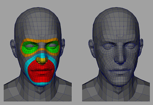
Once the character was finished with sculpting the next was re-topologising him to make him easier to animate and rig for later, lots of circles around the important parts of the anatomy. This will help deforming when rigging later, bending correctly and making the influences of the rig easier in the long run.

After the model was finished and UV’d and topology the next was creating the texture for the entire thing, this involved doing what was done with the body with the entirety of him, belt, hat, tongue, and shoes all ready for texturing.

The texture work, especially the eyes were influenced by the research earlier real frogs have a rectangle shape and the use of a type of paint brush helps keeps it from being too realistic. The skin overall follows the idea of a realistic frog, it has small amount of normal mapped bumps that are similar to that of scales helps establish the roots of the character’s design of being a frog.

Once that was done all the parts were brought into substance painter and were painted according to the ref and their real life counterparts, so leather for the belt, rubber for the wellies etc. once that was done it was brought back into Maya to be adjusted as needed.

One of the important changes to this model compared to others was the use of UDIMS for the body, this allows for even higher level of detail with the texture as it uses several blocks of a texture map and not just a single block.

https://puu.sh/Kpgth/d271c757b9.png

Last thing done was to adjust the mouth so its closed and helps with rigging the next stage of the model.

His final overall design now in 3D, the design followed the sheet as close as possible however there are certain aspects that were difficult to follow some muscle groups don’t follow the same and the head shape was complex, the sheet failing to completely establishing what was needed for the design so compromises were needed to create a solid headform.

Week 5 – 24th February

This time around was to use advanced skeleton to create the rig of the model, this would help with animating in maya as a lot of the controls and possibilities of the rig can be done quicker and with more flexibility when animating as well as using animbot and a picker to help make the process of animating faster.

The many stage of going through advanced skeleton, an important factor is to make sure the mouth and eyes have perfect topology as it makes the process of advanced skeleton easier to fix up and have ready.

The finished rig now capable of adjustments and clean-up of the rig would be next.

After this was created a discussion with the group was done to figure out if the rig was needed as feedback from one of the tutors suggested we make an exclusive blender rig, mostly to help unify the groups efforts as everyone seemed interested in animating this would mean that maya would need to be dropped for blender as the time to learn a new software wasn’t in the time frame we had.

The Maya rig was designed to allow one of the members to use maya for animating however it was established that blender was the focus for animating. The maya rig specifically was capable of a lot of minute details of the face, being able to pull and push certain small areas as well as having the brow be flexible however its lack of compatibility with blender makes it difficult to transfer over for others so it was needed to be scrapped. Another problem with the maya rig was its complexity, Maya offers a lot of tools to make the selection process easier however there are still a lot of very small specific controllers not needed and it could confuse people while animating, simplicity helps when it comes to a large group of people and the rig for blender achieves this.

The finished blender rig using rigify, this was a similar process to that of advanced skeleton however the clean up and changes weren’t too bad of a transition as once thought of, the final rig is as capable as the previous one and can be pushed far.

The blender version of the rig has a lot of similar controls to the maya one (a lot of facial ones especially) however for next time it’d be useful to follow familiarise what is possible with the controls and see if more or less were needed for the project. Weight painting is another part of the process that could of been better adjusted as the main core of the body had some minor deforming issues, similar with the feet and shoes.

A simple quick animation of the rig in action, moving his arm to illustrate the use of the body and how he could potentially move in the final animation work.

The simple animation establishes aspects of the character early on, the movement of how parts of the body works as well as figuring out what was needed to be adjusted from the rig’s own controls. Head movement and neck had to be adjusted as by default its on a seperate setting then hips were needed to be adjusted. The animation itself doesn’t push the rig’s controls and struggles to show problems with the current rig as the movement isn’t pushing parts that might show problems, arms, legs, feet etc. and doesn’t try and replicate influences ideas from the moodboard. For future projects establishing emotions, movements and body language with the help from the research would help establish problems that should be adjusted to help push the cartoon-y nature of the character.

Week 6 – 3rd March

After the rig was finished with and minor adjustments were needed other parts of the production was needed, Dynamite dog needed a texture and retopolised as he was a fairly dense model originally and would need some adjustments if he was going to be animated as well as colour the eyes and jaw. Lastly similar to when working on the frog topology should follow specific ways to help bending and deformation easier, however Mike had had a discussion with the group about how topology doesn’t need to be perfect for certain things as not everything will deform or animate, this will be brought into consideration for future projects and understanding.

Week 7 – 10th March

Another Frog animation, him snapping his fingers with an “Ah-ha” expression, this one was done to create a finalised version of the rig to figure out if he was animatable or not. Limbs, body, head, etc. all parts were moved in some way minus the legs, which was checked outside of the animation. In future checking of the model and animation a run/walk should be created to help establish the movement of the character and ensure that the entire body is correctly fixed and ready.

The second part is an image of using the storyboard/animatic to create the starting poses of the animation, this one had a shocked expression to be begin so the model was adjusted. Eyes, mouth, body language was all considered. The mouth placement and its shape were also important however in the future when working with the storyboard  the facial features could of been adjusted further, tricks with the camera were possible to push expresses similar to that in anime.

REM on X: "I was watching houseki no kuni-s production team's livestream and I AM AMAZED by this, the face changes FORM from different camera angles https://t.co/VDzffyRMaz" / X

Land of the lustrous is a 2017 anime that used a mixed media approach of 2D and 3D elements, this was an example of pushing the facial to closely replicate that of how 2D artwork would do it, even though it doesn’t work on a mathicly sense of 3D, artistically it establishes a stronger visual appeal.

Week 8 – 17th March

Two animations were roughed out this week, the first one was the frog (now named Marshal) pointing and shouting “Dynamite dog” which was established in the animatic and the second one is the character freaking out from what he was seeing, the face was adjusted for the second one.
The first rough animation is helps with the simple concept of him pushing and shouting, the finger dragging slightly helps push the dramatic aspect of the shot. However the facial expressions have a slight sutter and awkwardness to them which could of been smoothed out and adjusted to fit the body language better.
The second animation was done in stepped to speed the process up, the expressions and movement work well exaggeration used throughout, but could of been smoothed out with a spline however the fast pace and sudden nature of the animation helps with the idea of a panic going on. Some timing also had to be adjusted to best fit the animation over the animatic.

Week 9 – 24th March

The roughing out of the next scene that was focused on, this scene having the frog walk up to the dog and confront him. For a starting point it establishes that he has a goal in mind and the follow-through to help the sudden stop of him. Then a confrontal point to show where he’s pointing. Next time adjusting the pose to have a sharp silhouette to help the placement of him within the scene as a strong silhouette helps easily read the character’s movement.

Mouth movements will be done later as there isn’t much dialogue at this stage.

Week 10 – 31st March

After continuing to animate the character, now with a point to the other direction then establishing the second half of the scene of him jumping up to the dog and showing the chaos. However unlike last week this time was focus on gaining some life action footage to create something with a reference and using the walk, point and pointing out the chaos were acted out and used as reference. The jump and panic part of the footage helped to figure out the speed and timing of a wave.

However other parts of the footage wasn’t referred to specifically the walk and even though the follow-through was complimented by the tutor it could of been followed most established rules relating to a walk, such as hips sway, and using more referenced images from Richard williams about how to walk, but the walk is still solid enough. Hiding the feet with the camera helped the slight float it has when you see it below the camera.

Week 11 – 7th April

A further working on this same scene, this time adding a jump to him to climb up onto the dog. Reference footage was done of jumps to help figure out the timing and body language to understand how to properly jump from a frog position. The placement of hands, how far the body is pushed down are all considered and thanks to the reference footage helps understand where that goes.

Footage could of been done to help with the transition between the thought and then the jump action, as its difficult to figure out what sort of transition would be fast enough to transition. The camera was also adjusted to be lower down, this was created to establish that the dog’s size is a lot larger than the frog and it takes some work to climb up to his level.

Week 12 – 14th April

The scene being worked on more, this time now with a transition between the thought and the jump, it was decided to have a zippy cartoony transition mostly because previously established and researched this was designed to have cartoony movement more than realistic so squash and stretch on the limbs to have them push and pull along and make the character seem more elastic overall. However, with future reference finding a solution that works better for acting rather than a quick cartoony take might of been a stronger way of working the animation.

21st April – 28th April


The last parts of the animation cleaned up and fixed up, movement smoothed and acting all established now onto fixing up the final parts of animation and then into getting the scene put together.
This last part of the animation had a lot of easing in and out to help smooth out some of the movement especially during the zip across from his previous standing position to the new one and the hop has a limb stretch to full a squash and stretch motion. What could be changed for next time is pushing of smaller overlapping action items and follow through with it to help push some of smaller details, like the hat could potential shift slightly. The holster on the hip does flap but could of been done several more times to give a sense of weight.

After the animation was done the next was putting the scene together this required taking Sarah’s background and putting it into the scene, due to wanting to put the scene together and work on some post-production the character was split apart and rendered separately. So the characters were rendered as one sequence while the background was another but the background only needed to be rendered once due to the very intense nature of the background. The fog, high amount of items on screen was a difficult thing to manage as it needed some trimming in future, a moment would be needed to sit down with the artist and help optimise the scene so everyone could render the scene out correctly.

This was the post-production method, splitting the scene into just characters with lighting and background allowed for rendering the scene out as two seperate pieces which would later help in post-production. Characters being on their own allows for just the background to be adjusted and viceversa on the characters.


5th May


This was putting the renders together, taking the foreground and background and then combining them together once that was done next was adding a background blur for a sort of depth of field look then some extra fire, smoke and any other additions like bloom, and lens flare. Film grain, chromatic aberration and other post-processing effects were considered but ultimate wouldn’t have match the look of what was wanting to be established.

Lastly what was needed was the entire team’s footage together to be rendered however only this was ready for post, in future what should be done is everyone having similar rendered scenes all done and then one person taking over for post-production and not at the last moment. As it would of given time for everyone to have the short be similar in look throughout.

The finished animation, all three clips were created and put through post production. What should be considered for next time is the animation, rig and other scenes as the animation holds its own fine but some areas could be cleaned up and smoothed out, the rigs could of had controls more refined for what was needed and the post production could of been heavily established early enough of a timeframe so individuals wouldn’t have scenes that were misaligned. Overall however the team did their best with what they could do and overall the film has come together, solid work throughout.

Experimental Design – Research Blog

This project requires the research and use of inspiration from the Codex Seraphinianus, a starting point in the project.

The researching part started with finding a piece of the Codex that was used for inspiration, the page shown above with the fishes was the starting point for this project taking elements from the top two a shark like creature and then a fish inside of a scuba-diving type attire these two were the main sources of influence on the project.

After figuring out which would influence our work the next stage was creating a mood board to find artistic influences to help isolate a style throughout the course of the project an end goal of a visual design. This started with looking at the real life animation, specifically sharks to get a grasp of understanding how they look in real life then moving onto scuba diving gear and astronaut outfits and they both have similar ideas behind them and share similar design elements the biggest difference being materials used for them as rubber/neoprene materials are used for undersea traversal however large helmets and breathing apparatus’ are both found on them. Fishbowls have been a common trope relating to cartoon interpretations of space travel.

After looking at real life examples the next was moving onto artistic influences such as the Crow: The Legend a VR visual showcase which has the audience member experience the story in VR and has a full immersive environment. The other influences are various cartoon sharks, like Mr. Shark from The bad guys and Jabberjaw from the show of the same name. After other visual designs were used classic looney tunes and stylistic designs of human faces were also researched and used for inspiration. A balance between sharp and smooth angles had to be considered due to the animal used.


After looking some research the next was doing sketches based on what was found and initial sketches of ideas, this included scuba gear and realistic sketches of sharks to understand which directions best works for the design. Some cartoon inspired poses and sketches were created.

More sketches relating to ideas relating to the helmet and how to design the bodysuit.

This page was to figure out if pushing the design into less cartoon-y and more uncanny and off with black eyes instead of more standard ones. Cartoony would be more appealing while the black eyes could have an appeal in the opposite direction.

Refining the shark himself, figuring out different styles and approaches for the eyes and thinking about body shape, focusing on slim designs was considered more due to the process of animating. If the body was bulky it might make the idea of him swimming in a cartoony way difficult so slimmer helped allow for easier reading of limbs, this was discussed with a tutor.

Creating some more sketches of realistic shark designs, body shapes and poses to help push the design in a way that would make him fairly flexible when animating. Some style sketches to think about making them more classic cartoon or more modern. Lastly sketches and colours of rough concepts for the shark in a rendered state, the colour of his clothing and the potential use of caustics to help give the impression of being underwater.

The final sketches of the shark, refining his body shape and his clothing and keeping what may be needed for the character.

The final reference sheet for the character, including the original sketch, the inked and coloured version of his body and then a final version with all clothing on and details maintained.

The design of the shark needed some second hand opinion on the idea cause elements of the design might of been able to be adjusted further, the most notable is the size and shape of his body as the character has a fairly bulky body rather than slim however the neck made it difficult to figure out which way to go with elements cause a large neck and small body might of been vastly disproportionate to the rest creating an unappealing design. The most important aspect of the design is that if it reads well and reads clear especially for animation.

The initial blocking stages of the shark’s body to near-final sculpt.

The heavily refined version from block shape to highly detailed model and making the small designs like muscles, the connection to arms then scapula and overall connections throughout the body and also making sure the neck to body is still correct. Lastly details like scars and wrinkles etc. were done which was used from alphas created for zbrush and then dragged and dropped onto the model allowing for smaller sharp details.

Lastly the clothing from blocking to refinement to completed detailed body. Each piece of clothing was created individually then merged together with its mirrored self like gloves, belt and shoes. The body suit was all one piece and some asymmetry was needed to allow for the entire body to not look so perfectly symmetrical.

A fin which initially roughed out in zbrush then changed to a 2D texture which made the fin easier to animate as it was just a plane on the body rather than a whole new piece plus design wise it was difficult to achieve an accurate appealing fin.

After the sculpt it was brought into maya and retopologized heavily reducing the polycount and focusing on creating topology that allows for better animation specifically the face however the elbows, knees and finger joints were all considered and adjusted to help for better bending and flexing.


Once the topology has been redone the UV’s are fixed up and then its brought into substance painter to create the textures. Baked lighting was used an gradients as well as baking the high poly model onto the low poly to retain all of the details from the high poly model. Also a smart material of scales was applied to both the clothing and the shark’s body itself. The biggest obstacle was substance itself as crashing with ambient occlusion and sometimes break substance as well as UV problems which had to be fixed several times before being final.

The wireframe of the whole model with no textures.

The texture of the skin applied to the mesh, showing the details of all the muscles on the body and keeping even small details like scars and scales.

The final fully textured version of the model with extra details like valves, hard surface modeling done in maya was used to help with those parts as it would be faster to create than sculpting in zbrush and the models don’t have to be overly detailed due to their size.

Another model done in maya this time finding an image of a fish and hard surface modeling around the image to create a simple fish shape, as the model will be fairly small the overall detailing doesn’t have to be high so its created as low poly as possible even using the image it was referenced with and then UV’d with the original image as the texture.

A problem that happened was due to the method of putting the mesh over the clothing, what was done was taking the original body mesh and placing it over the clothing and using that as topology rather than doing more with this method its possible to save some time and the topology is cleaner cause it was already done on the base, however issues like this can occur were small details can be distort and if not noticed on time can break some parts of the model which was found and corrected to the best of my ability.

Using advanced skeleton helped create the rig as it allows for a quick n’ easy way to put together a professional-type rig with limitations, in this case the body was done first and allows for finger bending, arms and legs and has IK/FK switching. Then it has a facial rig which takes a lot more effort as you place points on the face and have to make sure the topology is good and symmetrical as it tries to create all the bones in a symmetrical manner however it is possible to do asymmetrical character faces. A change that was done was to simplify the eye lids as in their original form can have a lot of unneeded controls.

After advanced skeleton created the body and rigged it, the next step was cleaning up the influences so everything flowed corrected as originally the model had very harsh, sharp bending which needs to be lightened for the model to have a cleaner bend.

A quick example of how the rig operates and moves from the body movements, hands and thighs/legs and overall capabilities of advanced skeleton with the rig.

An issue that occurred near the end of the rigging stage with the model as parts of the model when pushed hard which break and bend in a way that needed to be fixed however due to time limitations it was difficult to fix in time however issues with the mesh are hidden with the animation.

The first stage of the animation, making the key poses for the animation on stepped as it helps show the general feeling of the animation while also making poses easier to read, once this was done we moved onto spline for the rest of the animation, unlike other projects this one was done almost entirely in spline to make the transition easier and less work overall.

Using references of a hop and a standard breastroke kick helped achieve the goals of the animation as it was planned to have him hop slightly then jump into his swimming pose the idea to imply he was already underwater and could just jump and float in the ocean. The principled helped in achieving this as well, as staging, squashing and stretch, timing and spacing and a lot of the other principles came in to help give the animation the achieved desire specifically him swimming.

The first half of the animation roughed out this involving him looking around which was added later as going straight into the hop felt like it needed a moment to establish the scene. The first key of this will be used later to create a complete loop of the animation.

An experiment that was attempted was using facial tracking with the rig to see if it could replace the process of animating the face however this process came off, awkward and the lack of control in some areas felt a bit overwhelming and planning for using it from the start of animating might help make it more usable however a lot of the tracking itself is eradicate and hard to focus its control so the solution was to hand animate it instead of using the tracking.

After finishing the animation next was onto blender to fix the model up, however the results were good in blender using a boolean to keep the water in the correct level, which is what the video helps with understanding however the process didn’t translate to sketchfab which was what was the final platform for the work, due to time and struggles using the maya version below was the solution. Another goal in blender was using a curve to create smears or trails to help express the idea of underwater however the results would require more time. Another issue was the path used from the maya version didn’t translate to blender or sketchfab but directly from maya it worked fine most likely due to the animation being baked which it was in the maya version.

A test of sketchfab in VR, model being scaled and the animation can be viewed in a VRheadset.


The final animation and the model uploaded to sketchfab, it’s completely viewable and the environment and model looks overal what the intention was for the goal of the project. The only issue is having to pay for HDRI changes so a solid colour was used to replicate the idea of the ocean.

Overall the project expresses the desire of the goal of creating a character animation and design inspired by the codex, next time I’d like to create something further out of the style that’s usually used in these projects and push harder on a tone for the characters created.


Timing in animation 2 : Acting and Staging – Digital Portfolio


The stepped version of the scene, the way to clearly see how everything moves together without spline/ autotangents on and see if everything reads correctly, a lot of principles can still be applied even at this stage, overlapping action, secondary action, squash and stretch, anticipation are all readable.

The problem with this state is that it feels like its running at a lower framerate compared to that of full spline/autotangents, it feels like its missing parts of the animation however it can become a large mess of keys.

The final version of the animation, using spline. Spline creates a rather smooth looking animation however it requires clean up with this method of animating compared to others so after your done animating the majority you clean up parts to make the transitions smoother because of the amount of keyframes used.

Overall however the project turned out well, the character’s are close to the storyboard and emote and act in a rather cartoony way. The part about it that’d change for next time would most likely be the exaggeration, pushing some of the emotions harder might push the style harder and be closer to that of a real tom and jerry cartoon.

Another aspect for next time would be mostly just polishing up the curves more, leaving some time in to focus exclusively on that however with the amount of keys done there might not be as much proper clean up needed potentially.

Overall I think the project was a success, minus some minor technical flaws with the presentation.

These ​were poses of the part that weren’t able to be animated mostly due to time limit. They depict Jerry pulling the hammer up and causing Tom to fall over. Which would be the end of the scene. Some exaggeration, squash and stretch would of been used as well as aniticaption and overlapping action and secondary action to achieve the fall and Jerry’s pull. Given more time this scene might of been completed.

Timing in animation 2 : Acting and Staging – Reflective Blog

This module focuses on the use of the animation principles to create a scene that focuses on acting and staging, we’ll be focused on using several characters to create animation that has an action and reaction.

For this project the characters Tom and Jerry have been chosen as their rigs are flexible and allow for a lot of acting choices, like smears and squash and stretch across a lot of the body. More subtle details are whiskers and hair fluff that have the ability to be used for overlap and follow through

(Animation / Cartoon Animation by Preston blair)

Another reason for choosing these rigs is that Preston Blair’s original version of his Advanced animation book has a lot of references to Tom and Jerry as they best showcase the ideas of fundamentals he presents with animation and even though the rigs are 3D hopefully the ideas of his work can be translated to 3D with success.

The first thing done was finding various Tom and Jerry cartoons and finding examples of the two characters actions in their original works, this helped figure out what best works for the two.

Going through example of classic cartoons and finding examples of actions I’d like to recreate was the starting point, slapstick violence requires a lot of sharp, fast timing and spacing as well as using squash and stretch to feel the impact of an hard object against another.

Taking screenshots of Tom from a Tom and Jerry episode using a bat, his anticipation and Arc, mixed with some overlapping action. Brought together to create the idea of weight being lifted, and the arc for a clear understanding of where the bat is going. A smooth C shaped arc and then a hard straight line for when it reaches the peak the release of the hit is also a similar C shape arc even the settle is an arc so in total 3 C shaped arcs to create the hit with the baseball bat.

Another part is timing, with easing in and out, the bat has weight to it with the use of easing hanging on the bat for slightly longer creates the weight, its not a light object so there has to be a moment to show that there is weight to it.

The initial hit of the hat has secondary action with spike being hit and his face squashing and stretching, this helps push the idea of the weight against his face as well as a way of quickly identifying the impact of the bat. Taking these factors into consideration when animating the bat swing will help create the illusion of a heavy object affecting the world around it. Action and Reaction is an important factor to also consider throughout.

Cartoon Character Animation with Maya: Mastering the Art of Exaggerated Animation (Required Reading Range)

(Cartoon Character animation with Maya, Mastering the Art of Exaggerated Animation by Keith Osborn)

In Keith’s book about Maya animation he expresses his desire to create a cartoony characters and begins this process with breaking it down into 4 sections, the Confident walk, Antic, Smear and “Vibration” these together create the idea of his animation. Firstly the breakdown of the keys to help understand the entire action is useful technique in figuring out the important parts of the scene, secondly he always ensures the character has a clean easily readable silhouette to understand everything that happens and lastly isn’t afraid to completely break a character in order to push the exaggeration of the character with the smears. These rough sketches are the foundation of the entire animation and thus several iterations are done to figure out the strongest poses.

Later in the book he shows off his method by using Tween machine and creating the breakdowns with it as well as discussing how to exaggerate the character’s movement to create a toony way of moving, this is similar to that of Tom and Jerry and thus shows just how flexible the method is.

This part of the book describes his need to input another breakdown before the final settle and helped understand that sometimes adding more in-betweens can benefit the movement this was a problem that was occurring frequently in the previous animation specifically limiting amount of in-betweens rather than potentially adding/removing some to help make the animation snap more.

A large factor in creating quick solid movement is the use of smears as it makes up some of the information that gets lost during a transition, its similar to motion blur too as it smears details that have a similar look in real life. Richard Williams shows examples of how t o use it for transitions, smearing the faces and parts of the body even if it looks off it works and feels good in motion.

Breaking the Joints is another property that Richard Williams discusses and gives examples of, having the arm and hand drag in a way that the elbow is leading the action so that it creates a flow, even if realistically it doesn’t work like that. Drag and Overlapping action follow similar ideas as they don’t always follow the main action but have reactions based on them.

Taking these elements from the books helps create fundamentals of creating an animated scene as well as using the principles of animation to help create the illusion of life.

Once analysis has been done for Tom and Jerry, what was next was considering an idea to create, this involved sketches and thumbnails to understand where elements of the screen and what the characters will do.

The initial sketches of Tom and Jerry, extremely off model but rough to bring out more ideas. It’s about quantity over quality at this stage and thinking what sort of way the principles can potentially be utilised throughout.

Posing expressions and trying to be somewhat more on model. Line of action and thoughts on perspective, staging/appeal and some dynamic movement were being considered.

The storyboards for the short scene, it depicts Jerry holding up a block of cheese and then devouring it becoming a block of cheese.

The shape is a reference to an episode of Tom and Jerry were Jerry is depicted swallowing a whole block of cheese and becomes a similar shaped piece.

Then Tom shows up, showing off a smug demeanor which is the start of the conflict as Tom wishes to dispose of Jerry. However he’s unable to due to his own overzealous behaviour he ends up hurting himself in the process however he has his revenge and Jerry is smug knowing that he’ll fight back.

The boards here have an extra scene of Jerry fighting back however this part was ultimately cut due to time constraints and the focus was what we originally had which was just up to Jerry being crushed.

This was a practice piece of just the two posing, getting acquainted with Jerry’s Rig and seeing how the two balance off of each other. A lot of Jerry’s Controls weren’t turned on or adjusted as much as Tom’s which made certain poses awkward to place with him compared to Tom.

The key poses from the storyboard taken and posed out into the scene, aiming to keep them accurate while also adjusting parts to try and keep the staging as clear as possible.

Posing being as clear as possible is the ultimate goal as later on in the process the animation will become easier to read as the poses will be clear.

Once the keys were done the inbetweens were next,a lot of anticipation, drag and overshoot to use of Arcs. The Arc’s felt like they were the most important as legs, arms, thighs, head all follow some form of Arc.

A pretty common element used throughout was smears, this was used whenever parts of the body moved extremely fast so it helps read better where parts of the body are going. Squash and Stretch was a fairly common way of achieving this, with drag as the palm is what’s pulling the entire motion forward.

Squash and stretch was applied to the face to help with fast motions too, a way of adding a bit more life to the animation as the speed can cause parts of the body to shake or wobble and this was the way to achieve that.

These two screenshots show exaggeration, (Touch and foot) to help push the idea of “Pain” hitting him and to highlight the area in which he is in pain. Pushing the expression can help quickly identify what emotion the character is feeling and what will happen next.

The second screenshot is of the arm, even though it isn’t exaggerated the arm is bent back to follow the ideas of Richard William’s proposed in which it can help push the animation’s flow by not always following the rules of the world.

These two screenshots show two parts of the body that had a lot of overlapping and secondary action as they both almost followed their own path while the body and head were moving. The tail swings around to follow Tom but also can have a mind of its own, the ear can change depending on emotion too but is more dragged around by the head. These two properties were considered throughout.

2 weeks into the project there was a showing on the progress we had made throughout and some helpful reviews were done a lot of the changes with this specifically relating to timing, and it was just to hold some poses for longer the two above are the movements that most requested to “hold” this would help read what the animation was and overall the feedback helped create a clearer understanding of the poses.

The first pass of the tom scene, all keyframes were in and timing was tweaked constantly to try and achieve a clear emotional and flowing animation. The timing of the hammer hasn’t been refined yet here and thus has a light feeling to it, it’ll be adjusted to be heavier and weightier throughout. The swing of the hammer is also too fast feeling like a light item and not something with weight, slowing it down and adding some easing in and out would help achieve that as well.

Video reference footage taken to help understand the movement of the heavy object from lifting to putting it down on the shoulder, the arcs, anticipation, easing were all considered when analysing the footage as well as general timing as reality can help understand that.

Another important thing was the overshoot and impact the heavy object has on someone when it hits their body, what the body does was considered like the thighs shifting weight and parts of the body that were impacted shift to help react to the object.


Lastly was the second part and that was the hit, even though later on in the scene the hit was a lot faster this one was considered with the intent to be a slower and heavier feeling also how someone would hold a hammer over their head and the swing is brought down as well as how the hands and movement happens. A sharp strong arc as well as overshoot, overlapping action and some secondary all help push the speed and power of this.

Another video reference this one to help with the idea of weight and how people position themselves, however this wasn’t the main focus it was mostly the easing in and out as well as general feeling of weight throughout.

In future the changing of the pose to focus on the realism might help with having a stronger pose that follows a realistic way of moving however the goal of the entire project was to focus on more exaggerated cartoon-like animation and not realism.

Pose to Pose – Wave Motion

This section will focus on the creation of overlapping action and follow through as well as pose-to-pose, with 3D the idea of pose-to-pose is a little different from how it’s done in 2D but the core concept is the same. Creating Key frames is “The storytelling drawings” they’re an important part of the whole, these poses express the intent and what happens next throughout the situation. Next is the extremes and breakdowns, the inbetweens and the further inbetweens these parts help create the entirety of the motion.

Overlapping action and follow through;

Follow through typically depends on the movement of an extremity which can be:

  • The actions of a character
  • Extremities own weight and flexibility
  • Air resistance

Like a Dog’s ear in the wind for example, as stated by Timing for animation by Harold Whitaker and John Halas.

I took the concepts discussed in the previous section and applied to my own work, this included a bouncing ball with a tail. To begin with I used the previous example of a bouncing ball and did squash and stretch, timing, easing in and out and Arcs but this time had a tail which involved having it sway in a direction opposite than the action happening with drag to help emphasis the idea of the tail being its own independent object compared to that of the character itself.

Similar to the bouncing ball example I believe there’s still some “float” when it comes to this which is most likely due to the spline not being adjusted enough and has been over easing going on to fix this it would need to be cleaned up with breaking tangents and removing keys that hindered the movement.

This is a breakdown of the process for this pose-to-pose of the Tom rig, when creating the movement for this I try and think about it broken down into stages, Firstly is the A key, typically the before action and then the B pose once these are established the anticipation of the action is next then the drag/breakdown, then an overshoot which can depend on how harsh I want the movement to be when it hits the B pose.

The posing and general silhouette of this is solid, I tried to keep everything as clear as possible however I believe his hand emerging from behind him needed to be cleaned up at tad as it snaps rather awkwardly into the next pose, adjusting the frames or his arm some might of given some help in fixing this issue.

Creating Overlap

The exaggeration throughout I believe helped make the final key overall solid, as it pushed the sadness of Tom. A concept that Richard William’s discusses in the survival kit is the idea of “breaking the Joints” which a lot of the time just involved having the character’s limbs not completely be stiff and follow the limits of real joints throughout and I try and use this concept as it helps with more cartoony characters. A similar idea to exaggeration as its pushing the limits of something for the sake of the animation looking good.

Squash and stretch in the eyes gave an interesting “zip” like eyes darting back and forth. Sometimes small details help with making something toony.

Another example of using the Tom rig for a Pose-to-pose exercise, this one involving Tom snapping. Similar to the previous example it has Tom posing from a chin rub to a double point then a snap, the idea being he’s pointing something out and then understands.

This time the focus was on exaggeration with the face controls and follow through/overlapping action of the ears, arcs are always important throughout these too, trying to make the arms/hips/face all follow an arc in a way that keeps the motion looking fluid.

The overall movement of this exercise is solid however a fixing of timing, might make the movement more snappy and less start/stop-like as right now it has a very stiff look to some of the movement and going through and cleaning that up would take some time to help smooth out the movement.


Walk and Run cycle

This section will cover a walk and run cycle, both fundamental to the art of animation as it uses multiple principles together to create a perfect loop. The examples found show the process of it, Preston Blair’s Run and Richard William’s walk were used to help figure out the basics of each of them then references were use to help fix any of the missing pieces of the two cycles.

preston blair deciphered – ANGRY ANIMATOR

There are typically four to six stages of a run and walk cycle, but both have Contact, down, passing pose and up and potentially extras depending on the run.

The endless reference video of a walk showcases a lot of about a walk that needs to be consider when creating it, the way the hips sway and follow the upper body’s twist and the arm motions while traveling between each stage. Arms and Legs always seem to move opposite from each other one moves forward and the other is behind etc, small things like the head following the body, up and down motion and bend of bodies are all important movement factors to consider.


Similar to a walk the run has equal amounts of important details, a lot of similar however a big thing to factor is how when running at least visually feet don’t always touch the ground compared to that of a walk and typically the body is further position forward to emphasis speed and aerodynamics.

The walk animation, a very old timey style of walk with his arms up in a fisticuffs type of gesture, while strolling about. Making sure to use the principles such as arcs, squash and stretch, timing and spacing, easing in and out, overlap and follow through making sure the loop is true.

Follow through and overlap help give the bounce of the ears and the arc of the hips always helps give it a solid bounce and similar helps the feet move correct manner.

This was the first attempt at a running animation and it sadly it’s more like a power walk than a run, as the feet connect to the ground and the movement overall feels a little too slow to be considered a run. Adjustments for this would be needed for it to be considered a run and a big one would be to adjust the back as its currently facing forward. When running the back is typically arc’d forward and not back as it is here. Overall speed too could be faster.

This run was similar to the previous attempts however I adjusted the back, sped up the overall cycle and made sure the legs followed a quick turn around. However it does appear to be a run I think there are minor aspects that are holding it back, mostly the lack of a body sway of overall body movement to help give it a bit of edge on a run compared to a walk.

Compared to previous attempts as well there isn’t a lot of overlapping action and follow through on parts to give it some extra motion during, which might of helped conveyed a sense of speed compared to the results here were ears and the tail are stiff. Something to consider for next time.

Flour Sack

The animation exercise is to create a personality for a sack of flour by using the principles to create a personality with emotion by acting and not having any facial expressions to help show the emotion.

Principles such as squash and stretch, overlapping action and follow through, arcs, timing and spacing, easing in and out as well as other principles help elevate the performance to give the character a sense of purpose.

Flour Sack Reference - Animator Island

This example shows all the potential ideas that could be done with a flour sack in 2d as its flexible and simple shape allowed for a lot of malleable possibilities, sadness, joy and a lot of falling has high potential with the flour sack.

The first attempt at the flour sack, starts with a simple hop and tries to keep his balance then falls over and gets back up. Showing off a positive, clumsy personality. This first attempt while a solid premise needed some real life reference to help make the posing of the fall more believable. Reference is a good way of understanding the posing and where limitations of the human form lie as well as help figure out certain transition between poses.

Using my phone camera I performed out the scene to show off how someone losing balance would look to help understand the way balance and how the core of the body looks as well as the arms and legs behave during such a motion and then regained my footing. I believe this helped understand the positioning and balance of forms throughtout.

Second attempt, adjustments were made to have the character double their pose to seem like an over balance however I don’t think the pose was pushed far enough and reviewing the reference again the limbs have an almost overshoot appearance.

This attempt was similar to the previous although in stepped and showing a different type of anticipation for the second part of it to try and suggest a struggle however I don’t believe it helped convince the movement of a struggle and more a minor twitch, some adjustments would be needed for it to be a convincing struggle to maintain balance.

Lastly the final version, removing the extra twitch and giving a more pronounced overshoot would help push the posing of the flour sack and give the effect of a struggle however the flip and roll of the character could do with a stronger arc and perhaps more squash and stretch to help push the flour sack-ness and maybe slow down some of the pacing to give the weight of the flour sack a higher prominence.

The final pose has a strong silhouette which helps with appeal and a clear view of the emotion of the character and his attitude.

Character Pushing Box (Weight)

This section is for the character pushing a heavy object/box and is to showcase the idea of weight and body mechanics, an important part of this process is to be aware of the line of action as Timing for animation showcases the idea of weight and strength to help have a solid form while pushing or being pulled. Squash and stretch, arcs, easing in and out, timing and spacing are all always very important to the overall process of pushing weight.

Throughout the process of creating the weight push a big factor was to trying to make sure the line of action was strong throughout, a lot of S’s curves and C’s to help push the line of action. When pushing it was important to keep the pose looking solid too. Another important tip was making sure feet stay planted firmly on the ground as form is just as important as line of action. Exaggeration was used throughout the scene too to help push the cartoony aspect of the rig. Follow through and overlapping action helped on arms and legs to give a moment of relief as well as help show the speed and shift in weight when Tom moves around.

A big concern through the scene was the character standing up from the ground so footage was recorded to help understand the mechanics of leg placement, body shifting, center of gravity changes and potential use of principles to help elevate the process. Arcs are everywhere from how legs are placed and move and offsets to body parts is also important as not every part of the body moves together. Drag in areas and followthrough, such as the head and arms to create the weight of the body getting up from an exhausting position.

First version of the animation, the major differences from this and the final is that a bit smoother in areas and his fall is complete, also him getting up off the ground has a bit more understanding and isn’t just guess work, lastly how the character pushes the object away has a bit more weight and adjustment compared to the final version. This version overall has several uses of Arcs, anticipation, exaggeration and such however what it could potentially have more of is squash and stretch to help push some of the fleshy aspects of the character. An example could be the use of it when his arms hit the wall to suggest him pushing his full weight onto the wall.

The final version, this one smooths out a lot of the animation work previously and adjusts the lift and push to the solid object, mostly fixes. The biggest adjustment is the character’s body being pressed against the object as it now feels more like the arms reach first then the body this gives the character a strong form when pushing the against the object.

Some of the arcs of initial step into the shot need to be adjusted as well as the foot placement as it walks into the scene, the push and the rock’s movement could be adjusted too to help adjust the weight. Anticipation is in the rock’s initial movement but could be adjusted to be more exaggerated.

Skip to toolbar