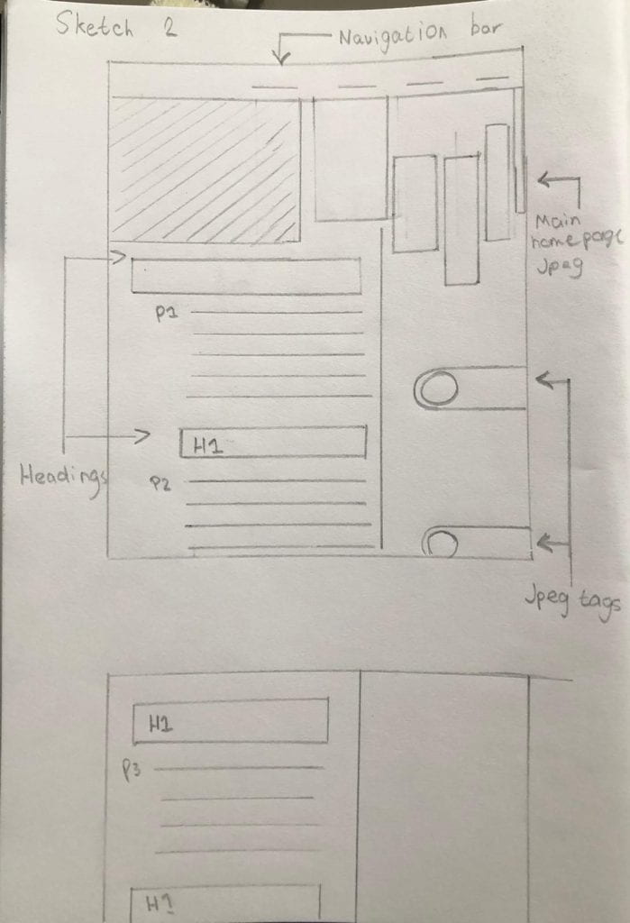
Firstly, I decided to go with a modular design with jpeg images on the right and type on the left. I took inspiration from my chosen practitioner incorporating his studies into my work, I want an organized, structured & gridded layout in a column down the left hand side of the page.
Website Version 1
Starting over again…
However, I quickly learned that my overlapping JPEG, ‘unique’ structure and layout will not work and will get quickly messy in terms of minimizing, tablet access, etc. So I started over again this time with my aim to make a neat and simple website whilst maintaining a sense of professionalism.
Version 2 – Current & Final version.
Wireframe
This simple layout is more realistic and evenly proportioned. I will be using this wireframe to develop my website.


