Composition 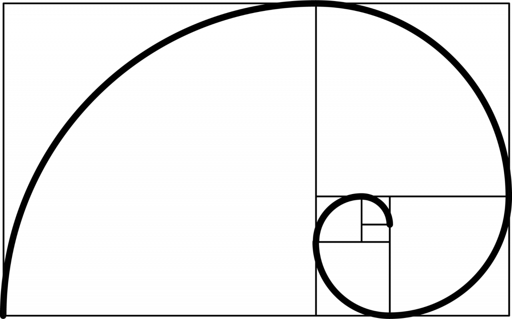
The Golden ratio was created by the Greek mathematician Euclid, it is perceived to be an atheistically pleasing form of Geometry guideline. It is the visual representation of the number PHI (1.618033988749895). Mathematically speaking, two quantities are in the Golden Ratio if their ratio is the same as the ratio of their sum to the larger of two quantities as seen in the image below.
Golden Ratio in Art


Golden Ratio in Nature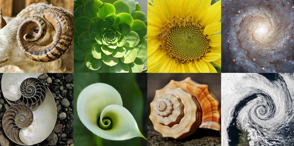
Golden Ratio in Architecture

Golden Ratio in Design

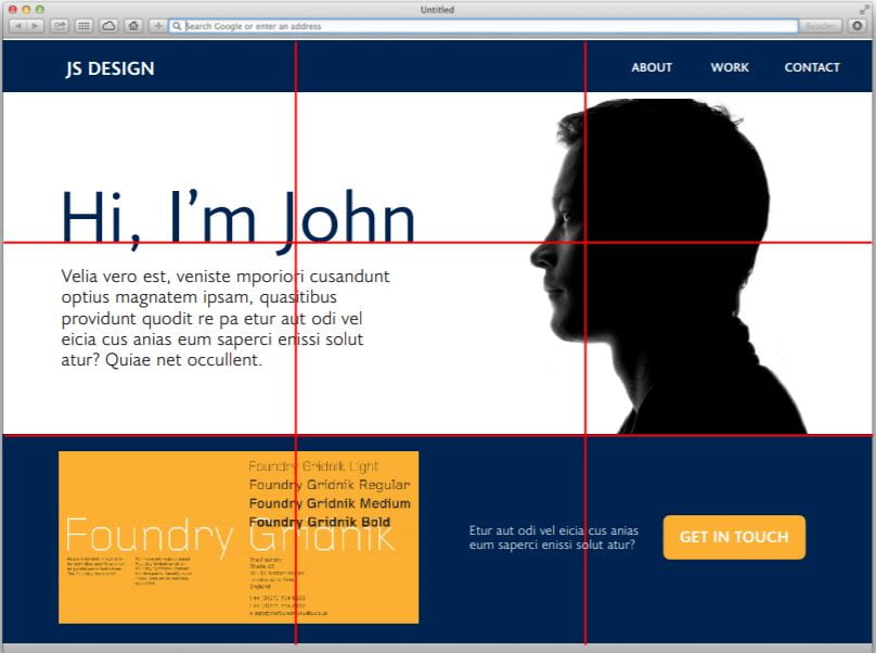
Websites need to be eye catching, simple and straightforward. For website and application design, the Golden ratio is a great guideline to show the designer where to put the hierarchy of information. E.g. at the start could be a non important image and near the focus point could be the services the website is provided, as seen above.
Fibonacci sequence
The Fibonacci sequence is a set of numbers (0, 1, 1, 2, 3, 5, 8, 13, 21, 34..) starting with 0 and 1, each term is the sum of the two previous terms. This famous sequence has been used throughout history with it been first used to observe beautiful patterns of leaf arrangements, pineapples and flowers. Calculating the ratio of the Fibonacci number you end up with a 1.61803…(Irrational number but rounded up to 3 decimal places and we have the Golden ratio).
The similarity of each means they are often combined together:
Rule of Thirds
 The rule of thirds is a guideline for composition for composing visual media such as paintings, photography, videography, illustrations, etc. As humans will naturally stare into a corner of a image this serves to show the editor where the human eye will be naturally more focused so they can align subjects better.
On the left shows where the human eye naturally leans towards when looking at a composition, this will differ depending on where the subject is and how prominent it is.
Task 1 – Point, Line & Plane
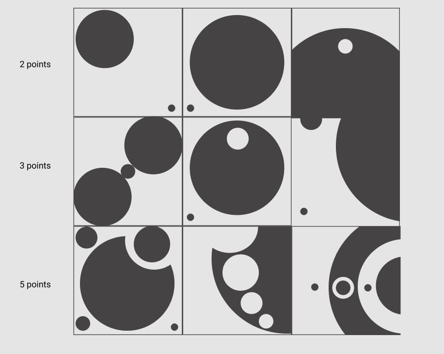
- For this task Paul asked us to redesign our point, line and plane diagrams from the previous week only using the Fibonacci sequence.
Task 2 – Type scale Visualiser

For this task Paul asked us to go back to our manifestos and use a type scale visualiser, creating a visual hierarchy and to put emphasis on words of importance.
With base height at 20 I created this:
Gestalt Principles
Proximity
 Objects or shapes that are close to one another appear to form groups or closer connection, this can include groups of different geometric shapes as long as they have a common rhythm. Objects that aren’t closer to the group are seen to have less of a relationship.
 As designers proximity helps us organize objects by their relatedness to other objects. This is the strongest principle for grouping objects as it organizes information efficiently by structuring objects making it easier to understand and maintain a systematic structure in the website
Similarity
The human eye can perceive similarity between objects in design as a whole group or even a complete frame, this includes objects that are separated but have similar qualities. The more similar the objects are to one another the tighter the relationship is perceived among them.
Elements of similarity can be formed from colour, size, shape, orientation, texture, etc.
Continuity
 Objects that are aligned on a line or curve are seen to have more in common than objects that are not in these sequences. The line will take the smoothest path possible.
Using this principle correctly allows the user to smoothly flow throughout segments and content on website in a coordinate experience. An example of this would be purchasing an item, you can do different actions on the one line with the user acknowledging they are connected.
Common Fate
The Common fate principle states that elements which flow or move together tend to have a better perceived likeness and thus more related to one another.
Figure and Background

This principle states that objects are instinctively perceived to be either being in the foreground or background. This means that foreground objects usually stand out (figure) while background objects usually recede into the background.
This relationship between figure and background informs the user of non-physical depth that relates to a two dimensional way of separating visual layers, spot affordances and tell content from structure.
Some of the methods that create this illusion of foreground and background include:
- Using saturated/brighter colours against a more dull palate.
- Inverted recognizable patters seen in the photo above.
- Objects that change shapes when hovered over such as subscription buttons or hyperlinks creating a 3D illusion.
- Motion blur backdrop (usually used for hero banners)
- Drop shadows/gradients
Visual Examples:
The out of focus unsaturated photo creates an instinctive out of bounds feeling in the user therefore we automatically presume its the backdrop. Their product purposely displays in focus with illumination forcing the user to visually gaze at the product.
The use of a dominate foreground (burger and beer bottle) with the added drop shadow under these objects serves the illusion that these are on top therefore the figure. The navigation bar also includes this with the slight drop shadow below creating a sense of importance and height.
In this example the relationship between the figure and ground is prominent with ground being boxed off visually layering the figure. The bright and vibrant box against the dark background creates a clear divide.
Closure
 The closure principle states that the human brain naturally conforms a recognizable pattern in an attempt to fix complex visual elements when there is nothing. This means if there is an inconstancy or break in an object the eye naturally reamends to create a picture.
Closure is commonly used in logo and icon design to communicate ideas or concepts with only a few elements.
Creating effective closure designs:
- Positive & Negative spaces – positive and negative space combined can create closure. This helps simplify the design.
- Colour – Colour adds life to the design and reinforces relationships between elements or shapes.
- Contrast – Contrast between black and white is the most effective in creating a strong connection between each object.
Focus Point
The focal point is selected based on a hierarchy of visual strength, whatever captures the most attention first is considered a focal point.
This is intended to capture the users attention to direct their attention towards the focal point. Focal points may be presented with colour, contrast, scale, shapes, abnormalities, etc. In many websites colour is a big factor in capturing a focal point.
 The website on the left shows the focal point with a white squared box segregating itself from the dull background. Inside the box is a vibrant green which will capture users attention making them focus on the task being presented.
Similarly, the website ’twillio’ does the same only with a contrasting red bar to gain the users attention.
Task

- For this task Paul asked us to recreate 3 of our favourite apps using the fabriconi sequence and planes.
I started off by creating each plane from 1px – 340px to give me more understanding and context of scale.
I also added a tone pallet underneath and worked with 4 different shades from white to black.
(IOS – iPhone Plus 8)
- Spotify
- Yahoo Mail
- Snapchat
Law of Prägnanz
The Law of Prägnanz is one of several principles in the Gestalt principles of perception, it shows that humans when presented with a set of visually difficult elements which can be interpreted in many forms, we will usually view them in the most simplest ways, “simplest” meaning having fewer than more elements or having symmetrical rather than asymmetrical compositions.
Research shows that humans are better able to visually process and memorize simpler elements rather than more complex figures. This means when creating a design to keep it simple rather than complex.
A perfect example would be the semi-colon, dash and an end parentheses to the right, to most people this would be interpreted as a smiley face rather than it’s rawest more complicated form.


