Reflection of Semester One

I really enjoyed this semester of IXD, even though it was online I still feel like I managed to get a good start on this year on interaction design and I got a good understanding of the course ahead of me. I learned many skills so far and I also learned a lot of history and contextual information that I want expecting to learn so early on in the year which was interesting. Keeping a diary helped me to retain lots of information and also helped me to lay out what I had to do in a simple format, so I plan on doing this throughout the year.

I also got to experience group work through blackboard which was interesting yet very fun to collaborate with new people in the class and we all felt a sense of accomplishment when we got to go into the university to present our presentation. I also got to complete various projects which differed in every way to one another which kept my mind active over the term. It was fun to move from project to project as there was always something to improve on or to work on. Some of my favourite projects were the Typeface Specimen, Follow the Rhythm and 9 iterations. I liked these projects so much because I got to keep creating different versions of each one and I could create endless design ideas.

Overall I feel like semester one has taught me a lot, however I feel like I still have lots to continue to work on and improve, therefore I am excited to see how the next semester goes and what I can create.

App Recreations

Throughout the year I have been working on recreations on weather and travel icons/ apps. I knew I wanted to learn and practise my design skills at the start of the year. I found interesting app designs when I researched weather apps and I found this specific image, this is where I further took inspiration from to make up other versions and designs.

This is the one I recreated, I chose the sunny one because I liked the colours. I chose weather because I thought it would a fun yet simple layout choice because weather apps have to be clear and easy to read. I then took inspiration from these to make other travel icons on Adobe XD.


I also recreated normal app designs which are basic yet since I am only new to this I wanted to start to perfect the basics, this is what I done:

I really enjoyed working on these throughout the semester and really feel like it has helped my skills for later on in this course. I am excited to see what else I can come up with this year.


Weekly Diary

During these 12 weeks I have been keeping a weekly diary on all of the information and skills I have learned throughout the week. I write in it on the Friday after Kyle/Paulines class because then I get to summarise and add in my input on their lecture that Friday morning.

I found that keeping a diary during this term has helped me stay organised and also its another form of learning and a way to retain the information I get in a week, because as I write I feel like it helps the information stay in my brain. It’s another method of repeating what I hear or read during the lectures aswell as the summaries and other research that I include in this blog. Writing it down on paper helps me learn in a different way. Here are some examples of the contents of my diary.


I also used this diary to set goals for myself and to summarise what I needed to improve on. Seeing what I need to do and practise written on paper encourages me to keep working on them. I write things like this:

I like doing this and feel like this exercise has helped me throughout semester 1 and I will be continuing this aid throughout the year.

Designing my Portfolio page

To start my portfolio I began in my sketchbook. I started with rough sketches on how I think it should look in a black sharpie, I always like to do this first at he beginning of any project because it gets my brain thinking, therefore making me more creative for the project ahead.

I then started on a design page. I like to make these aswell because I like to have a page that incorporates my colour palette and possible layout designs. I always like to keep these pages more neat and sort of aesthetically pleasing because it encourages me to keep thinking of designs or possible colour schemes that I can draw out.

I like this design the best because I think the colour palette and design layout works well and complements each other. I chose the various shades of blues and navys because most of my projects has blue incorporated in them. I feel a strong favour to blue when I start projects because I have always loved the calming and soothing effect the colour blue has. Although blue is known for its sullen and sad ‘bluesy’ connotations but that is not what I see when I look at it.

I also wanted to include hints of yellow because the sun in my manifesto is an important aspect of my motto ‘You are the sun, do not let anyone cloud your skies’, and I wanted to tie it into my portfolio somehow. To do it subtly I think it would be a good idea to make the navigation change colour to yellow when you hover over it.

I think it would be a good idea to add navy or a darker blue in sections because it adds more contrast and depth to the portfolio.


This is how my portfolio turned out:


I really like the colours I chose and feel like my overall aesthetic of this portfolio is what I wanted. A clean and fresh webpage that encourages calmness yet confidence. I like how everything looked in the end result however I still think I need to work on the placement of the titles and centre them more.

Updated manifesto

In order to make my manifesto better I looked up artists like Jessica Hische and tried a more out there type face and I even tried my own takes on these typefaces in my sketchbook as I have previously shown, however I felt them too busy and hard to read. I wanted to go for a more simple design and a design that was more to the point. I feel like this would suit the actual manifesto better, so I started to look at a clear typeface and went with ‘monsstreat’. I love this type and loved it so much that I used it in my website essay also. I love the clean look is gives to the text and I thought it was perfect for the reference to the ‘sky’ since some days the sky is the clearest thing.

I stuck with my original colours: blue, yellow, white and black. These are the two designs I favoured on adobe xd.


I like both for different reasons. I like the first one because I love the clear and clean text using ‘monsstreat’, I feel like it is easy to read and the yellow sun doesn’t take away from the message itself, it only enhances the visual. I also like the blue background and feel like in displaying the manifesto it helps for a clearer image. However I have to change my text, I need to make sure that the words are lowercase instead of a mixture, because it doesn’t look right. I only want the words YOU and YOUR emphasised in uppercase.

I like the centred layout of the second manifesto design and feel like the creative mixture of typefaces makes for a more illustrative outcome in comparison to the first one. However I think the combination of varied typefaces, colours in text and the main image being the circlular sun image, these things take away from the important message. I think it could be too busy. Therefore, I will be choosing the first design as my final one.

Follow the Rhythm

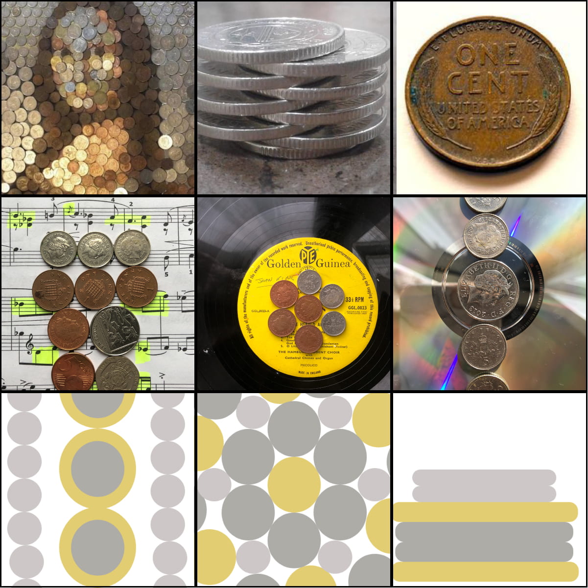
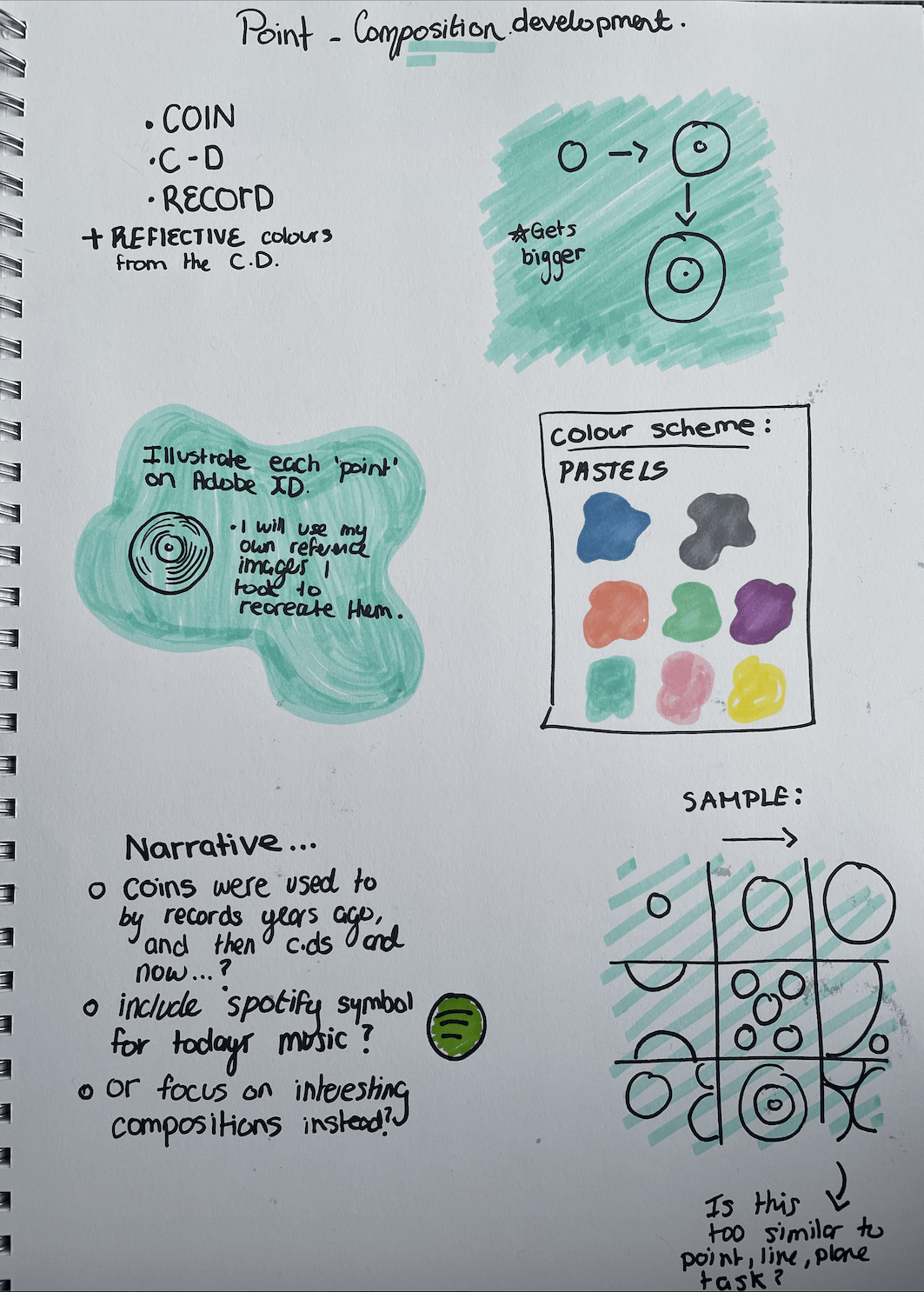
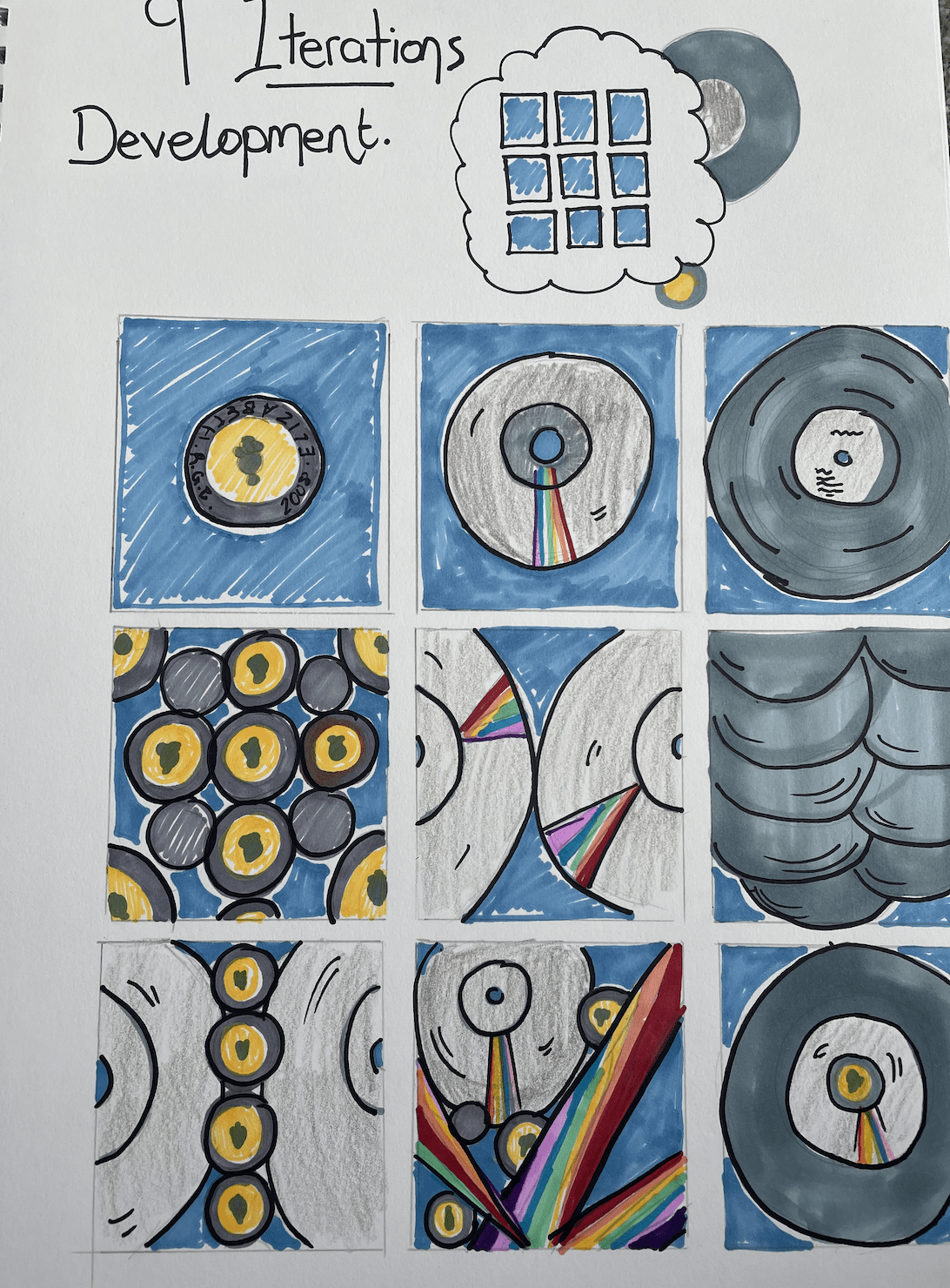
Inspiration from Pinterest.


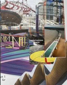
For the ‘Follow the Rhythm’ assignment I started on paper. I firstly began with looking through old magazines I had to see if I could find any inspiration. I found interesting shapes and colours that sparked ideas for me. I also flipped through many construction magazines that I found, I found these very helpful because there was a range of intriguing shapes and structures that I thought could work well in my first initial sketches. I liked the curved aspects to some structures for example the roads, buildings and …. I then thought that I should try some designs with this aspect, having the words curve a certain way like a road or highway.

Sketches and collages


I then found other curved features in other magazines like the pink and blue squiggles. I though this could be a fun approach because they looked bubble like. When I was cutting them out and arranging them on the page it sparked an idea for a lyric because of the pink and blue colours, I decided to go with a Harry Styles lyric – ‘ We will be a fine line, we will be alright’. The colours and lines reminded me of his album and the line aspect fit perfectly.

With the combination of curved construction images, a bright colour scheme and a fitting lyric I was ready to start sketching.


I started with a sharpie and a page to see where my pen would take me with the lines. I began with thicker, bubble type lines that took up the full page and fit the lyrics in between. I then tried a design with bigger letters and thinner lines which I think worked better but I couldn’t tell until I transferred these designs to digital ones.

First digital designs


These are the ones I chose to do with the blue and pink colour scheme because of Harry Styles album but I wasn’t happy with the outcome.

I feel like the lines didn’t correlate well and some are too wonky and some lines aren’t curvy enough. I think the straight lines I done on the last on worked better bu the placement of the letters weren’t working for me. I think the design is too much to the right and isn’t centred. I then went back to the drawing board and started again with this in mind.

Version 2 


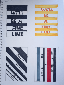
I chose to only do straight lines instead of curved. This made the designs more intense and shocking looking, they reminded me of posters.

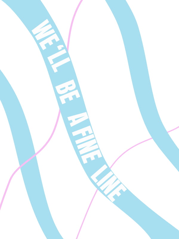
I still wanted to explore more of my options for this lyric so I decided to make another version, but this time I wanted it to be more delicate and fine like the lyric suggests – fine line. So I began sketching and to sketch and this is what I came up with.

Version 3


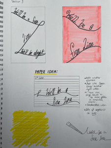
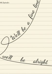
I wanted to take these minimalistic designs further as I felt they had potential to be something minimal yet beautiful. So I decided to take inspiration from a Conan Gray lyric video and use the idea of paper as the background, to give the illusion the text was wrote with a pen on a piece of paper and I think it turned out well. I combined line with delicate text and in comparison to the bulky and striking black and white version I think this works better because it fits the lyrics better. These are fine lines, that curve and bend allowing movement and suggest the work of an inky pen, which I think works nicely. However I still wasn’t happy with the finished result and decided to sketch more ideas.

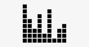
I wanted to use the inspiration from music bars and sound almost like a sound wave. I also had the inspiration from these images I found on Pinterest.

I feel like these designs and bars reflect line well and I feel like they look interesting and can be portrayed well and executed nicely digitally on adobe xd. These are how my sketches and digital designs turned out.


I like the second design more because I feel like it reflects music sound-waves and the concept of line well. The first design is too busy and the lines are too thick I don’t think they resemble the music bars like the second one does. I also think that the second design flows better, therefore the lyrics flow better. So the second one will be my final design.

This project took me a long time because I was never happy version after versi0on, but I don’t mind that it took me a lot of tries because with each version and idea I feel like I have improved my design skills. I have learned lots of things for example, simple can be better and colour palettes are very important. I am happy with the progress I have made and content with my final design after a long process of developing my many ideas.

CSS Exercise

In addiction to the John Baskerville and history of type exercise we were given a short exercise to practise css further. We had to take three of the same pieces of text – version 1-3 and make each one a different type. I chose ‘libra Baskerville’ , ‘open sans’ and ‘lato’ for my three choices and this his how they turned out.


I chose this green colour because it caught my eye as I was browsing through Adobe colour. I thought that this earthy green tone would go well with the black and grey text.

I think all fonts work well and I especially like the drop cap in the first version ‘Libra Baskerville’. I really like the tale on the ‘J’ that this from cap possesses unlike versions 2 and 3 that have more modern and sleek looking fonts.

What I could improve on:

Looking through this exercise again if I could have done something differently or the areas in which I need to improve on regarding CSS is fonts. I think the fonts ‘open sans’ and ‘lato’ are too much alike. This got me into researching both fonts and found lots of blog posts and online discussions on designers websites on ‘Open Sans vs Lato’. Both fonts are so alike but there are slight differences that encourage discussion for which is better.

However I think that to show a wider range of this body copy I should have looked for a three very different fonts. Overall I enjoyed this exercise and the learning skills that came along with it such as the introduction to the drop cap and the addition of breaking up each version with the black line. I am always discovering new tips and techniques when practising a new css exercise and I am finding it easier each time I use it.


Updated 9 Iterations

Revisting my 9 iterations I knew I wanted to illustrate my ideas on sketch or adobe XD was I wasn’t sure how I would start. I wanted to go for a pastel like theme like most of my other projects. My narrative was the point like composition of three items, coins, cd’s and records. So in order to illustrate them in some way that was interesting but still related to my initial 9 iterations, the pictures I took myself and my first sketches I made on figma. So, this was what I had to work on and my started point – my first design.

I liked some of the compositions in this but I didn’t like the bronze colour. I feel like it was too overpowering, bringing too much attention to the ‘coin’ aspect of these iterations. So I took to the drawing board, my sketchbook, and began to doodle interesting colour schemes and compositions that would hopefully spark some ideas for me.

Development 


These are my sketches of how I think my designs should look digitally and how I feel like the compositions and placement should look in each square. I also sketched out a colour inspiration and overall design page including what this task entails for my 9 iterations, including my reasoning behind the narrative and why I chose these images to recreate.

This is what I came up with. I used adobe XD to illustrate my designs into a digital design and I think it turned out well. I feel like the compositions really come across and it is easy to depict what the drawings are. I specially like how the rainbow reflections from the cd’s turned out digitally, I created larger and more spaced out spectrums of colour to create a chaotic combination for on of the images. I also added my own favourite album currently as the record and I had to list the songs in a small text on the front of the record. I feel like this made the record look more realistic and I liked adding my own touch to the records.

The first hand images I have of records are old-style records of Hymes or classical music so I really enjoyed making the records in this design more modern and my taste in music.

I feel like my illustrations appear realistic in an animated sort of way and I feel like the colour palette I chose, pastels, work well and create a delicate effect.

IXD101 -History of type

During our John Baskerville assignment we were asked to use information given to use an d to recreate the html and css tasks on our own with the ‘History of Type’. I liked this process because it made me practise the skills I had been learning in class.

I chose a different colour to my John Baskerville piece because I wanted to experiment with adding different colour with CSS.I chose a blue, green and orange colour scheme which I think worked well and was complementary. I found it tricky trying to transfer the same skills I learned from the Baskerville sample but with practise it got easier as I kept going. I enjoyed doing this project on my own as I felt a senes of accomplishment at the end of it.

The first versions were similar to the Baskerville project it was adding the simple html and the standard CSS and choosing the colour.

I chose a more modern typeface in comparison to the Baskerville piece I went for a more traditional type but for this one I wanted to reverse the concept. Since the topic is ‘History of Type’ I didn’t want to go for the stereotypical traditional old-style typeface to match, I wanted to do the opposite. Therefore I went for a sans-serif and more modern approach. I think this works well as it is easily read and works nicely with the colour palette also.

There was a table to be added just like the Baskerville task, however this table was different and more complex than the Baskerville one. Therefore, it took longer to input the information in the HTML. There wasn’t just two columns, so I did find it more tricky and if one section was incorrect then it would mess up the whole table. But when I got it right it was satisfying to see a correct table. I like the colour I chose the earthy green complements the blue header well I think.

To add images to this project I wanted them to stand out and be different from the Baskerville task, not just the plain image. So I want to take them to photoshop and experiment with colour, hues, size, and perhaps try different positioning or crop out the portraits and place them on a different background.

I went with a blue/green tint over each image to tie in with the navigation, I tried green and orange but they didn’t look right. Blue just seemed more complementary. I like how the overall outcome turned out and feel like this ‘History of Type’ project helped my CSS and HTML skills improve greatly. I found it really enjoyable to put into practise my skills I learned from the John Baskerville project.


Typography in Web Design

Our lecture on web typography was an interesting one for me because I was always curious where all these new fonts came from and why there was so many to chose from.

A brief history of web typography

 The creators of the web knew the importance of typography and fonts in the early days. Even the fist version of CSS in 1997 had special mention of fonts. However when the first computers were launched there was only a small variety of fonts available for the user. Only the fonts that were installed in the computer or software itself could be used, therefore fonts from the internet could not.

Ten years later designers were still working with the ten fonts they could access and then in 2009 web fonts became a thing. Right on the heels of all this news came the service Typekit, launched by Jeffrey Veen in May of 2009. Typekit was a font-hosting service that connected font foundries to designers and developers with easy to understand licensing terms and cross-browser compatibility.

Now there are endless possibilities for font styles and families available for use on all platforms without any restrictions on websites like Googlefonts,

A journey through beautiful typography in Web design

I wanted to do more research into web fonts. So I took to the internet to search for websites that use web fonts as a way of enticing the viewer and therefore use them to the business’s advantage. I wanted to find sites that use interesting and innovative fonts that really add the the experience of the website. These are some that I found.

This is a natural skincare website and this one caught my eye because of the simple yet delicate style and placement of their web fonts. The font style is simple yet suits the brand perfectly because their products are all natural and simple. The mix of sans serif type for the navigation  and a more traditional font for the description of what the brand is works perfectly and really makes this webpage appear classy and luxurious.


This website I found is called ‘I weigh’ and is well known for its unique home page and bold use of typography. I really like the colour palette used as I feel it enhances the impact of typography in the background. The simple sans serif navigation also doesn’t take away from the striking title ‘mental health’. The size and placement of the ‘title’ depicts what the what the website is about and gets straight to the point as the opening page of this website.

This is my favourite find. Its a website called Autumn and they are a small team of multi-disciplined creatives based in London. Their services encompass anything from Graphic Design to Branding, Print to Photography. They work with a human centric approach, crafting emotive, meaningful and engaging digital design. The most eye-cathing part of this website is definitely the web typography and the overall function of the website, this encouraged me to read on and find out more about what they do.

I really like the traditional like typography they used as it looks classic and sophisticated, I also admire the use of the same type only in italics for emphasis. There is also a combination of fonts used, a sans serif used for the body paragraphs, this only enhances the importance for the quotes or essential information that is in bold and a different font. I think what else makes me like this webpage so much is the placement of the typography, the variation of having the text in the centre and then toward the bottom of the screen makes the information easier and more enjoyable to read.


Tasks in class

In class we were given two pieces of texts of different genres and we had to chose an appropriate font that suited the information. I really enjoyed this because I knew the themes of both texts, therefore I knew what text would work well and represent the text correctly. The first one I done was the Frankenstein text by Mary Shelly. I knew this was a gothic horror story, so I chose the ‘gothic’ font which I thought really worked nicely. I chose a simpler traditional font for the body so it wasn’t as striking. I think both fonts complement each other and it was fun to pick a daring, bold font that I wouldn’t normally use.


The second piece of text was in the science-fiction genre, so this was a little more tricky for me to select a legible yet modern font. I went for a typeface that was easy to read yet had a science-fiction feel to it, so I chose a type that had squared letters with a larger size. The only thing I would change is that I would have chosen a different font for the title so it would differ more from the body. Other than that I think the fonts I chose work well for the text given.