I wanted to see if I could salvage any parts or elements of my portfolio I made last semester for Daniel. I put in a lot of work and learned a lot from creating that particular website last year and wanted to see what I could apply to this one. Below are some images of what my current website looks like,
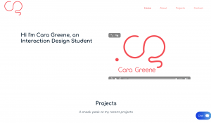
Homepage

Case study Example


About Me Page

What did I make this website on?
Dreamhost. I did this because Daniel had advised that I should make this on whatever I please or whatever I feel like worked for me. I found the site easy to use as it allowed me to purchase a domain name and also an email. I found it fun putting in my images and writing all about my work. The pages were easy to create once I got the hang of it, the hardest part about working with this site was I did not have very much control of the image placement or padding etc.
Reevaluating this website today…
Looking at my first attempt of a website now, once I am more knowledgeable, I feel like I could make a better one. I have found a lot of issues with this portfolio website but also I think there are elements that still work and ones I want to use this time around again.
What doesn’t work?
- The image placement on my case studies, they are too big in areas and too small in others, the design isn’t cohesive
- The content – I did not write enough content in my case studies, this is not what I want to do in my new portfolio
- The About me Page – The image is too big and I did not write enough about myself
- Homepage – There is too much going on , too busy
- The animation I made for the homepage doesn’t work and I feel its’ place there is irrelevant
- The spacing in my case studies – everything is too close together
What can I salvage?
- The colour scheme – I like the red and white of my brand and I want to keep using it
- The images of my work – the case study images, project images
- The case study process – I like how I included sketches, wireframes, mockups etc
- My brand – I like my monogram, wordmark etc. I want that to stay the same
- The Navigation – It is clear and simple and easy to use
Was this exercise helpful?
Yes. It was help to look back at my old website, see what I could use, see what works and what I do not want to do again. I have a lot to do for this new portfolio and I will not make the same mistakes again. It was also good to ensure that I take the good parts off my old website and see how I can use it in my new one because there was some things I really liked lots of elements of this portfolio but now I can make it better – which is so exciting.