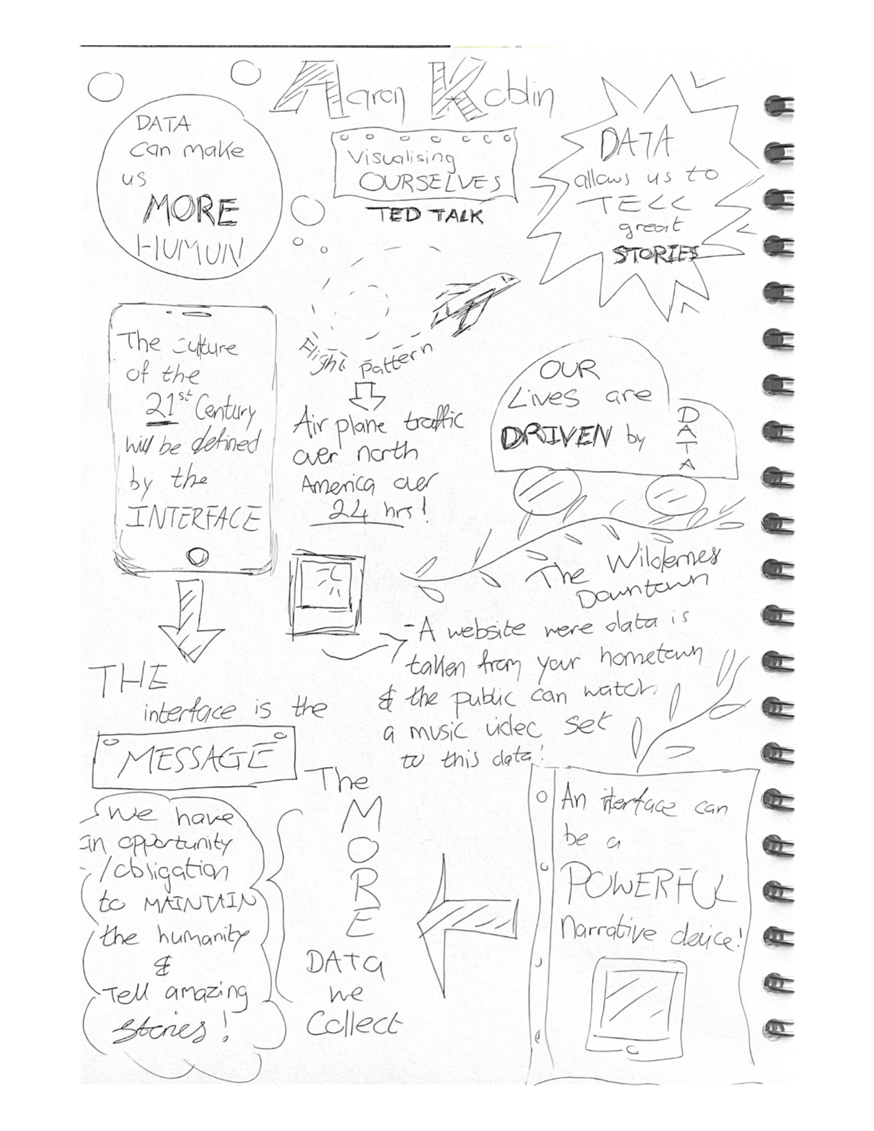
Aaron Koblin
I have decided to look at Aaron Koblin who is a designer, artist, programmer and the Co-founder and President of Within, he specialises in data and digital technologies and has created some amazing data inspired projects over the years, that have a big influence of crowdsourcing, virtual reality and interactive film. Koblin has work in Museum of Modern Art (MoMA) in New York and even has a grammy nominations for one of his music videos, as well as winning countless awards.
I have taken a look at his data driven projects and I have decided to watch his Ted Talk and I have added my thoughts and what I have learned from him below.
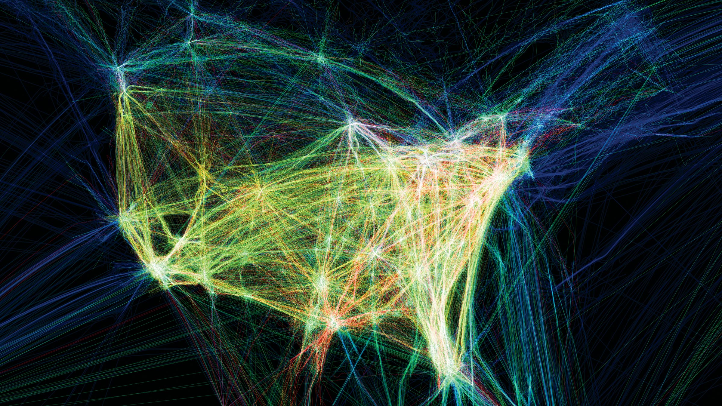
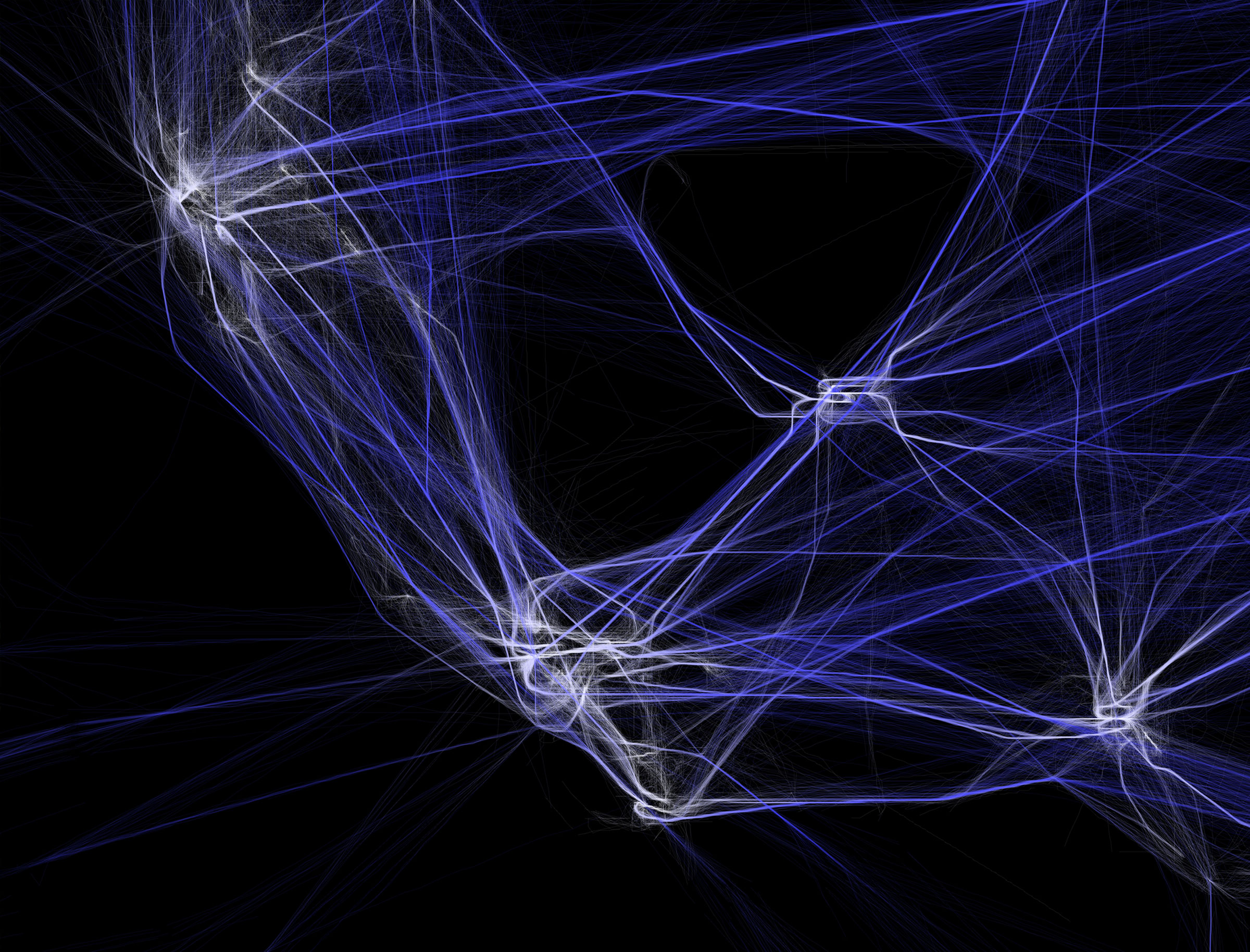
Flight Patterns
This is a project that show the paths of air traffic over North America in a period of 24 hours and he has visualised them in colour and form. This work was originally developed as a series of experiments for the project “Celestial Mechanics”. I have included images below.
In particular I found his flight pattern visuals were extremely mesmerising and beautiful, I watched them come to live through animation and this data work is really stunning. I was able to watch how the colour faded into the dark as people went to sleep and there were fewer planes flying at night and I watched them light up again with more air traffic in the morning hours. I was able to see how flights from Europe etc came in from the top right and people going to Hawaii on the bottom left.
I love the idea of this project, the idea is so simple but it looks so intricate and the way the planes eb and flow together really makes data and information such as plane traffic actually fascinating to observe and watch.
Ted talk
What did I learn from the ted talk?
This ted talk was packed with fun filled data driven projects that Aaron designed and it was very beneficial to see them in action and for Aaron to explain how they were created and what the aim for each was, and essentially how they work. A personal favourite of mine is the flight pattern project which is visually stunning to observe, I also loved the Johnny Cash music video where he got his fans to draw clips of his music video so each frame was a different drawing, I thought this was a special and creative way to remember this artist and visually it was stunning to watch! He mentioned a lot of how collaborate these data projects were and the public were included it was exciting to see how each individual drew something different or had a different vision.
One of the main things that I have learned from this Ted Talk is that the interface is the message and our lives in this day and age are driven by data but we can use this data, collect personally and socially relevant data then we can create amazing interfaces and therefore tell amazing stories!
What is next?
I want to take a look at some data based companies for research, I am very interested in this work and how numbers and information can be turned into beautiful and interactive visuals! I am enjoying the research aspect to his project so far and I am excited to get some more great research for my own data based infographic.