COLOURS THAT HELP LEARNING:
RED
- Red actually stimulates the adrenal glands and creates feelings of energy and encourages creativity.
- In the classroom, its recommended using the colour red in conjunction with repetitive or detailed oriented tasks in order to create an energy boost.

YELLOW
- Yellow is a great way to maintain attention when teaching.
- When it comes to grabbing and maintaining the attention of your students, yellow is the best for the job
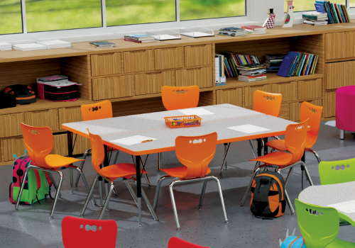
ORANGE
- The color orange encourages critical thinking and memory.
- Studies have shown that it also increases the oxygen supply to the brain, stimulating mental activity
GREEN
- Creates relaxation and long term concentration
- has proved to have a calming effect on the heart rate and respiratory system of students.

BLUE
- encourages a sense of well-being, making it ideal for learning situations that are intensely challenging and cognitively taxing.
INITIAL VISION:
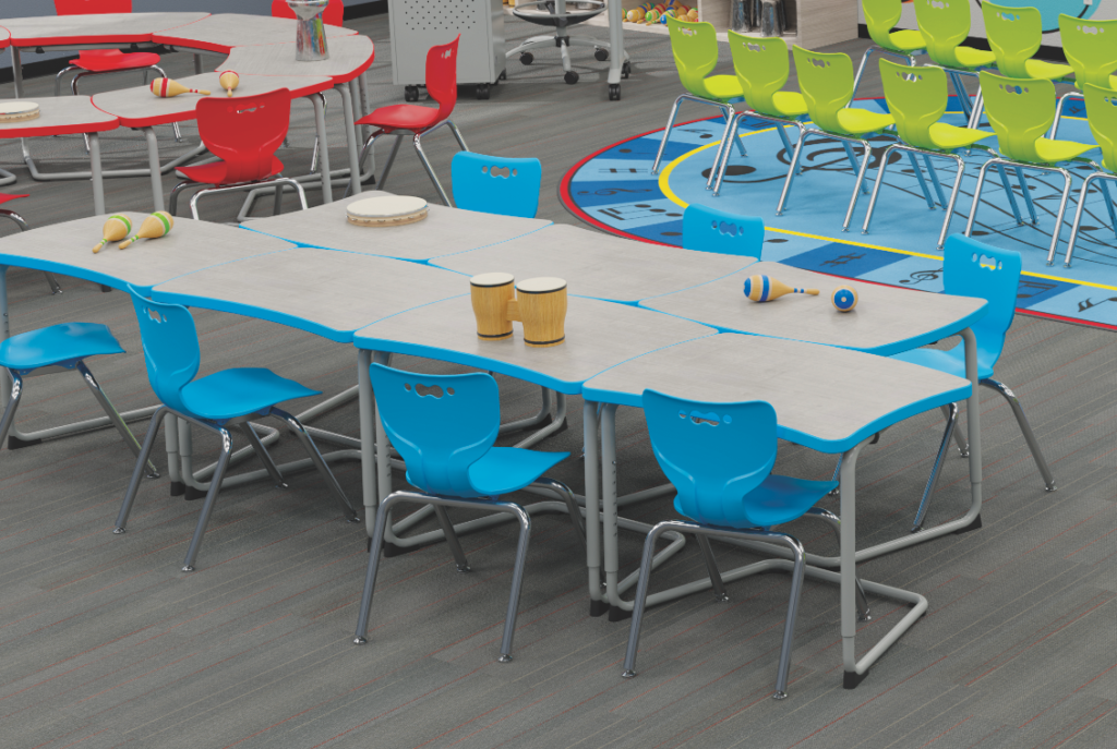
I had it in my head that I would go for a blue / turquoise and white pairing due to the reasons stated above.


WHY IT DIDN’T WORK:
- Too similar to the objects being shown on screen – all cool colours so they don’t stand out
- Gives off a very corporate tone due to this shade of blue being overused
A CHANGE IN DIRECTION:
• Black and white allows cleanness and focus when learning
•Using grey instead prevents harshness on the eyes
•The bright pink allows important info to be highlighted
TESTING COLOUR CONTRAST RATIO WITH TWO DIFFERENT WEBSITES:
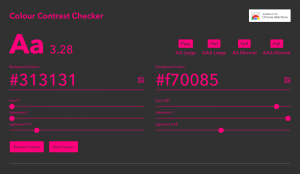
I used this website in the past and found it to be really useful, however it didn’t give the option to increase saturation, change the hue, or change the lightness on the website which was a hassle having to manually copy and paste hex codes.
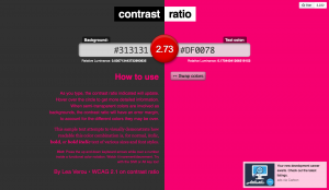
I then used this website, which allowed me to change the colour on the site as I went. My secondary highlight colour didn’t pass the ratio test, however my primary colour of white did.


I increased the lightness of the pink to allow for a higher colour contrast. My final colour was F70085
