After Kyles lecture on making web design as responsive as possible, I decided to read a bit more about it in my own time. I found this book by Ethan Marcotte as a free pdf online and read a few chapters.
I really liked how short and to the point it was, the tone throughout was friendly and made it enjoyable to read, and the use of lots of images throughout really helped to get his point across.
RESPONSIVE WEB DESIGN = WEB DESIGN THAT WILL SCALE TO THE SIZE OF DEVICE ITS DISPLAYED ON
The thing that I found hardest last year was getting all the elements in a website to go into the places I wanted them to. The idea of having to do this all over again this year is pretty daunting to me, and so I hope reading this book will help.
CHAPTER 1:
He talked about how its only a common occurrence in the more recent years that screen sizes are getting simultaneously much bigger and much smaller – tablet computing, smart phones, and even smart TV’s. The industry has moved away from desktop, never to return. In fact, its gotten to the point that many websites are only optimised for mobile, rather than desktops; responsive web design simply cannot keep up with the changing shapes and sizes of technology.
RESPONSIVE ARCHITECTURE:
He talked about how companies have created technology that can change the opacity of glass when it detects a person behind or in front.
Rather than creating spaces that influence the behavior of people that pass through them, responsive designers are investigating ways for a piece of architecture and its inhabitants to mutually influence and inform each other.

He explains that responsive web design is about treating designs as facets of the same experience. Designs shouldn’t be disconnected, each shouldn’t be tailor made to a particular device or browser, but rather we should adapt them to the media that renders them.
We should do this by embedding standards based technologies in our work, and by making a slight change in our philosophy towards online design.
INGREDIENTS FOR RESPONSIVE WEB DESIGN:
1. A flexible, grid-based layout,
2. Flexible images and media, and
3. Media queries, a module from the CSS3 specification.
CHAPTER 2: THE GRID
He talks about how since the start of graphic design, a grid layout has always been essential, even in literature and other art, the artist always bases their work on something that comes before it.

Making sure web design is based on a grid made prior to the website is key:

CHAPTER 3: FLEXIBLE IMAGES
In this chapter I learned that
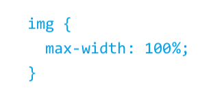
prevents images from escaping from the bounds of their container.
CHAPTER 4: MEDIA QUERIES