WHY I’M RESEARCHING DUO:
Duolingo is an app that really stands out to me as one of the best online learning tools – in the past languages really haven’t been my strong point, and they were the thing I disliked learning the most throughout school. I think looking back, this is because they were the most memorising/ test – heavy subjects.
![]()
However, Duo has completely changed by perception of language learning, and has made the entire experience enjoyable for me. Despite the fact that the apps goal is to make you memorise information, they make it feel like you’re on a journey, and like its a game/ puzzle.
For the learning section of Behind the Screen I’m going to take inspiration from Duo in order to try and create a similar experience.
I decided to look at the UX design behind Duolingo’s methods of teaching, as well as their general UI…
WHAT MAKES DUO SO GOOD?
ALLOW CHOICE BETWEEN LEVELS, BUT NOT TOO MUCH CHOICE:
This part to me is so important, and it’s so easy to go unnoticed. It makes you feel more excited about learning when you’re able to choose the topic.
The layout makes it feel almost like a narrative too – the use of icons at the start of each level stands out a lot to me as it’s a bit like a journey you’re going on where you have the option to choose your own path.

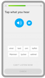
VARIETY IN THEIR QUESTIONS:
I like how they make use of multiple different ways to ask the questions, for example:
- Multiple choice using illustrations
- choosing the word you hear from an audio clip
- filling in blanks
- creating a sentence with multiple choice words
- typing out words for yourself

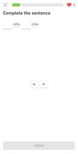
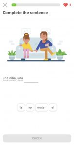
LOTS OF NEGATIVE SPACE:
The use of lots of blank, negative space with no content in it prevents the users from feeling overwhelmed. They’re more likely to take in the content that’s on screen when it seems like there isn’t too much of it – in the two cases below you can see that the questions being asked look like bite sized chunks, unlike a textbook or test paper where the questions are in a list on each page – one on top of the other.
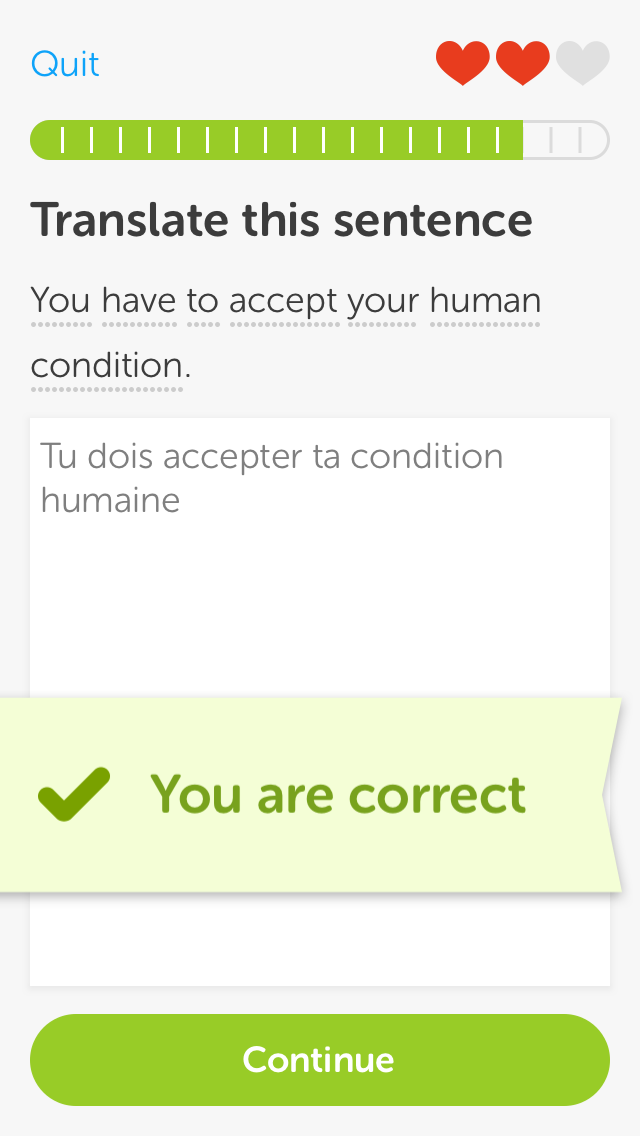
A PROGRESS BAR:
The use of a progress bar on each quiz section makes the users feel like they’re progressing: there’s nothing worse than scrolling continuously and not knowing when the end is. With a real-life test paper you can see the amount of pages left and this will prevent anxiety or boredom in this case. The more the users are left in the dark about the amount of content they still have left to cover, the more likely they will be to exit the app and start looking at something else more interesting.

A MASCOT TO CHEER YOU ON:
Despite sounding childish, there’s something about having a character on screen that subconsciously makes you feel understood and like they’re cheering you on to do better. This is definitely something ill consider in my own website, as I feel it is hugely effective in this case.


MAKES USE OF LEARNING STYLES:
READING/ WRITING: When learning a language with a different alphabet, it allows you to physically write the letters in order to memorise the letter forms.

It also allows for you to type out your own sentences for yourself.
VISUAL: Through the use of constant imagery and iconography throughout – it helps to stick in peoples heads and also creates a more visually exciting learning environment.
AUDITORY: Reiterating the language over and over using audio will help for it to stick in your head, but also for you to understand the accent better.
Throughout lessons, the words aren’t only on screen, but they’re read out to you, again, reiterating the accent and making the words stick in your head.
WHAT I’VE LEARNED
- Create structure with your levels
- Create narrative with your levels
- provide variety with your levels
- make use of illustrations consistently throughout levels
- if a word is difficult to remember, provide audio
- use the following methods of quizzing:
- Multiple choice using illustrations
- choosing the word you hear from an audio clip
- filling in blanks
- flashcard style questions – type out your answer
- creating a sentence with multiple choice words
- typing out words for yourself
- use lots of negative space
- add a progress bar throughout
- think about adding a mascot