NOTES ON CREATING A WEBSITE:


TAKEAWAY:
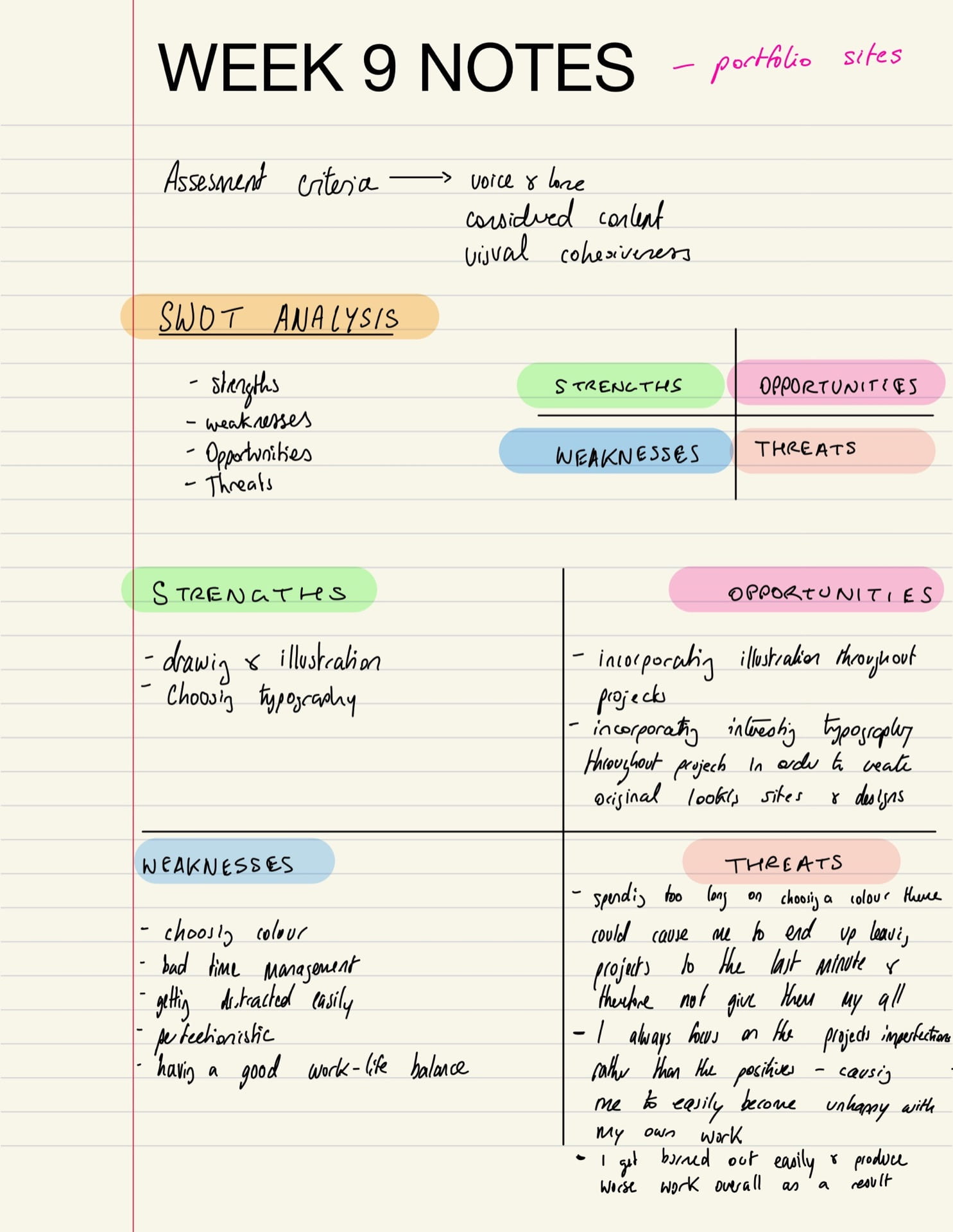
- Keep the 7 wireframing steps in mind
- create multiple iterations
- reject things that don’t work and use the positives from the multiple iterations you’ve done rather than trying to make the first idea work
- write down the goals of a portfolio site and then include things in the site accordingly
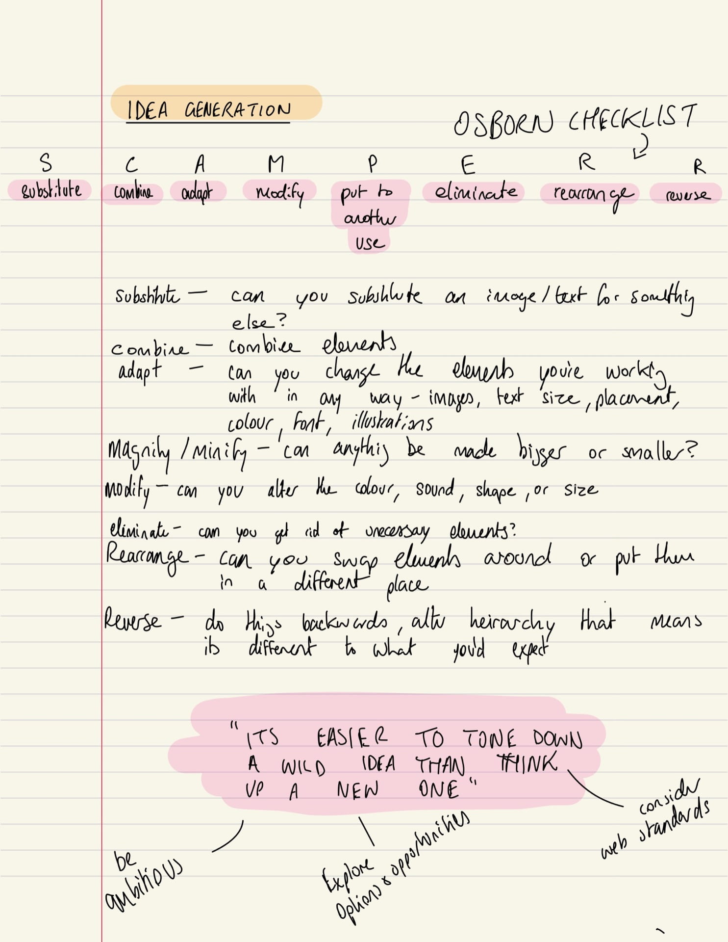
- keep SCAMPER in mind when altering the site from semester 1
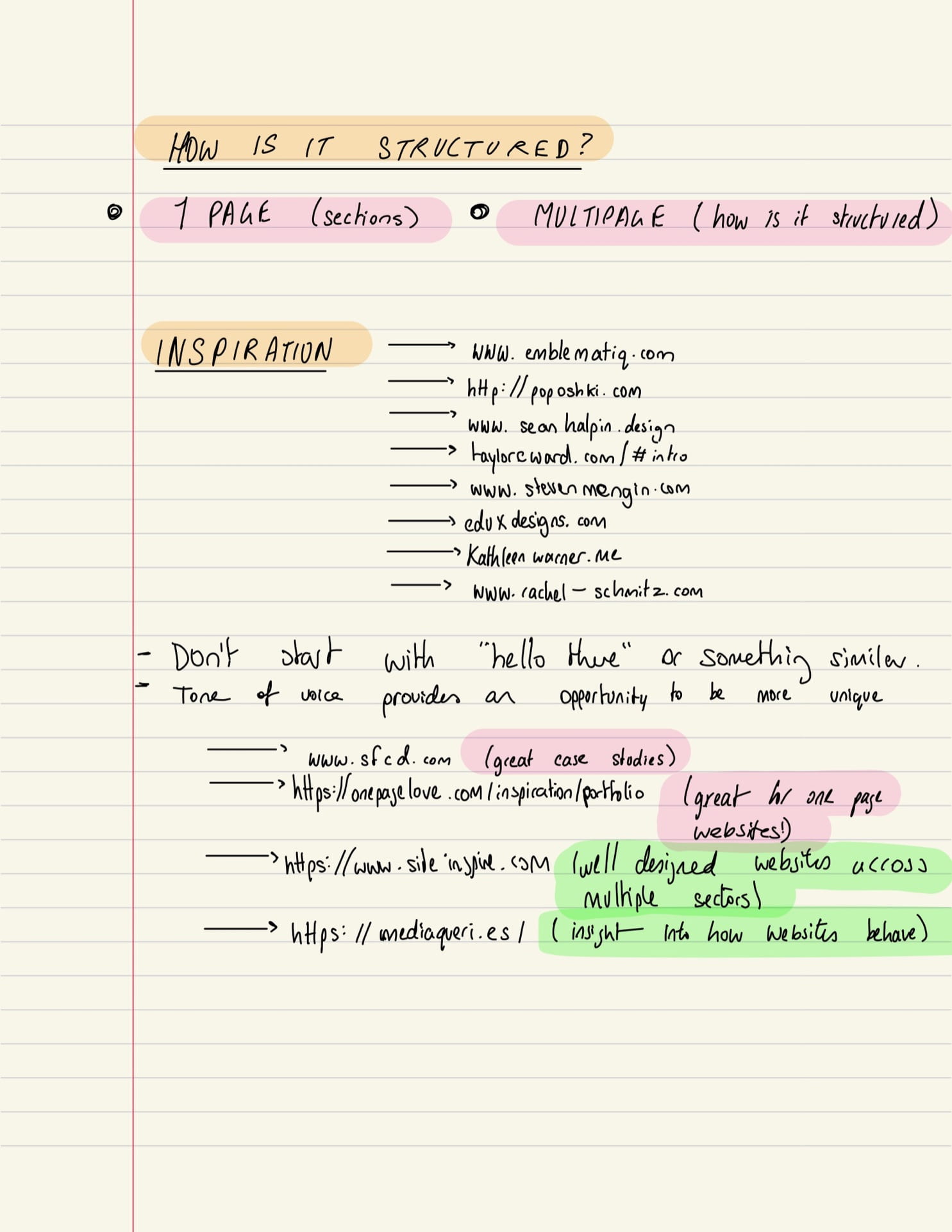
GATHERING INSPIRATION:
MOODBOARDING VIA DRIBBLE:
I found it difficult finding original designs for a portfolio website that fit my style on dribble a lot of the time. each design was too similar to the last. that being said I was inspired by many different layouts I came across on dribble – despite the typography, colours, and imagery being very samey.
MOODBOARDING VIA PINTEREST:
With Pinterest I found my design scope widened a lot. The designs I found here thought a lot more outside the box and were more illustrative in style. They made use of lots of bright colours, playful shapes, and different segments in the website online the dribble examples.
WHAT I’VE LEARNED:
- split the website into segments in block colours
- make use of lots or large typography – be big and bold
- use your icon set throughout – don’t hold back with them
- use a circular navigation
- use an interesting shape for your imagery – cut out your images in playful, childlike shapes similar to your icon set
- showcase your work immediately – that’s why people are on your website
WEBSITES THAT INSPIRED ME:
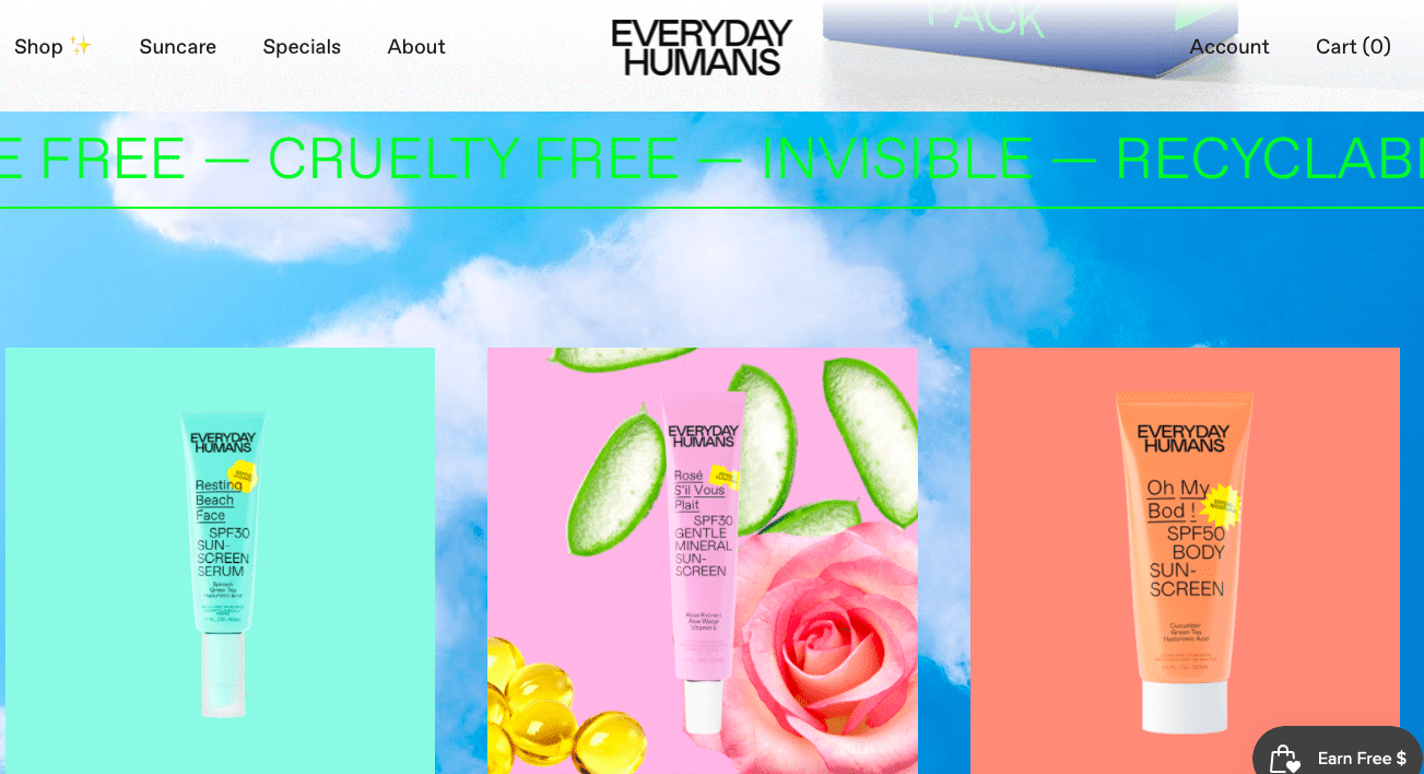
EVERYDAY HUMANS:
I really like the animated banner that everyday humans used in their main products page. it helped to separate the title image from their products while also conveyed very useful information about the products being told/ brand itself. I feel I could possibly do something similar to this with my own website potentially separating the website title/ welcome section to the portfolio section.

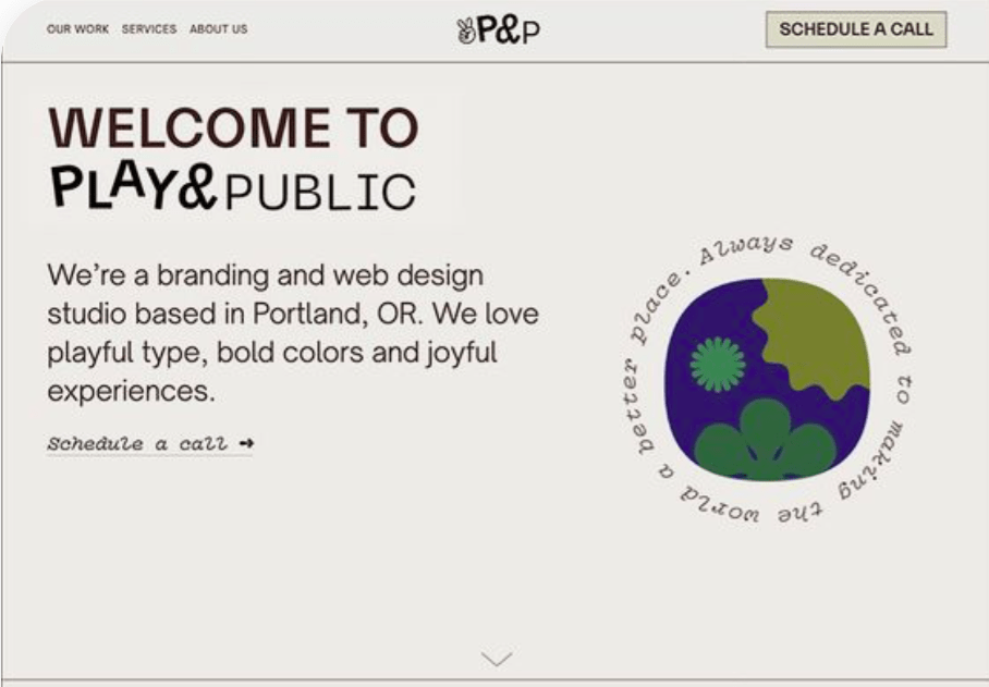
PLAY & PUBLIC:
I love play and publics illustration and layout on their title screen. The bold text at the top contrasts well with the text below and this is something I aim to do with my own brand. The illustration next to it is something I really admire too as the text around the circle stands out well.
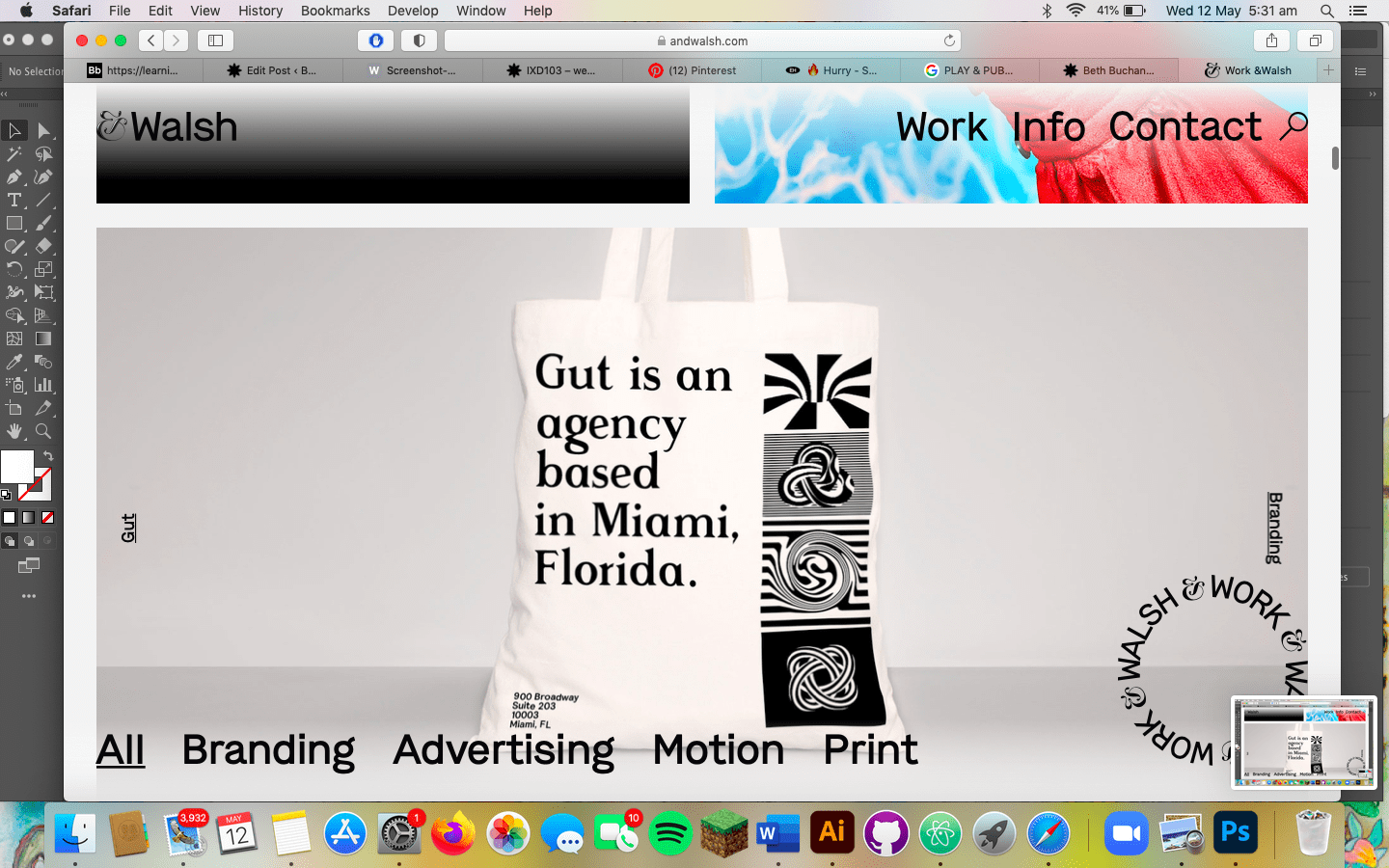
SAGMEISTER & WALSH:
The sagmeister and Walsh websites navigation section was something that was really inspiring to me. they somehow made the nav section almost like a work of art which followed you as you went down the page. I wouldn’t make my navigation follow the user as I feel this may be distracting and a simple nav section would be less confusing, however I’d love to incorporate a nav wheel like this into my website maybe on the title screen – allowing the user to immediately see where to go and how to navigate.

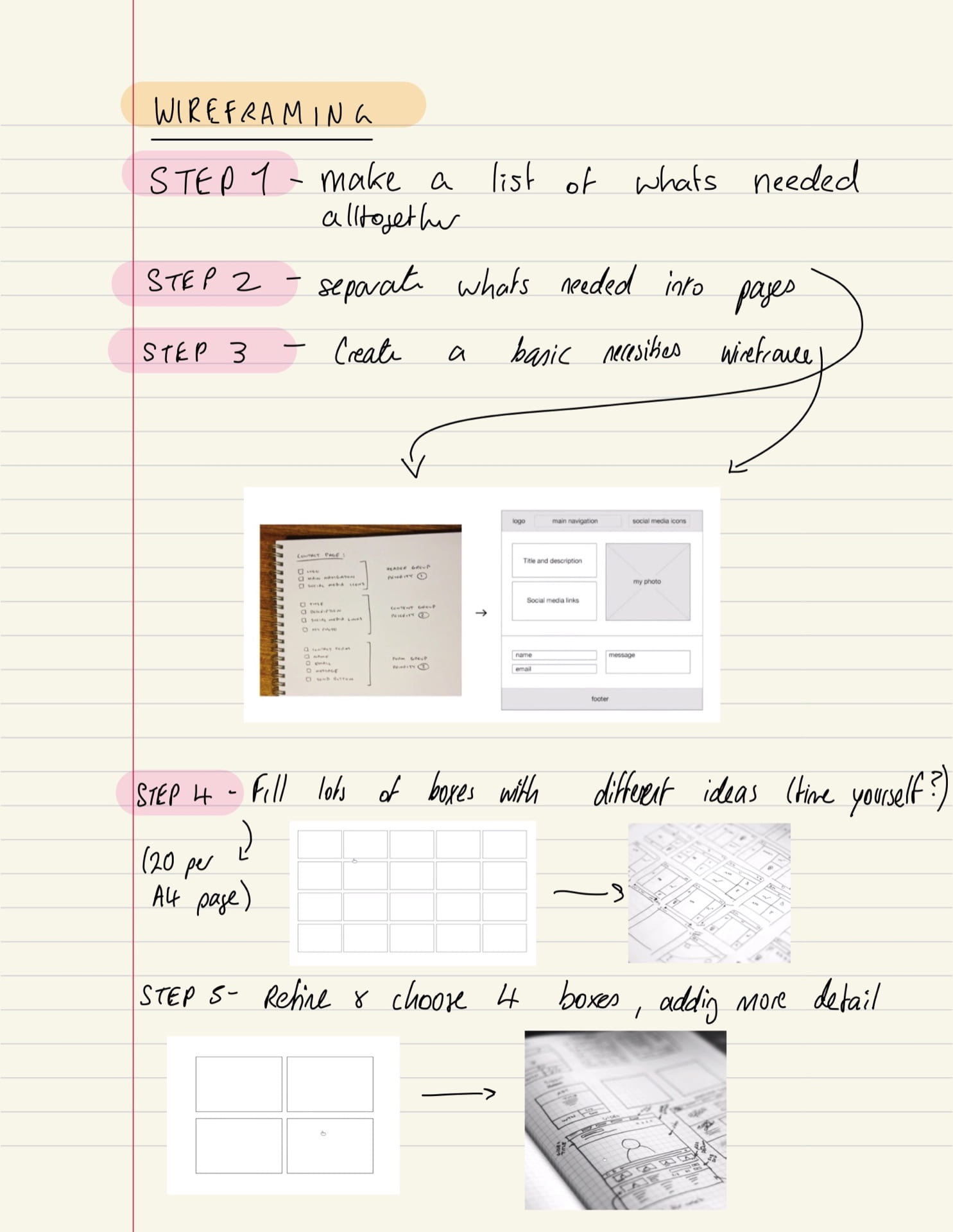
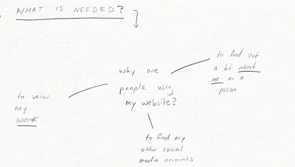
STEP 1 – SORTING OUT WHAT I NEED IN MY WESITE:
I started by doing a diagram summarising what we learned in the lecture and what the viewers were looking for in my website . This helped me with my next step which was to make lists of what was needed
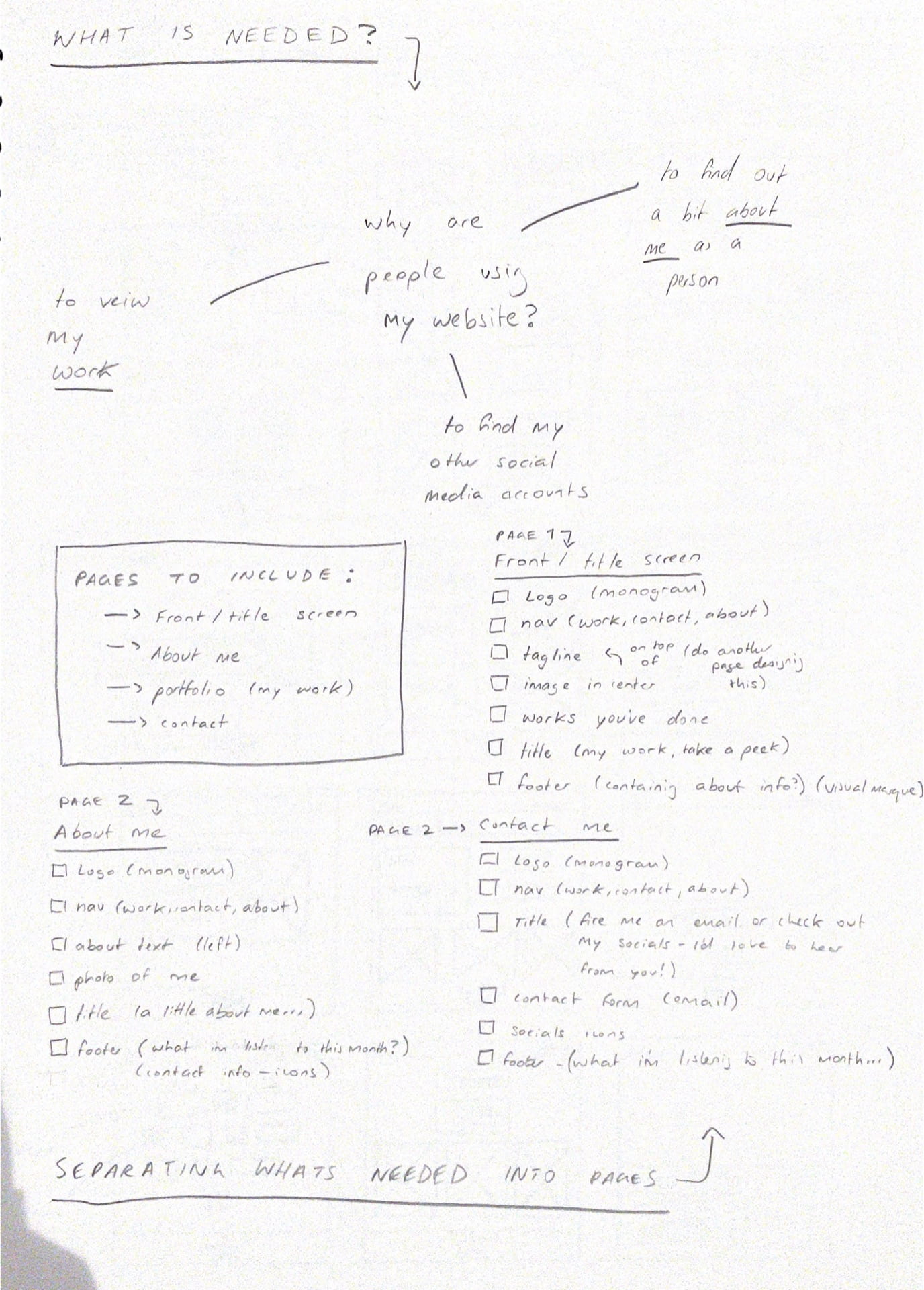
STEP 2 – SEPARATING WHAT I NEED INTO PAGES:
I next separated everything into pages and sections such as nav, footer, and main – allowing to see what was necessary a lot more clearly.
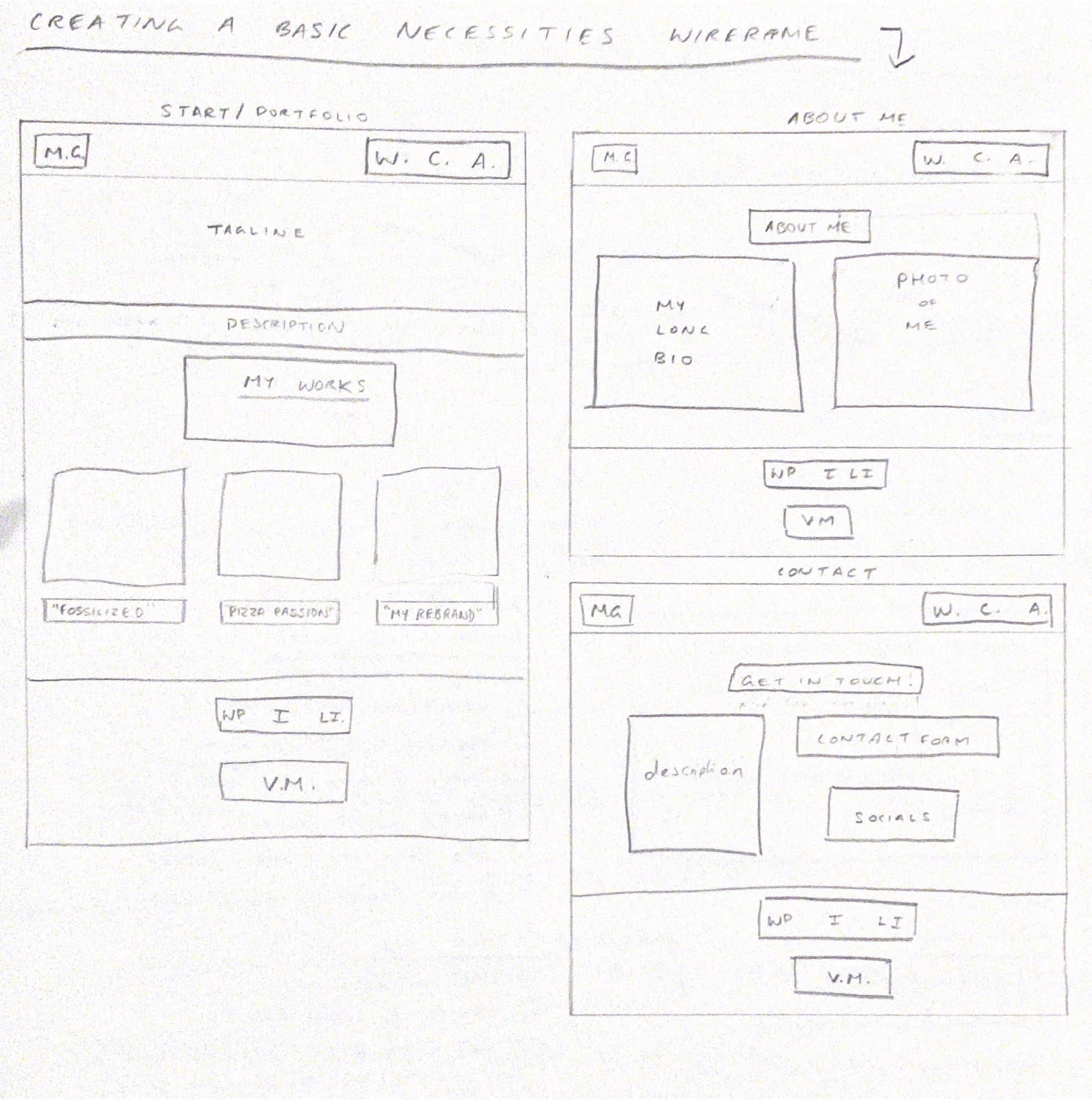
STEP 3 – CREATE BASIC WIREFRAMING NECESSITIES
I created very basic wireframes – just boxes and words in order to convey to myself what was necessary visually on each page and also to give myself an idea of sizing and layout more clearly.
STEP 4 – BRAINSTORMING LOTS OF IDEAS:
Next I brainstormed as many ideas on a page as possible – allowing myself to be inspired by other websites I’d seen but also just letting my head roam free and arrange things in whichever way came to mind.
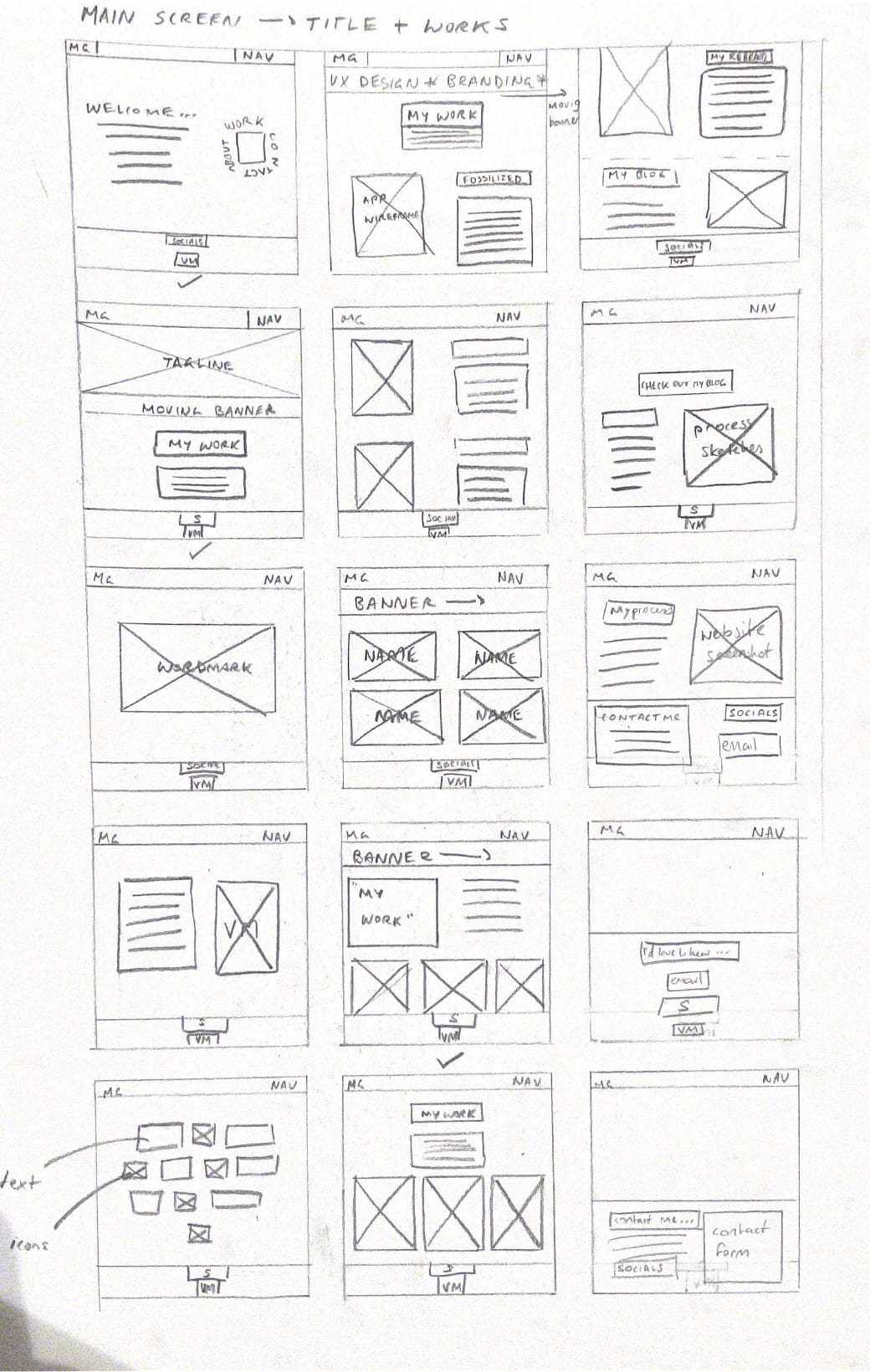
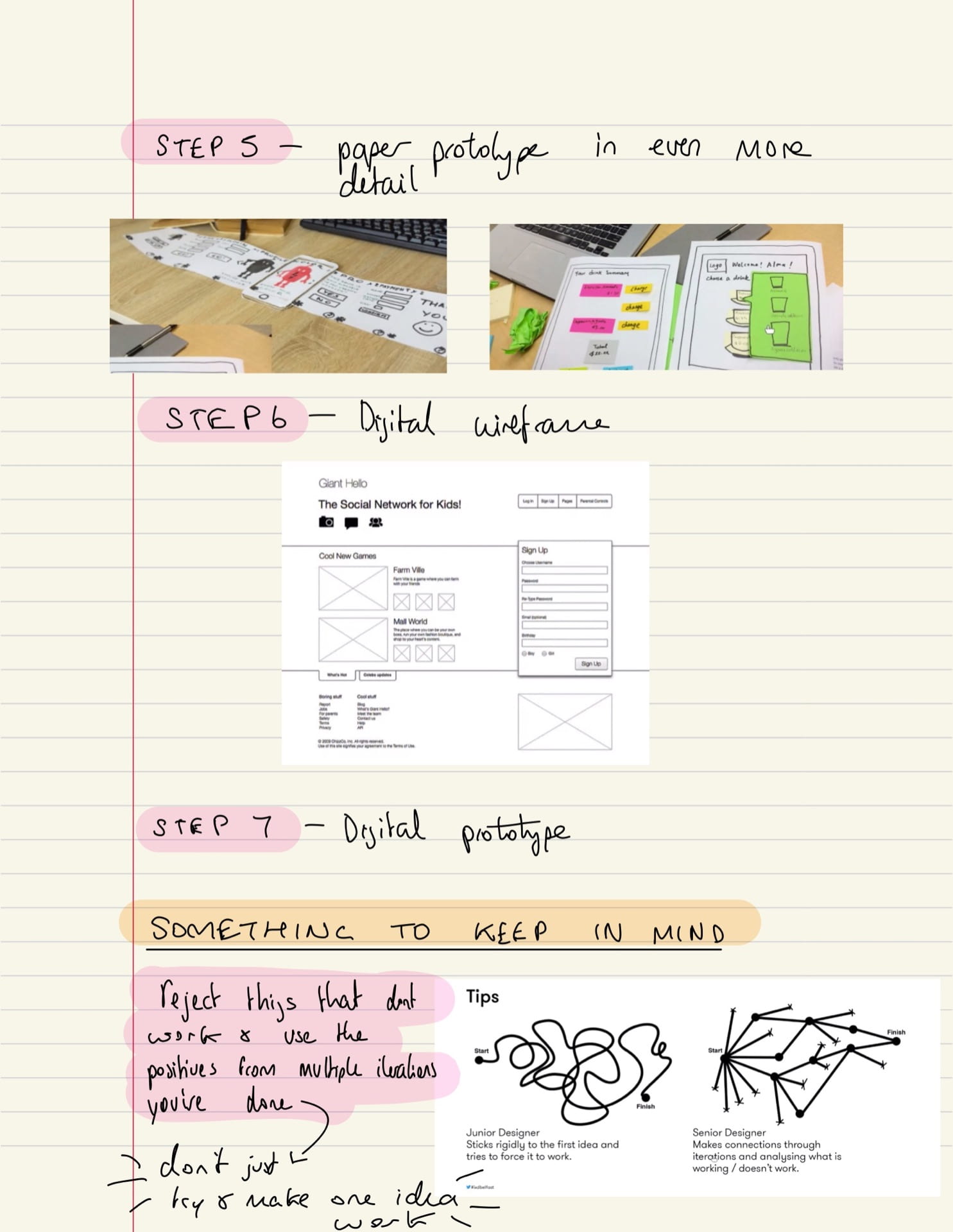
STEP 5 – REFINING, CHOOSING & ADDING MORE DETAIL:
Next I selected by three favourite screens of all and drew them out in a lot more detail so I would be able to easily create my digital wireframes from these as references.
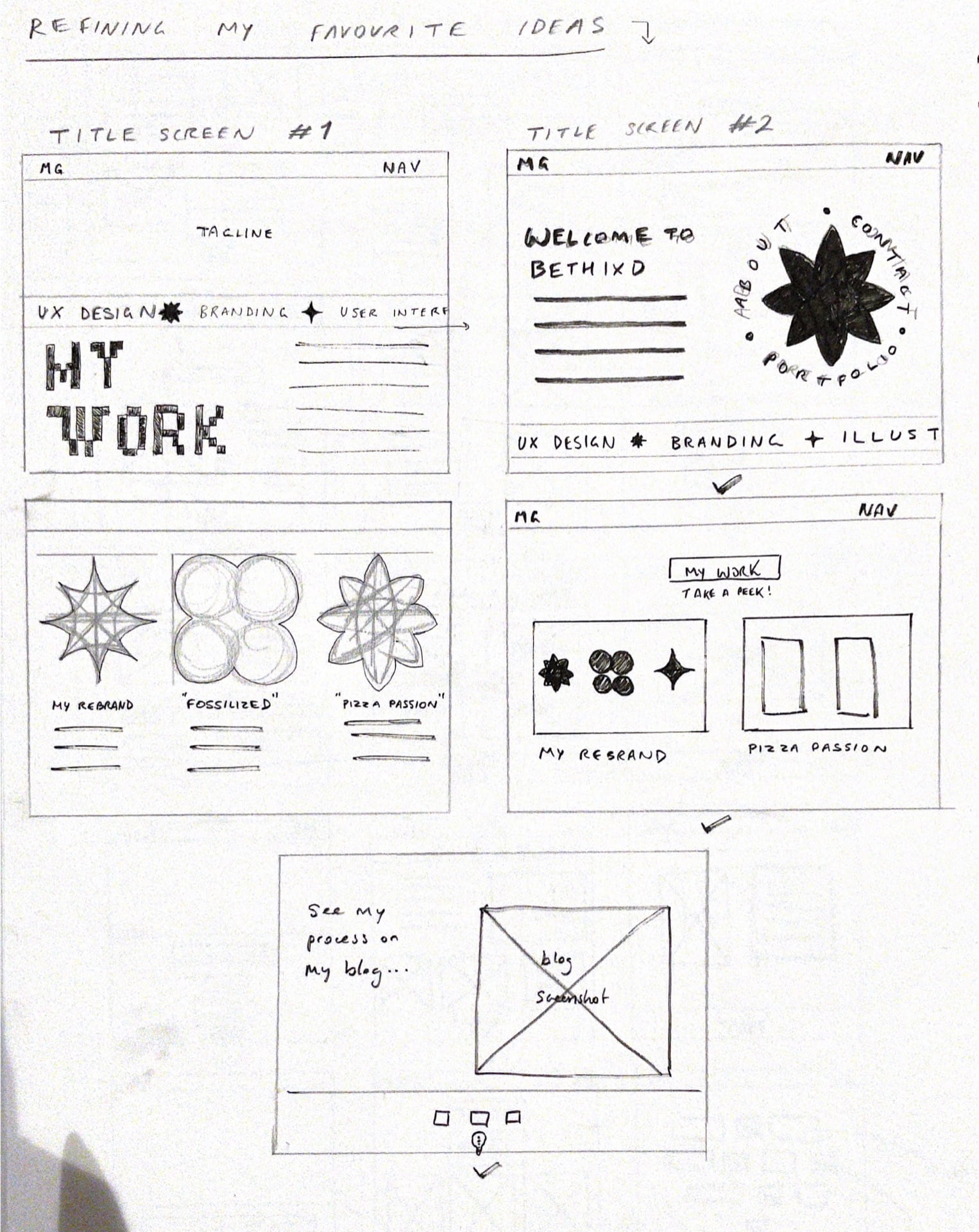
STEP 6 – CREATING A DIGITAL WIREFRAME:
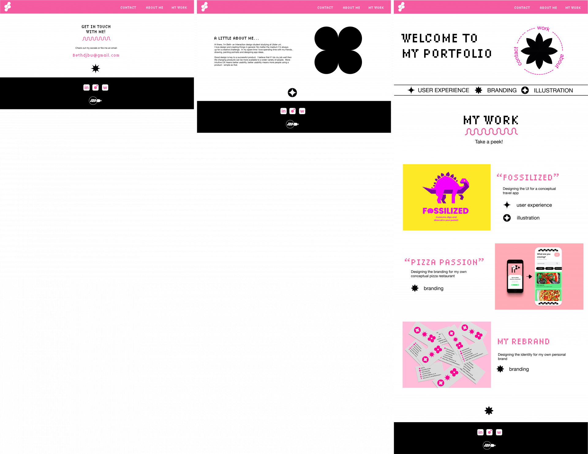
I created this wireframe on illustrator and really like the way it turned out. I tried to keep it minimalist enough so that my quirky lettering and icons didn’t get in the way or become too much visual noise. I separated my header, main body, and footer via my three brand colours and separated by title screen from my work with a banner that will be animated and move continuously on a loop to the right – the banner is also a key showing the viewer what the iconography means so that when they go to read about my pieces of work they understand the skills involved. The icon in my about section will be an image of myself but cut to be an interesting, playful shape similar to my iconset – however I will only add this in when I have a professional looking image of myself to use. I added my visual marque in my footer for a pop of personality right at the bottom, and created my own pink and white block icons for my social media accounts. Lastly – my title screen makes use of a circular extra navigation that will spin when a mouse hovers over the top.