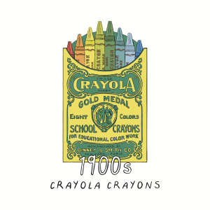
When it came to adding colour, it was quite easy to tell where I wanted everything to go as I had made the notes along the way that told me clearly about where I wanted certain colours to go, as well as what colours were commonly replaced. I knew that I didn’t want to use any black or white in the inside of the illustration, only for the text and the line work, and that whatever colour was in the background, could not be in the toy. I had to break this rule for my crayons, as the colourful nature of them meant that I wanted the crayon set to almost be a colour introduction to what I would be using in the book that followed, however I tried to make the red crayon as small as possible because of this. I still used my original colour palette but created a few more in-between colours as the detail on some of the lines meant that it was more difficult to draw the line between some colour accuracy to the original real life toy, and my interpretive illustration version.
This was a selection (narrowed down from about 50 images, nobody wants to scroll through 50 images), of some of the layers with one colour (or in the case of the game boy and train, shades of one colour). I surprisingly liked how a lot of these looked, especially the yellow and red ones, however in some of my illustrations as I only had six layers to work with due to making sure my canvas size was maximised most efficiently for printing and reducing pixelisation. this meant that I would do all of the colours of the same shade on the same layer, e.g how in the radio flyer wagon, there were multiple tones of red, and in the tonka truck there were multiple tones of yellow.


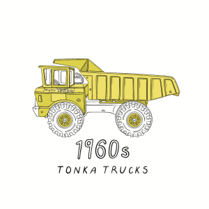

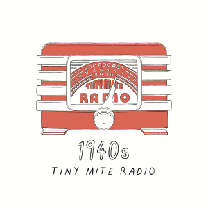
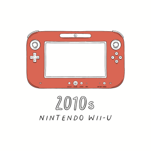

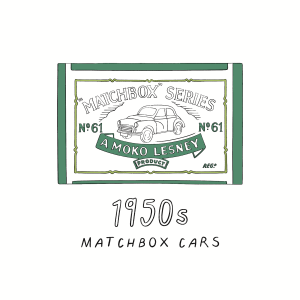


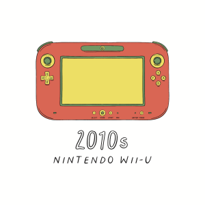
These are the toy illustrations with colour, and I will be posting the versions with the background in my following post, due to the fact that the final illustration will accompany a body of text beside it with the same colour background as the toy version. I also do like how these illustrations look on a white/ blank background, however I am still not completely happy with the Rubik’s cube due to not being able to use yellow as that was the designated background colour, however seeing it beside all of the other illustrations, you can see a consistent palette that while limited, doesn’t look too repetitive (I hope).