
In this weeks lecture with Kyle we focused on data and the opportunities we can gain when it comes to using data to our advantage to tell stories. This weeks aim was to undertaking how we can use data to presenting our stories to our users in a more appealing way.
Kyle firstly mentioned to us that data can be found everywhere we look and turn we just have to be willing to search from it. He also demonstrated to us method of prestning data such as within;
- Bar Charts
- Line Graphs
- Pie Chart
- Scatter Graphs
- Tables
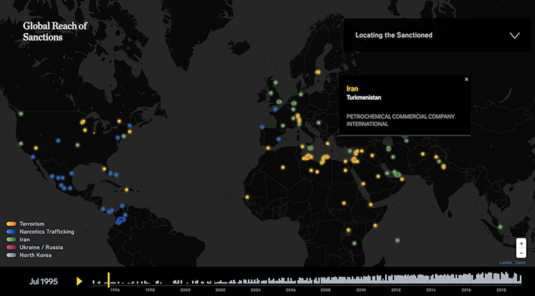
We spoke through the sanctions tracker by Enigma and how they present their data in chart form of the globe. I couldn’t actually understand what this data was about other than it had something to do with businesses engagements of US companies and was linked to the Department of Treasury’s Office of Foreign Assets Control but what I did understand was that it was a lot of information and it was displayed neatly in chart form where it was cluttered or too wordy for me as a reader.

Kyle also spoke to us about David Mcandless and suggested for us to look at how his data is presented. This data I could understand from I first got onto the page. This data broke down covid information in a really insight and easy to understand way. It presented data in a interactive map that allowed you to user your mouse to hover our counties to receive the data on the Average daily cases of covid per 100,000 people in the past week I that country. They also broker down the data by comparing number from different countries and gave inside into infection trajectories of where the virus is rising rapidly currently. 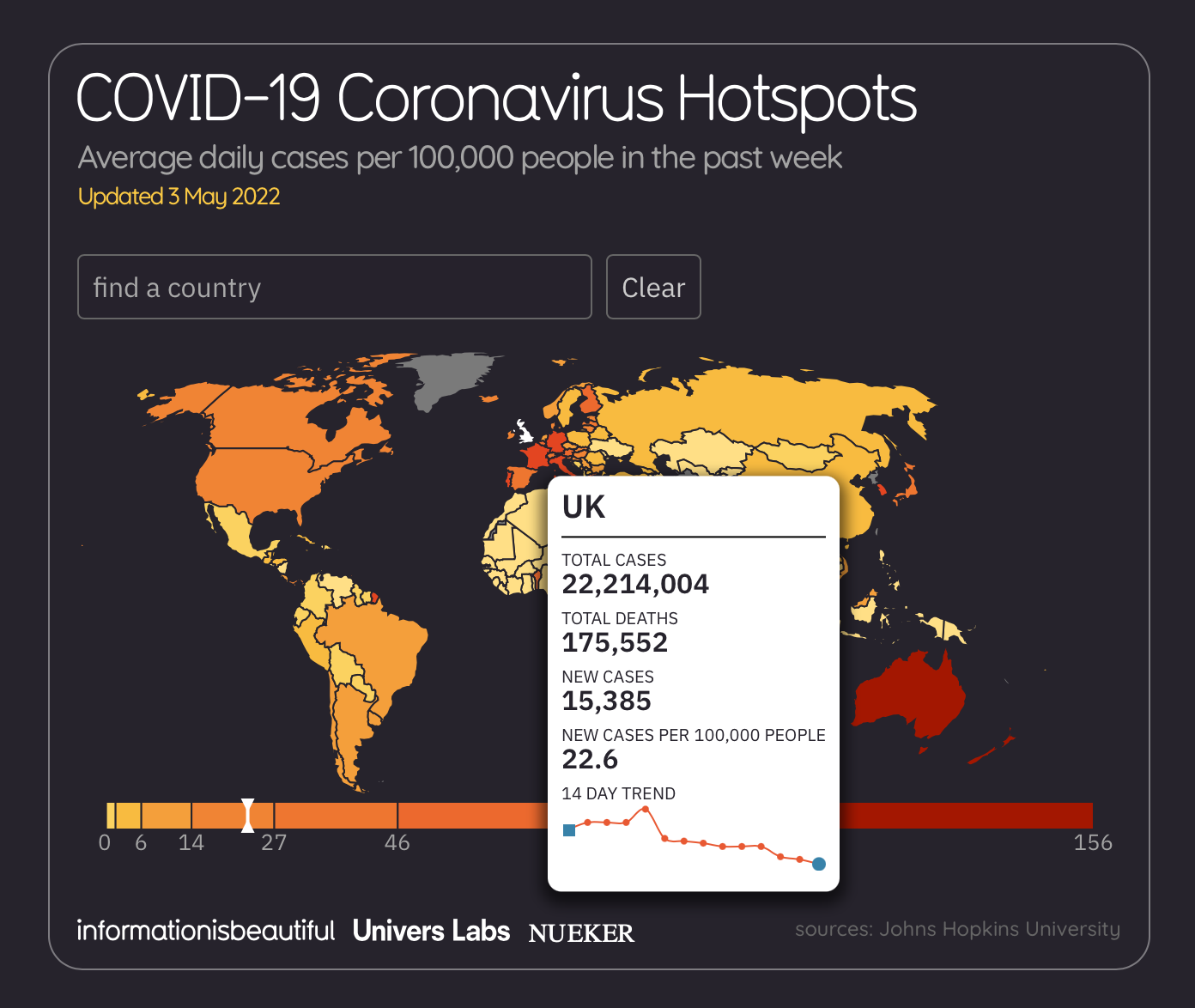


I thought this was an amazing way to portray data and to give an understanding about the data behind covid. I enjoyed getting to surf through this site as I was hit with too much data and information that I was confused the way that the data was broke down and presented allowed me to get an understanding of what I was reading.
https://informationisbeautiful.net/visualizations/covid-19-coronavirus-infographic-datapack/
Tools to use
Its helpful that when you are needing to present data in the concept of a chart or table etc that you are using the correct tools as this will help project the data visuals to the users. Kyle suggested looking into Chart.js a website that helps you understand how to code the following in the image below:
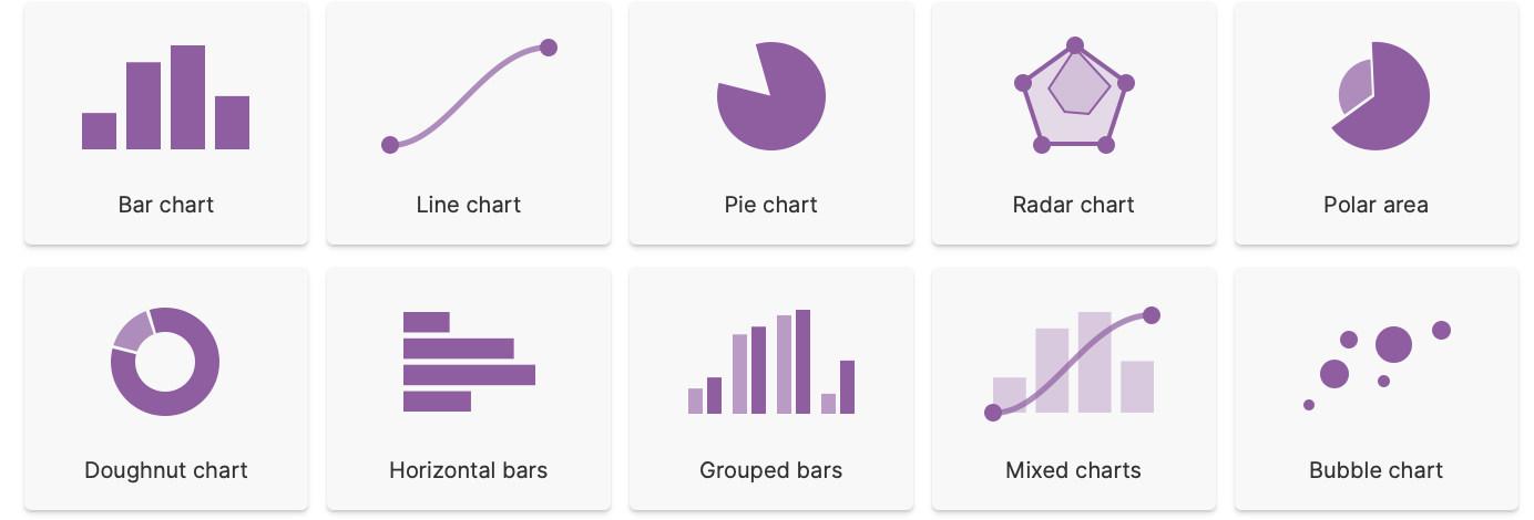
I found this article linked that helps break down the code further and what each chart is used for and why you might need it for certain aspect of data content.

https://tobiasahlin.com/blog/chartjs-charts-to-get-you-started/
In conclusion, truthfully I didn’t take much from this weeks class as I was struggling to understand what exactly we were talking about from the get go. Me and number don’t mix well and I tried so hard to keep focused on what Kyle was giving us but I just couldn’t get grasp onto the content that was given this week.
I understand the importance behind getting this area of design perfected and that using the methods of charts and tables to project and present my data will help my users understand the areas of my project that I might be required to use data in