Within this blog I will include my process through using webflow in the creation of my Apollo project with Kyle in IXD304.
When I am creating my webflow site I work off my prototypes and like to keep to one screen at a time to ensure that each screen gets my full attention and focus to minimise any possibility for mistake as this is would creates my frustration and I then can become unmotivated to continue through with webflow
Setting up my site – March 10th 2022
Another project another take on webflow. I won’t lie logging back into my webflow account got me nervous to start with again today as I know the challenges that await me in the coming weeks in order to complete my immersive website. To start with I had to go through webflow and upgrade my account because I don’t want to delete my portfolio website that I created and because I was on the basic plan I have to upgrade in order to have enough screens to fit all my content and to allow me to try and bring some of my own CSS code.
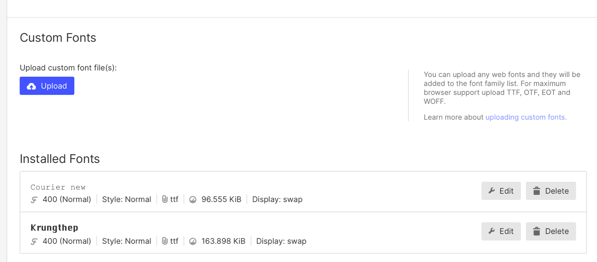
With upgrading my plan then I also created my new site and embedded my chosen typefaces that I have spoke about in my typography selection blog. My header fonts -Krungthep and my body text – Courier New.

I started off on webflow with creating my Home page
When moving over to webflow I want to try and create as close to my prototyped design shown below as I can. Going into this project with the idea of creating a Newspaper design I knew I was going to take full advantage of colums and grids through out every page.

The first thing I got sorted and worked with today on web flow was my Nav bar. This design that I had created I tried creating it before in my portfolio website but could master it. For this then I headed to YouTube to try and find something around creating a nav bar with a brand in the centre.
This was the Youtube tutorial that I followed to help me create my navbar.
My first step to creating my central nav bar was to bring in a nav bar element, from here I copy and paste and delete the content on the top navbar.
From here then everything get flexed to the center and I placed my logo into the centre and scale to the size that fits well and began creating my 4 Navlinks with my text and colour preferences and centred the second navbar that contains my navlinks.
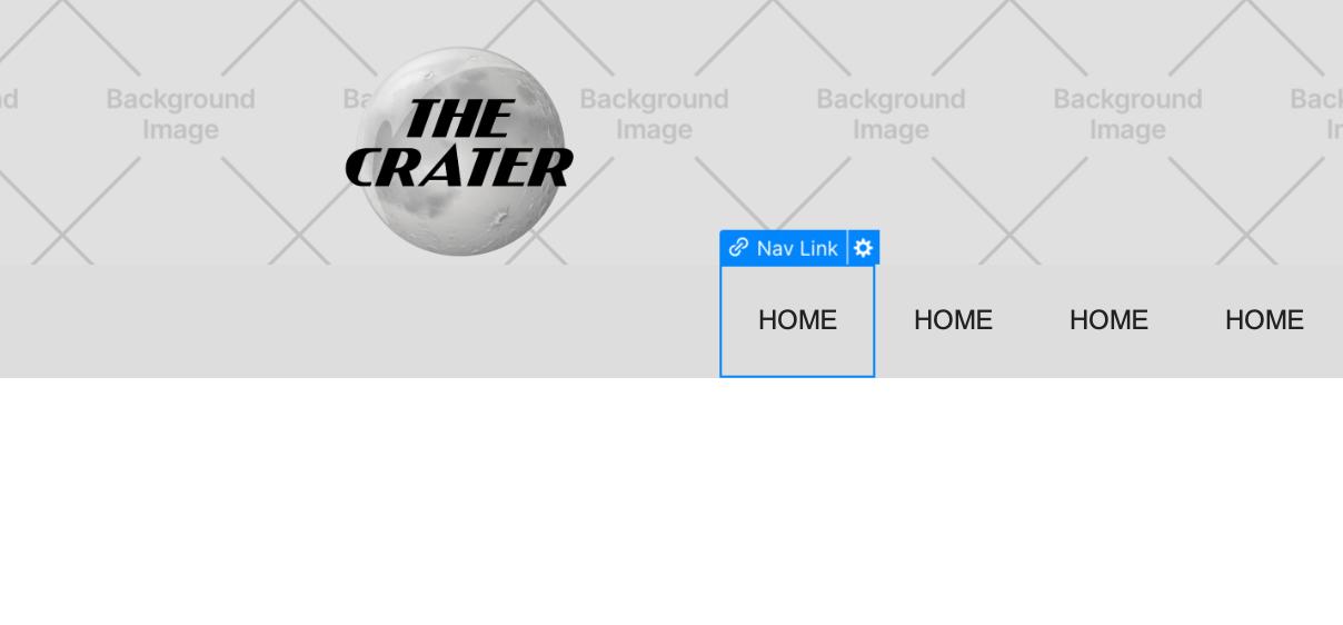
I was then able to drag my brand element into the the second nav bar and drag 2 navlinks on the left and 2 on the right
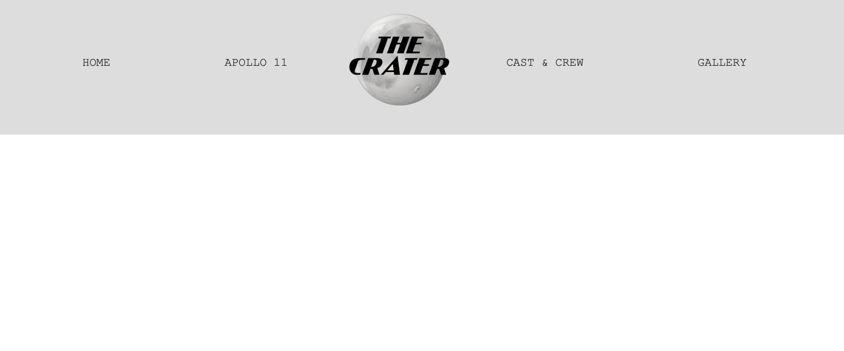
From here I’ve added thick black border on the top and bottom of the nav links, brought then closer together with a bolder text and created a hover state on each nav link that changes the colour of the navlink and underlines it. And from here then I will link each nav link to the correct page.

Home page
Now that I have my navigation bar set and my typefaces embedded its time to create my home page. This is the main page that my users will be landed on when this first access my site. I want it to look as realistic to front page newspaper as possible. I hope in this page to have an animation of a banner moving across the screen and being to include some interaction and animations.
For the first section of my home page it is simply just 2 columns inside a section with a div block with some text brought to the the left and using the ‘z-index’ tool bring the div block with the text to the front and then adding my read more button to help navigate the user to the following page.
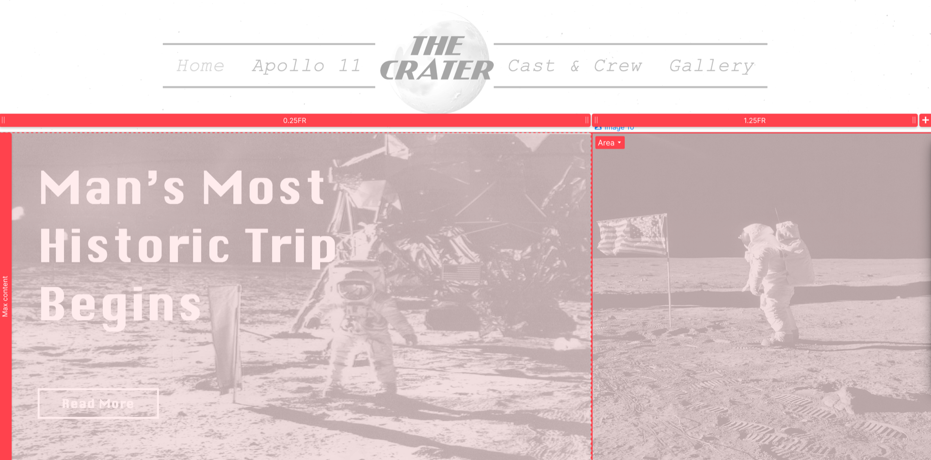
When I was creating my portfolio website I came across this YouTube tutorial on working with a grid when trying to incorporate both overlapping text and images in a webflow sited this was what I was trying to create with my home page.
For the second section of my website i needed to create a grid that would allows me to overlap some content in order to get my stacking of my three main topics located on the left hand side. This tutorial broke down using three columns and 2 rows and using the ‘z-intex’ tool. This was quite a tricky task to master and I found it difficult the first time I used it on my portfolio site but I completed it and with patience after my boxes moving in all directions I have my 1st and 2nd section complete.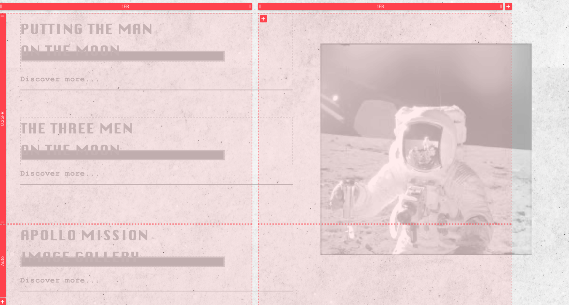
Now that I had my two main section of my home page complete I moved on to trying to create the animated banner. I found this tutorial below on how to create infinite text banners in webflow.
To my surprise this task only took me around 20 minutes to complete it was really easy and I’m so glad that I went through to find the perfect tutorial for this animation as I think it really brings my homepage altogether. For this I just created a section and placed a div block inside of this then set this to 3000px and then began adding my text. I went with “breaking news” because I really wasn’t to bring the users attention to the content then were going to be given was breaking news at one point in history. To create this banner then I had to create some animation which is a first for me using webflow, I was hesitant at the start as I didn’t want to set myself back but I knew if I could get this right then it would make all the difference to this page.
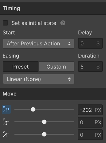
For the animation then I created a page trigger, I started the animation by selecting that I wanted it to move, I set it to its initial state of 0 and then from here I was able to move the selected div to move using the toggles and all I had to do was ensure that the ending position lined up to the starting position by bringing it back to 0.
The 3 state – initial, move, end
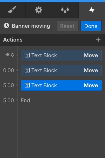
The timing sequence
14th March 2022
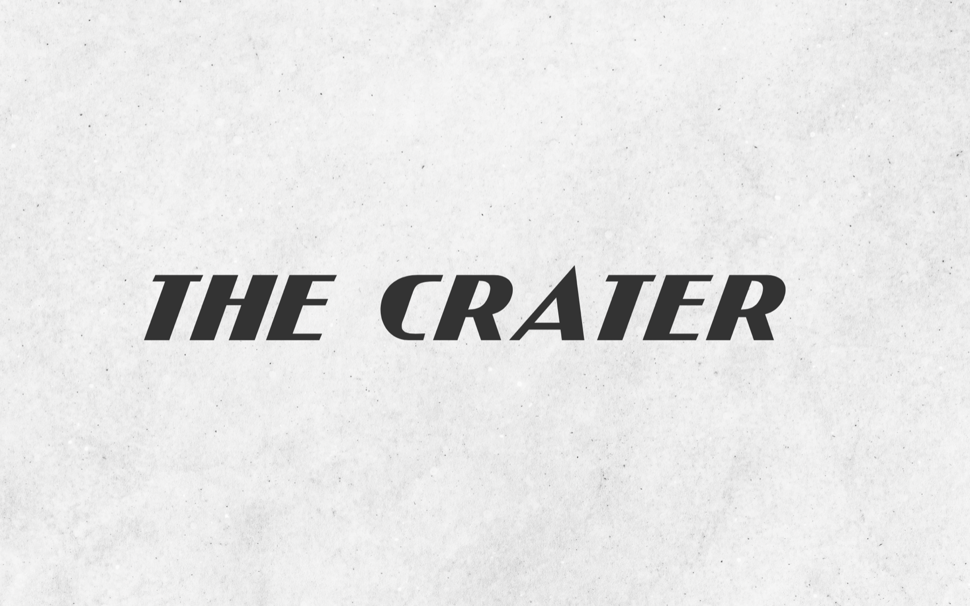
I took a break from webflow for the last few days and kept focus on my prototype as this hasn’t been completed just yet. With working through my portfolio however, I had this idea I wanted to try out on my webflow as its something I can’t do on figma. My idea was to try and incorporate a loading page that first appeared to the user when they visit the sight and it would load the page with the brand name being typed out automatically and after a delayed response then the user is brought to the homepage. I thought this would be a really unique way to bring the user into the world of the Newspaper that I was trying to create.
These were the website tutorial that I found worked best for this effect
This tutorial below is the video that I ended up working with
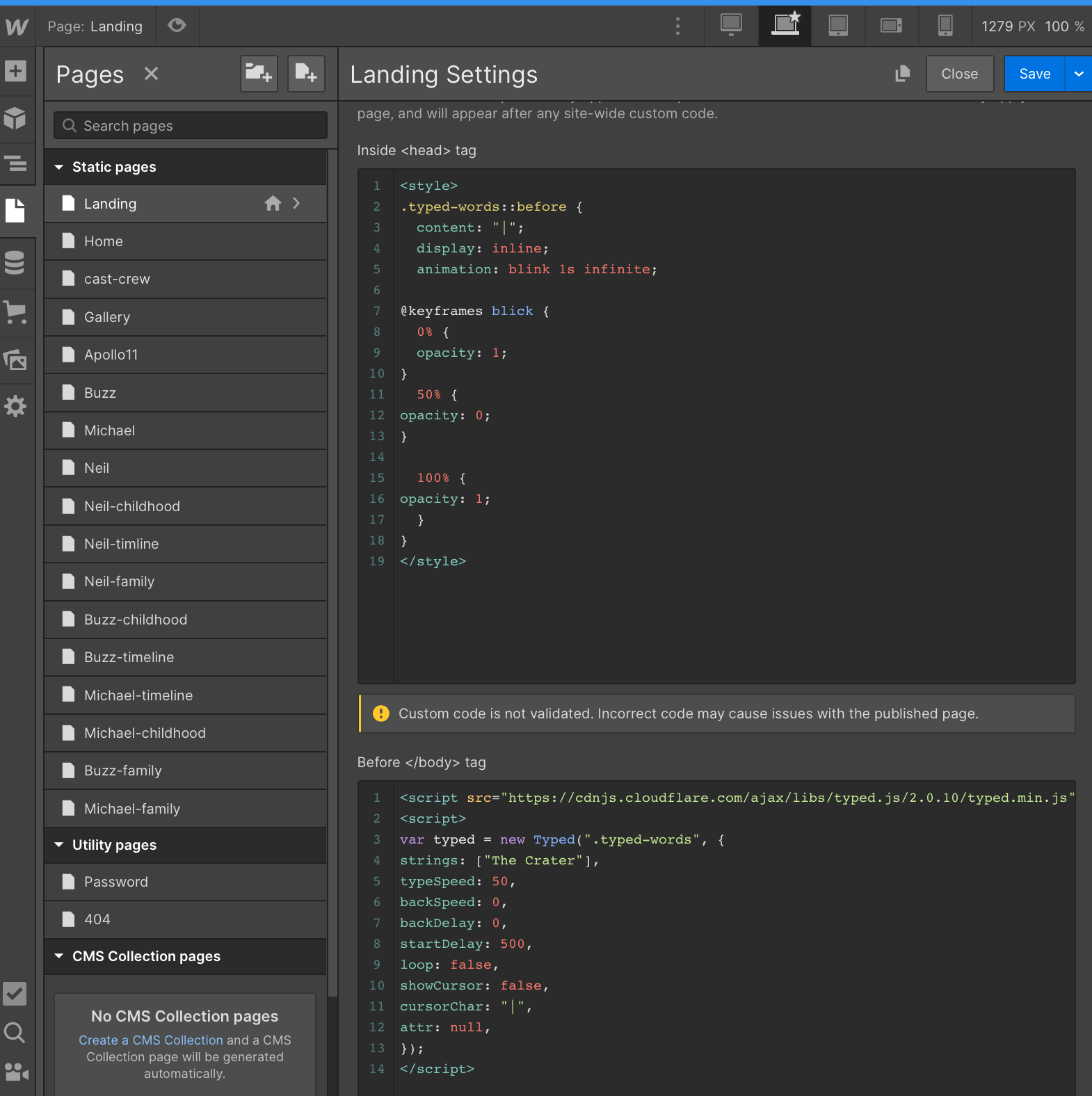
To try and create the typewriter effect loading page that I had in mind I had to firstly embed some code into my webflow which was super new but the tutorial was easy enough to help me through.
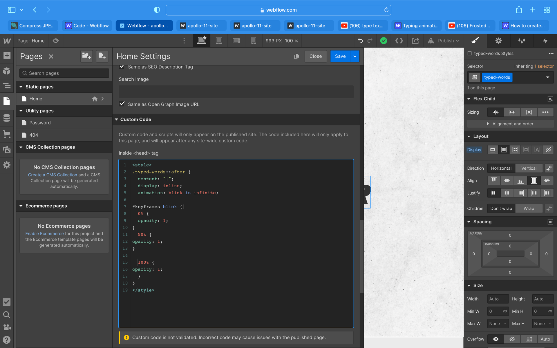
To create this effect I simply just created the text within a div block and with the named class Iinked that into the code that the tutorial had include in the description of the video. To embed code I located the page I wanted to place code into Landing>setting> scroll to custom code> paste code.
The embedded code is shown below
I finally got the code to work but one problem is that for some reason the type writer effect is type to the left instead of typing to the right and I can’t seem to get the interaction to delay into a the homepage either. I’m not too sure what the fault is and I can only imagine it would be with the code by I have redone this elements about 6 times and Im loosing my patience. Im going to bring this issue with Kyle and see if he can give me some guidance or get one of my peers to look through the code for me to see if they see the issue.
*UPDATE*
I got to speak with Kyle about this element and he couldn’t help unfortunately. I also got my peers to look over the video and code for me and they also didn’t see any problems with how I had embedded the code in comparison to the tutorial. I am going to try and continue on with this animation and hope that I can get it work as I think it would fit perfect into the story I’m trying to tell
3rd April 2022
I’ve completed my prototype and its time to focus on my webflow content now. I have my feedback session coming up in a few weeks time and I want to make sure that I have a strong enough set of screens to demonstrate my idea to this point to ensure I have enough to get some beneficial feedback.
Apollo 11 –
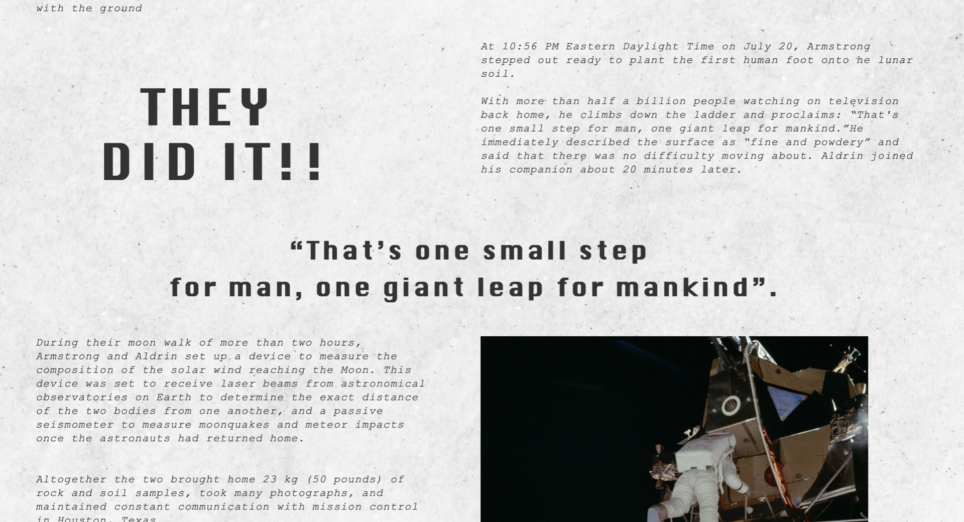
The Apollo 11 page my main article page that will contain the content around the Apollo mission of the decent till the arrival home. All my content has been created on my figma files for my prototype meaning my main focus with webflow is my layout of content distribution with my images and information.
I went into this page keeping in mind that this is to be as realistic to an article as possible meaning I took full advantage of using the column element when inputting my text and images. Because I was working off my sketches and my figma prototype for layout and structure this page was really easy to design. I thought this would have taken me the longest but I mostly continues images and text and once I got started it just flowed naturally. When creating this page I found out the DIVS are my best friends in webflow and I stuck a these everywhere I could to keep the structure and shape to my site.
Prototypes design


Webflow – I have completed my Apollo 11 article page but one problems thats occurring is that it looks how I want it to in my webflow file but when I make it live everything seems to move about. Its not an awful attempt at the style or an article I think I have some issues with space but for now I think I will keep it how it is just to get some feedback from my class on week 12 and ask Kyle for some guidance and from here I can hopefully fix up the spacing issues.


This page has no interaction which I’m a not mad about because I think the reason behind that is fair. I wanted this page and the whole site but mainly this page to portray an old style article and I thought by adding interaction that this might take away form the effect of trying to create the newspaper style that I’ve been perfecting for week. I have interactions and animations through out my other pages I just wanted to try keep one realistic to a newspaper, but this could bore the users with reading so much so hopefully in my feedback session I can bring this forward as a concern. Within this page also I have my TV animation in my prototype file on figma but I could get it embedded into my page of webflow. Ill see if this is an area of concern and if I have time I’ll trying to figure this out.

8 April 2022
Cast and Crew –
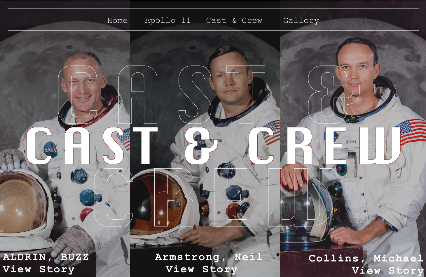
This is where my site started to get tricky as was bringing in a lot more elements of design for this area of my site. To simplify I have one main cast and crew page that gives the user the option to surf through each astronauts profile and within each profile links to 3 separate pages with content related their childhood, family life and their journey to getting to the moon.
I started off with creation my main navigation page that gives the users control of who’s profile they want to visit.
The typeface
The typeface I had created in my prototype was with a fill text over the top of text outline something I thought would be easy to create on webflow….. I was wrong. I used this tutorial below to figure out of how to create outline text.
I thought webflow would have a feature to outline text but to do so I had to do simply was to embed code once more selecting the element of text that I was wanting to outline.
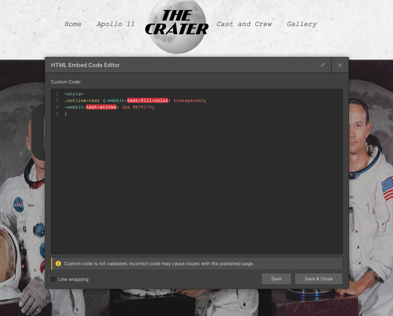
The reason why this was so hard was just that I couldn’t get the placement right for it to layout how I imagine and that it worked on preview mode but not live mode which was frustrating. I did continue through with this code and eventually got it working by typing in the code by hand instead of copying it from the source in the link of the tutorial but I could get it to work on and other pages. So this its not prefect but I had got it as close to perfect as I can at the minute with only know the basics of webflow and how embedding the codes work.

I then used this tutorial for my enlarge zoom on my images it was really simple I just had firstly created my grid and drop in my three image and then from here I had to select the hover state>transform>scaled the image up. With his then I placed my three image into link block also which all allow the user to click on the image and be navigated to the following page.
11th April 2022
Cast and Crew
I worked through my first section of my astronauts content starting with Neil Armstrong. Im aiming to create just one of these to present the idea to the class for feedback to see what everyone thinks before I fully commit to creating all of these separate pages.
So inside the astronauts profile in this case I’ll be focus on Neil Armstrong, the user will click their image from the main navigation above and this navigation them to a 3 linked block with content related to the astronauts childhood, family life and then a timeline of how they got to the moon.
For the three link blocks this was simply just three link block inside a div and I created a hover stat the brightens the opacity up as you hover. These then link to three separate pages 2 are styled as articles and the 3rd is the timeline.

Like with the Apollo 11 page the Childhood and Family like content pages both were created within grids and columns to mimic the style of a article. The spacing again with these have gone funny when going live but I hope to fix this once speaking to Kyle as I can’t seem to get to working and this is a crucial element to my site.
Once I have sorted out the issues with these two pages I will be able to duplicate the pages to create the content pages for Buzz and Michael making it a much quicker process,
14 April 2022
Cast and Crew – Timeline
This was a really fun element I got to create in figma and couldn’t wait to recreate it on webflow. This is a interactive timeline that brings the user through the journey of how to astronauts got to the moon through key moments in their lives. On figma I had prototyped this to have a hover stat over the image and to bring a pop up of information related to that key moment.


Kyle has sent me this YouTube tutorial on building an animated timeline on webflow.
It took me a view times to get mu head round how I could implement this tutorial around my design and had searched for other tutorial but haven’t been succcessful.
This tutorial breaks down creating difference sections of content for a timeline, a scrolling animation that brightens up as you scrolling through each section, image inputs and highlight dates. I couldn’t work out how I could create my figma design in webflow trying a lot of my own methods by I just don’t think I have the skills to perfect some that complicated as it took time on figma to get it right never mind with webflow. Because of this then I went with the tutorial above and got a good jist of how to create this around my idea for my timeline.

After about an hour I finally got this working and spent most of my day just getting the lay out to work properly. Its not perfect and I could get the hover stats to work in this element or have the informative boxes pop up which is frustrating as this was something I really wanted to include. I looked at things like pop up tutorials for this and even created a pop up on elf sight to embed the coded into the site and just would appear for me.
1st May 2022
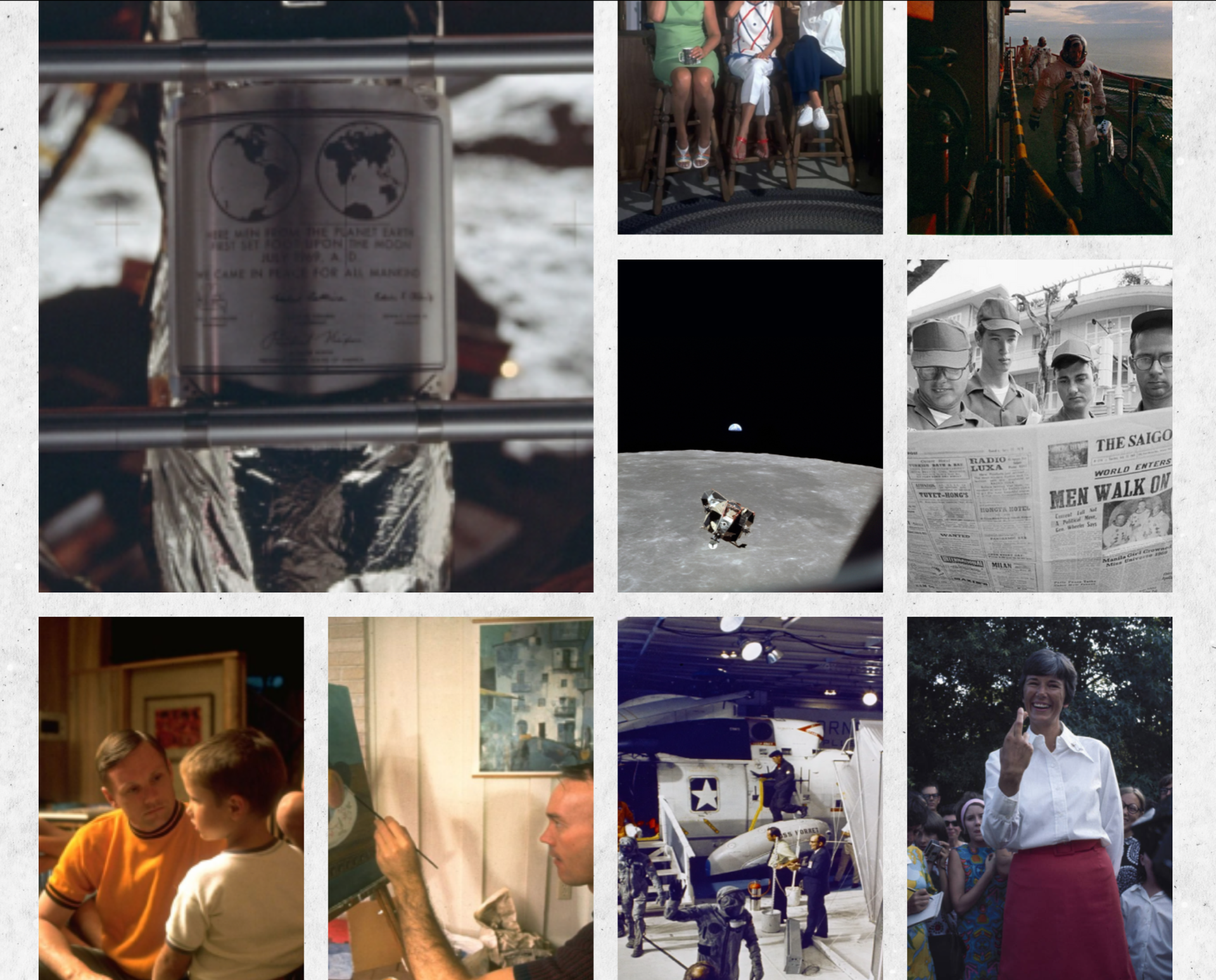
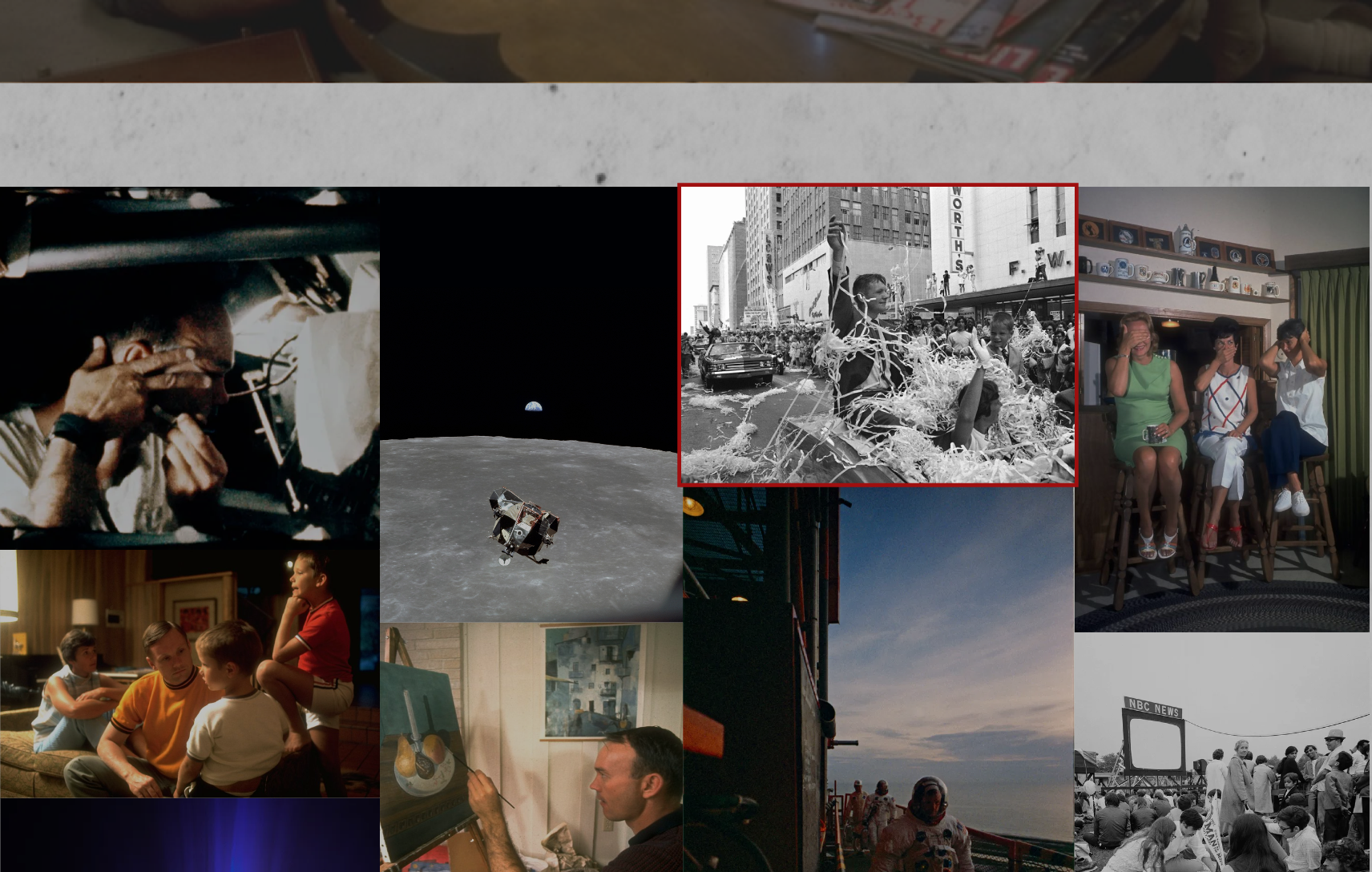
I finally completed my gallery page on my website. This took me forever to work out how I would get my images to present like I had designed in my figma prototype. This was one of the areas I was most excited about designing as I wanted a solid page the just emphasised on some rare images that viewers of this site might not have came across before.
Using Figma I had prototyped gallery page as follows:
When the user hovers over on of the 20+ imageg a hover state is activated to give them awareness that this is a clickable object. From here then the image is enlarged and a brief descriptions of what is taken place in each image is present alongside the data and who had taken the photo at that time.
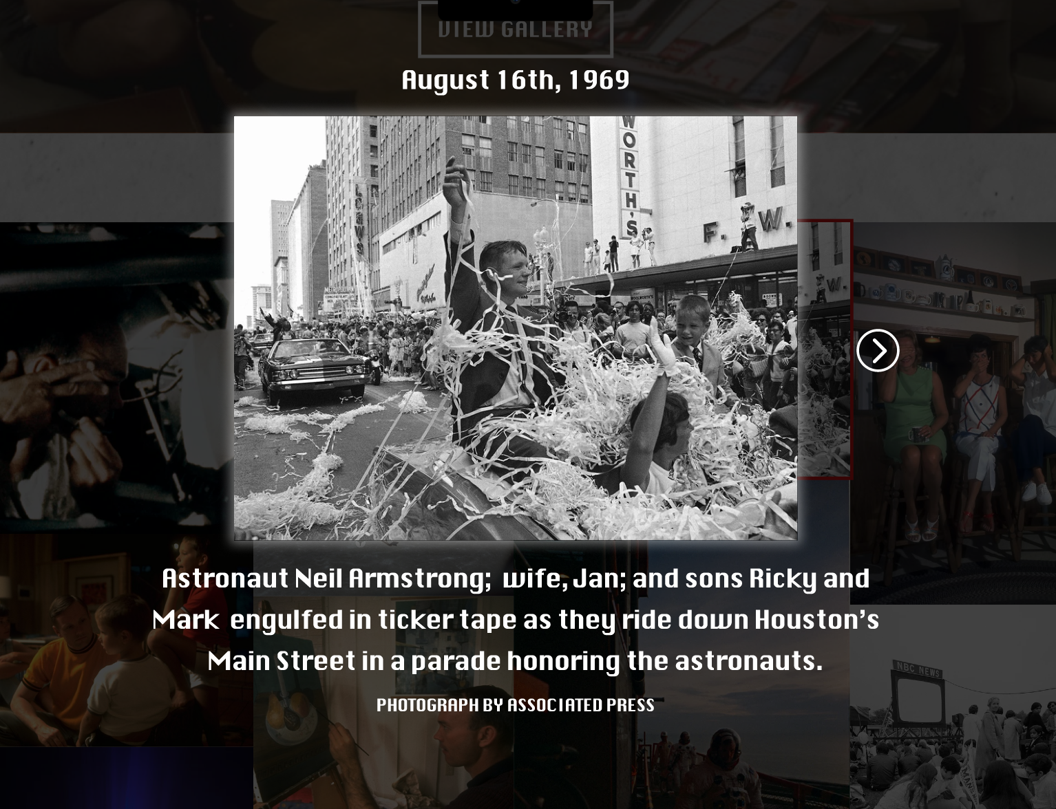

Unfortunately with Webflow I couldn’t get my layout right I used multiple videos like the one below to try and get the structure I had created on figma but each time I was close to completing it it broke on me. With this then also I couldn’t manage to work out how to create the interaction of getting the image enlarge and the description appearing which I am gutted about as this was the area of the gallery that appealed to me most. With the time I had left before my deadline then using webflow I created a standard Lightbox gallery that shows a range of images and managed to put the hover state on each image like I had created in my prototype.