
Health Application Sketches:
I started off this project trying to scope out a strong idea that I could go with and have spoke more about this journey of developing my idea for this project in my research blog linked here.
My idea-
My idea for this project is to create an application for those suffering with Arthritis that struggle to demonstrate to medical staff of the seriousness of their condition at a particular time. My application aim is to have a app that stores its users medical results of bloods and X-Ray results to allow them to keep track of potential issues that could cause a flare up. The application will have a section that will allow its user to keep track of upcoming appointments as well as trying to book through the app to see their Arthritis clinic. The main purpose of this application idea is to be a source of documentation of pain and flare ups, to have a sustainable back up of data for the months prior before a doctors appointment to demonstrate the condition of their arthritis through a particular time frame.
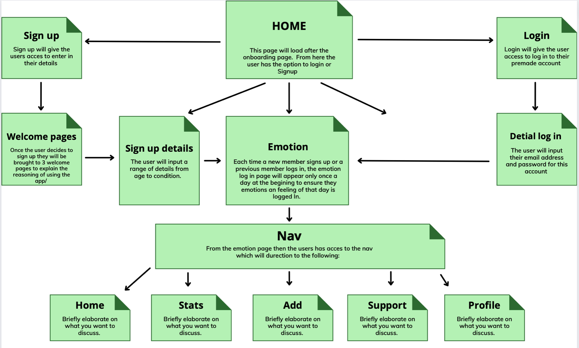
Flow map
This is my sketched through flow map below of the expected flow through the application from both a login and sign up point of view.

From my sketched flow map I brought this over then to Figma and created this much cleaner digitised version of the expected flow through the application.

The start of my Sketches
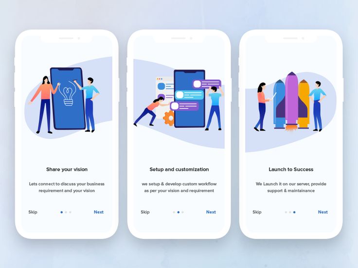
Before taking my pencil to paper I firstly got some inspiration form competitor application and some designs of application that I had saved on my Pinterest and Dribble boards for inspiration.


Pinterest link
Dribble Link
Moving on from my inspiration I began to sketch through each screen. I started my screens off allowing the user to either sign up or login. Clicking the register button would bring the new user through the sign up process that I had thought that would allow the user to place all their personals and medical details into the app via 3 form style pages.

One I had completed my 3 forms and new user sign up screens I then created a screen that would appear if the user clicked the login button. This screen would allow the user to type in their email and password before moving forward.

After the user has either Registered there details with the app or logged in successfully they will firstly be welcome their daily pain and feelings log in to input how there arthritis is affecting them on that specific day. Their inputed data is then kept within the stats page for each day and can be shown to the doctor to demonstrate the frequency of flare ups with the user.
From the pain and feelings input screen the user has the ability to navigate further through the other main sections of the application which include:
- Home Screen – For main navigation
- Collections of stats – Mood, symptoms, bloods, X-ray results
- Daily pain – Chart demonstrating daily pain and feeling in takes
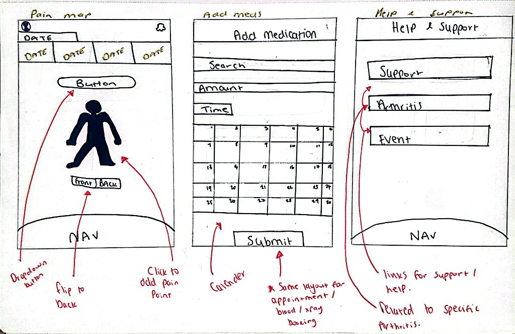
- Pain map – To allow the user to pin point the most effected areas
- Add – Add meds, appointments or results section
- Help and support – Support on arthritis and more info on specific condition

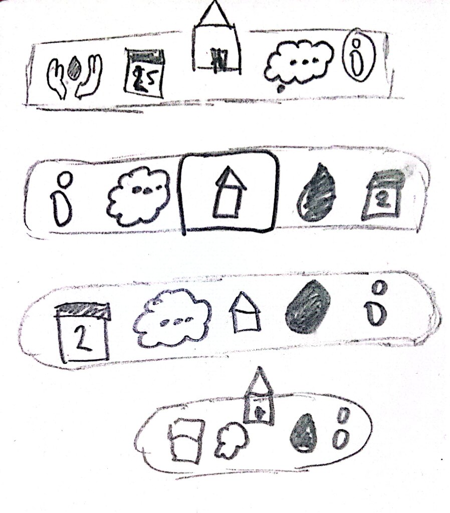
Navigation sketches:
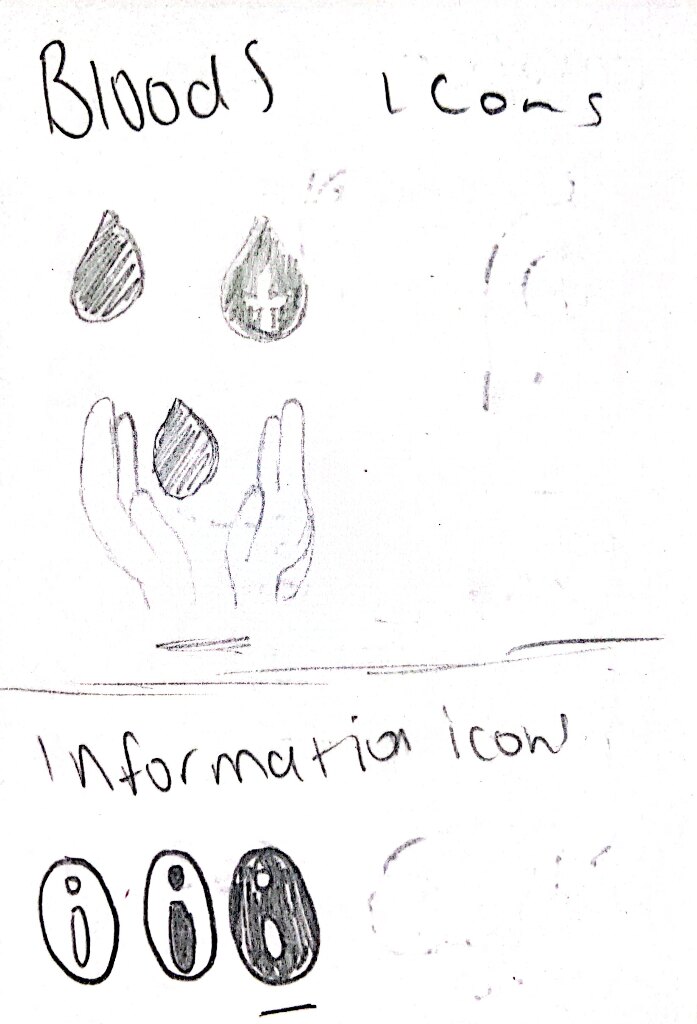
For my navigation I had a few ideas of how I wanted this too look and thought it would be best to bring the to a sketch before I would digitise it. Alongside figuring out my navigation I also had too take notice of the icons I would use as I wanted my application to me accessible to all so I had to ensure I was choose and creating the correct icons.

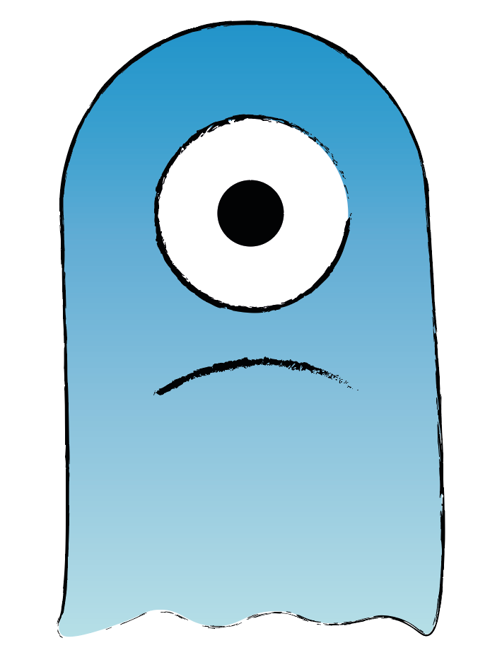
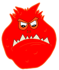
Sketching emotion monsters

For my pain and feelings screen that would allow the user to log in their feeling etc for that day I wanted to do something a little different that would bring something fun to the application instead of a standard 1-10 pain input toggle. For this then I created a range of “Emotion Monster” each mother would represent a different emotion or feelings such as happiness, sadness, feeling ill or tired.
I brought these sketches over to illustrator firstly to try and figure out how I would created my emotion monsters. I thought about simply using different shaped but I couldn’t get the concept right creating them this way.
 This was my first mock up idea using illustrator.
I moved from illustrator over to my iPad and onto procreate then and firstly traced over my sketches that I had made of each emotion and then used some vectors that I could find online to trace round to create the facial expressions such as with the eyes. Using my iPad and pen for this allowed me to include little details like the fur on each monster. I had a lot of fun creating these over the past week as I enjoy getting to design graphically in my projects.
My completed emotion monsters:


Once my sketched were complete then I was able to move over to fugue to being some lo-fi mockups to begin the digitisation process of my project for the application. Within my design process I like to start of with low-fidelity mockups which are static visual representations of my project. Low-fidelity mockups are basic designs using shapes and text to create a shell of the design in mind in the simplest form. Completing my Lo-fi Mockups will allow me to move forward to fully designing my Hi-Fi Mockups, these designs would represent the overall look of each page of my app. With the Hi-Fi Mockups I will be able to add my colour, text, buttons and branding to allow it to represent how my real site would look.


For my lo-fi mockups I created the following screens?
- Login in
- Sign up
- Welcome
- New user sign up details
- Emotions
- Home Nav
- Stats
- Chart
- Pain map
- Appointment/meds input
- Support
To conclude up to this point I have completed a range of sketches for my screen design, brand designs and idealisation for my navigation. These sketch are to change and are just general ideas of where I can take my application for this project in the coming week once I digitised everything and begin to prototype.