Wireframing & Final Design
Sketching & Wireframing
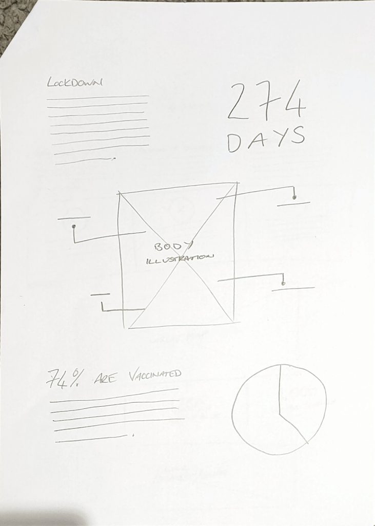
As I began this project by collecting information and data surrounding the COVID-19 pandemic I had a good idea on what kind of information could be displayed in a visual way, this could be in the form of charts, graphs, maps, icons or numerical values. I wanted to create some quick sketches to see how I could potentially display the data I have collected and ways I could get creative with it. I really want to include how the pandemic impacted the world financially and in business and I think the best way to compare the value of 2 companies or industries over a certain time period would be through a line graph, this will be something I would like to try and include in my infographic project.
I have included some of my initial sketches for visualising data below to give me an idea on different ways of displaying the information and data I had collected.

As I already had the content for my infographic created I wanted to create some ideas on how I could display this content along with some visual representations for the information and data I have collected. I want to include informative text throughout my infographic in order to inform the viewer in detail but I also want a visualisation of this data alongside to allow the viewer to get an understanding of what each section is about and the data that is included within each section. For my initial wireframe sketching I just wanted to create some rough layout ideas keeping in mind the content I had gathered in order for me to figure out what sort of layout I want my final design to have.
I have included some of my initial layout ideas below to give you an idea on what direction I wanted to take my infographic project.


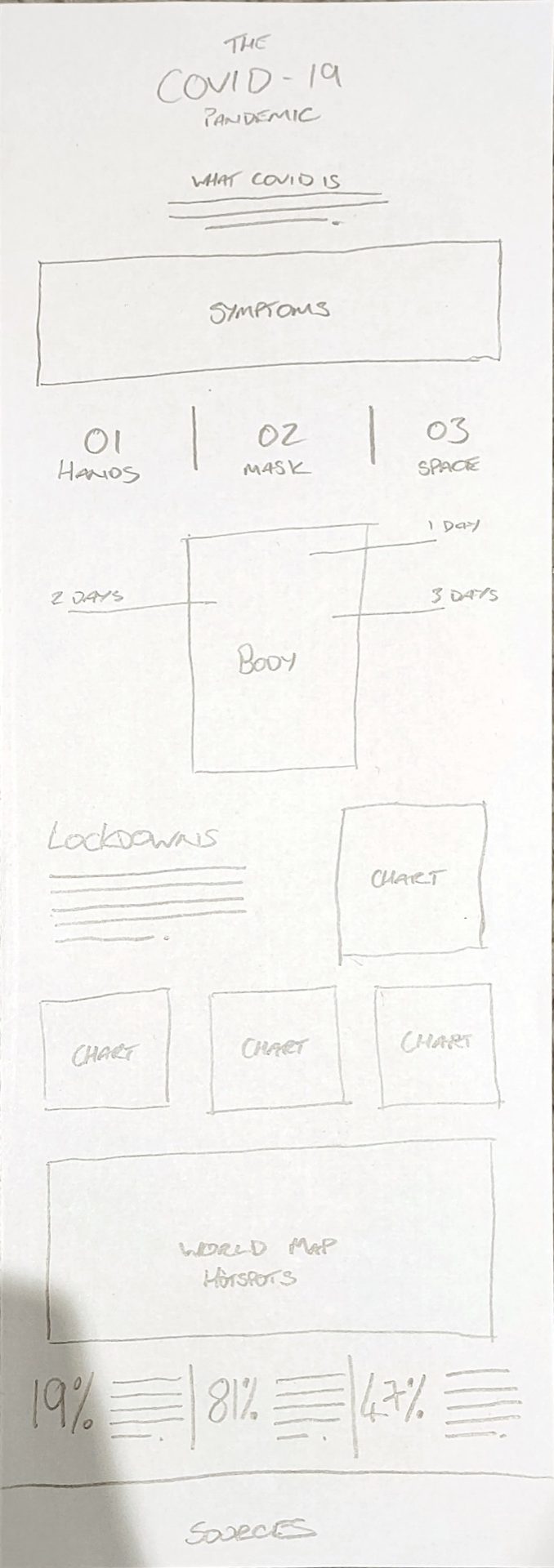
After creating various layout ideas and exploring different ways of displaying data visually I had a good idea of what I wanted to go for in this project, having already curated my content for my infographic I started to create a few layout ideas for the content. I initially created 3 wireframe ideas in order for me to see how the content and information could flow from section to section and what the best way of visualising the data was, after looking at these I decided to go with #3.
I have included my final wireframe idea below to demonstrate how my content research and idea generation helped me build the layout for my infographic.


Final Design
After considering my initial sketches and wireframe ideas I began to take the research and data I had collect and start creating the layout for my infographic design. I wanted to incorporate the colour palette I had chosen for this project in order to represent the medical theme I went for, I’m not sure if I will keep this colour palette as I am not a huge lover of the teal colour I am using but I will sit on this decision until after our group critique session on Week 12. I wanted to use stock SVG files and icon illustrations for this project, I found this quite challenging as stock imagery is often very hard to find in term of consistency with one another in addition to fitting the style of design you are creating. Overall I am happy with my final design so far, especially as this is my first infographic project, but I would really like some feedback from my classmates and lecturer to allow me to improve the design, I plan to make changes to this design after our group critique session on Friday the 15th of April (Week 12).
I have included an image of the first version of my infographic design, I will be revisiting this to make alterations after we have our group critique session on Week 12 of the module.

Revisions & Final Design Submission
After receiving some feedback on my design in our group critique session on Week 12 I wanted to revisit my design to make some changes considering the feedback and comments I had received from my lecturer and classmates. Overall I got a positive response to my initial design but some ideas were given, some of which I hadn’t noticed. Paul had mentioned about the title being bigger on the landing page section so I decided to increase the size of the typography and play around with some different type placements, he also mentioned about entering the headings in the cases & deaths section as he found these hard to pair with each other so I considered his feedback and made changes based upon what I thought worked for the design. One of my classmates pointed out that I should change Australia to Oceania to fit with the theme of continents as Australia is a country so I changed this throughout the maps and keys in the cases and death data visualisations. Another comment was to break up the large bodies of text into more manageable pieces of content as some of them are lengthy and become hard to read, I still wanted my infographic to be informative with assistance from the visuals but I did agree with this so I decided to create some paragraph texts throughout the larger bodies of text.
I have included an image of my final infographic design below, I will also include a download link for a PDF version on my submission blog post for IXD104 – Image & Data Visualisation.
