Research & Idea Generation
Initial Idea Generation
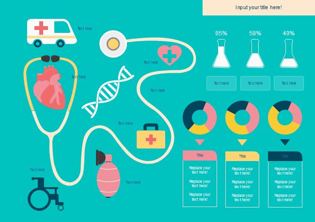
As I want to base my infographic on the recent coronavirus pandemic as a whole that is almost like an overview of the whole pandemic across the world I need to come up with a few ideas that I can include in order to allow me to narrow down my research. I know I want to include information about the symptoms of COVID and what you should expect if you catch the virus, in addition I want to include the preventions of the virus which has been plastered all over the media over the past year or so. I also want to include basic information about the virus as the aim of my infographic is to be informative and display an overview of the information in a concise way, alongside this information that is commonly recognised I want to include more statistical data and information regarding lockdowns, deaths, case count and global impact from the virus.
I have include a list of ideas below to give you an idea on what I want to include in my infographic:
- Deaths
- Cases
- Symptoms
- Preventions
- Global Impact (Trade, Education, Business)
- COVID-19 Definiton
- Lockdowns
- Vaccinations
To further develop these ideas I wanted to think of some questions that I could include throughout my infographic and help me build my content around these ideas. From my initial research and planning I had a good idea of what I was aiming towards and what sort of topics I wanted to include to display data and information around the topic I had chosen so I started to create question ideas based around the topics I previously mentioned above.
I have included these questions below to give you an idea on what sort of information I was looking to include:
- What is COVID-19?
- What are the symptoms of COVID-19?
- How can your prevent the spread of COVID-19?
- How many deaths occurred from COVID-19? (Globally)
- How many deaths occurred from COVID-19? (Per Continent)
- How many deaths occurred from COVID-19? (UK Only)
- How long was the lockdowns in each country?
- What is a lockdown?
- How many cases were recorded? (Globally)
- How many cases were recorded? (UK Only)
- How many cases were recorded? (Per Continent)
- Comparison between cases in the UK & US
- How many people are vaccinated?
- How many people plan to not get the vaccine?
- How does COVID-19 affect the body?
- How long does it take to develop symptoms?
- Timeline of symptoms and what to expect
Once I had a rough idea on some questions I could base my infographic content on I could start to focus on beginning the research for the project and gathering data, as infographics focus on displaying information and data I need to ensure the information I collect is valid and correct. I plan to go a bit OTT on the research side of things to all me options when it comes to developing the design for my infographics, having more information than necessary will give me more creative options in terms of how I display the data. I plan to use Wolrdometer for some of my research as they are a trusted source for data and statistics, I also want to utilise websites like NHS and World Health Organisations in order to expands that data I collect.
Colour Considerations
Before I start to conduct some research into the data and information surrounding the coronavirus pandemic I wanted to consider what sort of colour theme I should use for this project, considering the topic I had chosen which was about health and disease I wanted to try and relate that to the colours I choose. I began to look into different designs that were based on medical or healthcare projects to see what sort of colour they used and I noticed a light blue or teal colour was commonly used alongside a light greyscale palette, the colour red was also commonly used as an accent colour within these design projects. While the projects varied in colour massively I wanted to take some of this inspiration and use it to help me decide on which colour I should use for my infographic.
I have included some examples of colour palettes that I would like to use for this project below.

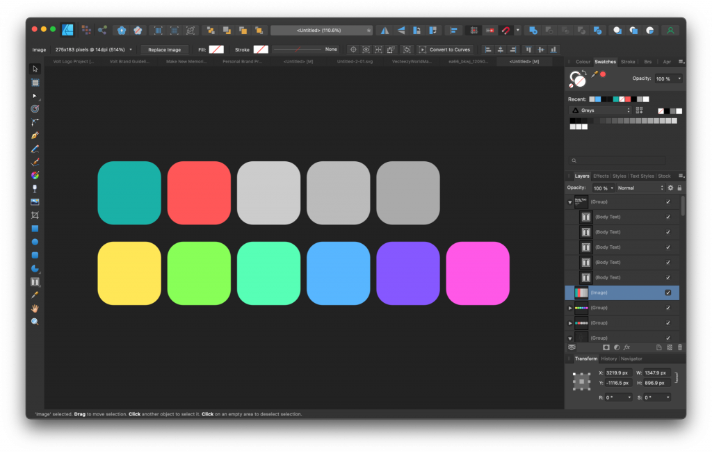
I decided to take some inspiration from a colour palette I had seen on Pinterest and bring those colours into colour-name.com to see what other palettes it creates in terms of complimentary, split-complimentary, analogous and various others. I decided to choose the rainbow palette that was created from the accent colour, I may change the primary colour and accent colour of this palette to a more playful colour as I want my charts to have this kind of vibe but for now I will work in greyscale and using this palette gives me a wide range of options to choose from.
I have included a screen shot of the colours I aim thinking of using for this project below.
Content Research
COVID-19 Defintion
COVID-19, otherwise known as coronavirus, is an infectious disease caused by the SARS-CoV-2 virus targeting the respiratory system of all age groups. Coronavirus has had a huge impact on the global economy, eduction, business and world trade over the past couple of years and is considered to be one of the deadliest diseases in the world.[1]
The first case of coronavirus originated in the Wuhan region of China and was first discovered by the World Health Organisation (WHO) on December 31 2019.[2]
Symptoms
Coronavirus is a cardiovascular illness that affects the respiratory system.[3]
Some of the common symptoms of coronavirus stated by the NHS in the UK include:[3]
- Fever/High Temperature
- A New/Continuous Cough
- Loss/Change in Taste or Smell
- Shortness of Breath
- Feeling Tired/Exhausted
- Aching Body
- Headache
- Sore Throat
- Blocked/Runny Nose
- Loss of Appetite
- Diarrhoea
- Physical Sickness
Symptoms will usually start to developed within 5-6 days of catching the virus, some cases have taken up to 14 days to start showing symptoms.[4]
People who have had the COVID-19 virus have said that it has cold or flu-like symptoms, with around 80% of cases being mild with no serious symptoms and about 20% of cases showing serious symptoms that require hospital treatment. Some symptoms like having a runny or block nose, sore throat and/or sneezing are less common and has only been seen in around 5% of cases.[5]
Serious symptoms have been more visible in patients who are vulnerable to the virus and more likely to catch it, these include people with pre-existing health conditions and the elderly.[5]
Symptom Timeline
As I want to create a timeline of what to expect if you catch coronavirus I needed to figure out the average days in which symptoms may occur and how long the virus may take to leave your system or cause fatal injury. As there is a huge difference in the data available and everyone will react to the virus differently it is hard to get exact results so I think getting the average would be the better idea. I found an article on Business Insider which described a brief timeline of what you could expect when catching the COVID-19 virus, this article also had sources and citations from trusted sources like the CDC and WHO.[10] With this overview I want to include some of the research I had completed on the symptoms of coronavirus as additional information and data to display on my infographic.
I have included a symptom progression timeline of the COVID-19 virus below, this information was collected from Business Insider:
- Day 2 – 14
- Initial Infection
- Develop Cough/Fever
- Develop Headaches, Loss of Taste or Smell, Body Aches & Fatigue
- Day 5
- Difficulty Breathing
- Day 7 – 11
- Hospitalisation
- Discharged After 1-2 Weeks
- Day 12
- ICU Admission
- Discharged After 4 Weeks
- Day 18
- Death
Prevention
Washing your hands and maintaining good hygiene is crucial to stopping the spread of coronavirus, wearing a mask over your mouth and nose will decrease the risk of catching or spreading the virus and maintaining social distance measure will reduce the risk even further.[9]
Vaccinations are another great way of preventing the risk of serious health problems from coronavirus in addition to receiving your booster dose of the vaccine each year for further protection from the virus.[8]
Extreme measures had to be taken at the start of the pandemic where governments had to go into nationwide lockdowns to attempt to stop the spread of the virus and reduce the amount of cases and deaths across the world.[8]
Vaccinations
11.4 Billion doses have been given worldwide.[11]
5,095,226,868 people have received their first dose of the vaccine globally.[11]
4,586,702,670 people have received both doses of the vaccine globally.[11]
1,709,611,779 people have received the booster dose of the vaccine globally.[11]
Vaccination Contest
-
- 1st Place – China (1.24 Billion Fully Vaccinated)
- 2nd Place – India (836 Million Fully Vaccinated)
- 3rd Place – USA (218 Million Fully Vaccinated)
Percentage Values
-
- 1st Dose Globally – 65.3%
- 2nd Dose Globally – 58.8%
- Booster Globally – 21.9%
Acceleration of a Digital Age
The COVID-19 pandemic took the world by storm causing business to shut down due to not having any traffic in their physical stores, this caused a huge increase in digital products across multiple industries like entertainment, retail, finance and banking.
When COVID-19 began to spread like wildfire across the world countries were forced into lockdown causing businesses to close their doors and workers being made redundant.
We began to see people begin to take profits from stocks with the Dow Jones Index dropping by 38.44%.[12]
Entertainment
Cineworld – 92.21% decrease from January 1st 2020 to January 1st 2022[12]
Netflix – 118.71% increase from January 1st 2020 to January 1st 2022[12]
Finance
US30 – 103.60% increase from January 1st 2020 to January 1st 2022[12]
Bitcoin – 1831.39% increase from January 1st 2020 to January 1st 2022[12]
Deaths & Cases
World Health Organisation Statistics
494,587,638 Confirmed Cases Globally[6]
6,170,283 Confirmed Deaths Globally[6]
Europe
Cases – 206,611,315[6]
Deaths – 1,954,583[6]
America
Cases – 151,241,852[6]
Deaths – 2,706,819[6]
South East Asia
Cases – 57,338,863[6]
Deaths – 780,442[6]
Western Pacific
Cases – 49,169,628[6]
Deaths – 216,107[6]
Eastern Mediterranean
Cases – 21,615,965[6]
Deaths – 341,127[6]
Africa
Cases – 8,609,251[6]
Deaths – 171,192[6]
Worldometer Statistics
498,672,083 Confirmed Cases Globally[7]
6,202,351 Confirmed Deaths Globally[7]
Europe
Cases – 183,717,670[7]
Deaths – 1,789,164[7]
North America
Cases – 97,040,668[7]
Deaths – 1,448,833[7]
Asia
Cases – 143,621,907[7]
Deaths – 1,410,995[7]
South America
Cases – 56,397,124[7]
Deaths – 1,290,561[7]
Africa
Cases – 11,792,858[7]
Deaths – 253,142[7]
Australia
Cases – 6,101,135[7]
Deaths – 9,641[7]
From the statistics above I wanted to figure out some percentage values to allow me to display this data in a different way, as these are big numbers I wanted to use a percentage calculator to ensure the values were correct. To get these values I used a website called calculator soup.com which allowed me selected the equation I needed to get the percentage I was looking for and then entering the values of each continent mentioned above, I found this tool extremely useful as it gave me decimal values on the percentages which will allow me to display more accurate data.
I chose to go with the information from there Worldometer website as opposed to the World Health Organisation as I found the data from the Worldometer site was more up-to-date and accurate in comparison, although I will be using the WHO website for collecting more information and data I don’t think I will be using it for this section of my infographic.
I have included these percentage values below based on confirmed cases and confirmed deaths from the COVID-19 pandemic:
Cases
-
- Europe – 36.84%
- North America – 19.46%
- Asia – 28.8%
- South America – 11.31%
- Africa – 2.36%
- Australia – 1.22%
Deaths
-
- Europe – 28.85%
- North America – 23.36%
- Asia – 22.75%
- South America – 20.81%
- Africa – 4.08%
- Australia – 0.16%
References & Sources
- Coronavirus . 2022. Coronavirus . [ONLINE] Available at: https://www.who.int/health-topics/coronavirus#tab=tab_1. [Accessed 10 April 2022].
- Coronavirus disease (COVID-19) . 2022. Coronavirus disease (COVID-19) . [ONLINE] Available at: https://www.who.int/news-room/questions-and-answers/item/coronavirus-disease-covid-19. [Accessed 10 April 2022].
- nhs.uk. 2022. Coronavirus (COVID-19) symptoms in adults – NHS. [ONLINE] Available at: https://www.nhs.uk/conditions/coronavirus-covid-19/symptoms/main-symptoms/. [Accessed 10 April 2022].
- Coronavirus . 2022. Coronavirus . [ONLINE] Available at: https://www.who.int/health-topics/coronavirus#tab=tab_3. [Accessed 10 April 2022].
- Coronavirus Symptoms (COVID-19) – Worldometer. 2022. Coronavirus Symptoms (COVID-19) – Worldometer. [ONLINE] Available at: https://www.worldometers.info/coronavirus/coronavirus-symptoms/. [Accessed 10 April 2022].
- WHO Coronavirus (COVID-19) Dashboard | WHO Coronavirus (COVID-19) Dashboard With Vaccination Data. 2022. WHO Coronavirus (COVID-19) Dashboard | WHO Coronavirus (COVID-19) Dashboard With Vaccination Data. [ONLINE] Available at: https://covid19.who.int. [Accessed 10 April 2022].
- COVID Live – Coronavirus Statistics – Worldometer. 2022. COVID Live – Coronavirus Statistics – Worldometer. [ONLINE] Available at: https://www.worldometers.info/coronavirus/. [Accessed 10 April 2022].
- Advice for the public . 2022. Advice for the public . [ONLINE] Available at: https://www.who.int/emergencies/diseases/novel-coronavirus-2019/advice-for-public. [Accessed 10 April 2022].
- GOV.UK. 2022. [Withdrawn] Face coverings: when to wear one, exemptions and what makes a good one – GOV.UK . [ONLINE] Available at: https://www.gov.uk/government/publications/face-coverings-when-to-wear-one-and-how-to-make-your-own. [Accessed 10 April 2022].
- Business Insider. 2022. Nine People Who Attended Trump’s Minnesota Rally Contracted COVID-19. [ONLINE] Available at: https://www.businessinsider.com/nine-people-attended-trumps-rally-in-minnesota-contracted-coronavirus-2020-10?r=US&IR=T. [Accessed 10 April 2022].
- Our World in Data. 2022. Coronavirus (COVID-19) Vaccinations – Our World in Data. [ONLINE] Available at: https://ourworldindata.org/covid-vaccinations?country=OWID_WRL. [Accessed 10 April 2022].
- TradingView. 2022. TradingView – Track All Markets. [ONLINE] Available at: https://www.tradingview.com. [Accessed 10 April 2022].