Re-Designing My Logomark
After evaluating my initial logo design for my personal brand and starting to come up with a few different layout ideas for my brand guidelines using the logomark I had created. I noticed that the logo lost a lot of its definition when it was displayed at a smaller size, when displayed at a larger size the logo looked great but as I will be using this logo at smaller sizes throughout my portfolio website I need it to stand out and be noticeable as a logo.

Responsive Logo Considerations
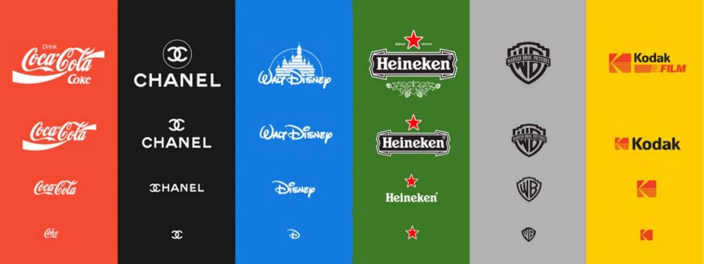
This gave me this idea to create a responsive logo set that could be used throughout the brand depending on what size the output is, I have noticed a lot of big named brands start to incorporate this into their brand identity recently and it could be down to the fact that our world is becoming more digital by the day in addition to our devices and screen sizes getting smaller and smaller on every product release. Having a logo that can adapt and work in all situations would be perfect but I still need my brand to be recognised through the logomark. I noticed that the brands using responsive logos usually have a pre-defined brand identity with a good connection with its audience to allow them to still be recognised through smaller variations or certain elements on the logo, one brand that does this extremely well in my opinion is Disney where we recognise the brand through their castle logo but when the identity is distilled down to just the letter D in Disney we can still establish the connection and associate that product with Disney. Although I have not yet established that same recognition for my personal brand it can help me figure out how my brand identity can be displayed in various ways depending on the product output.
I have included an example of a responsive logo design below to give you an example on what this would look like.

Logo Re-Design
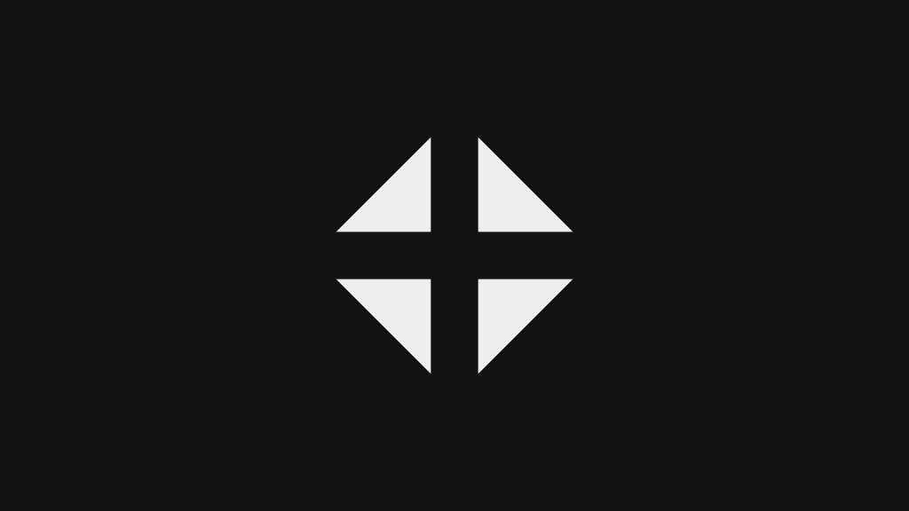
After considering how the logo was displayed at smaller sizes and how it lost definition I wanted to re-design my personal brand logo into something that was more visible at smaller sizes but still worked with the minimalistic characteristic I was trying to incorporate into my personal brand. When I was looking at the logo to see how it could be minimised into a smaller symbol or logomark I noticed that I had a few options to choose from without changing the logo drastically, as I had initially had the idea of specialising is 4 areas of design and brand development I thought about using the 4 triangles in the centre of the logo to represent this. One major consideration I had with this being the logomark for my personal brand was how I was going to present the brands name without using a wordmark or typography that states the brand name, as these are just 4 triangles it doesn’t exactly tell my audience too much about my personal brand.
I have included this design below to give you an idea on what I was going for when I was trying to minimise my logomark.

I decided against using this logomark for my brand identity as I feel like it would be hard to establish the brand name without presenting the brands name through typography, this consideration led me to create a designed based around the letter Z from the logo mark I had initially created. I felt like the letter Z would display the brands initials and still having a lot of influence from the minimalist research I had conducted prior to designing my logo, the more I looked that this logo design the more I loved how it looked and how it worked with the influence behind my personal brand. As my main issue with the logo was how it was displayed at smaller sizes I wanted to test out this logo variation and see if the result was better, when the logo was displayed at around 50 pixels it was still legible and didn’t lose any definition whereas the initial logo lost the majority of its definition and just looked like a white block.
Overall I am happy with how the re-design of the logomark for my personal brand came out and I feel like this is something I could develop a lot further as my design career continues, I feel like the simplicity of the logo really plays into how I want my personal brand to be perceived which is my main focus for my personal brand… Creating something that is minimal, simple and a foundation for further development, i.e. not overly cluttered from the get go.
I have included the re-design of my personal brand logo below.
