Colour & Colour Psychology
Colour Systems
Colour is an extremely important element when it comes to creating a successful brand and ensuring that these colours translate across each design system is crucial to achieve consistency throughout your brands products. There are a number of different colour systems that are available in modern design each serving their own purpose for different use cases, understanding each colour system is important to achieving consistency across multiple mediums like printed products, digital products and physical products. The most common example of this is the RGB colour system primarily being used for digital products that are displayed on a screen as this is how our monitors display colour through RGB LED lights, the CMYK colour system is often associated with printing and has less colour options available in comparison to the RGB colour system.[1]
The colours visible to the human eye is a lot bigger than the colours we have available in each individual colour system, RGB is the largest colour gamut available below what is visible to the naked eye, the CMYK colour system is the smallest colour gamut that is available and the Pantone colour gamut is almost like a middle-ground between the RGB and CMYK colour systems.[3]
I have included some more detail into each colour system below to explain what they’re used for and how they differ from each other.
CMYK
CMYK is a colour system that is commonly used for the full-colour printing purposes, this stands for Cyan, Magneta, Yellow and Black or the Key (K) colour. The CMYK colour system is a subtractive colour system which means that you need to remove certain amounts of ink ignorer to achieve a lighter colour, this is the opposite from the RGB colour system. The main issue with trying to match colours from the CMYK and RGB colour systems is that CMYK has a limited amount of colours to choose from in the gamut in comparison to the RGB colour system, ensuring brand colours translate across digital products and printed products is extremely important.[2]
I have included an example image of the CMYK colour system below.

RGB
RGB is a colour system that is commonly used for screens and digitals products such as mobile apps, websites, digital graphics and photography, this colour system is made up from the three primary colours Red, Green and Blue. The RGB colour system is an additive system which means screen starts off black and when all three colours are combined they create the colour White whereas CMYK starts on a white page and when all four colours are combined they create the colour Black. This colour system is possibly one of the most widely used colour systems today as we have a vast amount of technology that uses screens to interact with humans and display information. This colour system has the widest gamut available, other than the human eye, and has over 16 millions different colours to choose from.[2]
I have included an example of the RGB colour system below.

Hexadecimal (HEX)
Hexadecimal or HEX is an RGB colour system that is commonly used for websites and digital applications as it allows the developer to use shorthand RGB values to compile the stylesheet code. The RGB colour system is based on values of 0-255, each combination of numbers creating a different colour all together, the HEX system converts the values from the Red, Green and Blue colours into pairs of letters or numbers which often starts with a hashtag to define that it is a Hexadecimal value. These HEX values will usually be displayed as #FFFFFF which is the colour White and #000000 which is the colour Black, these can also contain numbers and letters together like #01F4DE.[2]
I have included an example of HEX values below to demonstrate this further.

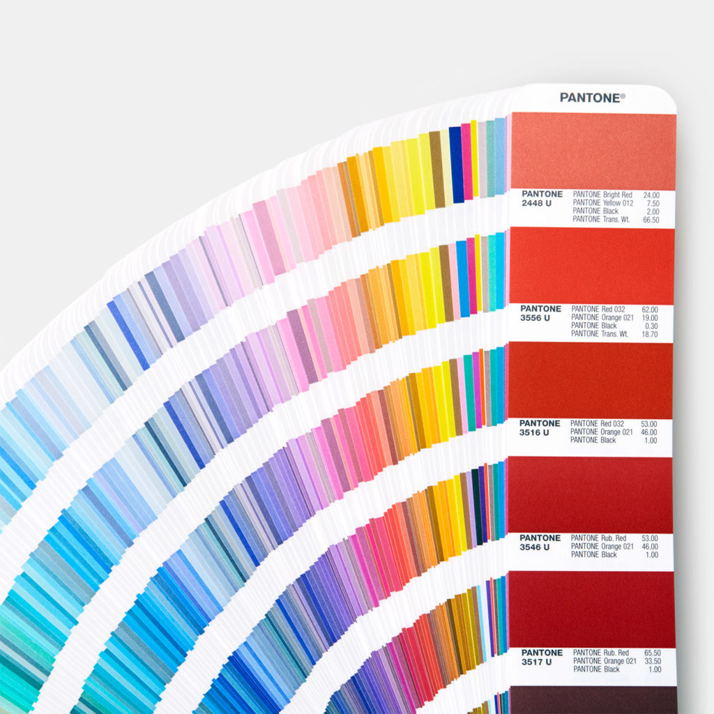
Pantone
The Pantone Matching System (PMS) is a universal colour matching system that is primarily used for calibration and matchings colours for print, although the Pantone colour system is used for print it is different from the CMYK colour palette and has more colour options available than the CMYK colour system. Pantone colours are often referred to as flat colours or spot colours which consist of 15 different colour pigments including black and white, these pigments make up almost 2,000 different colours within the Pantone gamut. The Pantone Matching System is crucial for branding as it allows for refined consistency across all products both print and digital allowing distributors to choose the correct colour based on colours within the Pantone colour system.[2]
I have included an example of the Pantone colour system below.
RAL
The RAL colour system is primarily used for colouring physical products that have a matte, glossed and metallic surface, these are colours that can be created for powder coating these sorts of materials and are often used as a reference for coatings, varnishes and plastic colourings for product design. This colour system is not widely used in the graphic design industry but it can be useful for branding if you are creating physical products that require a lick of paint or a powder coat, this system would commonly be used in industries like automotive painting where they powder coat the body of the car to change its appearance in addition to other industrial products and machinery.[1]
I have included an example of the RAL colour system below.

Colour Combinations & Colour Palettes
Monochromatic
Monochromatic colour palettes are made up from one single colour, commonly referred to as a hue and introduces black and white values to create different shades, tones and tints of the same colour. The most common example of this would be of a black and white photograph where the image is made up from shades of black based on lighting, although these can be considered as plain and boring this does make monochromatic colour palettes perfect for replicating lighting and adding realism to digital work.[4] A good example of this is how developers replicate shadows and highlights on buttons to simulate movement and depth when the user interacts with that component. Another example of monochromatic colour palettes being used is in charts and graphs, I see this almost every single day when I open up my Coinbase app to check how my investments are doing.
I have included an example of a monochromatic colour palette below.

Analogous
An analogous colour palette is a collection of colours that sit next to each other on the colour wheel, this is usually a primary colour choice with a colour on both the left and right side. These colours can vary in shades and tints but will often have very little difference between, this creates very low contrast between each colour and makes these palettes appear a lot softer and calming to the user. These colour palettes are often used for certain graphical elements like pie charts and bar charts in addition to other forms of graphic design like infographics.[5]
I have included an example of an analogous colour palette below.

Complementary
Complementary colour palettes usually consist of two or more colours that sit opposite or nearly opposite each other on the colour wheel, these colour palettes are usually very high in contrast and should be used very carefully as they can become extremely confusing when it comes to building a brand. Complementary colours are perfect for creating accent colours for your brand which can be used in digital products and ui elements like buttons and call-to-actions, the contrast between the accent colour and the main brand colour would highlight key information and draw the users attention. The most recognisable example of complimentary colours is Red and Green which we often associate with the idea of Christmas and the festive holidays.[6]
I have included an example of a complimentary colour palette below.

Triadic
Triadic colour palettes consist of three or more colours that are usually based on the points of an equilateral triangle around the colour wheel, these colour palettes are usually extremely high in contrast so should be used carefully when it comes to branding. This colour combination would be great for defining categories and sub-categories within a brand like sister companies or chapters within a booklet for example. One of the most recognisable examples of a triadic colour scheme is the basic primary colours Red, Green and Blue (RGB) where they are all equally spaced around the colour wheel, these colours are then mixed to create secondary colours which is also another triadic colour palette.[6]
I have included an example of a triadic colour palette below.

Tools for Colour Combinations
There are a number of tools to help us generate colour palettes and automatically translate those colours into other colour systems and colour values, these tools are extremely handy when it comes to developing and building a brand as it allows you to create your brands colour system and guidelines with the help of digital software. I have explored some of these tools like Adobe Colour and Coolors in the past, either creating my own colour palettes, extracting colour palettes from images or experimenting with colour combinations and contrasting colours, and found them extremely useful and easy to use. Coolors is possibly one of my favourite tools for colour as it creates create colour palettes and colour combinations that help create inspiration for projects.
I have included some links to these tools below as a reference for future projects.
Colour Psychology
Colour psychology is the study of how colour have an affect on how we interact with brands, make our purchasing decisions and build relationships with brands across the world, as humans we subconsciously associate certain colours with a specific message or meaning dependant on how we have been brought up, our generational differences and our cultural differences. Colour can have a massive impact on how your brand is viewed by its target audience, each colour has its own individual meaning and this can be completely different in other countries which makes it extremely important to consider what sort of colours are being used throughout your brand identity. Certain colours can also evoke certain emotions within the viewer and deliver a specific meaning or message without the use of words, a good example of this is in road signs within the UK where we recognise any red sign as a sign of danger, yellow signs as a sign of warning and blue signs as being informative, this may be different when it comes to branding as you’ll be trying to communicate your brands personality.[7]
I have included some examples of what some of these colours may represent below as a rough set of guidelines for future projects.
- Red – The colour red is often associated with the colour of blood, danger, war and power across western civilisations, in the UK we recognise the colour red as being dangerous or hazardous and something to be cautious of. Red can also be associated with being energetic and active.
- Orange – The colour orange is a blend between the colour red and the colour yellow, it is often associated with being energetic and lively but it also takes the joy and happiness from the colour yellow, we also connect the colour orange with being quite warm and tropical.
- Yellow – The colour yellow is often associated with joy and happiness within western civilisations and is often seen as a colour of fun and optimism, this colour can also represent warning and danger where, in the UK, we recognise yellow road signs as a warning message.
- Green – The colour green is often associated with health and growth where we see a lot of environmental brands using the colour green to help portray their image of being healthy and aiming for a greener planet. We could also associate the colour green with money and finance in western civilisation, especially in the United States of America.
- Blue – We often associate the colour blue with being harmonious and stable when it comes to branding and this is possibly the most commonly used colour in brand identity and logo design. We often recognise the colour blue as being loyal and and trustworthy which is why the colour blue is commonly used for bank brands and financial institutions as they want to gain their customers trust.
- Purple – The colour purple is often associated with royalty and luxury where it is recognised as a deep, rich colour for branding, in western countries we often connect the colour purple with spirituality, fantasy and wisdom. The colour purple can also portray a sense of ambition and aiming for the future where we associate it with being quite a futuristic colour.
- White – The colour white is often associated with purity and light, in western civilisations it is usually seen as a colour of birth and new beginnings where it is commonly used for new born babies and weddings as a symbol of new life. This is one of the most difficult colours to translate across different cultures as is means the opposite in eastern civilisations like Asia.
- Black – The colour black is often associated with death, evil and mystery, and good example of this is in western civilisations the colour black is worn at funerals as a symbol of death and mourning. We often associate the colour black with mystery and the unknown but, just like the colour white, this can mean the opposite in other cultures.
Different Cultural Meanings
Colours can evoke a variety of emotions and feelings as well as having multiple meanings, this becomes an obstacle when it comes to branding as you don’t want to convey to the wrong message to your audience. These cultural meanings of colour can vary from Western, Eastern, European, Indian and Middle-Eastern cultures and while some of them mean the same as other a lot of them mean the complete opposite. This would make it difficult if you are developing an international brand that aims to sell their products globally, although this can be an issue its not overly important as colour is ultimately subjective to the viewer and how they perceive a specific colour. A good example of how colours can portray a different meaning across different cultures is in Indian cultures the colour yellow is associated with being holy and sacred where they use the colour gold for religious purposes but in European and Western cultures the colour yellow is usually considered as a single of danger, caution or warning to the viewer. Another example is the colour white being associated with purity and life in Western and European culture but it recognised as the colour of death in Far Eastern cultures like China where they wear white are funerals as symbol of mourning as opposed to the colour black.
Brand Guidelines
Brand guidelines are a set of rules and guidelines that define and explain how a brand presents themselves to their audience through various design elements like colour, typography, photography and even through the way they talk and communicate with their audience. Brand guidelines are an extremely useful tool when it comes to branding as it allows for consistency across the brand and its products covering every little details to how the brand wants to be seen, these can also come in handy when a brand is sourcing work externally where the freelance designer can use the brand guidelines to match the personality of their design to that specific brand.[8]

There are a variety of elements that could be included in a set of brand guidelines like the brands story or mission statement, their tone of voice, how their logo should be presented, what colours, typography and iconography they’re using, layout restrictions and guidelines along with other graphics elements like photography illustration and motion graphics, all of these elements make up the look and feel of a brand and how it is portrayed to its audience.[8]
In have included a basic template for brand guidelines below as a reference for future projects.
- Story/Mission Statement
- Tone Of Voice
- Logo/Monogram/Visual Marque
- Typography
- Colour
- Layout/Hierarchy/Sizing/Structure
- Iconography
- Illustration
- Motion
- Photography
Style Guides & Component Libraries
Style guides and component libraries are becoming increasingly popular since the rapid development and growth of technology, a style guide is a document that consists of various graphics elements and principles on how a design system should be used and any do’s or don’ts when it comes to creating a digital product for that specific brand. A style guide will often contain certain elements like typography, colour, iconography, sizing, spacing and basic user-interface components fo demonstration purposes, these will often contain small code snippets for developers and programmers to help them create a digital design system from code. A component library uses the style guide to create a series of user-interface components that are based on the rules of the brands style guide, these could include certain elements like carousels, image containers, buttons, accordion tabs, dropdown menus and navigations. These are commonly used to help designers and developers create a minimum viable product (MVP) of the their user-interface designs and allow designers to drag and drop components to build websites or applications.
Throuhgout our lecture we look at some commonly used style guides and component libraries that are used within the web and app development industry, these include The BBC design guidelines, Mail Chimp design guidelines and Google’s Material Design stystem along with other popular design systems and frameworks like Bootstrap and Tailwind.
I have included an example of a component library below.

References & Sources
- Color Systems: CMYK, PANTONE, RGB and RAL explained | Snowball. 2022. Color Systems: CMYK, PANTONE, RGB and RAL explained | Snowball. [ONLINE] Available at: https://snowball.digital/blog/color-systems-cmyk-pantone-rgb-and-ral-explained. [Accessed 22 February 2022].
- Dabner, D., Stewart, S., Zempol, E. and Vickress, A., 2017. Graphic Design School. Thames & Hudson.
- de Soto, D., 2014. Know Your Onions: Graphic Design. Laurence King Publishing.
- Wikipedia. 2022. Monochromatic color – Wikipedia. [ONLINE] Available at: https://en.wikipedia.org/wiki/Monochromatic_color. [Accessed 22 February 2022].
- Bethany Cartwright. 2022. Color Theory 101: A Complete Guide to Color Wheels & Color Schemes. [ONLINE] Available at: https://blog.hubspot.com/marketing/color-theory-design#seven. [Accessed 22 February 2022].
- Lupton, E. and Cole, J., 2015. Graphic Design: The New Basics. Princeton Architectural Press.
- Help Scout. 2022. Color Psychology in Marketing and Branding is All About Context. [ONLINE] Available at: https://www.helpscout.com/blog/psychology-of-color/. [Accessed 22 February 2022].
- Bynder. 2022. What are brand guidelines?. [ONLINE] Available at: https://www.bynder.com/en/glossary/brand-guidelines-definition/. [Accessed 22 February 2022].