Logomarks & Monograms
Practical Requirements
During our lecture we took a look at some practical requirements for different logos from the Marks of Excellence book, there are a number of different kinds of excellence when it comes to logo design which include; uniqueness; value; attention; description; association; tone; quality; reputation; discretion; repetition and recognition. These kinds of excellence in logo design help define the brands that we use today like Apple, Facebook, Twitter, MasterCard and Visa along with hundreds of other brand and companies in a variety of different industries.
- Uniqueness
- Value
- Attention/Holding Power
- Description
- Association
- Tone of Voice
- Graphic Excellence (Quality)
- Reputation
- Discretion
- Repetition & Recognition
I have explored a handful of these below to give me some insight into incorporating these kinds of excellence in my own logo design.
Simplicity
Is the mark simple in its concept and therefore easy to understand?
Simplicity is extremely important when it comes to logo design for a number of reasons, the first reason is when the logo will be scaled in size it may not have there same impact if it has too much detail in comparison to when its displayed at a larger size, the second reason is that it is easy to understand and communicates the brand identity to the audience. Simplicity can be seen in hundreds of logos from brands and products that we use on a daily basis, Apple’s logo is extremely simplistic but communicates the brand really well and is also memorable and recognisable.
Attention/Holding Power
Does the mark draw you in and hold attention momentarily?
Holding power is important when it comes to logo design especially in the modern day as there is so much competition when it comes to business, if a brands logo is able to stand out when placed next to other logos and be the first to be recognised then the logo and brand have been successful in creating that brands identity. An example of this would be the way McDonalds have created their brand logo, although we recognise the brand by the arched M we also associate the brand with red and yellow colours, if you was presented with arched lines and the colours red and yellow you would associate that with the McDonald brand.
Application
Can the mark be used in all desirable applications?
Does the mark work at smaller sizes?
Application is extremely important when it comes to logo design as the logo is going to be displayed on a variety of products, all at different sizes. An example of this would be having the logo displayed on a website at 64×64 pixels and then having the logo displayed on a billboard, these will be displayed an different sizes but they both still need to do their job at communicating the brand and what it stands for. This would also link in with simplicity as if the logo is too detailed it may not represent the brand in the correct way as opposed to when its displayed at a larger size.
Competition
Does the mark distinguish itself from other marks?
Competition is important as there are so many brands and companies fighting for attention these days whether that be in fashion, business, hospitality or design, the logo needs to stand out from other brand logos and brand identities. If a logomark has this kind of excellence it is usually the first brand that comes to mind when someone mentions something related to the company.
Tone
Is the “feel” of the mark inline with the “product”?
Tone of voice is important when it comes to logo design as the logomark needs to represent what the brand is about, either their product or their brand values. A good example of this would be how Nike have designed their logo to portray a sense of direction and movement which falls inline with what their brand is about and what products they offer to their audience, which is sports, running and activewear. If your logo does not represent the brand correctly your audience will have a hard time connecting your logo to your brand.
Fashionability/Timelessness
Is the mark contemporary?
Will it lose relevance over time?
Fashionability is extremely important in the modern world as we have an abundance of devices and products in which logos can be displayed on, this will continue to evolve over the years as we start exploring into Web 3.0, NFT’s, DeFi and DApps. The logo still needs to be recognisable 20 years down the line, while some brands and companies rebrand and redesign their logos they often keep it extremely similar to what they had previously so they don’t destroy the brands recognition, brands will often just modernise their logos as we have a lot more technological advancements over the past few decades which allow us access to a variety of tools and software.
Design Programme
A design programme is almost like a part or section of the brand guidelines, this could also be referred to as a logo suite for the brand. A design programme will usually consist of the brands name, a symbol, the brand colours and typography, along with an extra, decorative element. These elements should all work in harmony with each other to help define the brands identity and allows the brand to communicate to their audience who it is, how it is and how they want to be seen. Creating a design programme is extremely important as it allows for some form of consistency throughout the brands logo in addition to giving multiple options and variations on different logo designs, a good example this is how Disney have scale their logo down into 3 different variation.
I have included some basic design programme contents below to give you a foundation for building your own logo design programme.
- Name Mark – The brands name displayed in a special way
- Symbol – A picture mark or decorative abbreviation
- Colours – Selected brand colours
- Type – Selected typeface(s)
- Fifth Element – An extra, decorative element
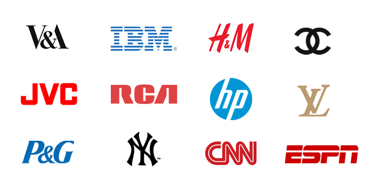
Monograms/Letterforms
A monogram is a mark that is usually made from combining 2 or more letterforms together to display that brands name or initials, this type of logo is often used for companies that have a longer name than other brands in addition to personal brands where the individual may use a monogram to display the initials of their name or personal brand. The first sightings of monograms and letterform logos date back to 350 BC where the Ancient Greeks and the Romans used to imprint the monogram of the city or leader onto their coins, one of the most recognised monograms in history is the monogram of Albrecht Durer which was created in 1562 ad displayed his initials ‘AD’ in a creative manner.[1]


These early renditions of monogram logos have inspired many other brands and companies to follow suit with some of the most popular brands in the world today having a monogram as their companies brand identity, these logomarks are common for fashion brands and clothing designers as these brands are often named after the designer who created them. A good example of this is the brand Yves Saint Laurent where they use the initials YSL to create the brands monogram logo. Some other popular companies that utilise a monogram as their brand mark are companies like Gucci, Louis Vuitton, New York, Chanel and Volkswagen, these are all brands that we see or use of a daily basis and are all instantly recognised by its audience.[1]
Geometry In Logo Design
Geometry is widely used in logo design as it allows for the most simplistic form of communication and allows the audience to connect with the brands identity. The IBM monogram designed by Paul Rand, the creator of the Futura typeface, used geometry and typography to create the monogram that we identify IBM as today, the logo consists of equally spaced bars overlaid on the companies initials ‘IBM’.[1]
“You can’t criticise geometry. It’s never wrong.”
– Paul Rand
A lot of brands and companies are rebranding and redesigning their logos to have a more geometric ‘feel’ to them, one of the most obvious companies that did this was the computer and technology brand HP where they decided to simplify their monogram logo from the initial HP to just a dash, the company reduced the logo to just the stem of the letter ‘H’ which has more of a geometric feel to it as opposed to their old logo with the HP in a circle. There are a number of reasons why brands and companies may want to target a more geometric appearance of their brand, the first that comes to mind is the fact that the world is becoming increasingly more digital by the day and we are spending more of our time on screens and applications, geometry would help with the display of logos on these electronic devices and would allow for pixel-perfect design. Another reason could be that we are developing into a more modern form of design where geometry is the foundation of design.
Golden Ratio In Logo Design
The golden ratio is commonly used in logo design as it allows the designer to achieve harmony and balance within the design, this also allows the logo be translated into multiple sizes as the golden ratio is based on the divine proportions and is commonly linked to the design of real-world objects. A good example of the golden ratio being used in logo design can been seen in the infamous Apple logo where they have used a series of circle based on the golden ratio to create their brands identity, although these are just guidelines to creating a well-balanced logo these guidelines can be broken in order for the designer to achieve optical balance. A good example of this can be seen in the Google ‘G’ logo where the designer has offset the G slightly which gives the letterform the appearance of a G as opposed to a circle.
Case Study – Luton Airport Rebrand
London Luton Airport Re-Brand Video
During our lecture we watched a video on the Luton Airport rebrand, I found it extremely interesting to see how such a large brand went about redesigning the face of the company without having a detrimental effect on the brand itself. When watching the video I noticed that they had based their designs on grid systems and modular design using cells and basic geometric shapes like squares, this made me think of the case study I had done on Off-White during Week 3 of our branding module where their brand was heavily based on deconstructivism and grid-based design. I also noticed that they rotated the typography in some design ideas they created, this was interesting as it gave the impression of an airplane taking off which works extremely well with what the brand is providing to its audience. Throughout the video what amazed me the most was the amount of ideas the design time had initially generated for the rebrand of London Luton Airport and how they had recreated the brand from scratch and gave it a much more modern aesthetic.
Case Study – Canadian National Logo
We also looked into the Canadian National logo which was designed by Allen Fleming in the 1960’s for the Canadian National Railway Company, one of my favourite quotes from Allen Fleming in the article I read was “it is designed with the future in mind.”, I found this inspiring as this was way ahead of their time back in the 1960’s.[2] The design is heavily based on a grid system which was heavily apparent in design throughout the 1950’s when the International Typographic Style was in full swing, this grid-based design helps the logo have a more geometric appearance which is commonly seen in brand identities that we see in the modern world.
“It is designed with the future in mind.”
– Allen Fleming
Allen Fleming said he initially sketched his idea on a napkin while he was travelling and further developed the design into what we see today, I noticed that due to the grid-based design that the logo had an extremely low stroke contrast and all the lines and spacing where equal. This is another technique that is commonly used in modern logo design where designer will often use the Golden Ratio to achieve the correct spacing to allow the logo to be well proportioned.
Visual Marque
Visuals are a key part of branding and designing a visual identity for a company as it allows the brand to stand out from the competition and be memorable through its design and how they have stylised themselves. As humans we process visual information 60,000 times faster than word which makes pictures, images and icons extremely important when it comes to branding and logo design, there are a variety of logo types to choose from like monograms, pictorial logos, mascots, abstract logos, combination marks and many others. It is more likely that we will remember an images or an icon as opposed to the actual word which is why brands opt for these type of graphic visuals as it allows the brand to be easily remembered by its audience.
Humans process visual information 60,000 times faster than words.
Although brands choose to use pictorial style logos and icons for their brand identity it doesn’t necessarily have to relate to the product of the brand. A good example of this is the computer and technology company Apple, while their products are primarily technology based like computers, tablets, phones and accessories for tech their logo is just an illustrated apple icon. There are a couple of reasons why this decoupling is beneficial to the brand, the first reason is that it allows the brand to be easily recognised and remembered as we are more likely to remember something abstract as opposed to a literal depiction of an object which allows the brand to stand out from its competition. The second reason is for legal purposes a literal image may be harder to own and copyright, this is crucial when it comes to developing your brand and building a product line and/or reputation.
We briefly looked at some different types of logos in our previous lectures but I wanted to explore a few which I would be interested in developing in my bank brand project, I have included this research below.
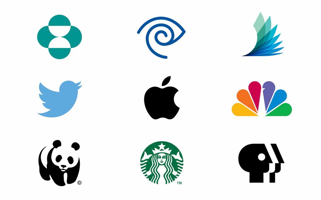
Pictorial Logo
Pictorial logos are a graphic-based icon style logo that is often referred to as a brand mark or logo symbol, some of the most popular brands that we see today use a pictorial logo throughout their branding in brands like Apple, Twitter and Google. While these brands are recognised by their logo symbol alone it might be harder for new, emerging brands to get the same recognition from their audience, this is where it would be beneficial to use a combination mark of the logotype and the pictorial logo. As mentioned previously, the symbol doesn’t have to relate to the brands product but this is ultimately up to the brand and the designer as they need to decide if the mark relates to the brand name or the brands product. An example of this would be Windows and Apple where they have chosen to relate the symbol the the name of the brand as opposed to the products they offer. On the other hand, you could relate it to the product and what the product as to offer, a good example from the article I read was Snapchat where they used the iconic ghost symbol which has relevance to there feature of disappearing messages and images.[3]
This logo type is something I will be exploring when it comes to designing my modern banking logo in addition to combination marks which falls inline with my idea of combining my icon and typography through the use of negative space.
I have included some examples of modern pictorial logos below to illustrate this style of logo design and brand identity.
Abstract Logo
Abstract logos are a form of pictorial logos but are a more abstract form of the brands logo mark, these marks usually have no relation to the brands name or product but the main benefit of an abstract logo mark is that it allows the brand to be unique in its logo design and visual identity. This type of logo is usually based around geometric shapes which can be seen in logos from brands like Adidas and BP.[3]
I will look into creating an abstract mark for my banking brand but this logo type isn’t at the top of my list when it comes to creating my logo as I already have a good idea of what I want to achieve with this project, that being said an abstract version of my logo mark could be developed when it comes to sketching my ideas for my logo.
I have included some examples of abstract logos below.

Combination Mark
Combination marks are another form of pictorial logo but often combine the brand name with the icon or symbol, this can either be in a creative way or a basic way. The main benefit to this type for logo is that it makes the brands identity extremely unique, a good example of this is in brands like Dorito and Burger King where they have combined the brands name along with an abstract version of their product to create a unique, memorable logo. This type of logo can also be simplistic which allows the brand to combine their logo symbol and typography to create a memorable version of their logo, a good example of this is the brand Rolex where their logo symbol is recognised on its own but having the symbol placed with the name of the brands allows for greater recognition from a wider audience, especially if people haven’t heard of Rolex watches before.[3]
I will definitely be exploring this type of logo for my project as it falls inline with the initials idea I had for my banking brand, while my logo will be a more modern version of a combination mark I don’t think ill be exploring the creative style of logo design that is seen in logos of Burger King and Dorito.
I have included some examples of combination marks below to illustrate this style of logo.

Pocket Profiles
Tim Boelaars
Tim Boelaars is a graphic designer, artist and illustrator based in Amsterdam, throughout his career his has built up a huge client list including some of the most well-known brands and companies today like Apple, Google, IBM, AirBnb, Pinterest and Forbes along with a collection of other reputable brands. His work is widely recognised through his use of geometric shapes, line art and vibrant colour palettes which can be seen throughout the vast amount of work he has created over the years.[4]
I have included some of Tim Boelaars work below to demonstrate his illustrative style using lines and geometric shapes.


Jeroen Van Eerden
Jereon van Eerden is a Dutch graphic designer and illustrator who is well-known for his work in brand identity and logo design, he has over 9 years experience and has worked with well over 150 companies across the world including Adobe, Google, Tinder and Disney, his work is often recognised by its clean, minimalistic aesthetic and his modern design style.[5] This minimalistic and modern design style originates from his use of geometric shapes to create abstract icons to be used as logo symbols.
I have included some of Jeroen Van Eerden’s work below.


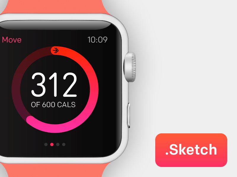
Fabio Basile
Fabio Basile is a product designer, graphic designer and illustrator based in Manchester, England. His portfolio mainly consists of user-interface designs alongside some illustration and icon design work, I noticed that his UI design projects had a variety of devices including web, mobile, and smart-watch interfaces, I was also inspired by his use of kinetic typography and 3D effects on some of his designs as I really like that brutalist style of design.[6]
I have included some of Fabio Basile’s work below.

Ivan Bobrov
Ivan Bobrov is a graphic designer, artist and illustrator based in Russia, he is widely recognised for his work in branding and logo design and is often recognised through the use of basic shapes, vibrant colours and its abstract appearance. While I was looking at some of Ivan Bobrov’s work I noticed that he creates a lot of abstract illustrations and icons of animals, I think its extremely interesting how he maintains the realism but makes the design more modern while still being recognised.[7]
I have included some of Ivan Bobrov’s work below.


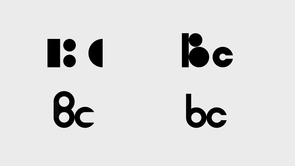
Task – Creating A Monogram With Basic Shapes
During our lecture we were asked to create a simple monogram logo of our initials but we were only allowed to use basic shapes like squares, circles and triangles. As my initials are BC I was mainly looking to use circles as those letterforms are rounded as opposed to having sharp, straight edges, I wanted to create a few different ideas to allow me to experiment with what I can create using basic geometric shapes. I have recently bought a pair of Beats headphones and I was inspired by their logo to create the B in my initial, this was simple enough to create using a black circle, a white circle and a rectangle. Another piece of inspiration I got for the letter C was from Coinbase as this is an application I use religiously on a daily basis, the way they have created their monogram is similar to how I created the B so I wanted to merge the two. The final version is by far my favourite and I think its the cleanest out of the four results.
I have included an image below to demonstrate some of my ideas and how I approached this task.
Task – Creating An Animal Icon With Basic Shapes
We were asked to create an animal icon using basic geometric shapes like squares, triangles and circles, for this task I wanted to take the opportunity to explore the use of the golden ratio and using the Fibonacci sequence to create my illustration. When I was designing my illustration I wanted to keep it as simplistic as possible without including too much detail, I found this task quite challenging overall as illustration is not exactly my strong point when it comes to design but it was good to explore different avenues and get out of my comfort zone a bit more.
I have included my foot illustration below to demonstrate how I used geometric shapes to create other shapes to build up the image.

References & Sources
- Design & Illustration Envato Tuts+. 2022. What Is a Monogram? Types, Designs, and Ideas. [ONLINE] Available at: https://design.tutsplus.com/articles/what-is-a-monogram-types-designs-and-ideas–cms-35023. [Accessed 15 February 2022].
- Creative Review. 2022. Allan Fleming Canada National logo design – Creative Review. [ONLINE] Available at: https://www.creativereview.co.uk/allan-fleming-logo-design-canadian-national/. [Accessed 15 February 2022].
- 99designs. 2022. The 7 Types of Logos And How to Use Them – 99designs. [ONLINE] Available at: https://99designs.co.uk/blog/tips/types-of-logos/. [Accessed 15 February 2022].
- Tim Boelaars. 2022. Tim Boelaars. [ONLINE] Available at: https://timboelaars.com/About. [Accessed 15 February 2022].
- About – Jeroen van Eerden. 2022. About – Jeroen van Eerden. [ONLINE] Available at: https://jeroenvaneerden.nl/pages/about. [Accessed 15 February 2022].
- Dribbble. 2022. Dribbble – Discover the World’s Top Designers & Creative Professionals. [ONLINE] Available at: https://dribbble.com/fffabs/about. [Accessed 15 February 2022].
- IB. 2022. About — IB. [ONLINE] Available at: http://www.ivanbobrov.com/about. [Accessed 15 February 2022].