This week we focused on composition and perspective.
Composition is the artistic arrangement of the parts of a picture or piece of art. An artist can decide on how they are setting up their shot. All the elements of the photo or the artwork could be in the center of can be within the thirds of the frame. When an artist places the focus of the shot in one of the thirds of the canvas this is known as the rule of thirds.
Perspective: “the art of representing three-dimensional objects on a two-dimensional surface so as to give the right impression of their height, width, depth, and position in relation to each other.”
The rule of thirds: “The rule of thirds in photography is a guideline that places the subject in the left or right third of an image, leaving the other two thirds more open. It divides a photo into nine equal parts, split by two equally spaced horizontal and vertical lines.”
The rule of thirds in used the most in art as it is considered too simple and boring to have the focus of your piece in the middle of the screen. This is due to the fact that your eye cant wander in any way. For example if you place your focus on the bottom left of your canvas but have background details above it leading to the right of the canvas. This causes your eye to naturally wonder around the canvas. This in a way makes the audience more interested in what you are showing them.
Here are some examples of photos that I took using the rule of thirds.
I tried to Take photos that used the rule of thirds but also could act as reference for my world.


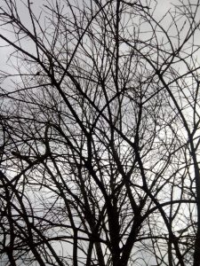

I took some photos with symmetry in mind, but also to use as reference when approaching my world.

The idea of the world that I am building is:
Demons live amongst humans but nobody knows, these monsters have tattoos that are capable of movement. The demons use mirrors in the bathrooms are convince stores to transport themselves back to their worlds. The convince store In hell is known for selling human emotions to the demons so that they can fit in with the humans. The convince stores also run a black-market on the side, where demons can buy human skins to disguise themselves as humans so that they can pass through the mirror and enter the human world.
The world would be mostly a darker colour scheme. Mainly reds and oranges being used for the demon world and blues and greys for the human world. In the demon world it would be lit by fire lamps and look run down in a way. As all the demons who can afford it move to the human world. Demon world seems to be in poverty. The human world would be slowly getting destroyed due to the negative impact of the demons. there would be earthquakes and wars due to the negative energy being given off by the demons.
One and Two point perspective:
I did 3 pieces to show the use of one and two point perspective in different animated series and/or TVshows. I got 3 animations that I enjoyed visually and also the backgrounds looked to be in a slightly different style from each other.
Here are the shots with the perspective lines that I drew on top of them.
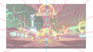
As you can see from this scene from “Rick and Morty”, it is an example of one point perspective. the lines coming from the center focus point of the image all match with the scene as then are being dispersed. As you can see the path that the character is walking on perfectly lines up with the perspective lines, as does the buildings on the two sides.
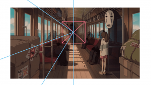
Next as you can see this is a scene from “Spirited Away”. This is another example of one point perspective. The vertical blue line dividing the image in half shows the perfect symmetry of the background scene ‘The train’. and as you can see the seats and windows of the train line up with the perspective lines yet again.

Finally this scene from “Into the spiderverse” shows an example of two point perspective. The blue horizontal line joins both vanishing points together which cuts the image perfectly in half. The two sets of perspective lines perfectly outline the train and the tracks in which it is on.
This was a very good exercise because although I already had previous knowledge of one and two point perspective it was good to look at how it was visible in animations that I have watch where I wasn’t on the look out for it before. I have learn that most scenes are made using two point perspective as well as major buildings or objects in a scene. One point perspective tends to make the layout of a scene look softer.
Continuing on into building my world I drew some thumbnails of the composition of the world.

As you can see I did some different versions of the same thumbnail. This was because I wanted to experiment and decide which I liked best. I decided to include them as I wanted to show my thought process through designing the world.
I took into account using the rule of thirds and also one and two point perspective where I could. I also used the photos I took as shown previously as reference while designing the world.


I started some character designs for the world that I am building, I focused the the characters demon personas rather than than human form for this assignment. I tested different ideas for characters and design style, as shown above.
I decided in order to properly shown the difference between the demons and the humans I wanted the demons to have very few if not none of human characteristics.
Finally I sourced some images from google and Pinterest to show some ideas for how the world will look. I wanted to source from real life therefore I looked at abandon buildings and caves for the demon inhabited world. I also want earth to look in a way run down due to the presence of the demons.


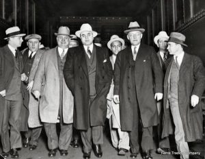
I also looked at some reference photos for mafia members, as I imagine the demons would take on this sort of role once in the human world.