
Before redesigning my CV and Cover Letter, I wanted to get some inspiration for the visual element.
In my most recent course we had the same task of creating a CV and Cover Letter, but looking at it a year later and with the tips we received from Daniel’s last lecture, I’ve realised that it doesn’t look very professional or mature. Yes, it shows my creative style but now I think it’s best to just leave the creativity in my portfolio and create a CV that is more appealing to an employer.


I wanted to look at other UX Designer’s CVs to get an idea for visual styles.
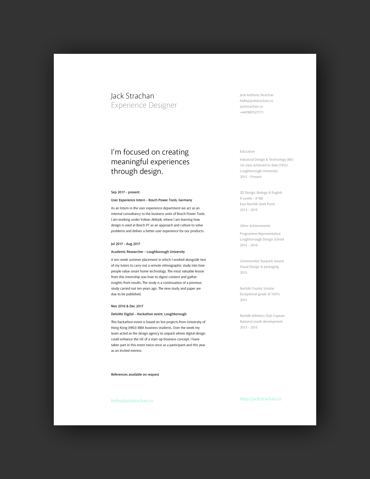
I really like the visual hierarchy of this CV – the font sizes for the different categories works really well and give it an easy-to-follow reading order. I like that the right side also has a lighter font colour to emphasise the left column first, and the pop of colour highlights the portfolio link effectively.

I think this CV also works quite well as the use of the Swiss International graphic style shows an awareness of design history and trends while still keeping a minimal effect.

I think the banner at the top left corner works well as it maintains a minimal colour palette but manages to make the contact details and portfolio link pop to ensure it isn’t missed.

I think the use of white space and layout in this CV is so effective and looks really professional.
When starting the design of my CV, I wanted to match the style to my new branding that I have created for my portfolio website, as I feel like brand continuity is really important in being remembered.


My new CV and Cover Letter


Updating my LinkedIn
Now that my new CV and Cover Letter has links to my social media accounts such as Instagram and LinkedIn, I thought now might be a good time to update my LinkedIn profile to show my more recent jobs and skillsets.
The first thing I wanted to update was my profile picture and header image so that it better represented who I am now, as opposed to an old picture. I wanted to have continuity visually between this and my portfolio website. So I used the picture of me from my ‘About Me’ page on my website, as well as the gradient used throughout my website for my header.


Before:

After:

I also updated my about section as before I described myself as a college student, whereas now I wanted to make it clear that I was looking for a placement role in case any potential employers came upon my profile. 
My featured link was my Starry Eyed Designs website which is more for illustrations and graphic work, so I wanted to add my portfolio website as it was more relevant.


Articles used: