
Poly Modelling
Following on from the style guide, my group received feedback to change our pipeline to use poly-modelling as we had simpler characters and wanted to get onto texturing as quick as we could. This allowed me to build on knowledge from last year and Mike sent us some tutorials on how to quickly set up a base with correct topology. I updated my style guide to fit this new workflow.

After learning about game optimisation from Rachel, I got my group to establish a standardised sizing, with it being 1x1x1m for a crate in game, which is one square on the grid system for Ben. I looked online for some research on the sizing of standard human characters online and found around 2M tall to be good practice (height of the default player actors in unreal). So for my human characters I’m going off a guide of fitting in the 1m wide by 2m tall grid.
I also largely referenced this low-poly model from Brawl stars, it has been triangulated but drawing over it helped me better track where the loops were going, and also fun to note is the lack of posable facial features that allows them to allocate tris elsewhere. I also referenced the matcap and UV checker to see how the model functioned in general, when making models for games vs animation.

I found Mike’s approach a lot easier than how I would’ve approached poly modelling the face before, as it starts you off with some base volumes while keeping the poly count low to be able to add on and adjust later, and this was what I was most concerned with when creating with poly-modelling. The body approach is also nice as now I have to try be really concise with my topology for the sake of preserving processing power and loading times when these characters are in-engine and this starts you with the correct loops and volumes. Roughly looking online I could stay under 10k triangles to keep things low-poly, with my reference models using around 7k tris- this is what I was aiming for.


My first attempt at Poly-modelling didn’t turn out so great, it got to the stage where I have to decide if I should continue wrestling it or give it a fresh new start and I ended up deciding to redo this but pay closer attention to my 2D concepts volumes after a day break. I decided to approach creating these by making the female base mesh with the correct topology and then duplicating and adjusting the volumes for the Male so that they were consistent. 
First Poly-Modelling Attempt
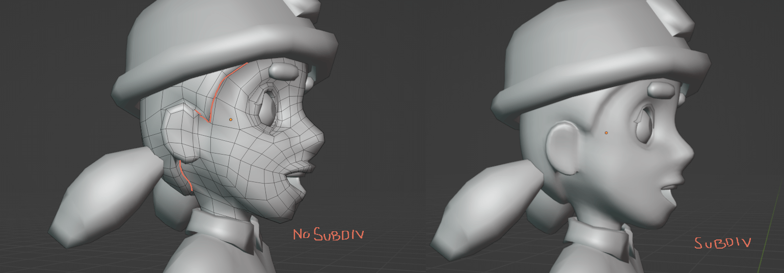
The second pass on this went a lot better, using the subdiv modifier was helpful for visualisation and I manually added and adjusted some loops to areas that needed it, I went ahead and pulled out the neck and the ears once I knew the head shape was looking right, the ears I had to redo as I had initially placed them too high for my style guides notes, then you can see how I am able to just duplicate this and broaden the jaw and square out the head to create the male version.

I found one of the hardest parts of this was trying to make a hand low poly but functional, last semester I had discovered more complex/functional topology, especially with the hand loops to help with more natural deformation, but my group wanted to do low poly and so this is a challenge in the opposite direction. I think this turned out ok, it ended up as around 400 tris, with the functional loops and wrist loops as well.

One area I ended up overcomplicating was approaching shoulder topology. I wasn’t happy with how it was going so I looked at some references and did experimentation before deciding to stick with my bendy straw topology as the models didn’t need to have the extra loops for maintaining that anatomy since they were simple and stylised. To check any topology movement/deformation I always check with a quick rig and animate some basic movements.
Extra Shoulder Topology References


I went around the model and reduced some of the unnecessary loops I found, as well as adding in some functional deformation loops on the elbows and knees. I was able to save on around 500 tris by attaching the base hair directly to the scalp and deleting those faces underneath, this will also give me a nice seam for my head unwrapping later. The only issue I ran into this was attaching around the ear, but I just attached the hair straight onto the shell instead of around it and I thought this worked well and didn’t create any weird faceting/overlaps on the model.
I also adjusted the eyelash planes to sit better with the face topology, having a cat-eye wing to separate the female and male versions.


For the torsos, I went and extracted out the collar shape, then duplicated the male and female shirt and inflated to create the Hi-Vis shape from my concepts and extracted out a thicker rounded collar. The hats were made from a subdivided cube and adjusted to fit the style guide.

I went ahead and put these onto the unreal project using GitHub, although this looked scary Ben, our programmer was able to explain how to easily use it. Importing a bone to make this asset a ‘Skeletal Mesh’ so that they could swap out the default unreal mannequin, It was pretty cool to see my models move around on screen even without any sort of rig.


With the basic models done, I then worked to add some crease topology. I went and gathered some more references (Blender’s Rain rig) on how to create movable topology for rigging as well as more cosmetic loops to retain shape in the sleeves, not wanting to add too much and up the tri count too high/overcomplicate the simple models. For this I just cut shapes into the mesh with the knife tool, making sure things stayed quaded.


I did also want some creases in the elbow bend but I was overthinking this a lot and Mike said to just use normal maps to achieve these creases, as they didn’t need to be functional.


With that, all the character modelled elements were done, landing around 7k tris! There are 8 varieties on NPCs, which should be enough to populate a level.
Unwrapping
Then I went and had a look at how to approach unwrapping for efficient texture space that would keep material loading time low. I found that using a combination of mirrored UVs and non-mirrored for asymmetric details was the common approach, making sure to pack all the islands together while letting some margins to avoid overlaps. As well as using 2K textures for scalability and an average textile density.


I was also able to find this blog capturing the development of a skin for a league of legends character, how they tested the texture and built up the model before landing on the final version. This is how I will approach my texturing- testing how it looks in Unreal before going back to Substance to adjust.
https://nexus.leagueoflegends.com/en-us/2018/01/battlecast-illaoi-modeling-and-texturing/
I also went and found how I could approach the swapping clothing approach that I was using to create variety on the NPCs. This guide goes really in-depth of the process they use to modularly create assets, how he lays out his UVs and seeing how he will approach texturing was interesting to me!
For optimisation reasons, as well as our time scope, I chose to make use of mirroring when unwrapping (elements like the jeans, sleeves, gloves etc), this will cut the texture time in half as well as get more resolution from my UVs. With our chosen camera angle I chose to have a more equal resolution over the models.

I did run into some really stretched areas when unwrapping that made it so I had to add on extra cuts, areas like the face, boots and hands, but we won’t get too close up to them so it should be ok. I also looked at that brawl stars reference on sketchfab to see their cuts. I unwrapped the Female and Male mesh at the same time to make sure the elements were of equal resolution, and tried to group things largely based on texture/colour.


I then went and unwrapped the hi-vis jackets and the helmet on a separate map, again making sure that it was the same resolution as the shirt unwraps. I did a test to see if I could texture/unwrap the helmet just once then set up a material instance to change the colour and this worked fine so I was able to save on time texturing and save on the draw call from loading more textures in game.


Art Tests in Game (Week 6)
One thing we were told was a the importance of getting our assets into game, getting them all together to see if they worked with each other and with the mechanics/style of the game that we were making. For this I went ahead and set up temporary rigs, wanting to build on my knowledge from last year and add elements like hip and foot roll controls so I researched how to achieve these. For these temporary rigs I used automatic weights.
https://blender.stackexchange.com/questions/254659/how-to-properly-rig-a-hip-control

Then I needed to know how to import this animation- Ben said he would set up the blueprints all for me so I just had to get them in engine correctly. I found this really helpful video and then just blocked out animations using the constant interpolation in Blender, (this is most similar to 2D animation for me, and 3D animation is something that I still have a lot to improve in). I made use of the action editor to store all the animation in one file, and allow me to make copies for adjustments and be able to have poses match up between animations. For our style we wanted to keep the animations quite cartoony.

At this stage I also set up a storyboard of how I thought our Grimm character would spawn into the level. I also was pretty active in assisting team members with their rigs/meshes/setting up the asset list/making note of feedback on discord (including putting Shane’s assets onto Github, and assisting him with some Blender Navigation/Modelling).

This was then implemented by Dahe, our level designer around week 9
Rigging/Animation
Setting up my final rig, we were given a tutorial on setting up foot roll controls and CoG controls, two. This would make animating a lot easier as I could set up all the controls that I make use of with downloaded rigs. I did have a small issue with my foot twisting and to fix this I just adjusted the bone roll. I also spent a good amount of time weight painting these rigs so the movement was correct on the bones.


I also went and created Blend shapes following closely with my style guide. I then attached these to controllers in my rig using drivers, naming both the male and female Blend Shapes the same so Unreal would translate these all my models.

One piece of feedback I got was to use the same skeleton for all my models, so that I could greatly cut down stress and animation time. So I had to go see how this worked and found this very helpful video. Resizing my skeleton to fit the female proportions in Blender, (moving the bones with the volume snapping on), adjusting some weight painting and even adding extra bones in case I want to animate her hair. Then when uploading to unreal I just needed to select the male skeleton as the skeleton base and they can all share animations.

I had Blend Shapes set up but needed to import them into Unreal and found this video that explained enabling morph targets to allow Blend Shapes to work in Unreal.
I did end up having some issues where some of my Blend Shapes weren’t importing with my animation, and to fix this I ended up editing the animation in Unreal itself by editing those animation curves.

Over Easter, I made a lot of progress on all of the animations that my group had wanted from me. I approached these all by blocking out with constant interpolation and then added in-betweens, before changing the interpolation to Bezier. I got some feedback that these played almost with a reduced framerate, and while this wasn’t the plan, people thought it worked well with the style of the game so I kept this as is.
Texturing
I didn’t get to practice clothing or skin texturing for the style guide, so I needed to collect some more reference and wanted to do a test early on (week 4). This mainly involved looking at Fortiche’s texture work on Arcane:
https://www.iamag.co/the-art-of-arcane-league-of-legends-90-backgrounds-and-matte-paintings/
Texturing Supervisor Candice Theuillon:
Texturing Artist Céline Giglio
Senior Texture Artist Gilles Roman
I made this texture practice the first week after our style guide was finished and got a feel of how to approach the painterly style.

To add the crease details I went and baked normal maps in Blender using the Multi-Res modifier, I stuck to using the Draw Sharp, Crease and the Flatten Brush and got Ellen to do the same to keep our characters consistent. I kept to subdividing around 3-4 levels as I wasn’t looking for massive detail, and then followed my references, and using what I learnt from Peter Adamson last semester on how cloth wrinkles form S/C curves. I did end up getting some baking errors from where the silhouette changed to much with the subdivision and I tried re-baking this and applying edge weight to the problem areas but that didn’t help. To fix this I simply went into Clip Studio Paint and painted out areas I didn’t need normal data on.


Then I realised that I had forgot to export my meshes with the eyelids closed, so I was getting some stretching in these areas. To fix this I just re-exported these meshes with them closed.

I also unfortunately noticed that when unwrapping, to get the checker texture laying good I ended up with some awkward cuts on my mesh, particularly in the under-chin area. This won’t be noticeable in the game from our camera angle but is something I have to be careful with when applying the dithering colours.

I went and gathered a handful of more references to try and get the painterly style we were going for, including Arcane, Aka, Death’s door and water colour paintings from Hayao Miyazaki.

The main thing I wanted to do with my texturing was to reinforce the volumes from our chosen angle with highlights and shadows, and to use this water colour texture (the sort of grain/noise in the images) that I found in Miyazaki and Aka’s works. This is most obvious in the boots, thighs and chests of my characters.

When it came to painting the meshes I started with general broad colours and then slowly built up detail (starting with a base colour, then using an AO generated highlight to get contact shadows- as I don’t use the baked AO in the final render material), this was the longest stage of production for me. I had a lot of fun adding detail with painted creases and and highlights in the chest area of the shirt. I made sure to define the creases with shadows and highlights and also add dithering colours as noted in our style guide. When it came to the helmet. One area I struggled a lot with was the reflective strips, while they do give that idea from our chosen angle-close up they have this unfinished rough quality to them which I’m not happy with. For the faces/skin I looked at Arcane and took note of how they ‘sculpted’ the face with texture work and replicated that in a smoother way on my characters.
I didn’t receive any critique or feedback from my group on these, and they were recognisable so I decided to leave them as is.


We received some feedback on adding a safety inspector mechanic, so I used the Male shirt base and painted on a different style of hi-vis, making use of the text Alphas in Substance to create this unique character. I also created a Fresnel material in Unreal for the ghost- initially we planned on using 2D for this but were told it would work better and be quicker to implement a simple material.


Animation Updates
With these new character types, I had to create some more animations, and I also went back to refine past animations. I kept these fairly simple, and they did end up pretty rough as this was towards the end of the project and I was running out of steam a little. I made use of the Dynamic Parent add on to quickly create the safety inspector animations- particularly useful to make use of my existing walk animation.
Safety Inspector Idle:
Safety Inspector Write Up:
Safety Inspector Writing Loop:
Ghost Spawn:
Safety Inspector Walk:
Then here is all of the character animation I created for this game project. I think I was able to create animations that fit our chosen style efficiently and was able to gain more knowledge of 3D animation. These by no mean are perfect, some animations being particularly rough, but they are functional for our games quick scope.
Props-Environment Help
I had a lot of fun learning about environment optimisation, trim sheets and modular asset kits from Rachel.


I was able to use this when knowledge when helping Nicolle out with some props, as Shane wasn’t communicative/able to help and she had a long asset list. For this I followed along with Nicolle’s style guide and made whatever she wanted me to do. For optimisation I went and combined multiple props onto one map since none of these were hero props and I deleted any faces that wouldn’t been seen by the camera.


We also decided to just use my style guide assets to save on some time- so I needed to correct some errors with my wooden plank asset and then finish texturing this to fit with the style of the game. Originally, I had a Normal map and simple textures on my construction blocker- but to try and match Nicolle’s props I removed the NM and added some more dithering and highlights. Admittedly- I am not happy with how these turned out I think we were a bit ambitious with the texture style and I think I could have spent at least a week fixing both my props and NPC textures up to be better but they looked fine, if not messy, for the game in their current state.


The game team had just been using the default lighting so far, which feedback said was boring. I adjusted the overall sun light to be less intense and warmer and I went in and added rectangle lights in the kitchen, (adding an emissive texture that I created in Clip Studio Paint), the strange shadows on the ceiling/wall is due to Dahe making these from pyramid shapes instead of cubes. Then I added some rectangle lights between the scaffolding buildings to remove the harsh shadows that obscured the Player Character.


For our playtest I also created a quick loading screen, I based this off of games I had played, and set up a render in the Unreal project itself. I also created a quick skull logo since our UI member hadn’t put any work in-engine at this stage. I also created some posters for our playtest to bring more attention to and show our passion for our game, something I had seen at Play My Demo and RENDR. When I told the group about this Nicolle went and created stickers to supplement the playtest too, which were a big hit! We did get some feedback that this camera angle didn’t show our assets in the best light- but this was for our UI guy to adjust.


Post Playtest
One piece of feedback we got from the playtest, was that it wasn’t obvious what you could/couldn’t interact with, so I went and used a tutorial to set up a highlight post-process material as well as some rigs to give interactable objects a wiggle animation for some UX. I did this for my crate, as well as Nicolle’s banana prop. I also went and rigged up her forklift asset as Ben had been asking for it for a while and Nicolle had been slow on outputting her work.

We were also told to incorporate a new death, for which I had to make some new assets. I went and rigged my hand drill asset so that it would spin the main body, as the drill bit would be in the head of the NPC and created and animation for this interaction.
Mike also wanted some blood to reinforce the more gory aspect of our game so I quickly created a plane, subdivided it and animated it using a Blend Shape to create the spreading effect.
I used the marked clip as reference for the drill impact. Similar to the above, I created a shape key for the blood to fit around the head, using the shrink-wrap modifier and adjusted it before applying it as a shape key and then was able to animated the size increase to match with when the drill would make impact. To make the blood track with the NPC mesh, I used a child-of constraint and set the inverse so it sat correctly. This isn’t the best, but for a quick blood effect it gets the job done for our game.
I also created these ‘Target’ photos for the newly implemented kill list that Ben wanted- I just adjusted the idle pose animation and set up a 3 point lighting in Unreal to take a high-res screenshot and quickly removed the background in CSP to create pngs.
![]()
Game Demo/Project
This was our final game vertical slice:
Here is a Quick Overview of our project:
I was sad to see that not all of my assets ended up being used, despite the games team communicating that they were a high priority. This included my interact and electrocution animations not being used as demonstrated below, where the interact animation should play the NPCs just continue walking. This is also the case with the text asset. It was also sad to see that my cement death animation was implemented strange- with the cement mixer on a diagonal and not on the grid Ben’s blueprint rotated the asset so it clips in game (on a previous version with the cement mixer in a different location it didn’t have this issue). We also didn’t get any UI from Johnnie which makes the game feel a bit thrown together still.

Module Reflection
Throughout this assignment I really tried to give my all, which was to my detriment in some areas. I have a large passion for games and being able to see assets I create be used made me feel really giddy. One area I’m not happy with would be my texture work, I don’t think I was able to really capture the ambitious texturing style we had wanted- with no critique from my teammates and only seeing Nicolle’s/Ellen’s texturing work in the last 4 weeks it was hard to try match up consistently with them, I struggled a lot with leaving imperfections in my texture work which was integral to the hand-painted look we had wanted. I think that if I took on less work in creating assets I could have spent more time ensuring this effect could have been reached better. In future I will have a quality over quantity approach.
I also think I could have had some more tris in my model to make them look a bit smoother- I noticed in Unreal that I was getting some weird shadow effects, but overall I think I was successful in creating low poly models that fit the style guide plan. I was able to improve in my understanding of 3D animation over the module and was able to produce a handful of prop and character animations that worked with our style. I also developed my knowledge of rigging, game optimisation and environment blocking, which I can now take on to my personal projects. I don’t think the games team made use of the variety of NPCs that I created, and I think we could have benefitted from more death mechanics that could have made use of these as the gameplay feels a bit limited to what we had wanted in the earlier weeks.
I had a lot of fun working with the game design team, I enjoyed collaborating with them and feel I was really communicative over the course of the module, with the games and animation team and this communication is what got us off to a good start, despite the struggles through development. I think I was able to produce a lot of good assets and apply critique quickly, working to creatively problem solve when assisting my teammates. I got a lot of enjoyment seeing my contributions in a functional game!
If I were to do this module again, I wouldn’t stretch myself so thin and take on creating so many assets, focus on getting my elements finished to the best of my ability before working on supporting other members. I would also have a bit more fun with the assignment, as I found it quite stressful as I was taking a lot of the critiques to heart and forgetting that this was a group assignment. It was nice working with the majority of my group, who were receptive to feedback and had a passion for the project.
Links to more in-depth blogs here: