Project 1
Within our first class with Paul we discussed what our first project would be and it was to cover our visual vocabulary and it would help us better understand the basic elements of point, line and plane. I began by going over what we had learnt in class such as examples of where point, line and plane are used in logos and everyday life. This would help inspire my designs within this projects and gave me multiple different ideas on how to use point, line and plane.
Point
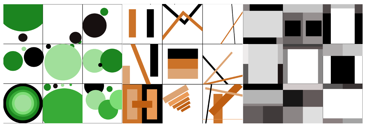
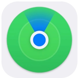
Beginning with point I picked three different words that I can describe through point, these were reflect, scale and dominance. For each word that I have chosen I began by researching logos and designs and found examples like Audi and MasterCard which use reflecting points in their brands. When researching the next word which was scale I found the logo of CBS tv which shows scale through points and I was also inspired by the idea of stars and plants as you can have larger and smaller ones. Finally, when researching designs on the word dominance I found Chrome and Find my iPhone icon uses circles incasing in size for each circle used, showing dominance in design.
Research:
![]()
![]()

![]()


![]()
![]()

Final Design:

Overall, I’m pleased with this design and I feel like with the use of my research I was able to express my interpretations of each word through the use of point and I believe that my designs turned out well.
Line
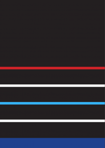
Next I worked with Line and the words given to us to use were rhythm, frequency, symmetry and asymmetry. I found completing the grid using the word frequency slightly harder than the rest because I was still trying to figure out figma and I struggled to make the lines look like frequencies. I feel like my struggle with figma and my dislike of my designs within the frequencies grid can be seen however, I feel more confident with my other designs. I also found my research for rhythm and frequency a little harder to find as I struggled to find logos that used theses ideas however, I did find some such as, the British Heart Foundation. I was able to find examples of rhythm, symmetry and asymmetry much quicker such as sound cloud and Adidas and I felt more confident when creating theses designs.
Research:


Final Design:

Overall, I’m not extremely happy with this piece of work, especially with the frequency grid as I struggled with it the most. However, I feel like the rhythm, symmetry and asymmetry grids turned out well as I gave myself more time to think over the designs and didn’t allow myself to overthink the work like I did for the frequency grid.
Plane
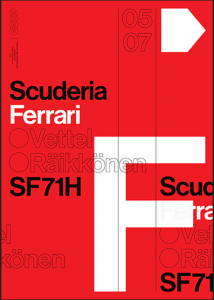
We finished this project with Planes and just like point and lines I began researching planes however, instead of finding examples of planes in logos I found designs that were created by Harry Heptonstall which showcases different sports which are created using planes. Another examples of using planes to create eye-catching designs are F1 Posters created by Dune Dalton who’s worked is described as minimalistic which clearly communicate the meaning and message of his work. His F1 posters which talk about different F1 cars, I feel are attention grabbing and the use of planes to create the layout of the page I think makes the poster stand out.
Research:

![]()


Final Design:

Overall, I’m happy with the way these designs turned out and I feel with the research I conducted it helped me when coming up with my own designs. I feel like at this stage since I was able to use figma a lot better and became more confident in my own designs, my work has improved a lot more since my last grids using lines.