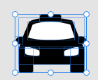
App screens that I like
Visually, I think this layering affect is really slick and looks modern and this element of design I want to use in my screens. I took a lot of inspiration from my research and applied an element from each of these screens to my design with the correct branding application so as to reinforce that it is a Mountain product.


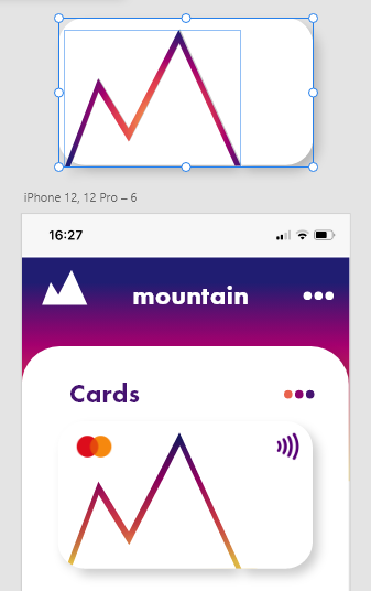
After conducting research on the what banking apps include by taking a look at my Santander online banking app and my Monzo app. I then looked at App screens that I like and with the prior knowledge of what’s commonly used and what I want to feature I began writing down lists of what each app screen would show.


As my brand is only present online, the banking app is the most important touchpoint and the main product of Mountain. The aim of the app is to serve as a place that users can successfully save and budget properly and that when they do they are rewarded with discounts on their favourite or most popular stores. One of these selling points I will feature on my landing page will be the Mountain Savers Scheme where you climb to the peak of your savings goal and I want to visually demonstrate this with the mountain logo starting blank and filling up with the appropriate seasonal gradient as more money is saved. As my logo features 2 peaks I think it would be a good idea to have a halfway mark achievement that will result in one of the discounts or special offers. This is to give the user a little reward before they reach the final amount to give them some motivation.
Design Considerations
I have chosen the summer colours for this app as its my favourite season and my favourite gradient within the brand. Below I will discuss version 1 and version 2 simultaneously, showing how I improved upon my first design.
Screen 1
For the bank card I first used a line of the mountain logo and filled it with the gradient but it didn’t follow look right so I used this line to subtract the shape from the rectangle then placed a rectangle with this gradient behind it which I feel looked better.
version 1 & 2
Initially, the navigation bar featured 3 links your wallet or the page featuring your card and recent transactions. The middle button being the mountain icon which represents your pots and current account and savings, where you transfer your money within the places of your account. The directional arrows which represent the friends page and where you can transfer your money to other bank accounts such as friends or family.
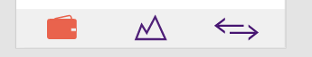
version 1
I added a forth element to the nav bar, being a percentage icon and this represents the page where you find your discounts and rewards for reaching savings and budgeting milestones. Instead of the icons filling with a colour when on the current page, the icon line changes colour in the final version as to not draw so much attention away from the page you’re looking at. I also increased the thickness of the line to make it a little more visible.
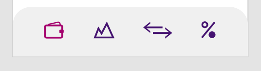
version 2
Screen 2
The first version of the pots screen featured the pot icons with the colour fill and the amounts in each pot.

version 1
In the second version I fixed the sizing of some of the type to have better visual hierarchy and one of the main things was that I inverted the colours of the pots icons. They now featured coloured rectangles with the icons almost cut out in white. This majorly helped to fix the hierarchy issue with this page as now the first thing your eye looks at are these pots in the middle rather than your eye not being sure where to look at because a lot of the design elements where the same. I also changed the heading of pots and savings from an gradient underline to a button pressed in depending on the page your viewing. I also added the current balance the page which was a major piece of information I missed in the first design. Something that isn’t really as important to highlight is that the reason I switched the food and clothes icon is because the icon for clothes is more closely shaped to the rent icon. It no longer looks like one icon is stepping down in the middle and back up with the next.

version 2
Screen 3
On the third screen the only real changes I made was to the sizing of elements and the colour of the amount saved to follow brand guidelines of the colour matching the part of the gradient that its closest to.

version 1
I also added a pop up to appear when you first open this screen to show the user that they have received the halfway mark and this is accompanied by the text that appears below the total savings amount.


version 2
Screen 4
There weren’t many changes to this screen other than the needed resizing and colour choices to make a more visually pleasing page

version 1

version 2
Screen 5
I didn’t have the rewards and offers screen until my second version. This page features a small piece of information on the purpose of the screen, a bar to show different categories of results and below tiles featuring the places that you can receive discounts. On reviewing my work once I had finished created my screens, an addition I would make to this screen would be to add a search bar above the categories so the user and look directly for the store they wish to find.

Revisiting My Idea
When typing up my work on my blog and discussing the app idea with a friend I came to an important realisation. The purpose of the app is to help students with saving and budgeting but the inventive for this is spending money. I hadn’t realised before that this idea is almost redundant to my aim. This is when I came up with the idea that the rewards system could be composed of something that was free. When trying to think of free services or things you could get I remembered that sometimes you can get free haircuts with trainee hairdressers. This began the the idea for my new proposition.
What if instead of being rewarded with discounts on stores, you could receive free lessons from students in your university with things like cooking classes or pottery classes. This would be a way to exchange the knowledge students have been learning at university and the user also receiving something for free for saving money, rather than having to spend money to receive your reward. I feel like this is something that could be implemented real world into universities and the benefit for those that hold the class could be additional credits or something along those lines. I know myself from doing the foundation course that getting to get a taste of all of the courses offered at university was a lot of fun and the potential to get a class with the game designers next door and see what information they have learned so far as something that would motivate me to save some money to receive.
App Screens for New Idea
As I made this revelation so close to my hand in date, I didn’t have much time to expand on this new idea. I kept the same offers page and just changed the content with the tiles now featuring icons for the degree pathways at our university and a small piece of information at the top describing what this page is for. When researching icons, I found that for less well known icons it is best to label them for clarity for the user. I used the same element of using coloured rectangles with the icons cut out for consistency through my app but as these rectangles are most of the page I made them a little opaque as to not be overwhelming to look at. The first version of my icons were lined but I decided to combine all ad create a solid icon like I had on the pots page. I think this change just gave it an overall better finish.

version 1

version 2
The next few pages basically are an idea of what each section may look like when you press on it and also what the screen would look like when you have a new offer to claim. The progress indicators are made up of the mountain logo in the appropriate colours. The first idea to show a new offer could be claimed was to follow the same design as when a new achievement had been made in the mountain saving scheme, I thought this would work best as there both linked. However with this idea there is now where to claim the offer so I decided to go with the second design instead.

version 1

version 2

Experimenting with different arrow buttons
Trying out different arrow designs.


Process of designing icons
Composed of different shapes overlaid on top of one another.


Conclusion
The app screen process was one of my favourite parts of this unit. I enjoyed having to follow my own brand guidelines and see them work on a different application other than the booklet or touchpoints. I would have like to design some aspects better to make it look more professional. The main thing I would’ve hoped for is for my idea to have changed quicker so that I could have more time to explore this avenue and expand on it making it an even bigger focal point of the app. I would like to revisit this idea in the future and see if I can bring it to life.
PDF of Screens: Mountain App (1)

Comments