Colour Systems
In my previous unit, I explored colour and the role it plays within design, the types of colour systems, how colours can be interpreted depending on your cultural background and the psychological effect they can have on us as humans. You can see this previous post here. Summarising on this information, exploring further into colour systems and how these can be applied to brand guidelines.
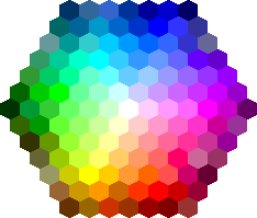
There are a number of different colour systems each for its own purpose across digital products, print based media and physical objects and understanding each system will allow you to achieve constancy in your brand design.
RBG
RBG is a colour system used in digital products and screens and is comprised of 3 primary colours red, green and blue. This type of colour system is what is known as an additive system where the screen is black in the beginning but with the combination of these 3 colours, white is created. Due to the rise is digital products and the decline of print based media, RBG is one of the most widely used colour systems.

CMYK
CMYK is used in full-colour printing and is a subtractive colour system using cyan, magenta, yellow and black or the K (key) colour. This system is the opposite of RBG, wherein it uses the combination of the 4 colours to create black and the less ink used the lighter the colour will appear. CMYK has less available colours in its gamut compared to RBG and this can cause issues when maintaining a cohesive colour scheme throughout a brand whether its on digital screen or print based product.

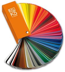
RAL
RAL is primarily used in the production of physical products with different surfaces such as metallic or matte. These colours are created and used for powder coating, varnish or plastic colouring and are needed when something physical such as a wall in a shop is painted to follow the brands colours.
Hexadecimal
HEX is an RBG colour system that is used in the creation of a digital applications or websites and is used when applying a colour to something in the stylesheet code or HTML. The HEX colour system takes values from red, green and blue, displaying 6 digits, either letters or numbers, with a hashtag at the beginning indicating the hexadecimal value.
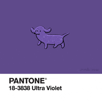
Pantone
The PMS or Pantone Matching System is a colour system that is used worldwide as a colour matching system in the production of colours for print. Although its primary use is for print just like CMYK, Pantone has more colour options and is vital when creating branding as it allows for consistency throughout digital or print based products within your brand.
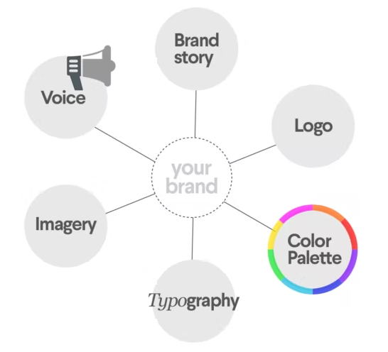
Brand Guidelines
Brand Guidelines are a clearly defined set of rules and standards set for your brand that instruct others how your brand should be represented through their use of colour, graphical content, typography, photography, do’s and dont’s and tone of voice. Brand guidelines ensure consistency for businesses
Psychology of Colour
Each colour of the rainbow as different affects on the emotions of humans. I would like to find a way to incorporate as many of these positive emotions into my brand so that the branding seems to be packed with benefits.

Brand Colour Research
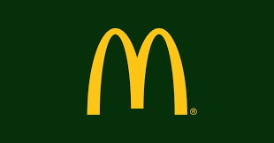
I conducted some research on brands that have changed their branding colours and whether this has led to success or failure. In 2012 McDonalds India went from the trademark bright red and yellow to a more mature muted palette. As well as this, the McDonalds branches changed from neon yellow and red interior to less intrusive, pale colours. This was done in order to increase the numbers of adult consumers instead of just kids. There were mixed feelings on this as many believed that McDonalds biggest consumer base lies with children and by using the more mature colours, the young consumers may feel alienated. This was also apparent with the removal of the much loved mascot Ronald McDonald. In Europe, McDonalds famous golden arches had its background changed from red to green to show its commitment to the environment. This was seen as another way the brand was moving away from kids and toward more environmentally aware adults. This was a successful move for McDonald’s in a rapidly changing, environmentally positive consumer mindset.
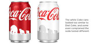
In the same year, Coca Cola also changed their signature red cans for white in an effort to support the World Wildlife Fund in protecting the polar bears. The white cans were unique and stood out but this had a negative impact for the brand as people thought the Coca Cola flavour had changed. There had been no change in the ingredients or chemical composition of the drink but the change of colour had a psychological impact on the consumer and how they felt about their favourite drink. As a results sales had dropped, and just a month after the launch, Coca Cola halted production of the white cans, returning to their trademark red.
It seems that if a brand is already strongly associated with a colour in consumers minds, then it may not work in the brands favour to change those colours. On the other hand, if a brand already has neutral imagery in a consumers mind, it may benefit the brand to use a unique colour/colour pallet and give itself some level of distinctiveness in its market. In the same token, do environmentally friendly companies always need to have that relationship with green or do food or drink companies do best when they stick with red?
Brand Colour Scheme Research
Kanye West album art for graduation has always been something I’ve really liked from it was released. The use of bright colours and diverse colour pallet makes the composition feel active and full of life. I would like to replicate this energy in my branding.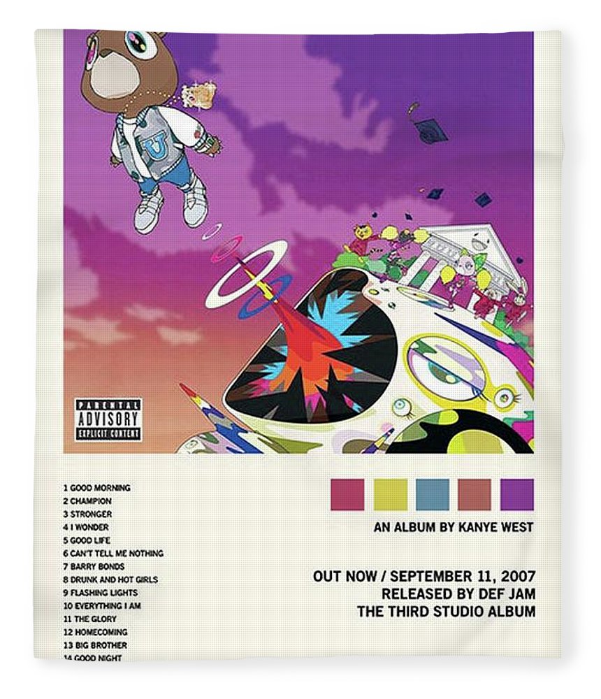
Chobani
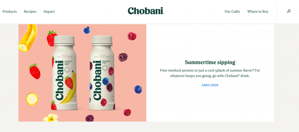 I really like the use of traditional landscape colours in the images on their website in tandem with a variety of different colours, It gives the same effect of giving the image some energy about it while still all tying in well together.
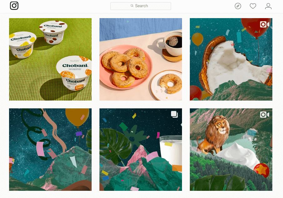
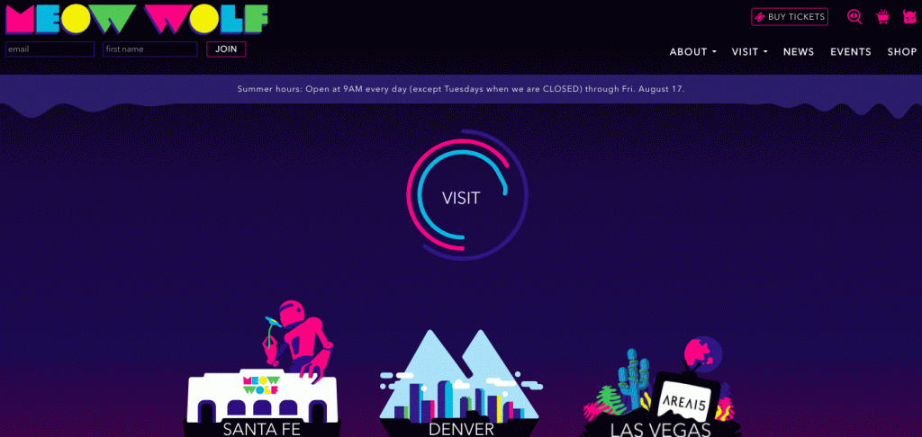
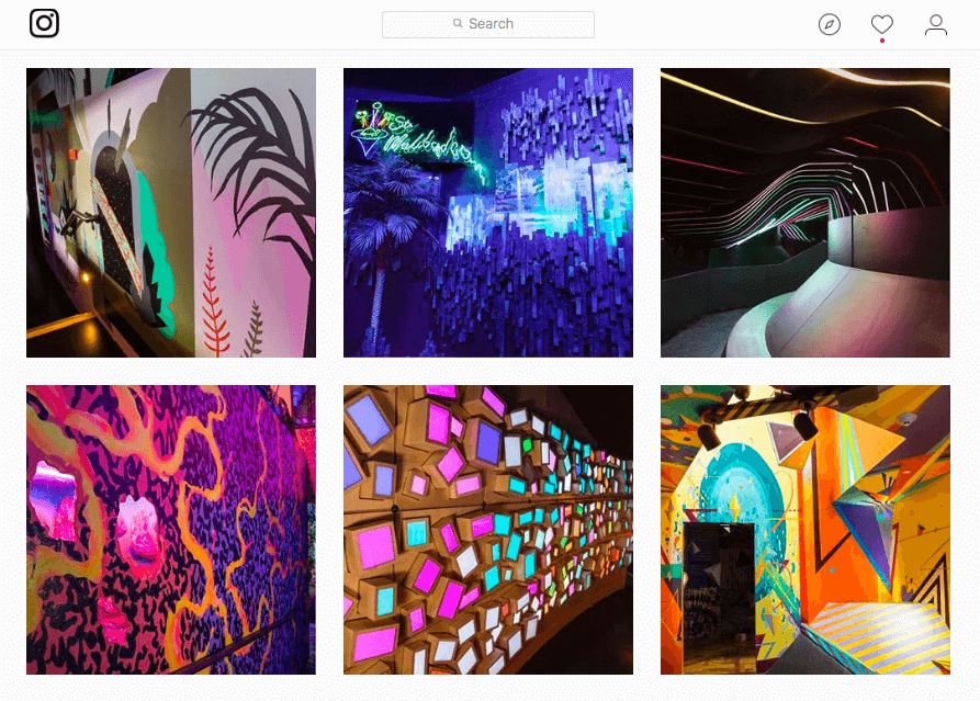
Meow Wolf
Meow Wolf’s branding colour consists of bright, neon colours that stand out against a dark background. It feels like a modern twist on an 90’s colour pallet. I would like to try and see if this neon effect also works on a white background.
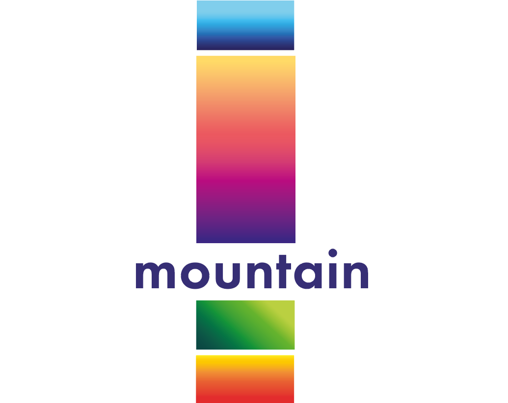
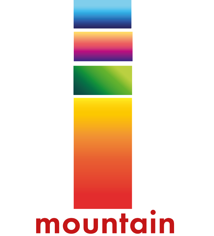
My Chosen Colour Scheme
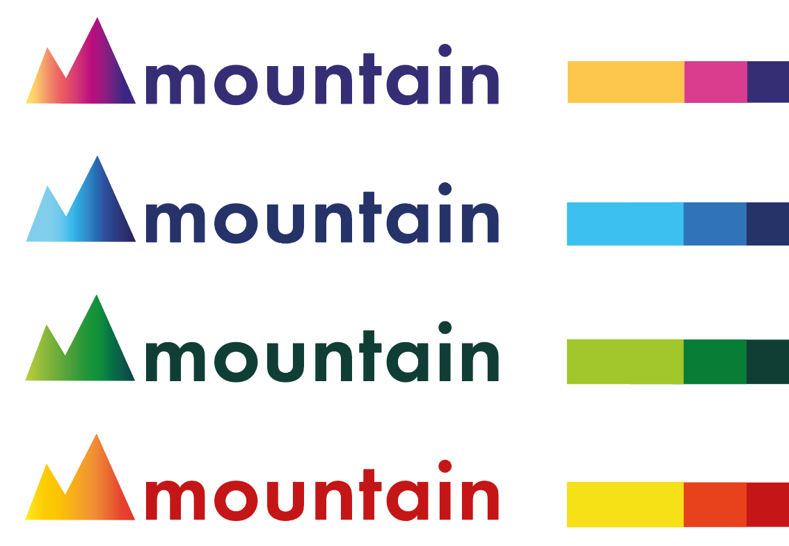
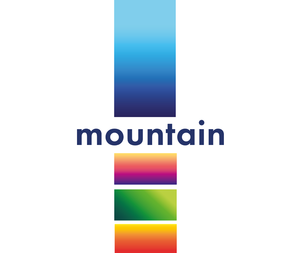
As my brand is closely associated with the landscape, I wanted to create that link between nature and my bank without just using green. I decided to create a dynamic colour scheme for my brand that changes with the seasons. Each of the 4 seasons will consist of a gradient based on images that I have taken of the landscape or sky during each of the season. I feel like this is fitting as it will truly reflect the season as its seen and this will be something that is easily recognisable.
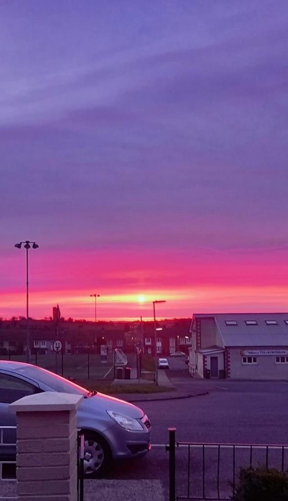
Image of the summer sunset my grandad took. Unedited

Image taken at the end of Autumn. Unedited

The cold winter sky. Unedited
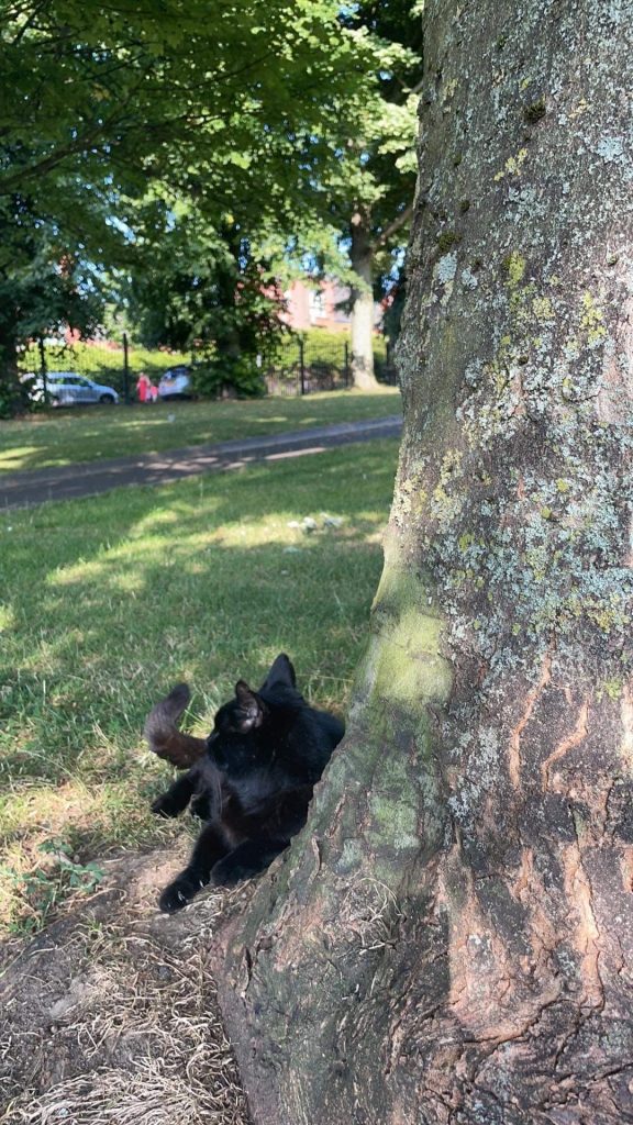
Sitting in the park with my cat last spring. Unedited
As you can see from the images above, my chosen colour for each of the seasons was influenced by images taken during the corresponding time of year. I chose to use gradients so that my logo would be more dynamic with the idea that on digital applications the colours would move around when you moved the device or mouse. Equally, print based or physical products would have the holographic gradient that could cycle through the colours as its moved. This strengthens the idea of a dynamic colour scheme that changes throughout the year as well as changing to different colours within the gradient.
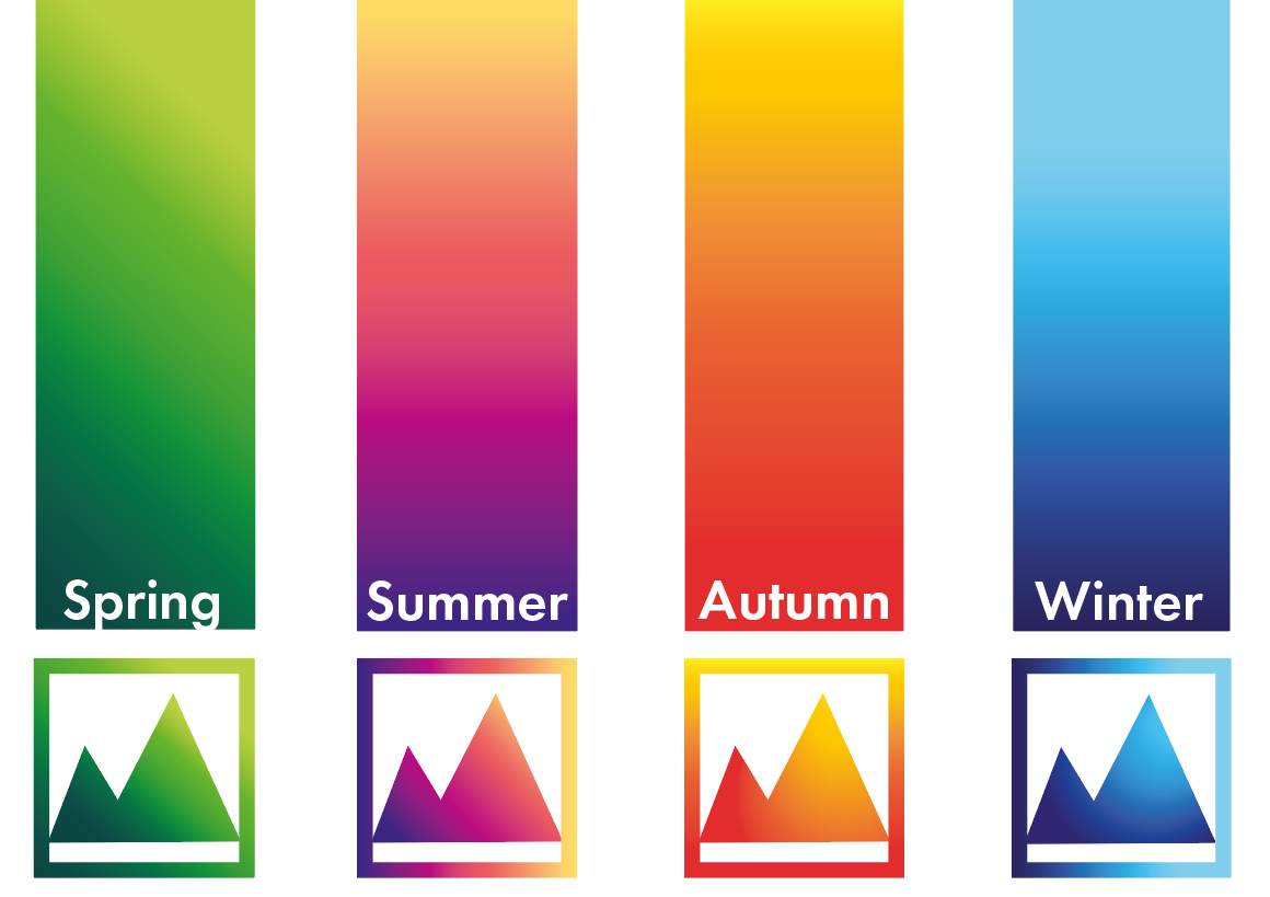
I broke down the gradient into 3 colours that can be used to colour elements such as body of test, heading or buttons in digital or print products.
 Winter
Summer
Spring
Autumn
References
https://www.pantone-colours.com/
https://www.mathsisfun.com/hexadecimal-decimal-colors.html
https://htmlcolorcodes.com/
https://en.wikipedia.org/wiki/Color_psychology#:~:text=Color%20psychology%20is%20the%20study,as%20the%20taste%20of%20food.
https://www.rapidtables.com/web/color/RGB_Color.html
https://www.thehindubusinessline.com/catalyst/when-brands-change-colours/article23030006.ece![]()
Comments