For the first project of the course, our task was to create a type specimen of one of the six fonts that were giving to us. These six fonts where:
- Futura
- Gill Sans
- Helvetica
- Palatino
- Times New Roman
- Baskerville
To get a grasp of every font, I did a little research around each; this also helped me with my pick which font I was use. After my research I went ahead and made a quick summary on each typeface as a reminder on what I researched.
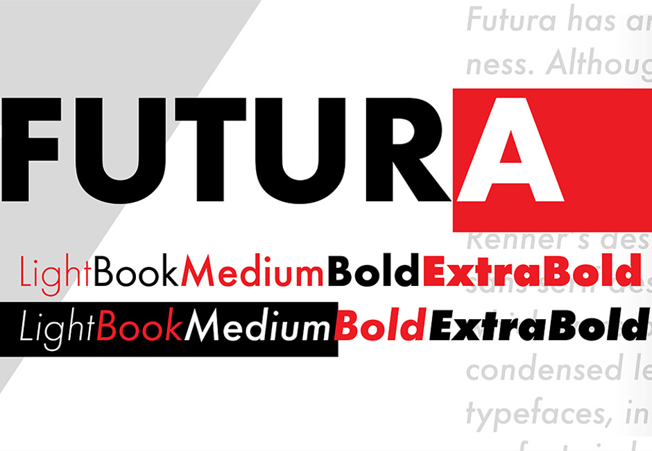
Futura
This is a geometric Sans Serif typeface designed by Paul Renner in 1927. Renner was looking to create a modern model of a typeface instead of repeating previous overly used design. With the geometric forms used within Future, the typeface is subtle and simple while referencing the classic serif elements. This modern take on a typeface went to highlighting Radicalism that was growing in design,
Helvetica
This is a Sans Serif typeface that was created in 1957 by max miedinger. the word ‘Helvetica’ is formed from the word Helvetia which is a Latin word for Switzerland. The Helvetica typeface has a very strong strong and bold appearance while very futuristic to the eye. It is very clear and has easy to read text along with a commanding time that radiates. This typeface replaced Futura in their time and is now looked at my many all the time either in the streets or on your phone.

New Times Roman
Known For its bold and italic style, New Times Roman was created by Stanley Morrison in 1929. With its use in newspapers, the typeface gained a lot of popularity among printers. Since the typeface is very narrow, some people do see flaws within the elements and is not liked by many, but there is no denying its success as its use in newspapers really helped convey a serious tone.

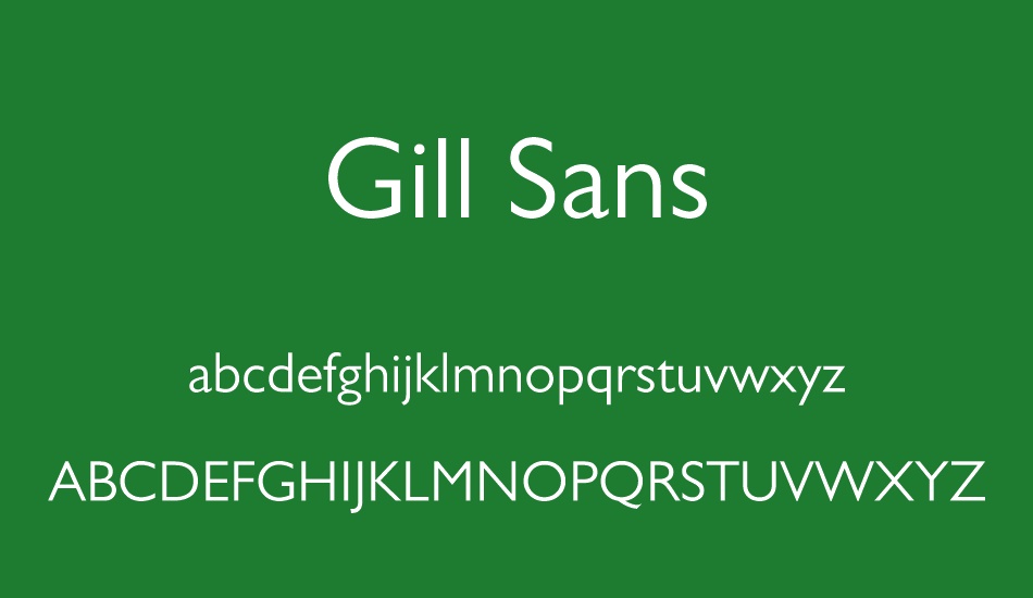
Gill Sans
With its very cheerful and British element, Gill Sans was created by Eric Gill and was made public around 1928. This typeface has a very signature style of letter ps such as the capital G and R, but this typeface can be most notable for its usage at railways around Britain, Especially London. The Typeface as a Sans Serif and contains geometrical forms which gives that modern feel for Gill Sans.
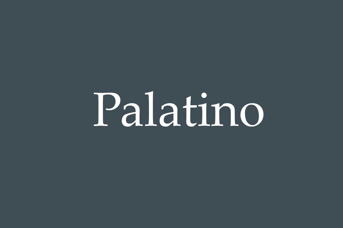
Palatino
This admired Serif design was created by Herman Zapf in 1948. A lot of Palatino’s history is connected to Herman Zapf’s love for the Renaissance period due to its style of grace. The proportions are larger and can be easier to use. This Historical approach to a typeface a range of elements to be found such as weights and italics. Palatino is a typeface that is universal as it is great for marketing , newspapers and books.
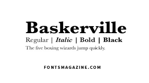
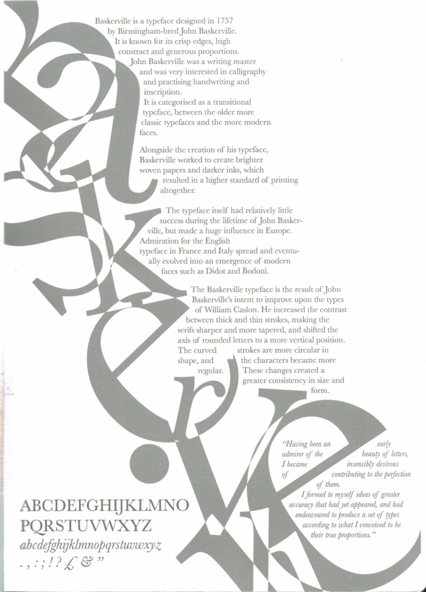
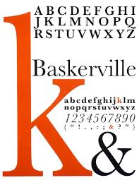
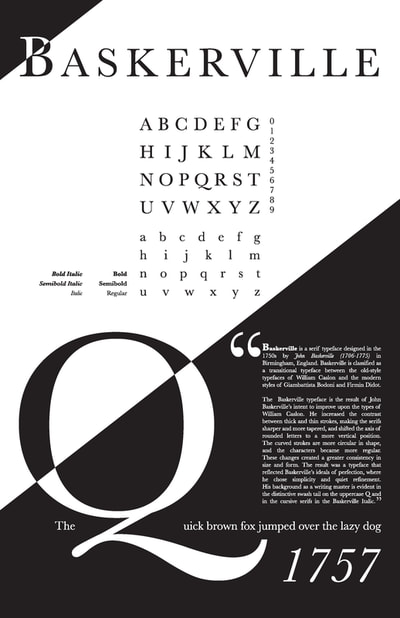
Baskerville
Being created by John Baskerville in 1757, Baskerville is a very classic and elegant known typeface, as it is pleasing to the eye in my opinion. It was the start of shift from older fonts to new and experimental modern styles of that time period. The use of Serifs give of a historical feel, but very sophisticated at the same time.
With all this information in mind , it was Baskerville that I was very drawn too as i like that traditional and older look as it gives me a nostalgic feel when I see it. The serif one of my favourite elements about it along with the italic as well.
Type Specimen For Screen: Ideas
As I have chose Baskerville as my font, I research into Baskerville type specimens along with what specially are these specimens. A type Specimen is a poster like display of showing the extent of certain typefaces. This can include the alphabet, quotes from the creator of that font or simple just a letter or its name. Looking at Baskerville examples, I came across with very bustling pleasing images that I though I could incorporate into my type specimens.
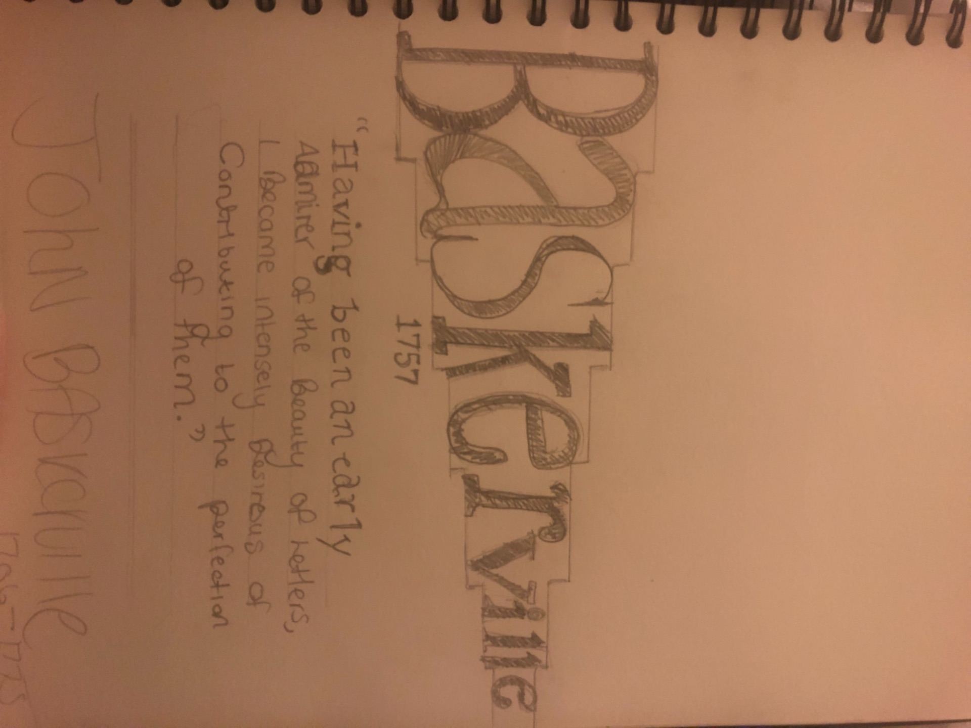
After researching into my Type specimens, i started on doing some sketch’s to get a rough idea of what I was going to design.

After some ideals, I start straight away of my type specimen designs on Illustrator and these were my drafts.
Draft one
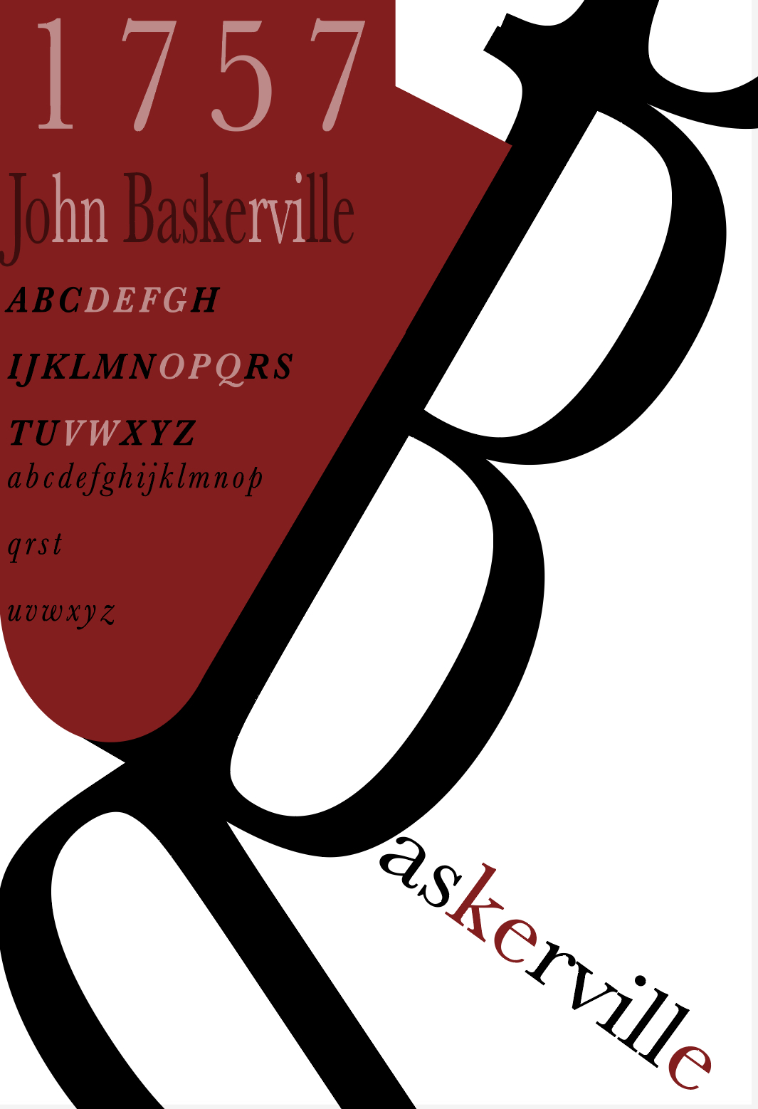
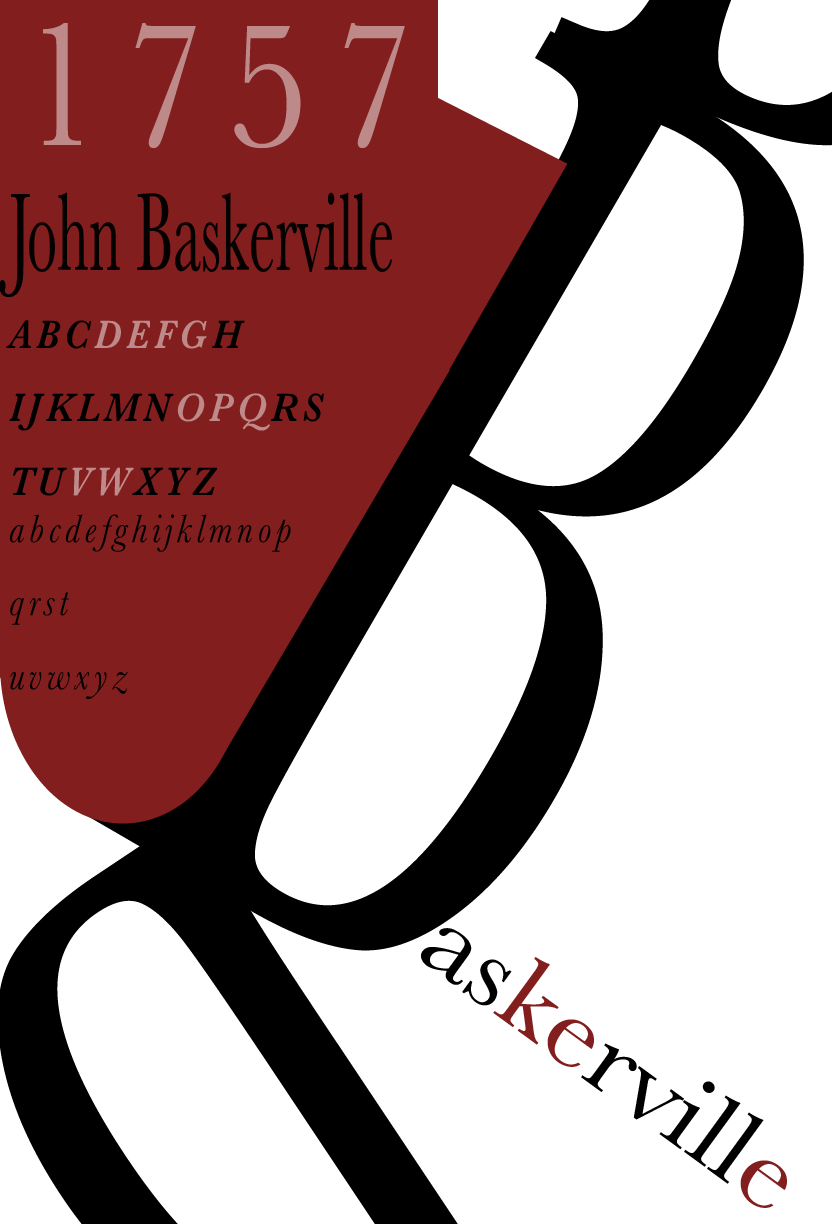
I really liked having the Capital B tilted along with connecting it too a continuous lines of B’s. In class we got a Monster Inc. vibe from the specimen; I really liked that comparison as I thought it brought a humour tone to it and helped balance it overall, I did like this outcome with the reds and blacks but, I felt that in another type I could create something less simple than this. But my final outcome with thus specimen did not change much, I but more black into the letters to make it stand out better against the red.
Final outcome
My Second draft
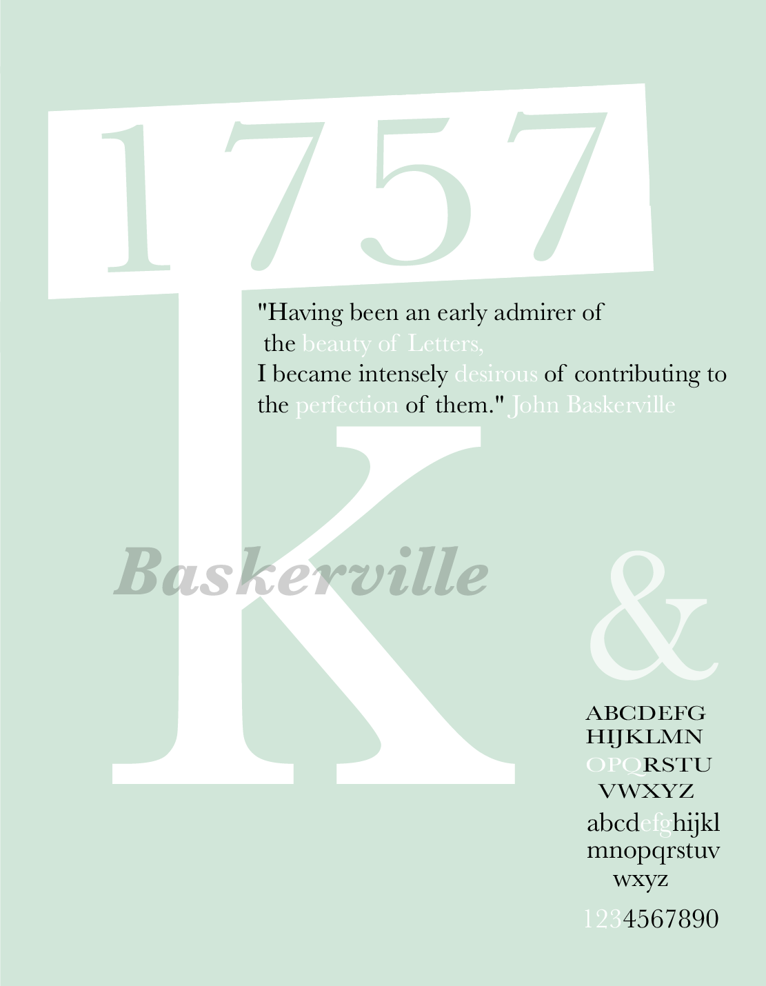
I came across the idea to involve the main letter ,which is K, with the date of when this typeface was created. I experimented with colour and came around this pastel blue and green background that I wanted to try out as I never came across any Baskerville type specimen with these kinds of colour pallets. My overall comment is that I really liked the idea of the K incorporated with the date and I think compared to my first draft, this draft felt more realistic as a published type specimen. Though the colour I do really like, it was more experimental and matches me as a designer than the typeface Baskerville.
For my final outcome, I completed changed the main colour to black which I really enjoyed as it was still becoming more realistic when I changed the colour. This become my favourite as it’s very fun and exciting while showing off the Baskerville elements.

Final draft
For my last idea, I wanted to create something a lot more different than the type specimens we see for Baskerville and decided to try out my stair effect with my specimen. I used a beige colour along with a white and black colour palette. As the stair effect decreased, so did the word and again had a light hearted take on the Baskerville word.
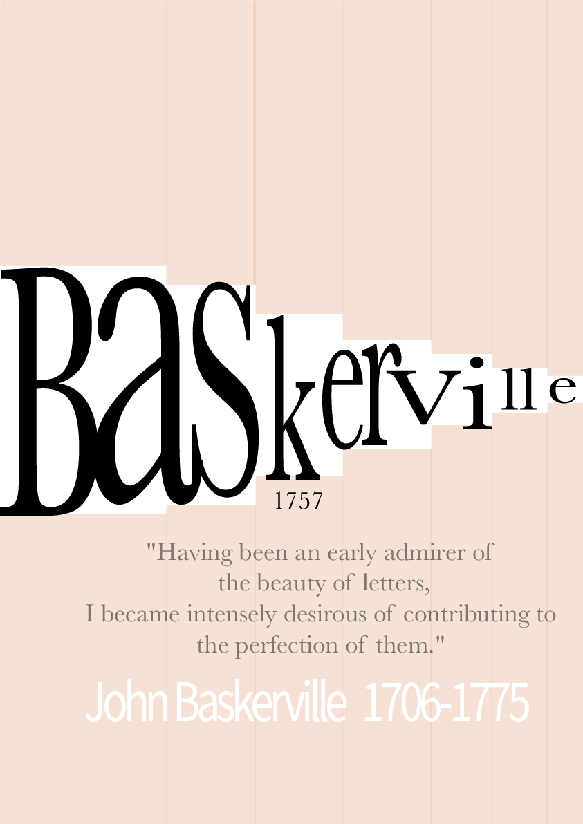
Realising my mistake, I accidentally used a different typeface at the end of the type specimen, so I made sure I fixed it along with adding more beige and cleaning up the background as best as I could.
Final outcome,

My Overall Type Specimen for Screen
I chose this type specimen as I thought that out of the references for Baskerville, I felt like I was able to create my own version with inspiration I had used. The black background and along with the K mixing in to the date of the typeface was my favourite outcome and out of all the ideas and drafts, this specimen was the closest to, in my opinion, as a professional specimen you could see on you laptop, phone or Ipad.