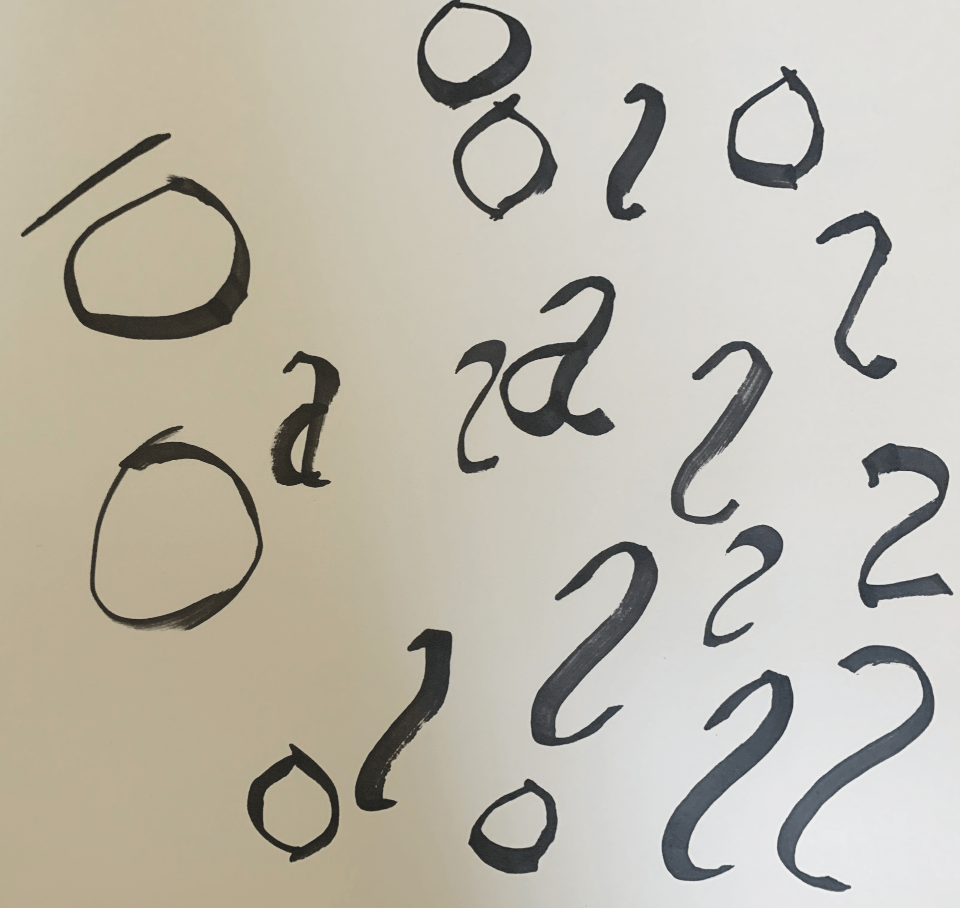
We were taken through a calligraphy tutorial so we could try and form our own letters. I used a black ProMarker with a chiselled tip, and I found it quite difficult to get used to at first, but ultimately this proved to be an interesting task and I would like to keep practising to try and improve at calligraphy. 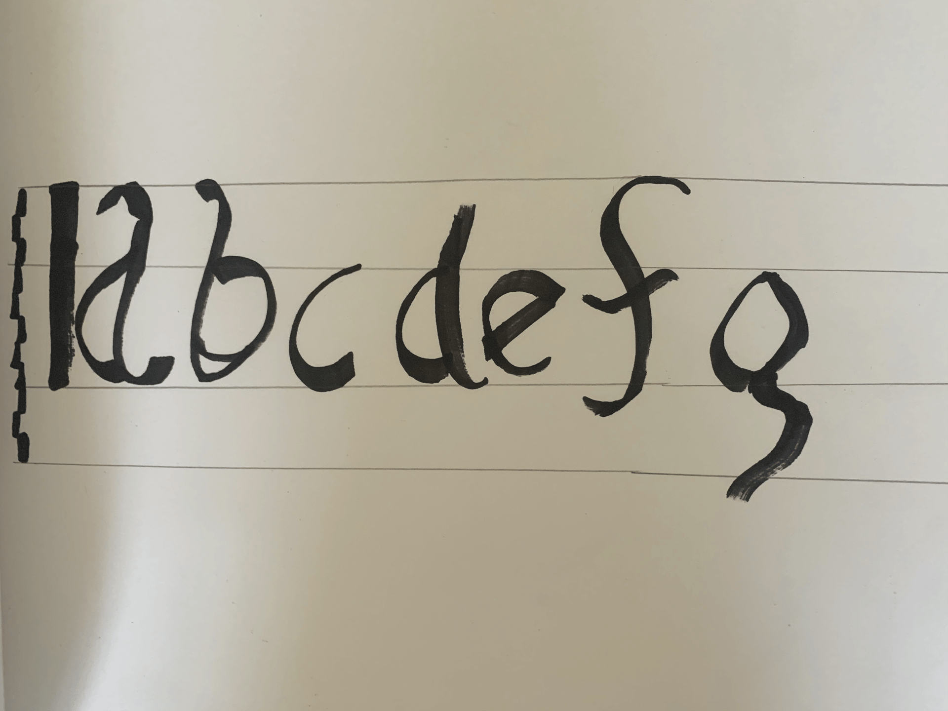
Tag: letter
Week 3: Anatomy of Type with Name

I enjoyed this typographic exercise a lot, as it allowed me to research the anatomy of type as I identified each part of the letters in my name. I chose Trajan Pro Regular as my typeface, which admittedly made it somewhat difficult for me as most diagrams of type are based on lowercase characters, and Trajan Pro is an uppercase typeface. However, I managed to find several features of type within my name. I thoroughly enjoyed this task, as I am used to doing similar work in Adobe Illustrator from courses I have done in the past.
Week 3: Initial Logos (Procreate Development)


![]()
![]()
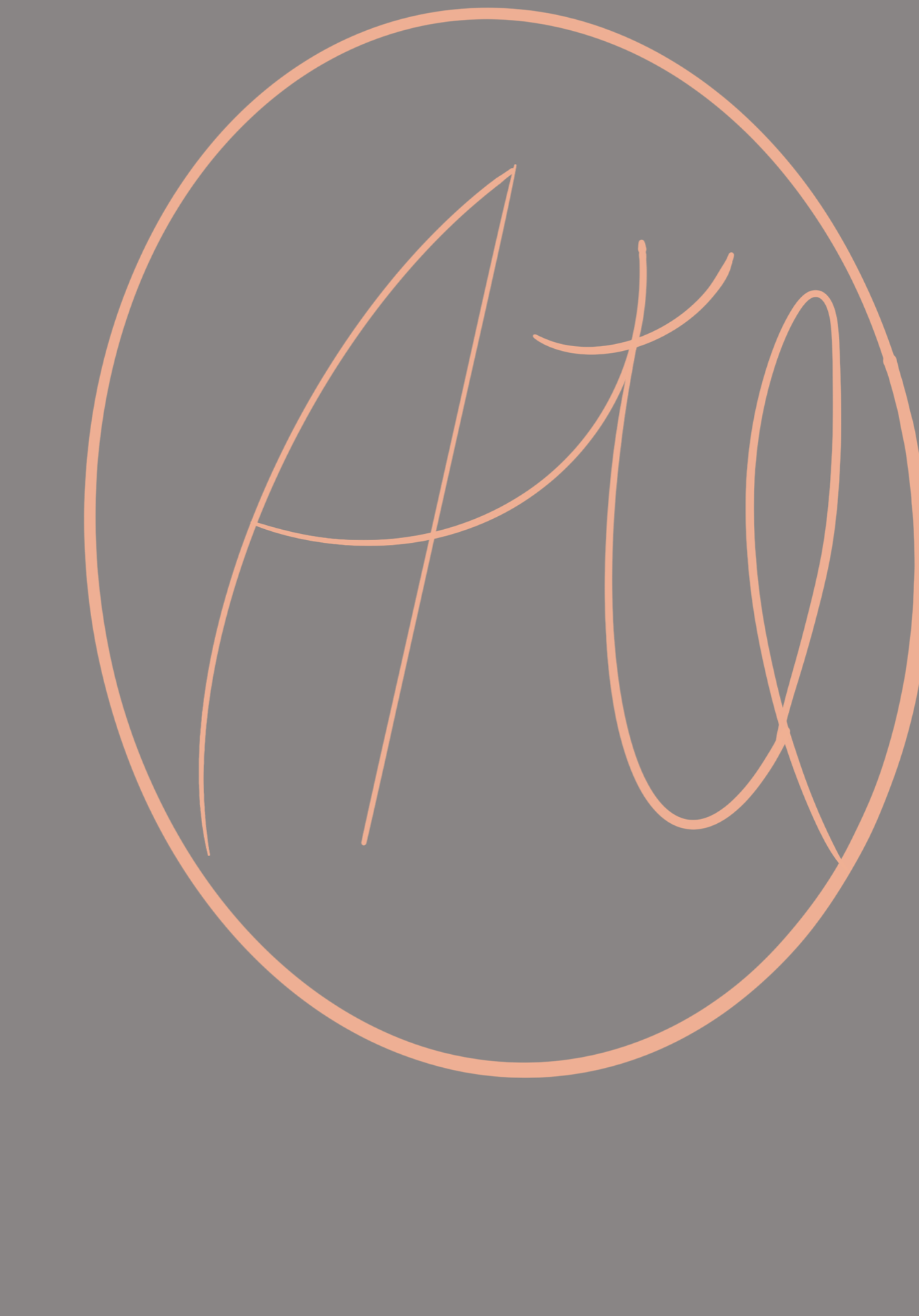
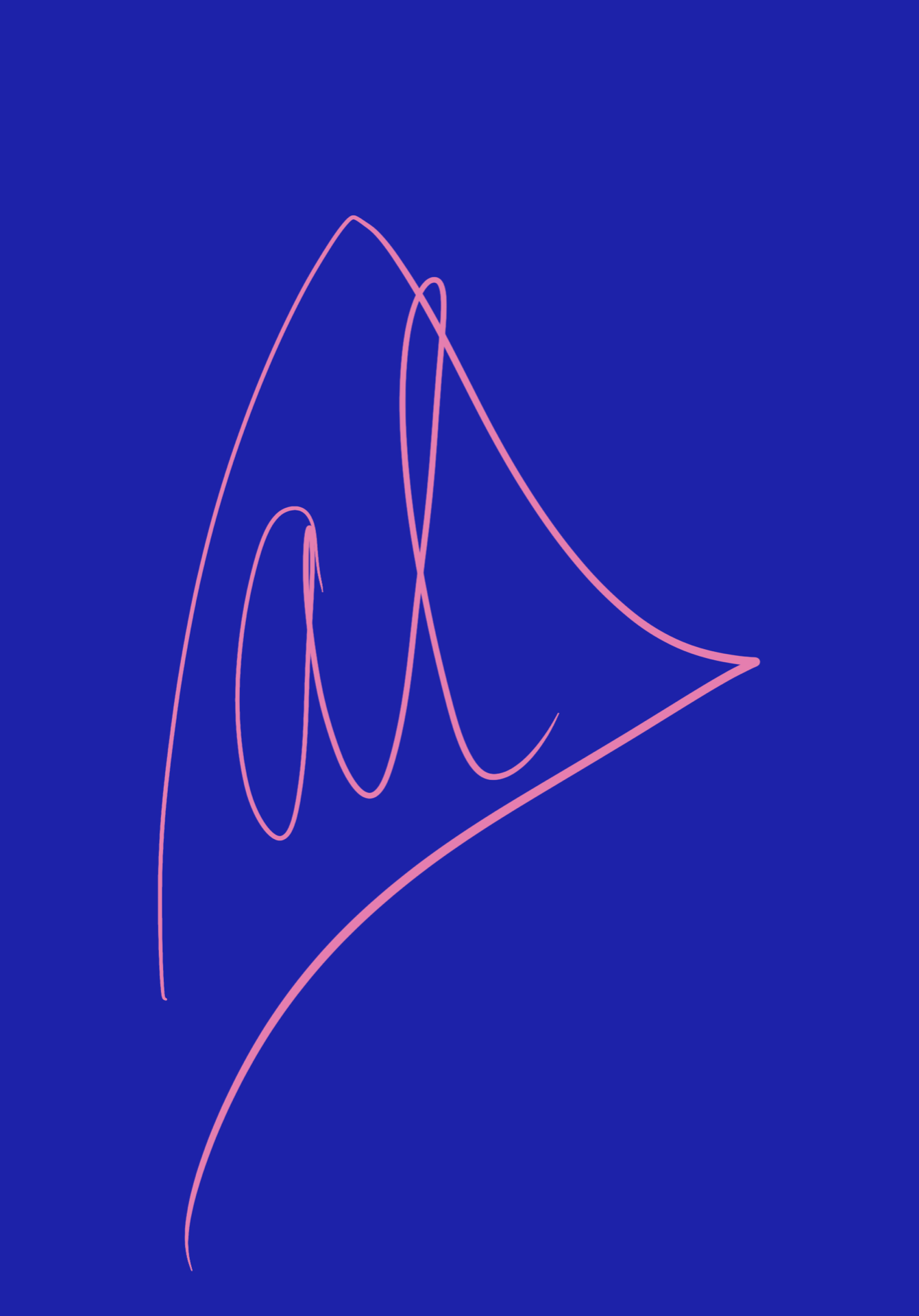
I chose to develop my logo sketches further using Procreate. Some of these are directly based off my sketches, but others are ones I thought of whilst I was doing this task. The top three are my favourites, both due to the shapes used and the colour scheme (the pink/blue one is incredibly vibrant and the contrast is eye-catching).
The first logo uses a lot of contrast as well as the second, and I love how well the colours interact. The third uses very gentle colours and the pink makes me think of ballet shoes, so this logo would be good for a ballet company.
I liked the apple in the fourth one, as I thought it was quite different and was a different interpretation of geometric shapes. I like the way the colours interacted with one another.
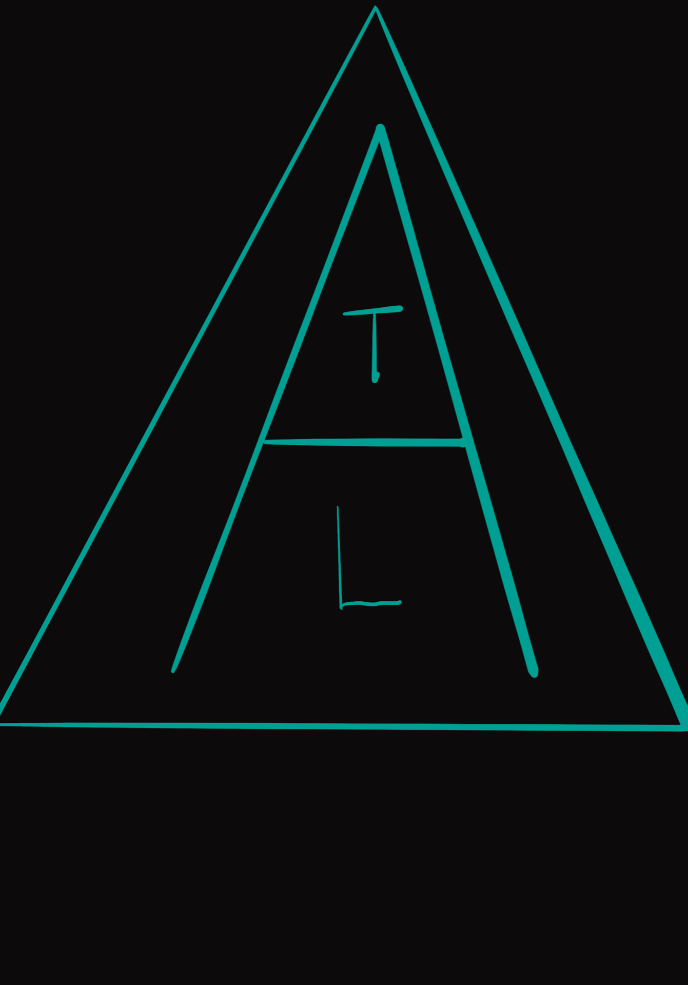
The fifth one has a very bold, vibrant colour scheme which makes it stand out. The letters of my name are stacked within the letter A, which is, in turn, encased in a triangle. I like the neon turquoise on black.
The sixth one was inspired by Sparta, using gold which reminds me of their armour, and red, from the Spartan cloaks worn by soldiers. This is because I was using Greek letters, which, as I have previously mentioned, made me think of a Spartan shield. I really like this one, but the red on gold is perhaps too vibrant.
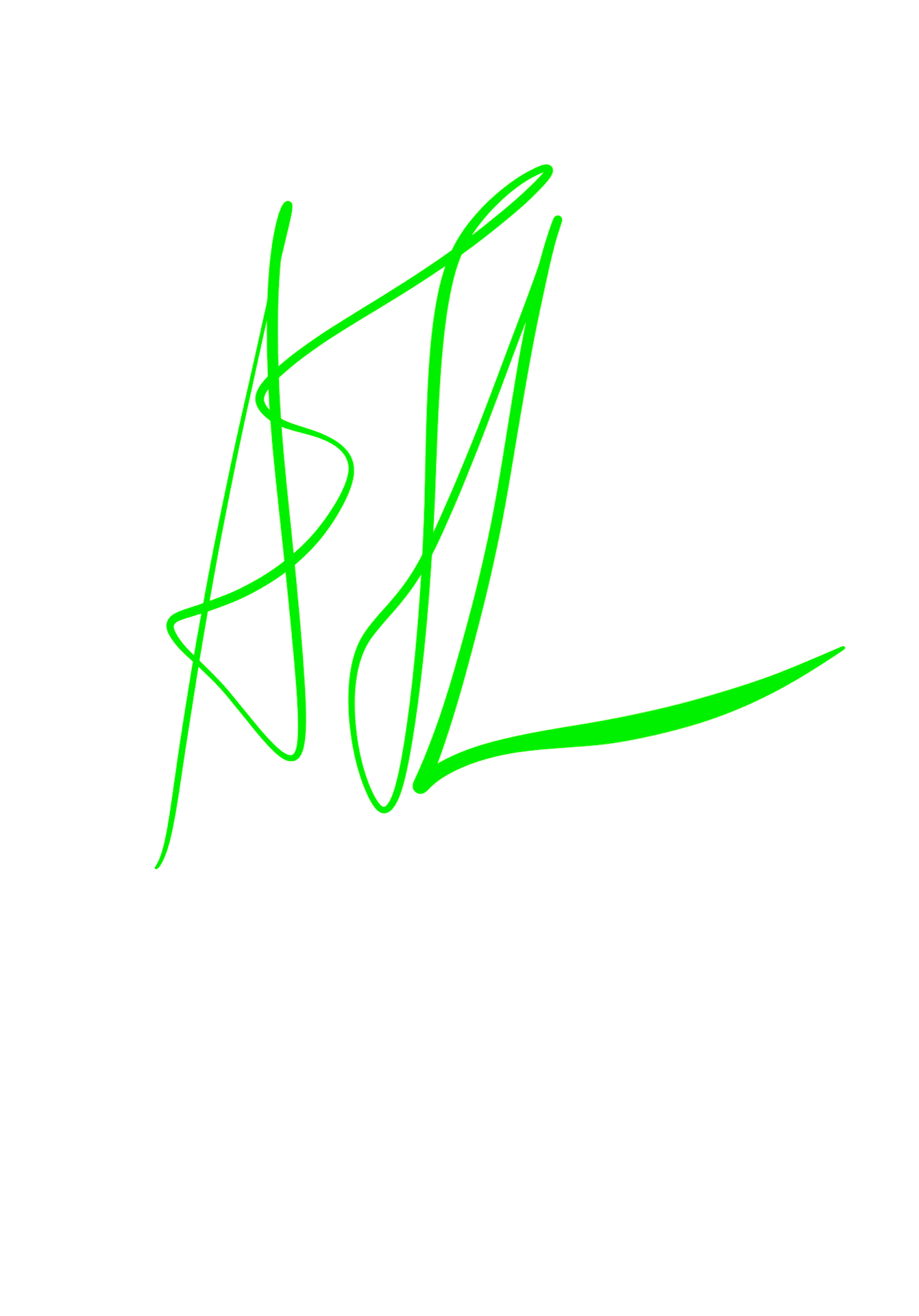
The seventh and eighth ones had nice colour schemes, but I didn’t think they were as successful as the others. The ninth had a good script style, but the neon green didn’t work well on the white background. If I were to re-do this, I would put it on a black background.
Overall, I thoroughly enjoyed this task and would love to do more work like this in the future.
EDIT: I have also included the variations on my logo/wordmark in black on white and white on black. I liked the style of the pink and blue logo so I chose to use this for further development.
Week 3: Experimental Letters using Household Objects
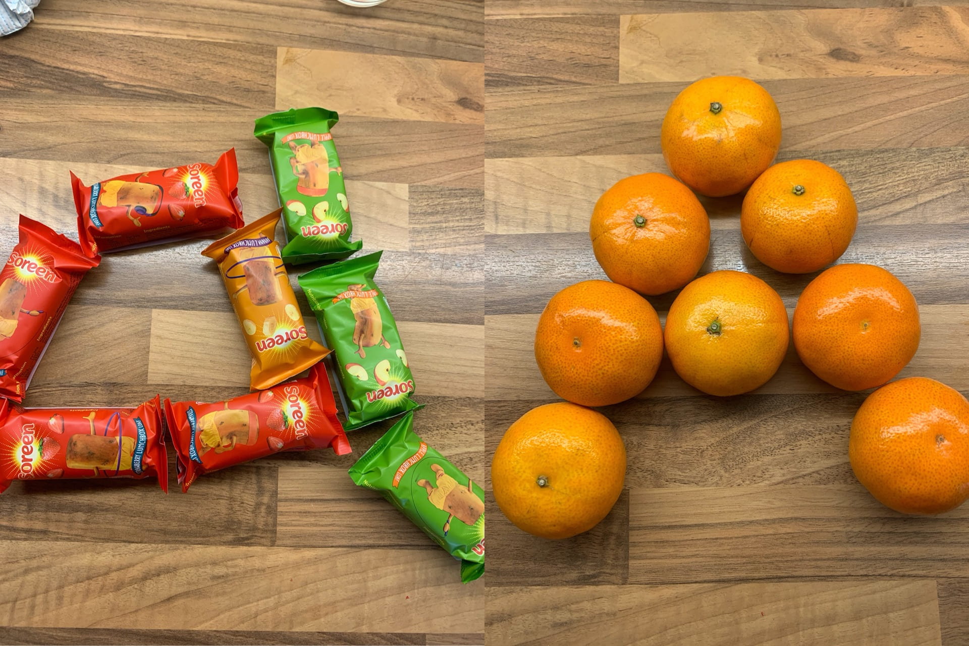
We had to do a short task, using objects or food in our houses, to create our chosen letter. I wasn’t sure if I fully understood the task at first, but I gave it a try. I made an uppercase A out of oranges. I like that an A might be more closely associated with apples, but I used oranges instead. My other letter was a lowercase A made out of my little brother’s Soreen snack bars in different colours. I much prefer the look of the oranges A, as it is clear, as opposed to the Soreen one, which is very busy due to the illustrations on the bars. I do, however, like the colours in the Soreen A a lot more, as it reminds me of a traffic light, and the colours are very vivid.
I enjoyed this task in the end, and think I was successful.
Week 3: Initial Logo Sketches
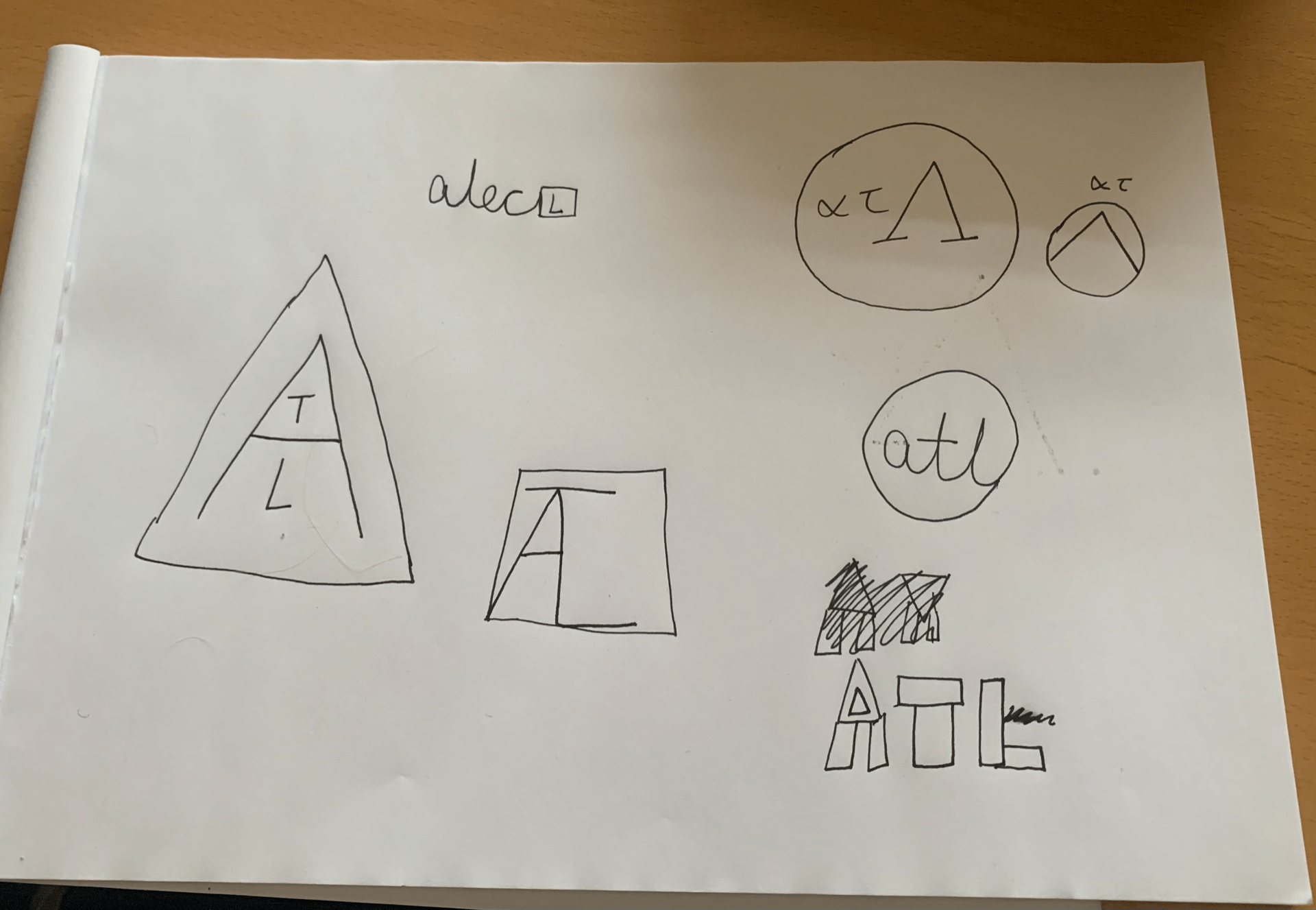
We used our initials to create logos using triangles, circles, and squares. These could either be in the shapes, or arranged into a shape. I did a few different styles, but they were only rough sketches for now, as I planned to develop these further using Procreate on the Apple iPad. Whilst I liked these initial sketches, I wanted to see what I could do in Procreate to improve them. My favourite from the sketches was one of the top right logos, with the Greek letters, lowercase alpha, lowercase tau and uppercase Lambda (ατΛ), as the Lambda reminded me of a triangle, and with a circle around it, it made me think of a Spartan shield, as that is what they would have looked like. I added small, lowercase letters for my other initials, to make it more logo-like.
I enjoyed this task but looked forward to developing these further.
Week 2: Using Adobe Illustrator to make the Alphabet
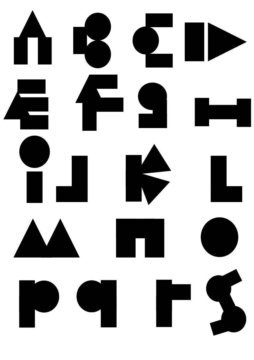
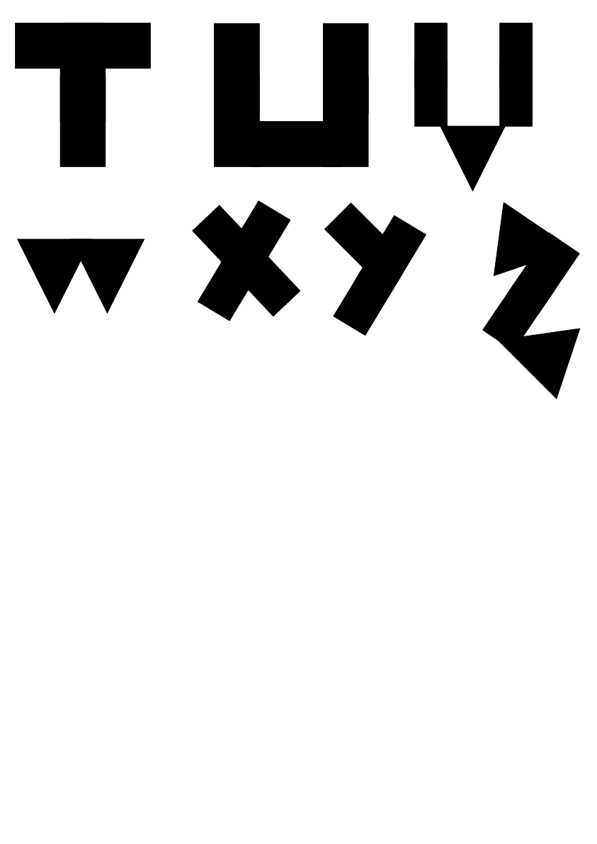
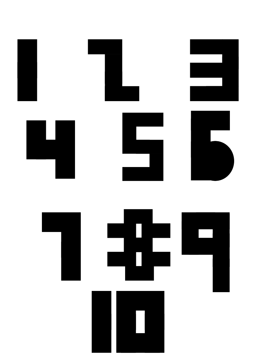
Our digital task this week was to create shapes using Adobe Illustrator, after doing various tutorials using Photoshop and Illustrator. Once we were confident in this, we were given the task of creating the alphabet using these shapes, trying not to skew or distort the shapes too much, to keep the letters looking almost geometric, and to give it our own style. I enjoyed this task a lot, as I am confident using Adobe Illustrator, so I worked with each letter carefully, seeing what would look best and scrapping it if it did not resemble the letter closely enough. My favourite letters are the D, M, and Z, as I felt that they looked very interesting, but I am happy with how they all turned out. I also did numbers 1-10, and I think that the number 5 is very sleek, but I like the way the 8 turned out, as I did a lot of replicating shapes and rearranging them to get it to look the way it did.
Overall, I enjoyed this task and look forward to working in Illustrator in the future.
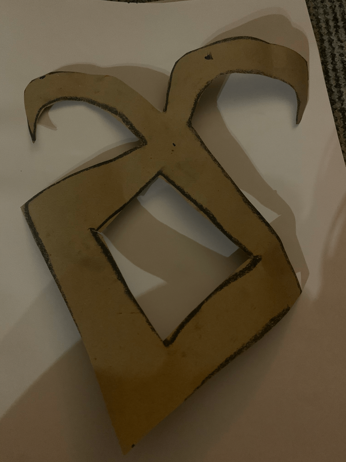
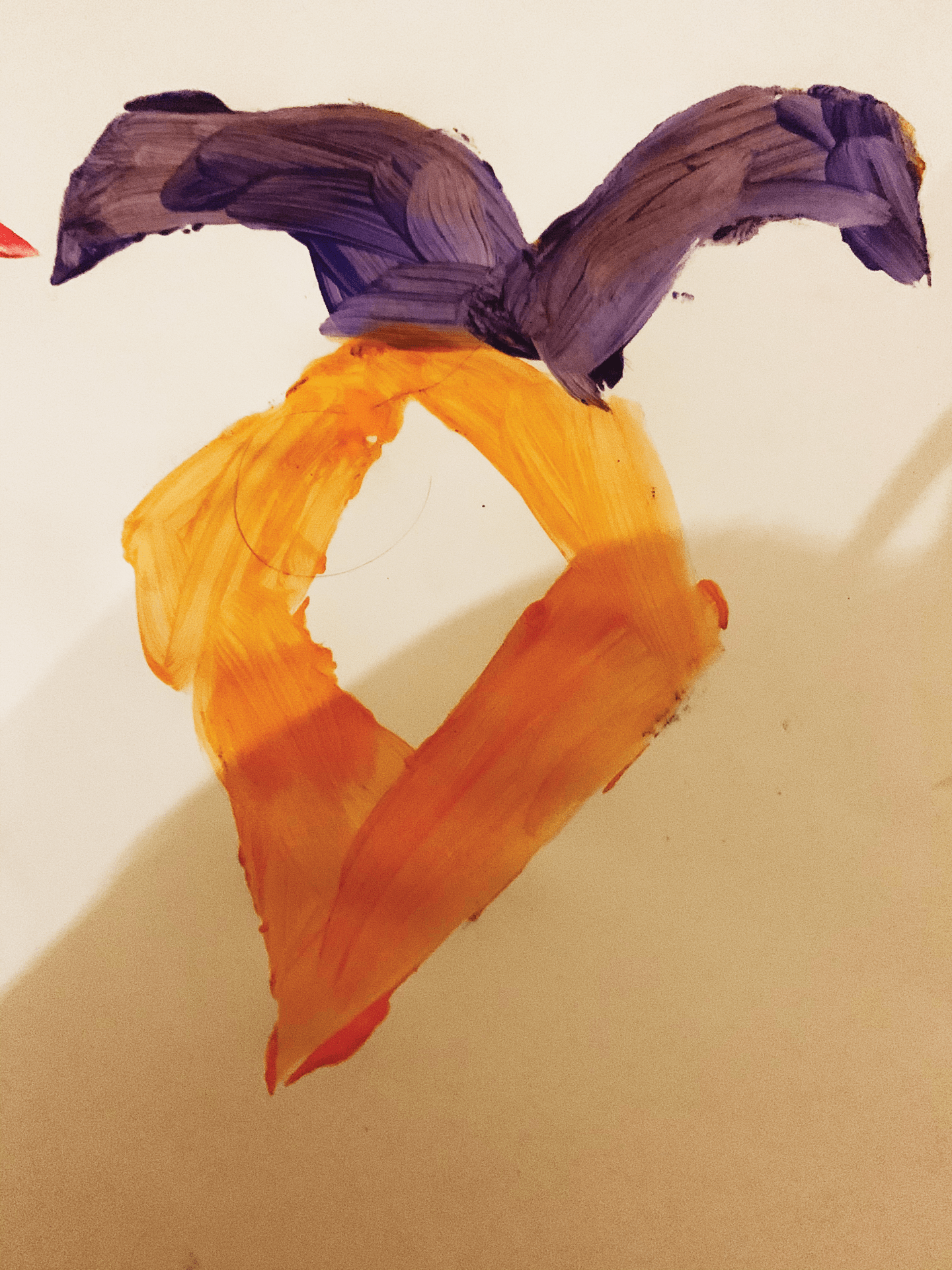
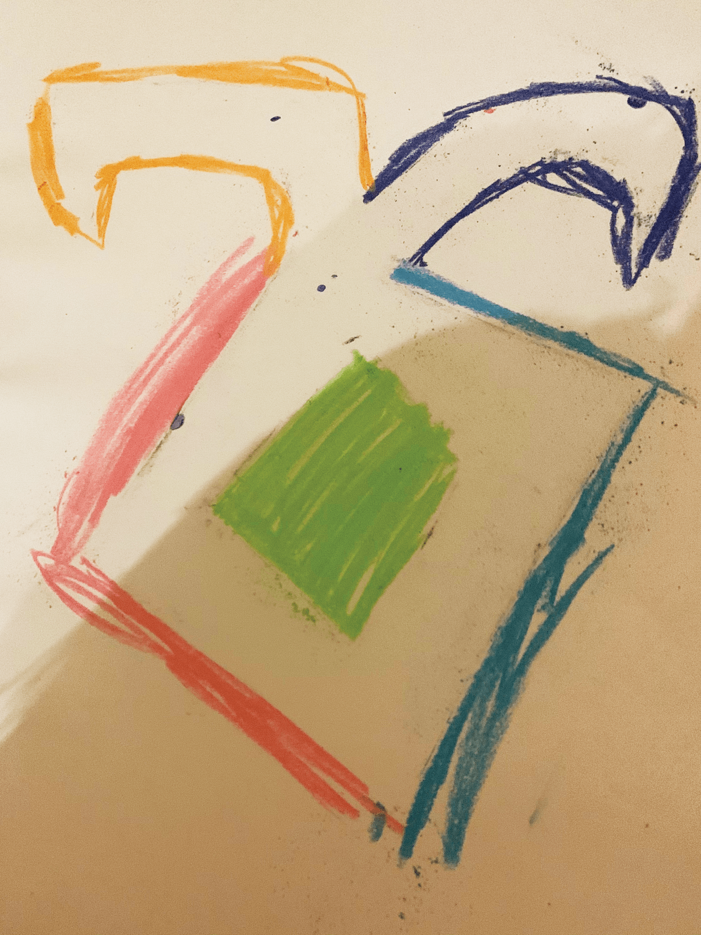
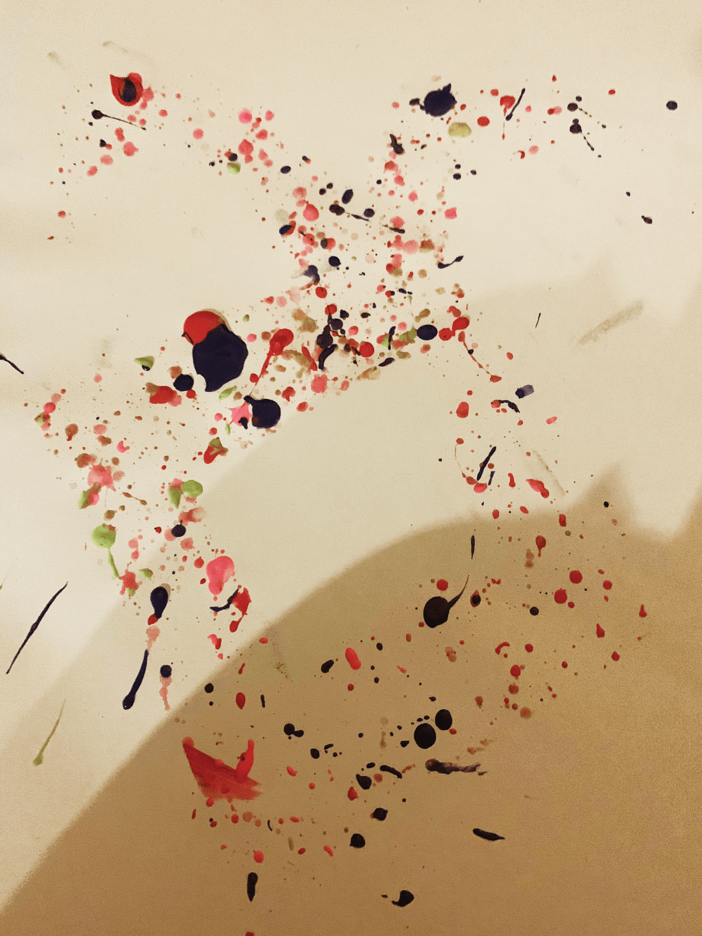
Week 1: Stencil Work
Our next task was to make stencils out of card or cardboard, and to use them with art supplies to create our letter on paper or other materials. I did the rune design again but chose to do it the right way up, but the design could always be turned on its side to resemble the Alpha I had done before. I drew the rune with black soft pastel as it was quite dark and noticeable on the brown card, and began to cut it out. Once I had done that, I chose a few different media to use. I went for paint splattering for one, painting the design for another, and drawing the outline using soft pastel for the last. As I am not yet too confident with stencil work, I think my first attempt was okay, but if I were to attempt this in the future, I might choose a different medium or use cardboard instead of card, as the card was quite light and flimsy.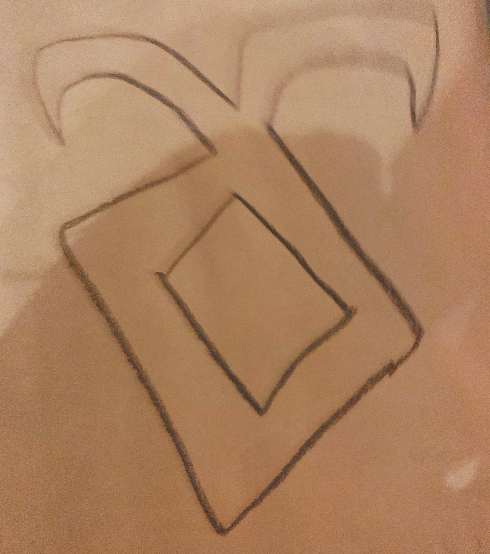
Week 1: The Letter A on Branding/Books

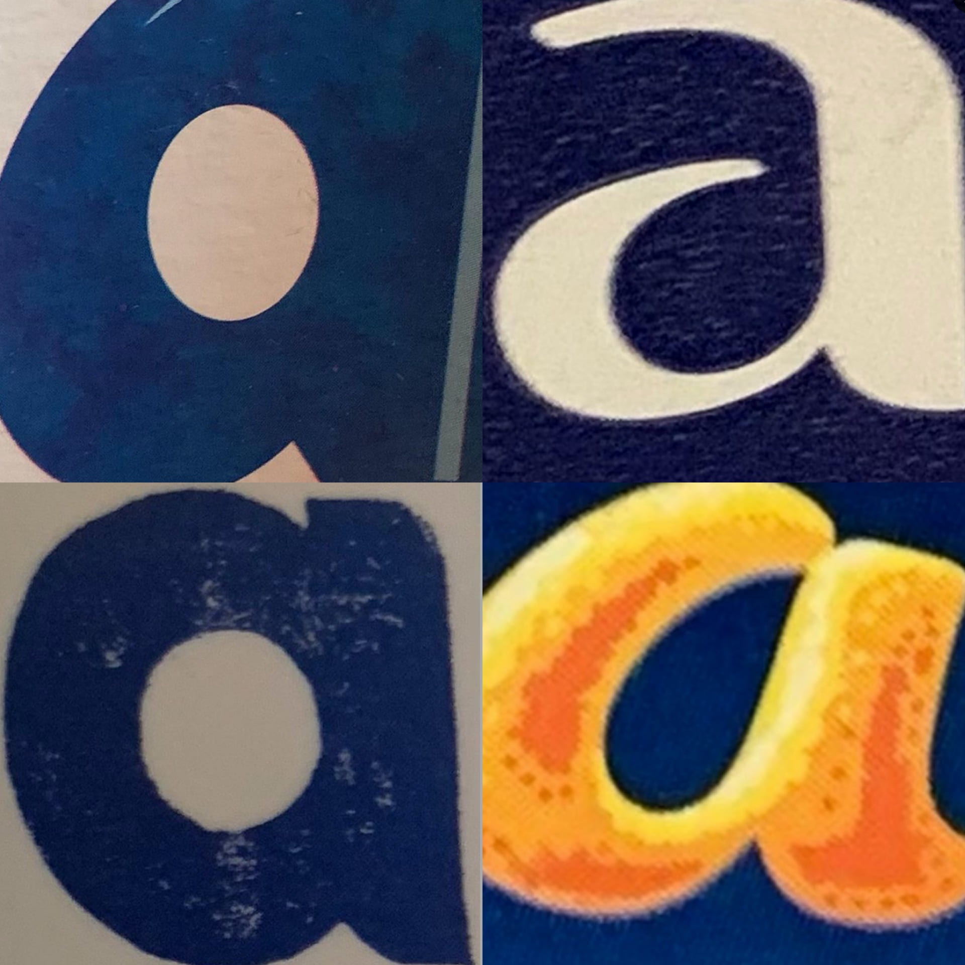
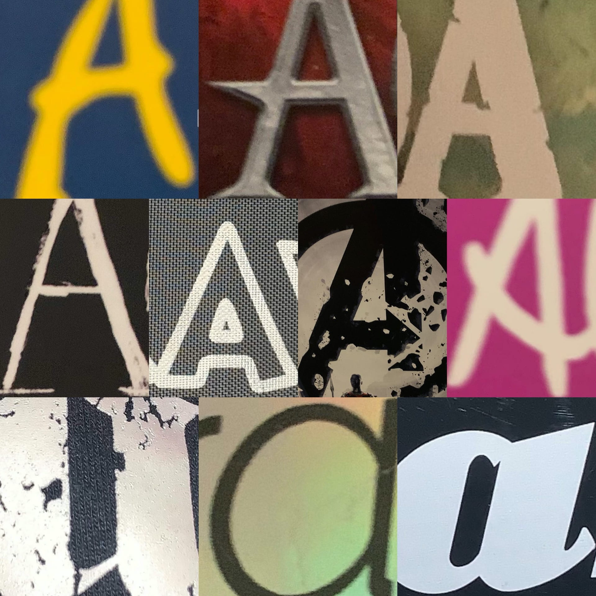
One of our first tasks was to take time to look around our environment at home and find interesting examples of our chosen letter. My three collages above show the letter A I found on Star Trek books and DVDs, on packaging, and other miscellaneous As.
Two of the Star Trek ones are actually the Starfleet logo, which is called a Delta, but despite this association with the Greek letter (the equivalent, of course, of the Latin alphabet’s letter D), the book which features the first one uses it in place of the letter A in Picard. It fits well and it is immediately clear what the word says, despite a symbol being used in place of a letter.
The packaging As are from Fab ice lollies (top left), Carex hand sanitiser (top right), Alpro soya milk (bottom left), and a Terry’s Chocolate Orange. My favourite of these is the chocolate orange one, as I like the contrast of the dark blue and the orange, and the fact that the A resembles orange peel is very effective advertising.
The other As are from a range of book and video game covers. I really like the first one, as the colour scheme, despite the book’s location being Italy, reminds me of the Swedish flag. I like this collection of images as they show a range of typefaces being used, from sans serif and serif to script typefaces.
Week 1: 3D Letter A
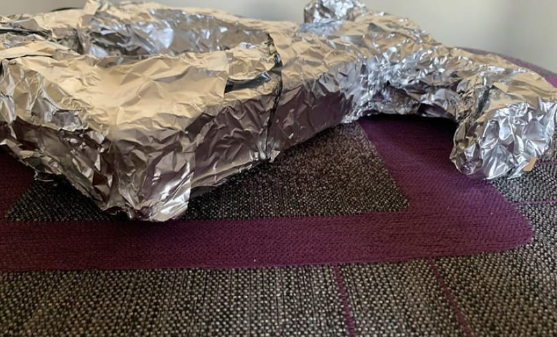
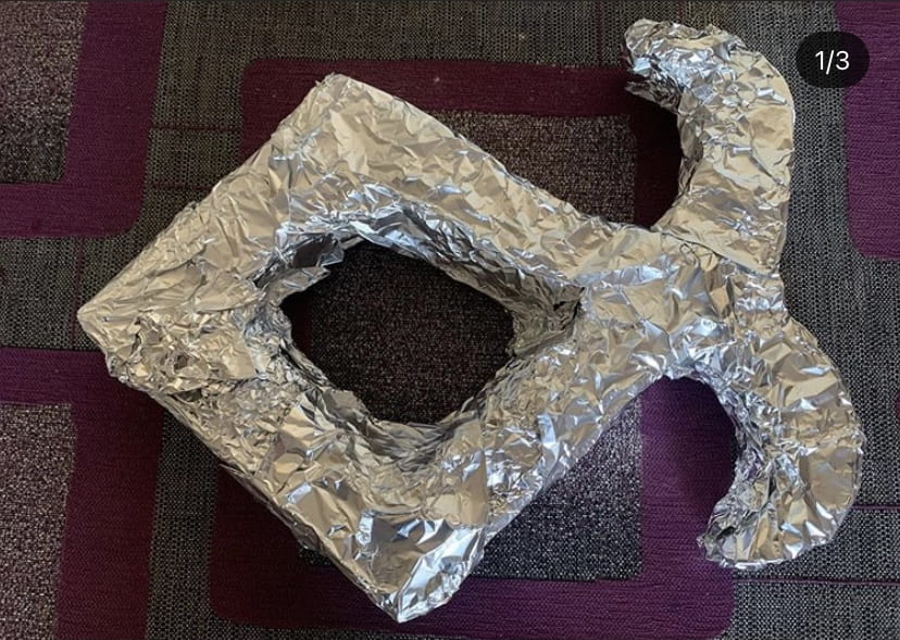
We were tasked with creating a 3D version of the letter we had drawn. I began to see the problem with choosing such an elaborate shape, as I knew I would have difficulty in creating this out of cardboard, which was my chosen medium. However, I took the challenge and began to create this. I started by drawing the shape on two sheets of cardboard, making tabs for folding as I went along, and then I cut it out. It took a while to assemble using masking tape, but I eventually finished and moved on to decorating it. I chose to use tin foil as I felt that if I painted it, the heavy layers of tape would still be visible, so I wanted something which would both cover the letter and create an effective finish. I believe I achieved this successfully, and whilst I had difficulty in creating this piece, I am happy with the end result.
Week 1: Chosen letter in more detail

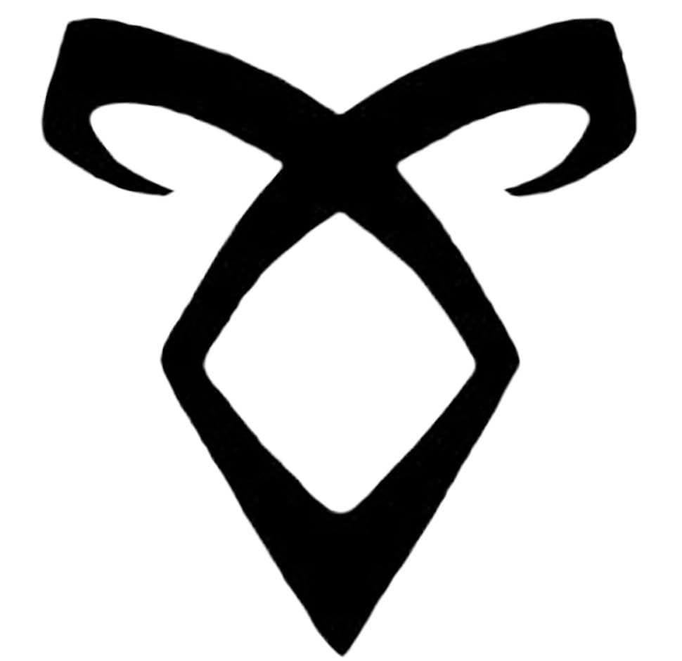
For our next task, we were told to choose one of the letters we had drawn, and to draw it again, in more detail. I chose to draw one I had based off a rune. The rune is called Enkeli, or the Angelic Power rune, from the Mortal Instruments book series by Cassandra Clare, and I had noticed that placing the rune on its side made it almost resemble the Greek letter alpha (α), so I chose this letter to draw as I liked that it had a bit more background information, and was simple yet effective as my chosen letter. These have been drawn in charcoal, pencil, fine drawing pen, and pro marker (with an outline in fine pen). I had a lot of fun drawing these, as runes are very interesting for me to draw.