Branding Moodboard from Week 3

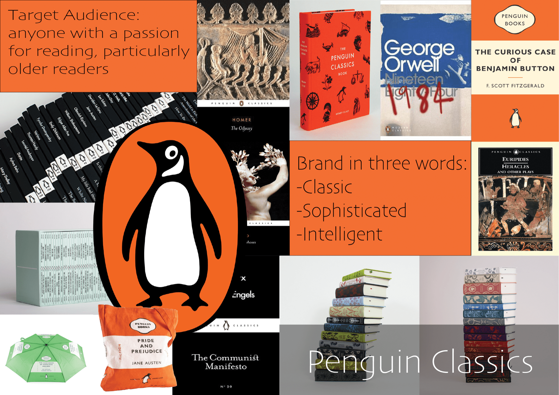
We were tasked with creating a research moodboard into an inspirational brand. Whilst I had looked previously into the Polaroid Originals brand, I chose a new brand to research so that I would have fresh ideas in my head. I chose Penguin as I love the colour scheme they incorporate into most of their marketing materials and the books themselves, using a common theme of black and orange. One thing I find interesting about Penguin is that they are such a well-known and widespread brand that they also have merchandise, such as mugs, umbrellas, and tote bags, which are easily recognisable as being from that brand, as it is a very popular brand amongst readers. My moodboard, created on an A3 artboard using Adobe Illustrator, highlights both the target audience and three words I chose to sum up the brand, and shows the various styles of covers Penguin have, from the Little Black Classics and Modern Classics ranges, to the original orange and cream covers and the premium Clothbound Classics covers. I really enjoyed making this moodboard and would like to continue to do similar work to this in the future.

Week 5: Animated GIFs of our Icon

We were shown how to make our icons into animated GIFs using Adobe After Effects, and then we could try it out for ourselves. As I was not yet confident using After Effects, I chose to try and animate it using Procreate on my iPad. This was hard to get used to at first, but I used the ‘animation assist’ tool which showed me a timeline and helped me to duplicate and remove layers as needed. I found this task quite difficult, but it will be useful in the long run and I am pleased with how it has turned out.

Week 4: Making 3 Icons in Illustrator

I made some icons based on my photograph and initial sketches of a USB stick. I like the third one more, but it wouldn’t be suitable as an icon, and would work better as a GIF or animation. The first was based on the first one but edited to have a filter in Photoshop, to try and abstract it further. I think it works very well for an icon.

Week 4: Iconography picture/sketches

Our next task was to take a photograph of an object with a function. I chose a USB stick as it was nearby and I felt it would work well. I drew some basic sketches, both of the USB and of some icon ideas, from which I would like to develop further into an icon, as they are very simple as they currently are. I like the bottom icon, with files ‘flying’ into the computer, but this would be better as a GIF or animation than an icon, as it is too large and detailed. I found this task somewhat difficult at first, but it became more enjoyable as I sketched more ideas.

Week 4: Calligraphy

We were taken through a calligraphy tutorial so we could try and form our own letters. I used a black ProMarker with a chiselled tip, and I found it quite difficult to get used to at first, but ultimately this proved to be an interesting task and I would like to keep practising to try and improve at calligraphy.

Week 3: Anatomy of Type with Name

I enjoyed this typographic exercise a lot, as it allowed me to research the anatomy of type as I identified each part of the letters in my name. I chose Trajan Pro Regular as my typeface, which admittedly made it somewhat difficult for me as most diagrams of type are based on lowercase characters, and Trajan Pro is an uppercase typeface. However, I managed to find several features of type within my name. I thoroughly enjoyed this task, as I am used to doing similar work in Adobe Illustrator from courses I have done in the past.

Week 3: Brand Research (Task 4)

My chosen commercial brand is Penguin, specifically the Penguin Classics imprint of the brand. The reason I have chosen this brand to research is because Penguin is an iconic brand amongst readers and is often chosen by universities for set books for their courses. There have been several cover design changes throughout the years. The current design consists of the cover image taking up roughly ¾ of the cover, with a thin white bar underneath (with Penguin Classics and the logo on it), and below that is the title. This book cover design is arguably one of the most iconic features of the brand, as it is recognisable as Penguin, and is sleek and minimalistic. The main colours of the brand are black and orange, and are used widely throughout both the covers and marketing materials, and of course, in the logo itself. Their children’s imprint, Puffin, has a lot of the same features in the logo, with a puffin instead of a penguin. Penguin have also released a set of beautifully designed clothbound hardback classics, which have an audience amongst collectors or people looking for gifts. The main target audience for the brand would be anyone interested in reading, but mostly somewhat older readers, as younger readers would be more likely to read the Puffin imprint. The brand connects with its audience by presenting well designed covers which are simple yet effective, and often use paintings or statues as the cover images, showing the class of the books. Penguin is on multiple social media sites, to update readers using these sites as to release dates or book announcements. They are also found in essentially every bookshop, allowing them to reach multiple age ranges, as some people might not shop in physical bookshops often, choosing instead to buy books online.


(300 words)


Week 3: Experimental Letters using Household Objects

We had to do a short task, using objects or food in our houses, to create our chosen letter. I wasn’t sure if I fully understood the task at first, but I gave it a try. I made an uppercase A out of oranges. I like that an A might be more closely associated with apples, but I used oranges instead. My other letter was a lowercase A made out of my little brother’s Soreen snack bars in different colours. I much prefer the look of the oranges A, as it is clear, as opposed to the Soreen one, which is very busy due to the illustrations on the bars. I do, however, like the colours in the Soreen A a lot more, as it reminds me of a traffic light, and the colours are very vivid.

I enjoyed this task in the end, and think I was successful.