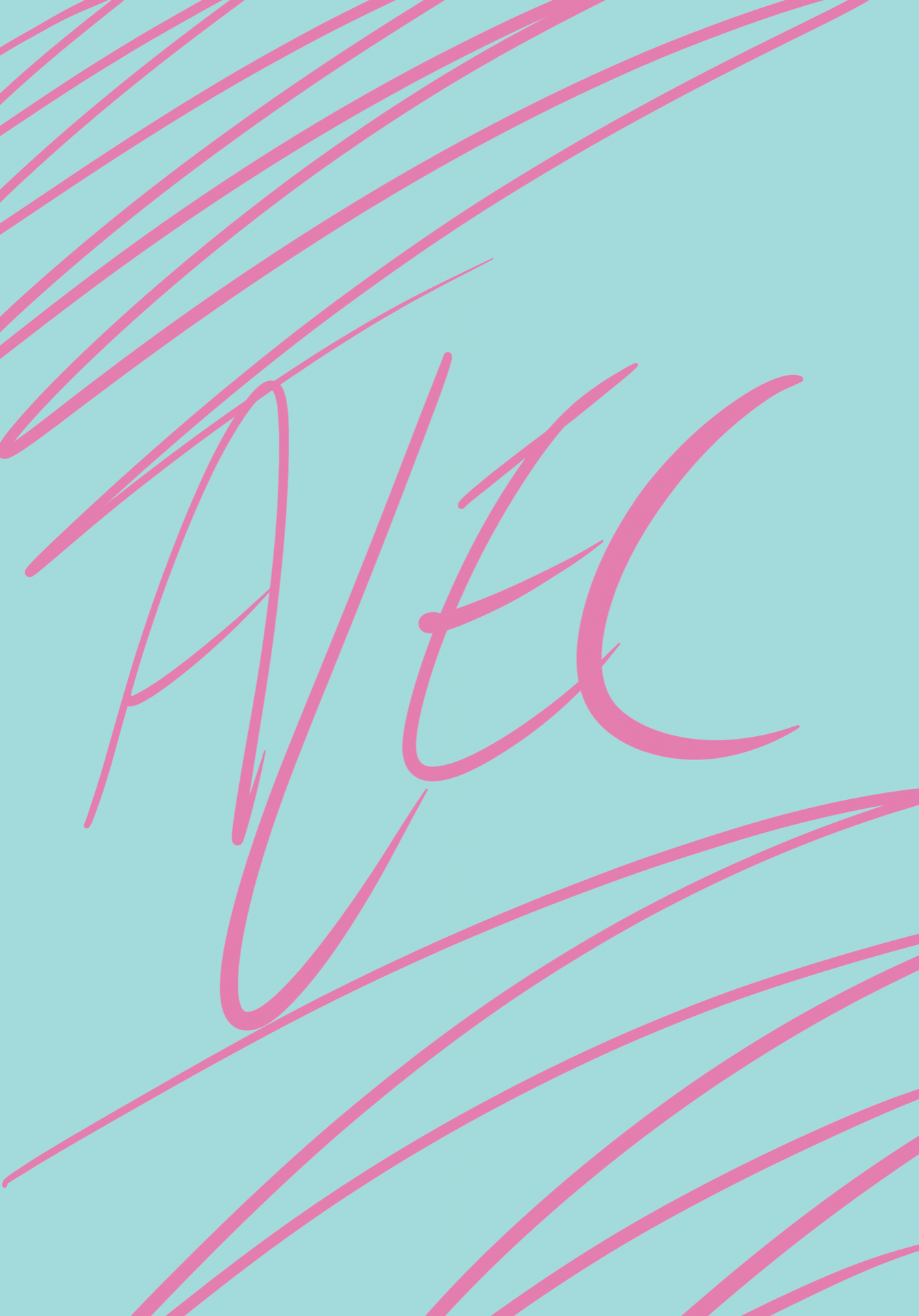
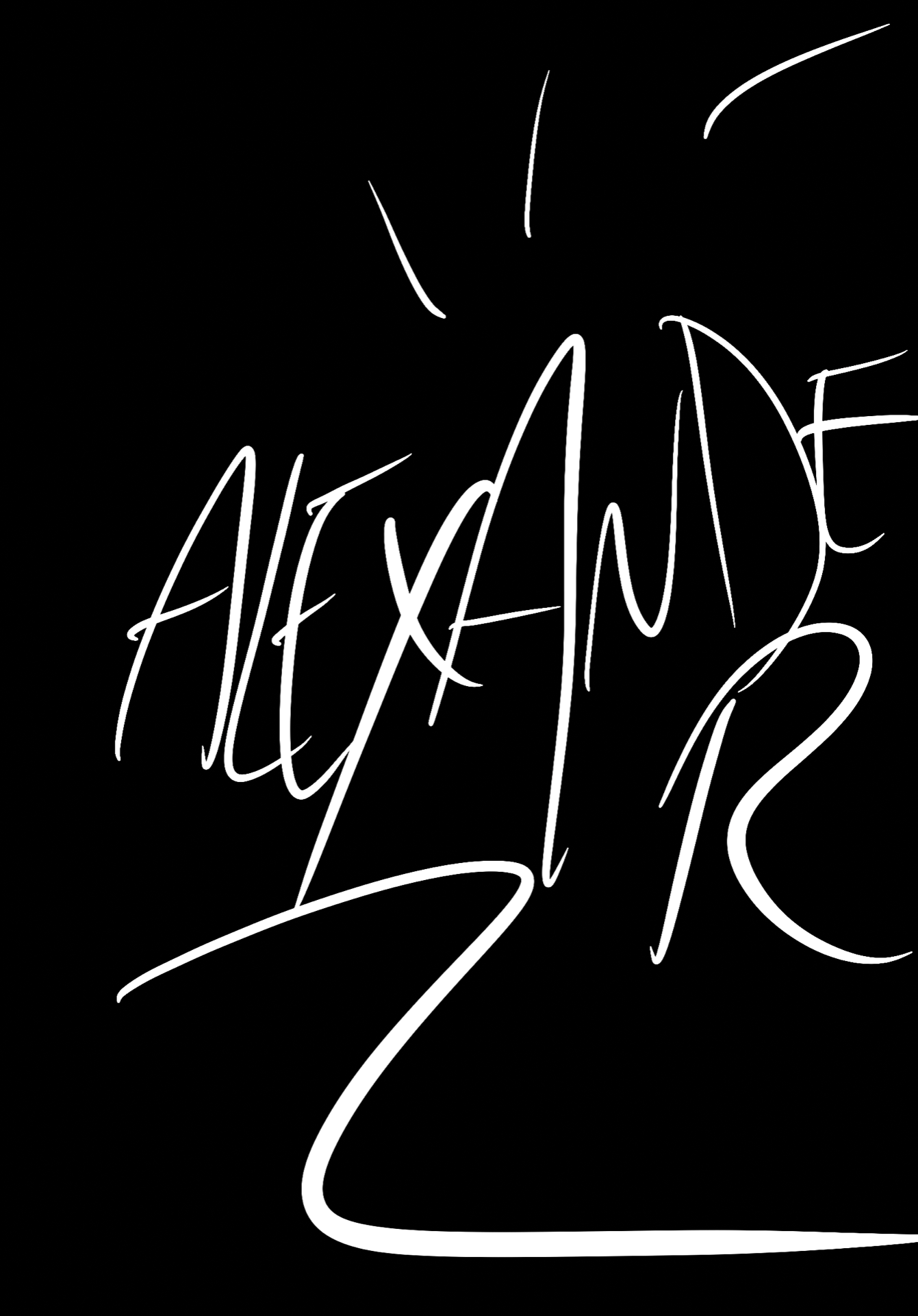
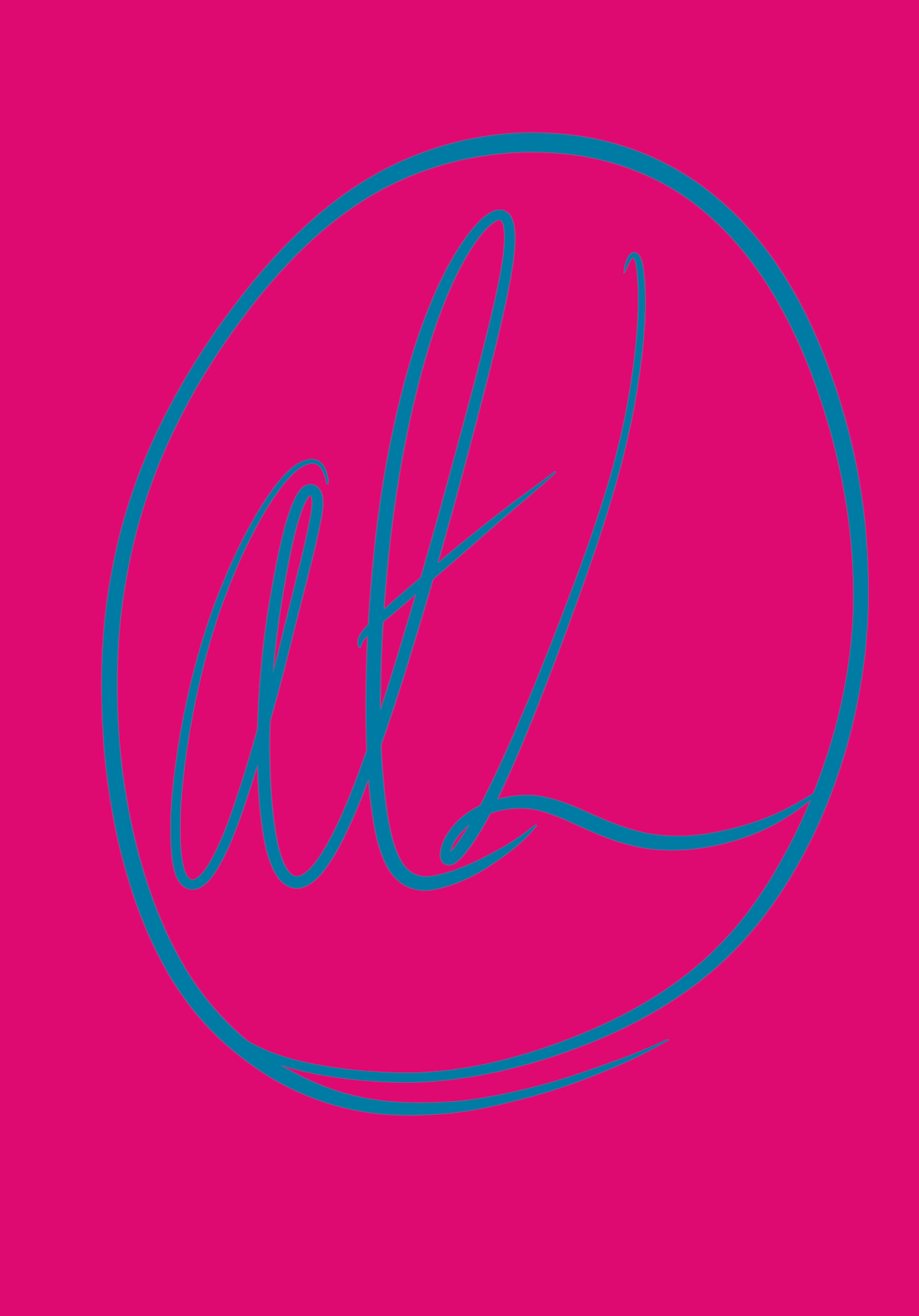
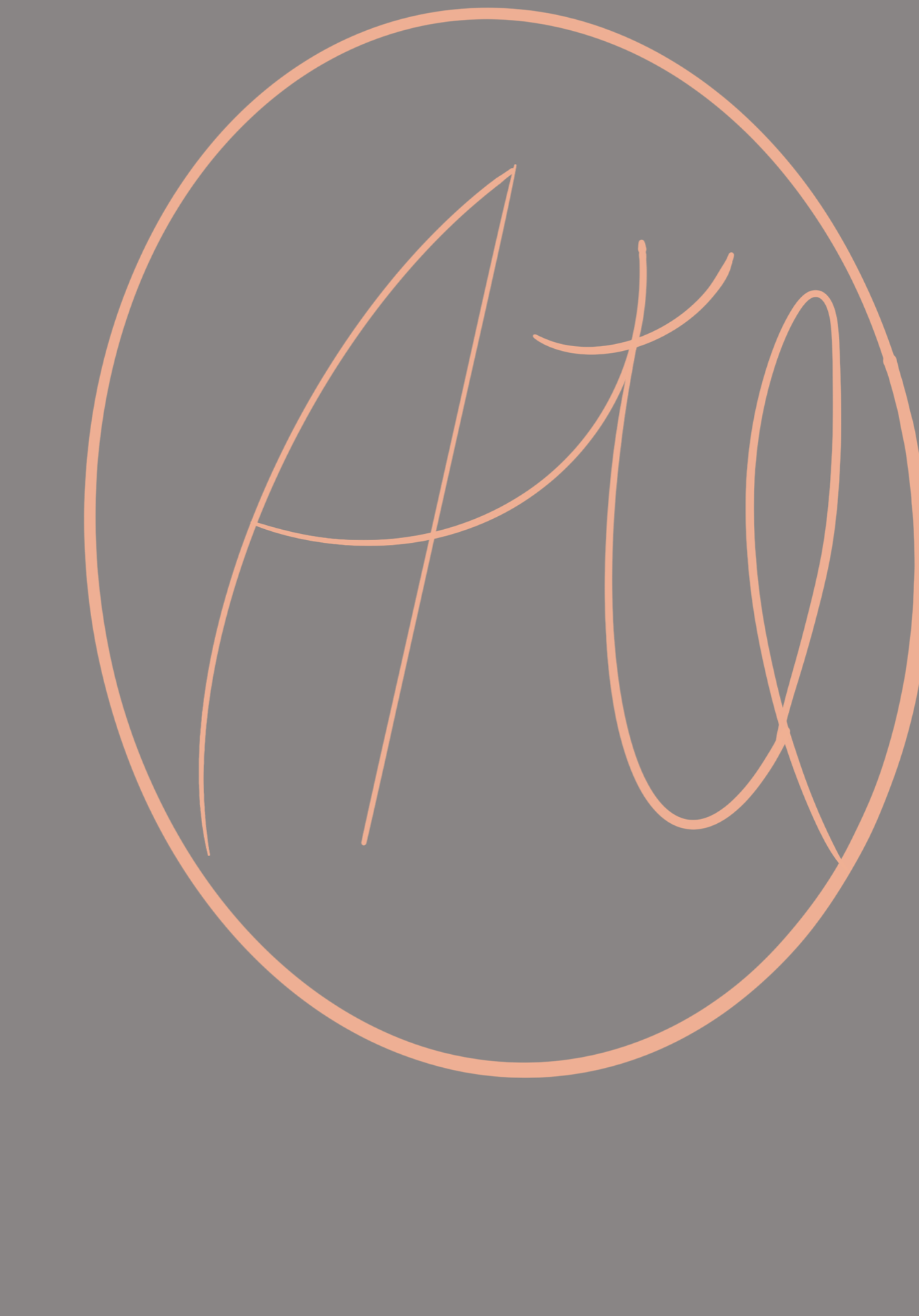
To develop my logo ideas further, I wanted to try using my full name in Procreate, to see if I could make successful logos out of it. Some have my full (extended) name and others just say ‘Alec’, as I wanted to have a mixture. I really enjoyed this task, as it allowed me to continue trying out different colour schemes and styles of writing my name. My favourite ones are the ones with the green/yellow background and the orange background. I developed the orange one into black and white ones to be part of the final pieces. 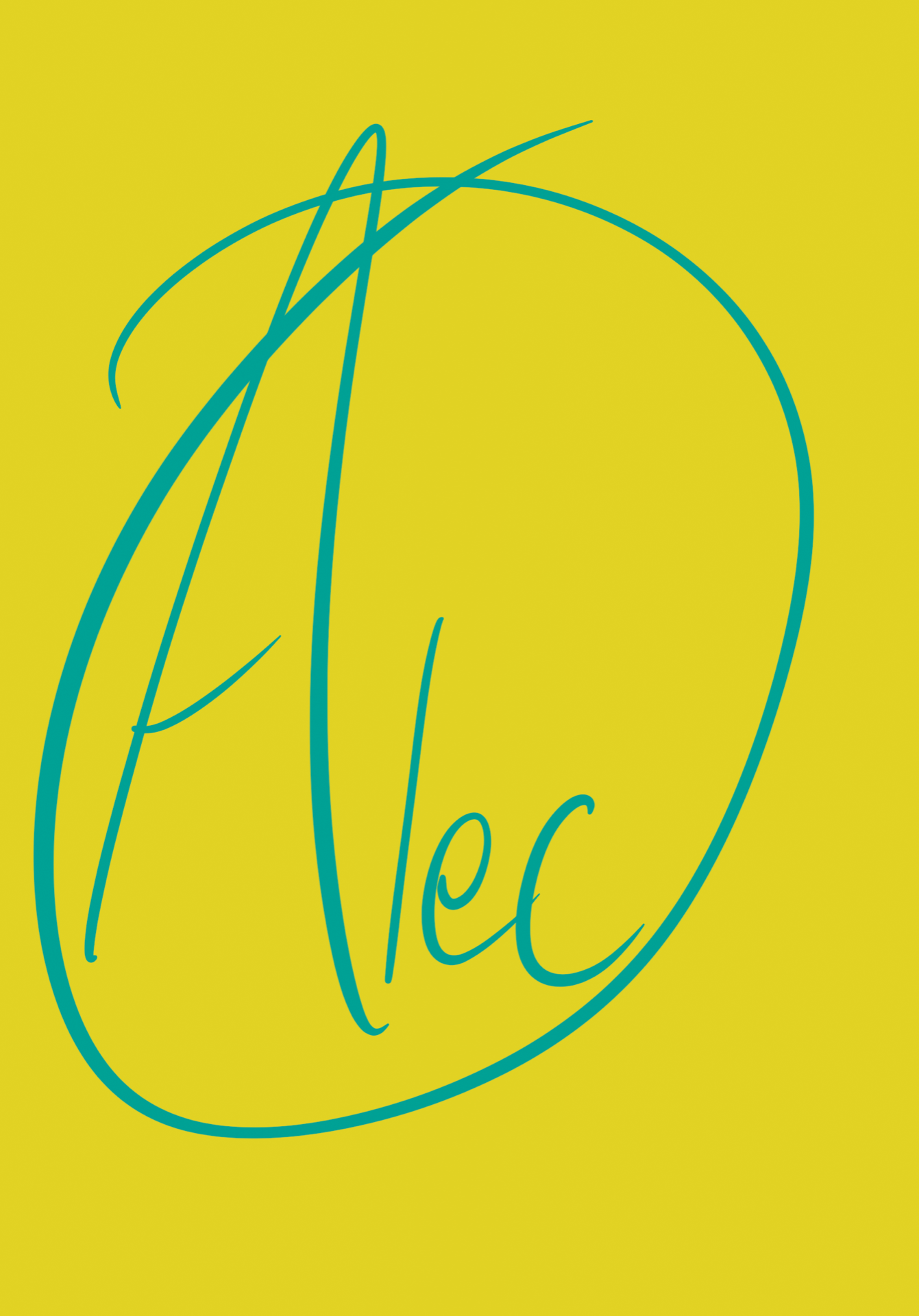


Tag: drawing
Week 5: Animated GIFs of our Icon

We were shown how to make our icons into animated GIFs using Adobe After Effects, and then we could try it out for ourselves. As I was not yet confident using After Effects, I chose to try and animate it using Procreate on my iPad. This was hard to get used to at first, but I used the ‘animation assist’ tool which showed me a timeline and helped me to duplicate and remove layers as needed. I found this task quite difficult, but it will be useful in the long run and I am pleased with how it has turned out.
Week 4: Iconography picture/sketches
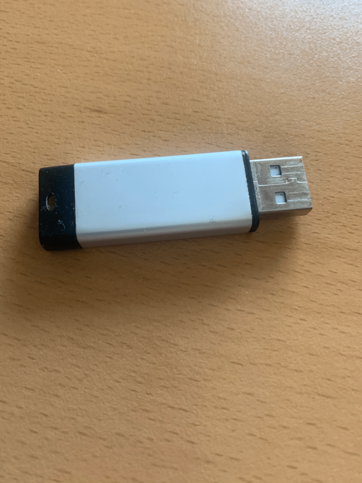
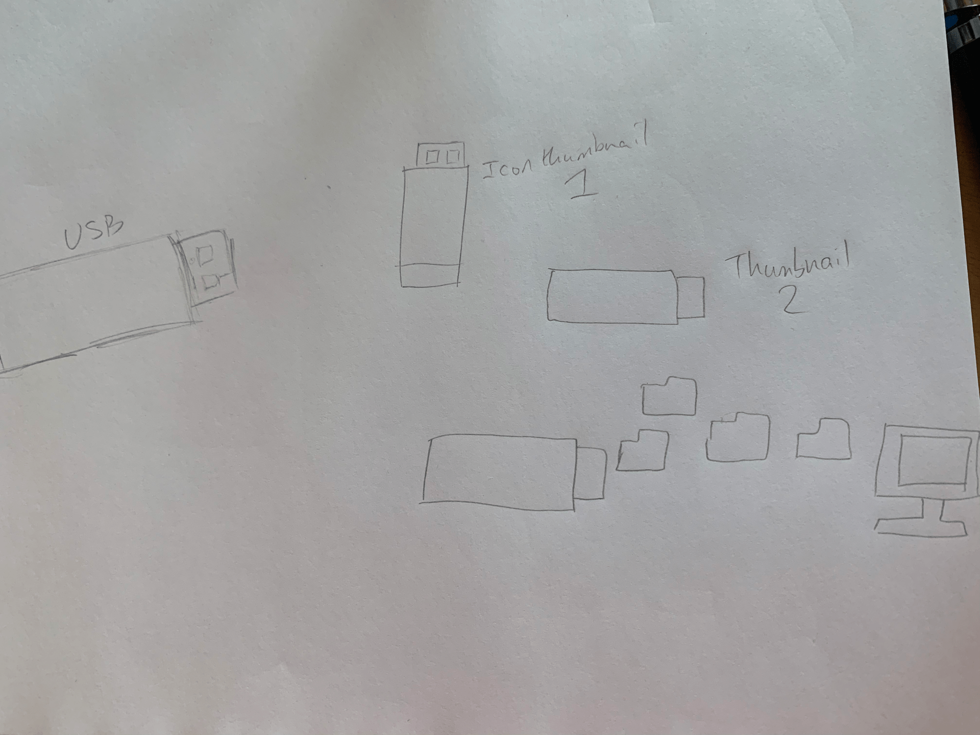
Our next task was to take a photograph of an object with a function. I chose a USB stick as it was nearby and I felt it would work well. I drew some basic sketches, both of the USB and of some icon ideas, from which I would like to develop further into an icon, as they are very simple as they currently are. I like the bottom icon, with files ‘flying’ into the computer, but this would be better as a GIF or animation than an icon, as it is too large and detailed. I found this task somewhat difficult at first, but it became more enjoyable as I sketched more ideas.
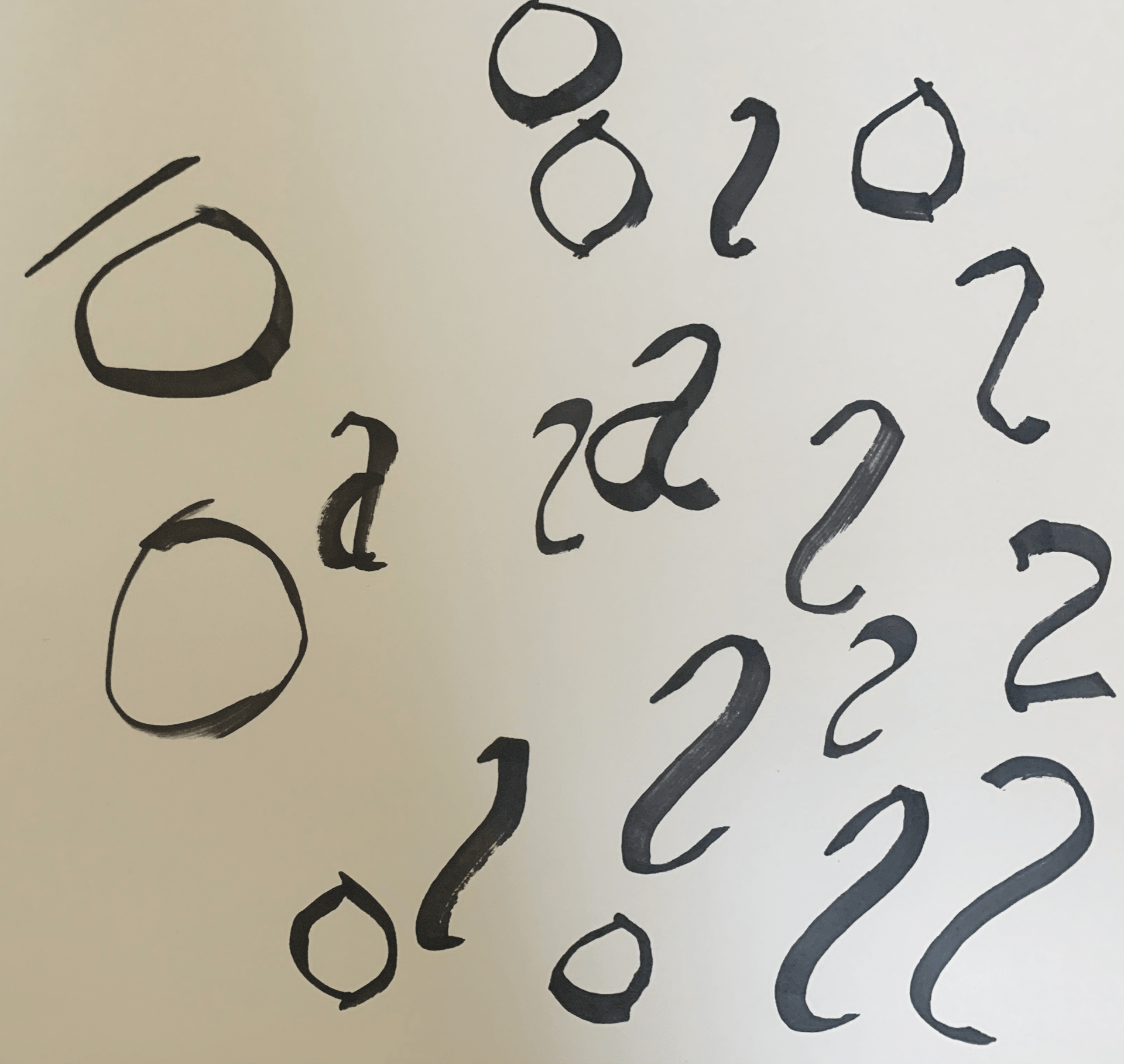
Week 4: Calligraphy
We were taken through a calligraphy tutorial so we could try and form our own letters. I used a black ProMarker with a chiselled tip, and I found it quite difficult to get used to at first, but ultimately this proved to be an interesting task and I would like to keep practising to try and improve at calligraphy. 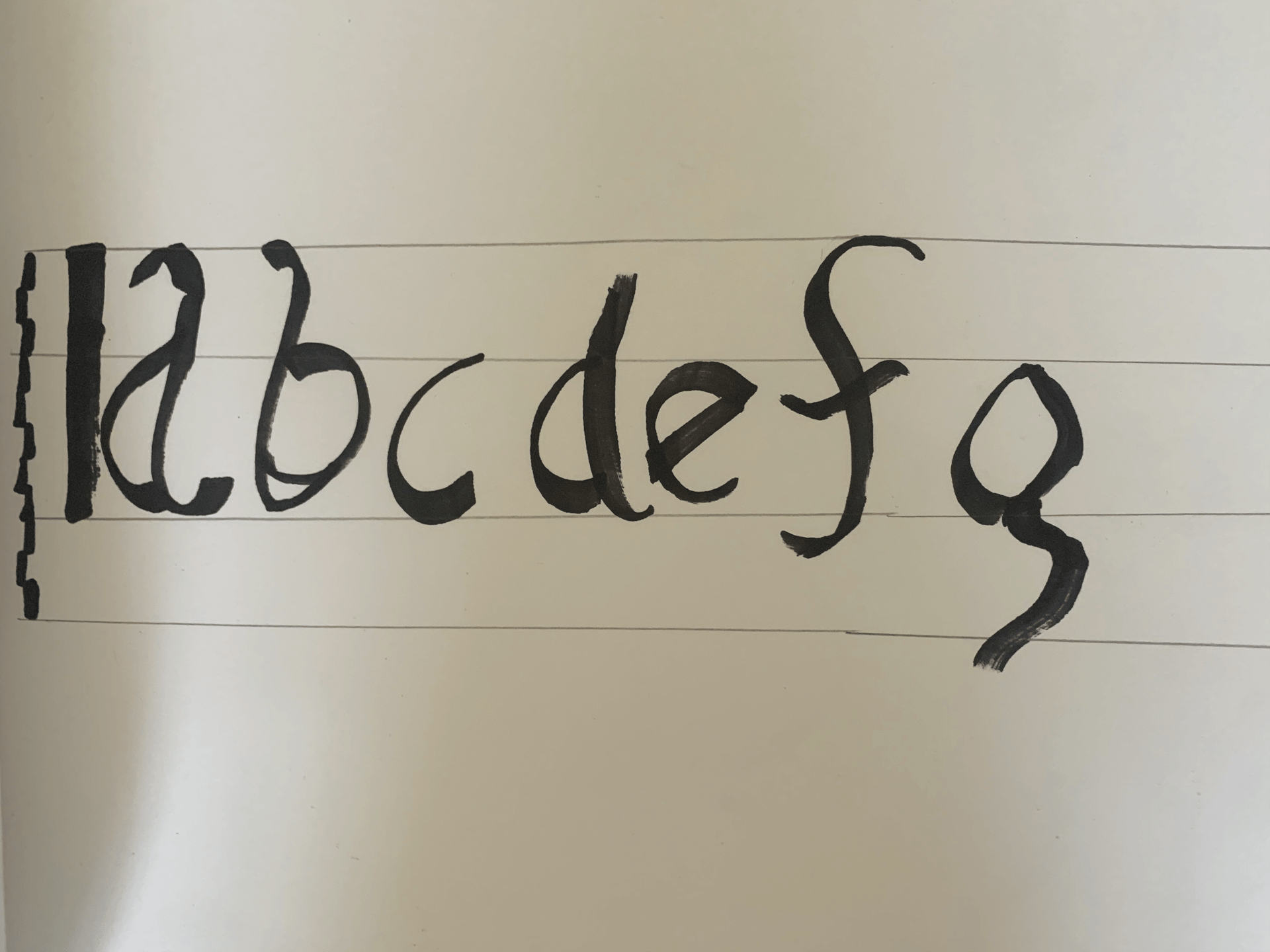
Week 3: Initial Logos (Procreate Development)


![]()
![]()
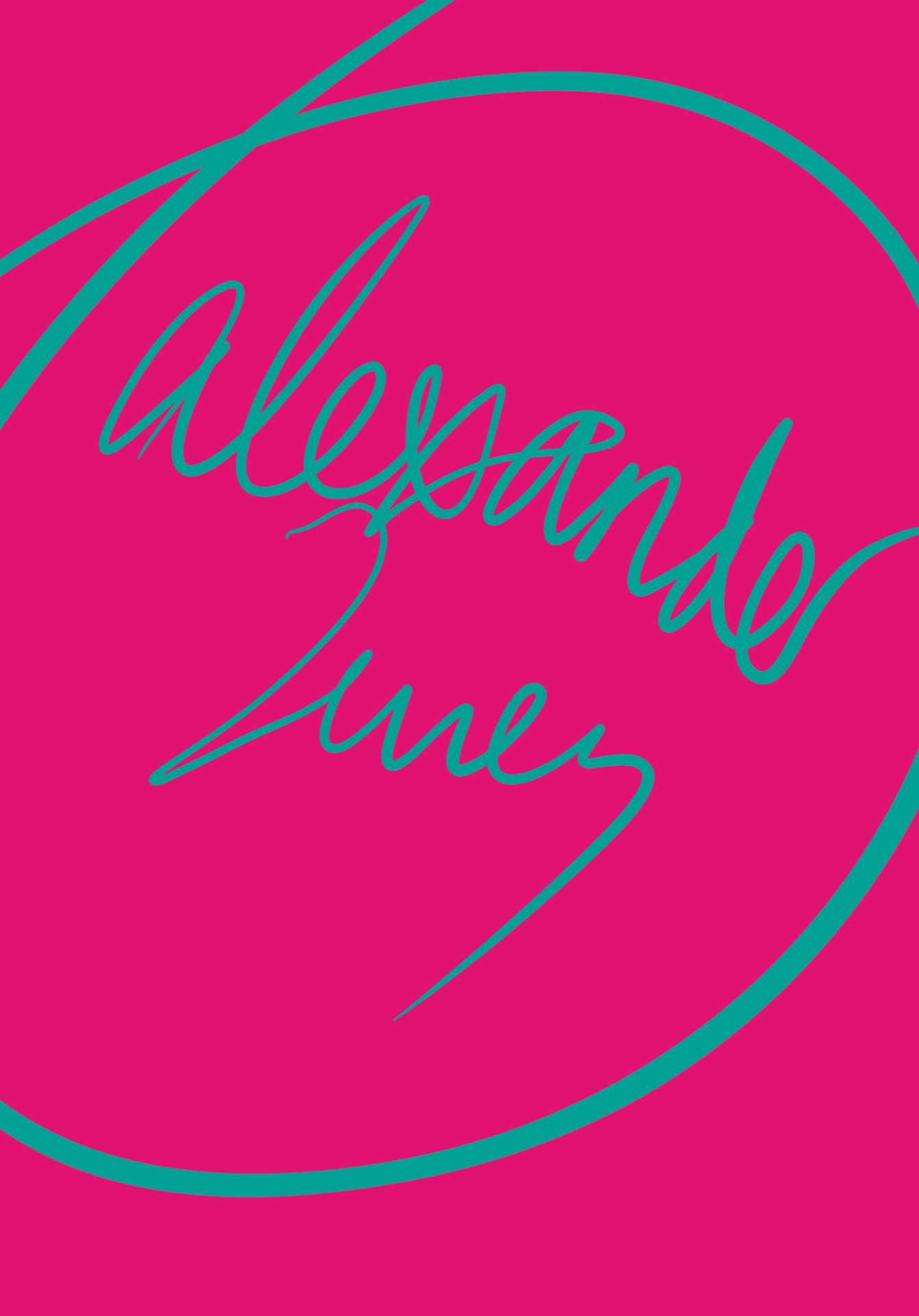
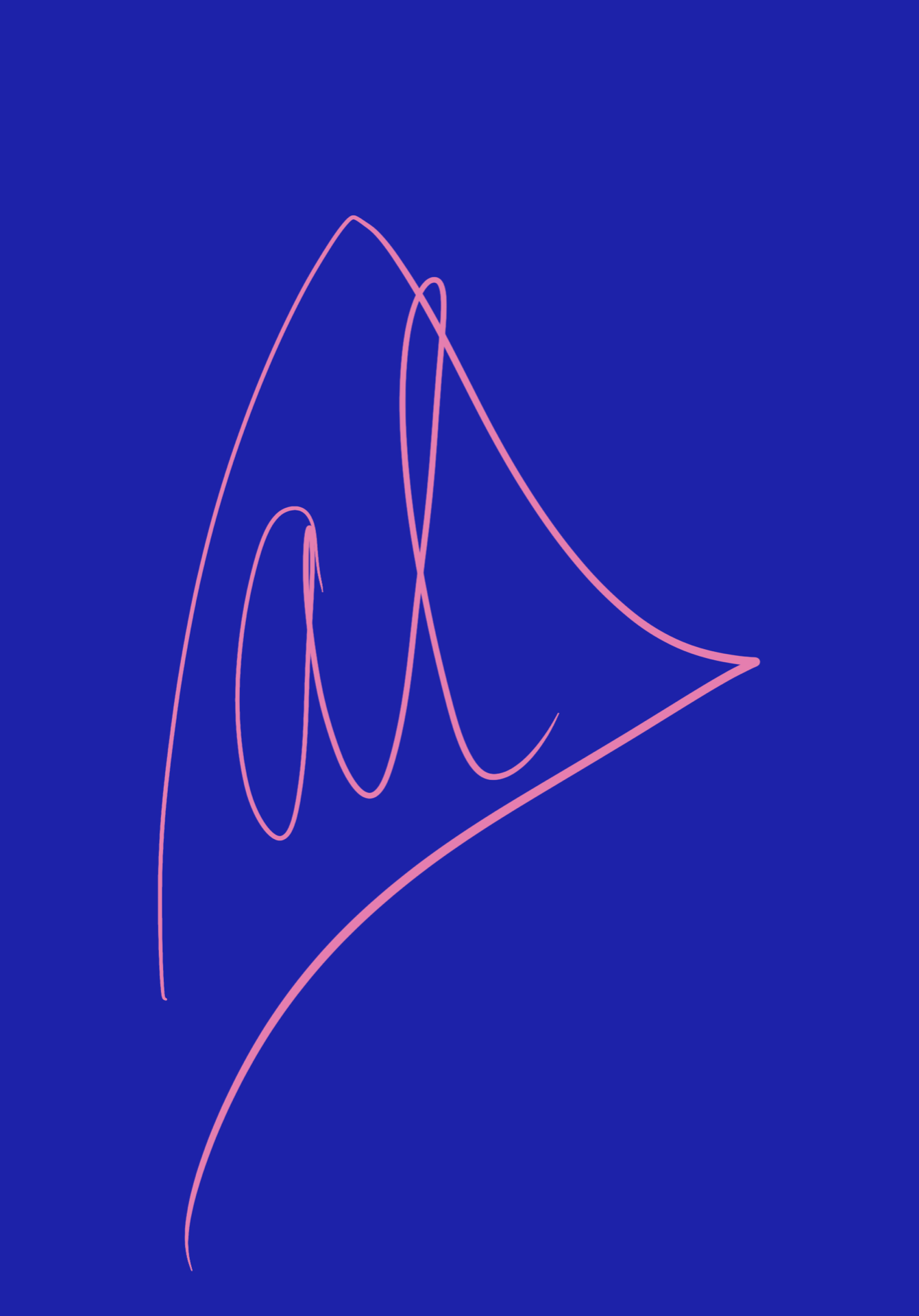
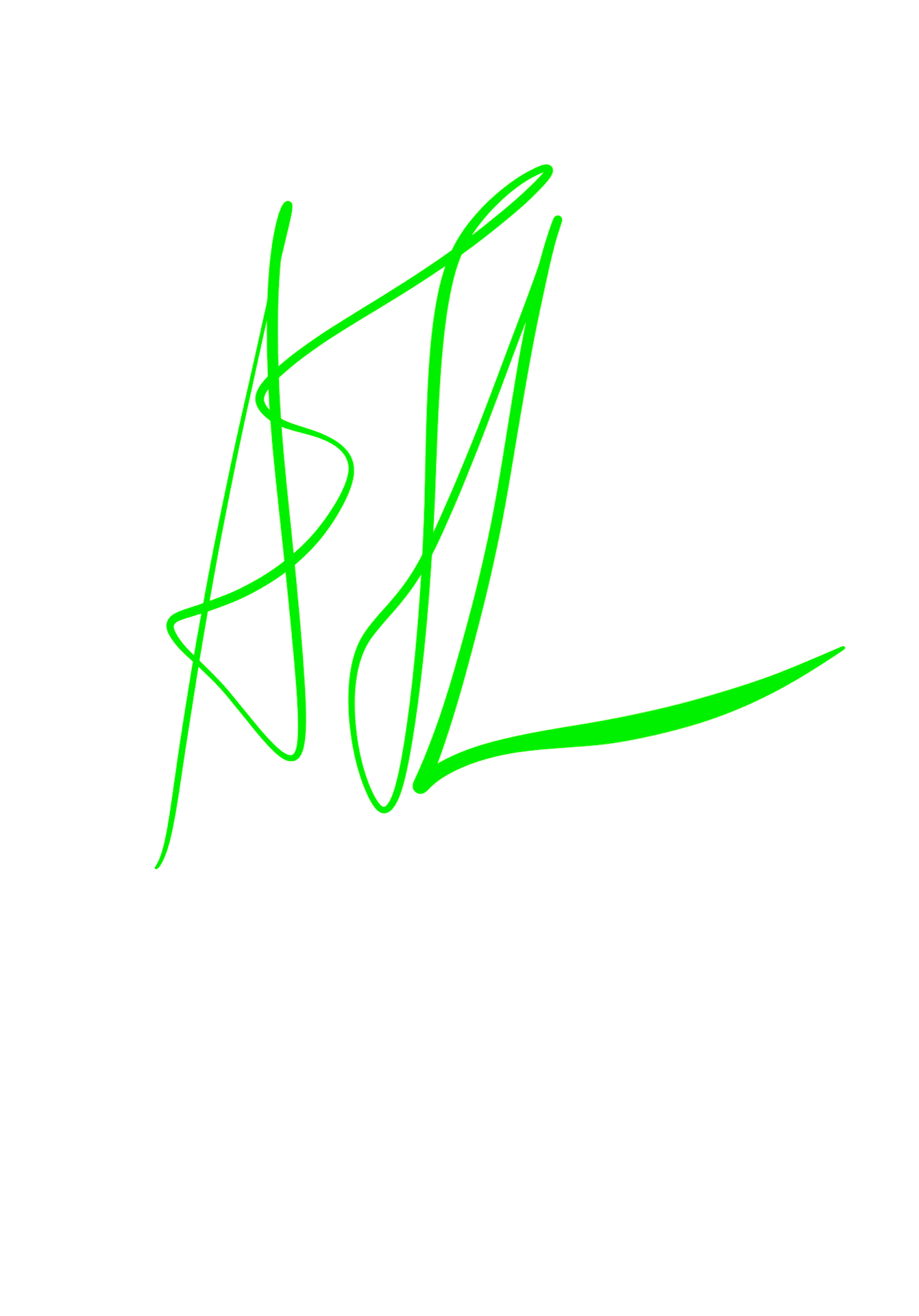
I chose to develop my logo sketches further using Procreate. Some of these are directly based off my sketches, but others are ones I thought of whilst I was doing this task. The top three are my favourites, both due to the shapes used and the colour scheme (the pink/blue one is incredibly vibrant and the contrast is eye-catching).
The first logo uses a lot of contrast as well as the second, and I love how well the colours interact. The third uses very gentle colours and the pink makes me think of ballet shoes, so this logo would be good for a ballet company.
I liked the apple in the fourth one, as I thought it was quite different and was a different interpretation of geometric shapes. I like the way the colours interacted with one another.
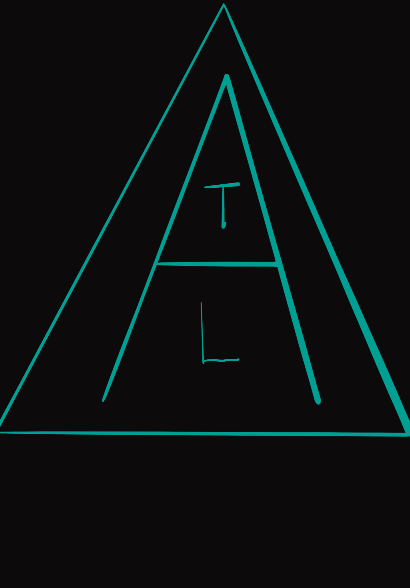
The fifth one has a very bold, vibrant colour scheme which makes it stand out. The letters of my name are stacked within the letter A, which is, in turn, encased in a triangle. I like the neon turquoise on black.
The sixth one was inspired by Sparta, using gold which reminds me of their armour, and red, from the Spartan cloaks worn by soldiers. This is because I was using Greek letters, which, as I have previously mentioned, made me think of a Spartan shield. I really like this one, but the red on gold is perhaps too vibrant.
The seventh and eighth ones had nice colour schemes, but I didn’t think they were as successful as the others. The ninth had a good script style, but the neon green didn’t work well on the white background. If I were to re-do this, I would put it on a black background.
Overall, I thoroughly enjoyed this task and would love to do more work like this in the future.
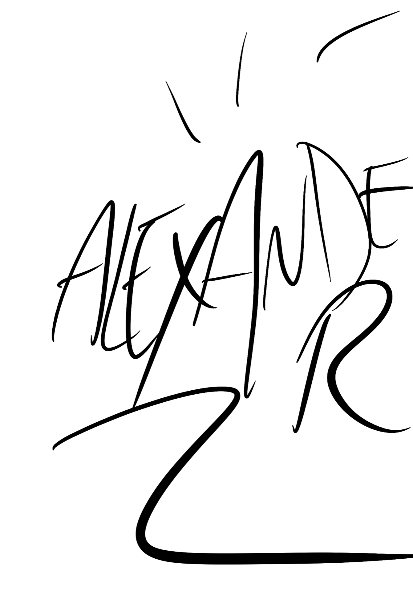
EDIT: I have also included the variations on my logo/wordmark in black on white and white on black. I liked the style of the pink and blue logo so I chose to use this for further development.
Week 3: Initial Logo Sketches
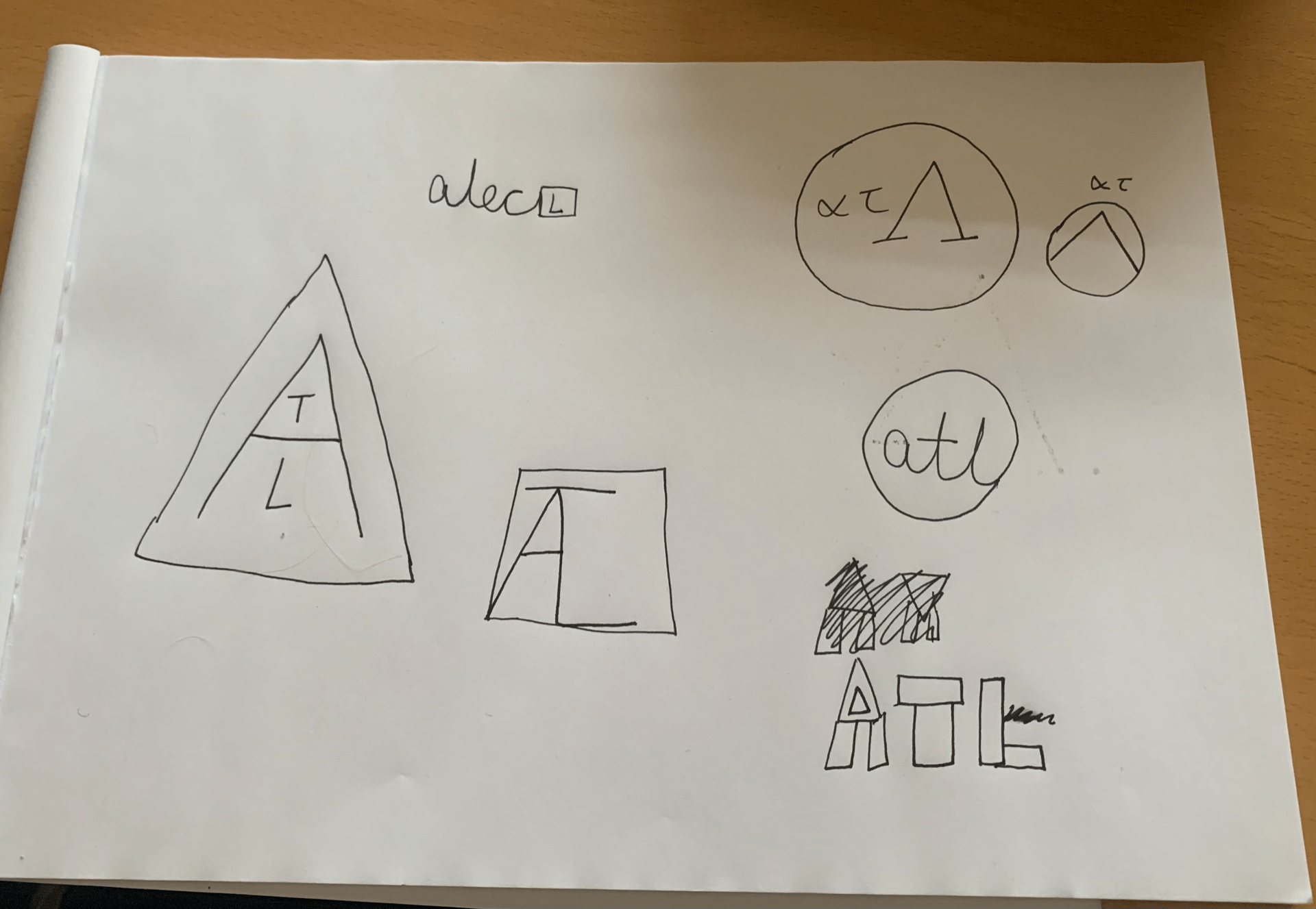
We used our initials to create logos using triangles, circles, and squares. These could either be in the shapes, or arranged into a shape. I did a few different styles, but they were only rough sketches for now, as I planned to develop these further using Procreate on the Apple iPad. Whilst I liked these initial sketches, I wanted to see what I could do in Procreate to improve them. My favourite from the sketches was one of the top right logos, with the Greek letters, lowercase alpha, lowercase tau and uppercase Lambda (ατΛ), as the Lambda reminded me of a triangle, and with a circle around it, it made me think of a Spartan shield, as that is what they would have looked like. I added small, lowercase letters for my other initials, to make it more logo-like.
I enjoyed this task but looked forward to developing these further.
Week 1: Chosen letter in more detail

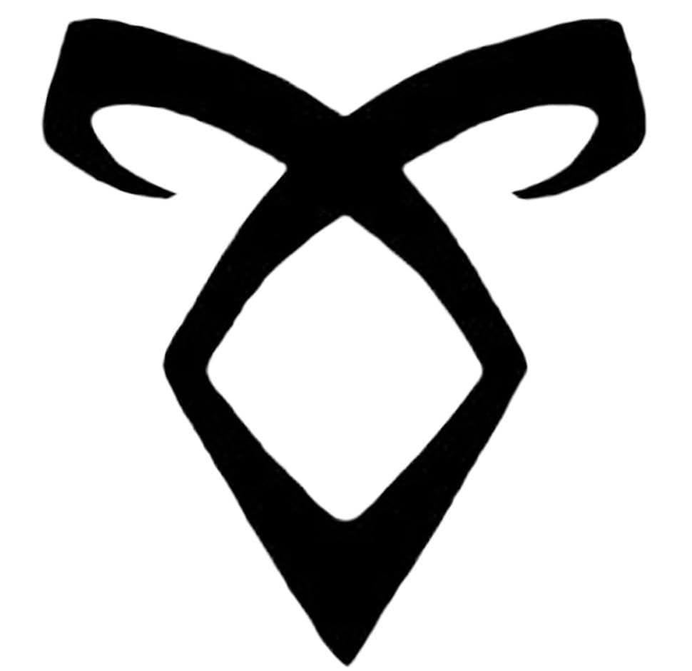
For our next task, we were told to choose one of the letters we had drawn, and to draw it again, in more detail. I chose to draw one I had based off a rune. The rune is called Enkeli, or the Angelic Power rune, from the Mortal Instruments book series by Cassandra Clare, and I had noticed that placing the rune on its side made it almost resemble the Greek letter alpha (α), so I chose this letter to draw as I liked that it had a bit more background information, and was simple yet effective as my chosen letter. These have been drawn in charcoal, pencil, fine drawing pen, and pro marker (with an outline in fine pen). I had a lot of fun drawing these, as runes are very interesting for me to draw.
Week 1: Drawing different letter shapes
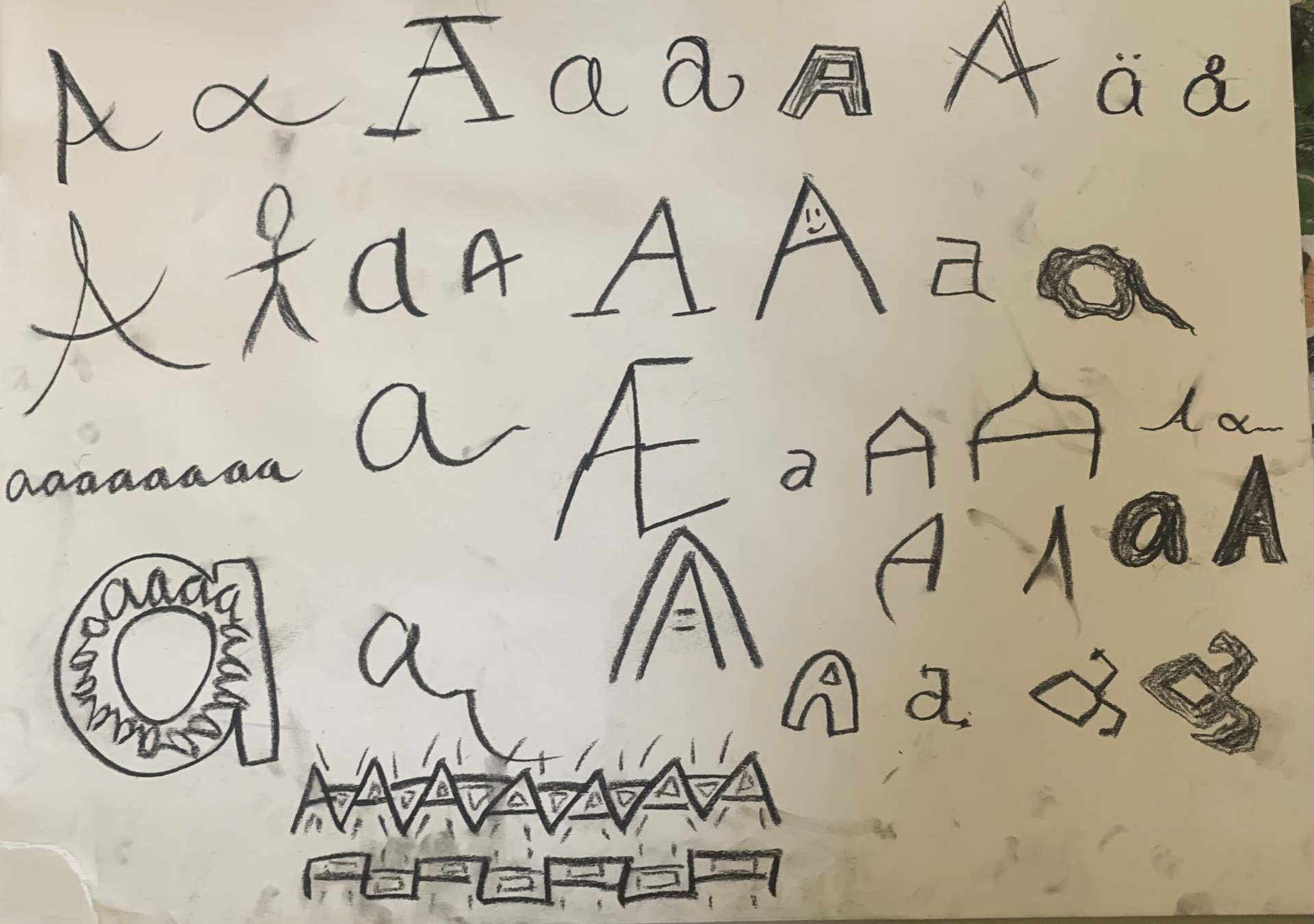
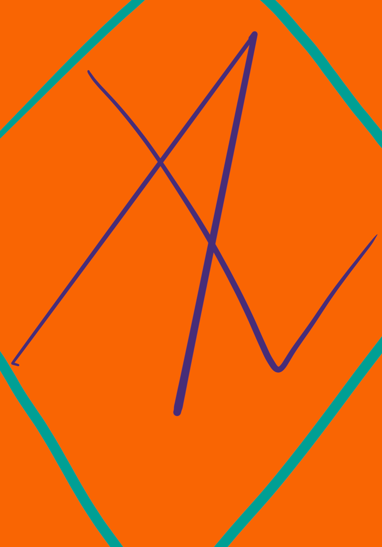
Our first task was to create as many different forms of our chosen letter as we could think of, within the time limit. I chose the letter A, not just because of my name, but also because I could think of lots of different styles of the letter to draw. I had a lot of fun doing this task, and found that I knew more ways to draw the letter A than I had previously thought.