We were tasked with creating a research moodboard into an inspirational brand. Whilst I had looked previously into the Polaroid Originals brand, I chose a new brand to research so that I would have fresh ideas in my head. I chose Penguin as I love the colour scheme they incorporate into most of their marketing materials and the books themselves, using a common theme of black and orange. One thing I find interesting about Penguin is that they are such a well-known and widespread brand that they also have merchandise, such as mugs, umbrellas, and tote bags, which are easily recognisable as being from that brand, as it is a very popular brand amongst readers. My moodboard, created on an A3 artboard using Adobe Illustrator, highlights both the target audience and three words I chose to sum up the brand, and shows the various styles of covers Penguin have, from the Little Black Classics and Modern Classics ranges, to the original orange and cream covers and the premium Clothbound Classics covers. I really enjoyed making this moodboard and would like to continue to do similar work to this in the future.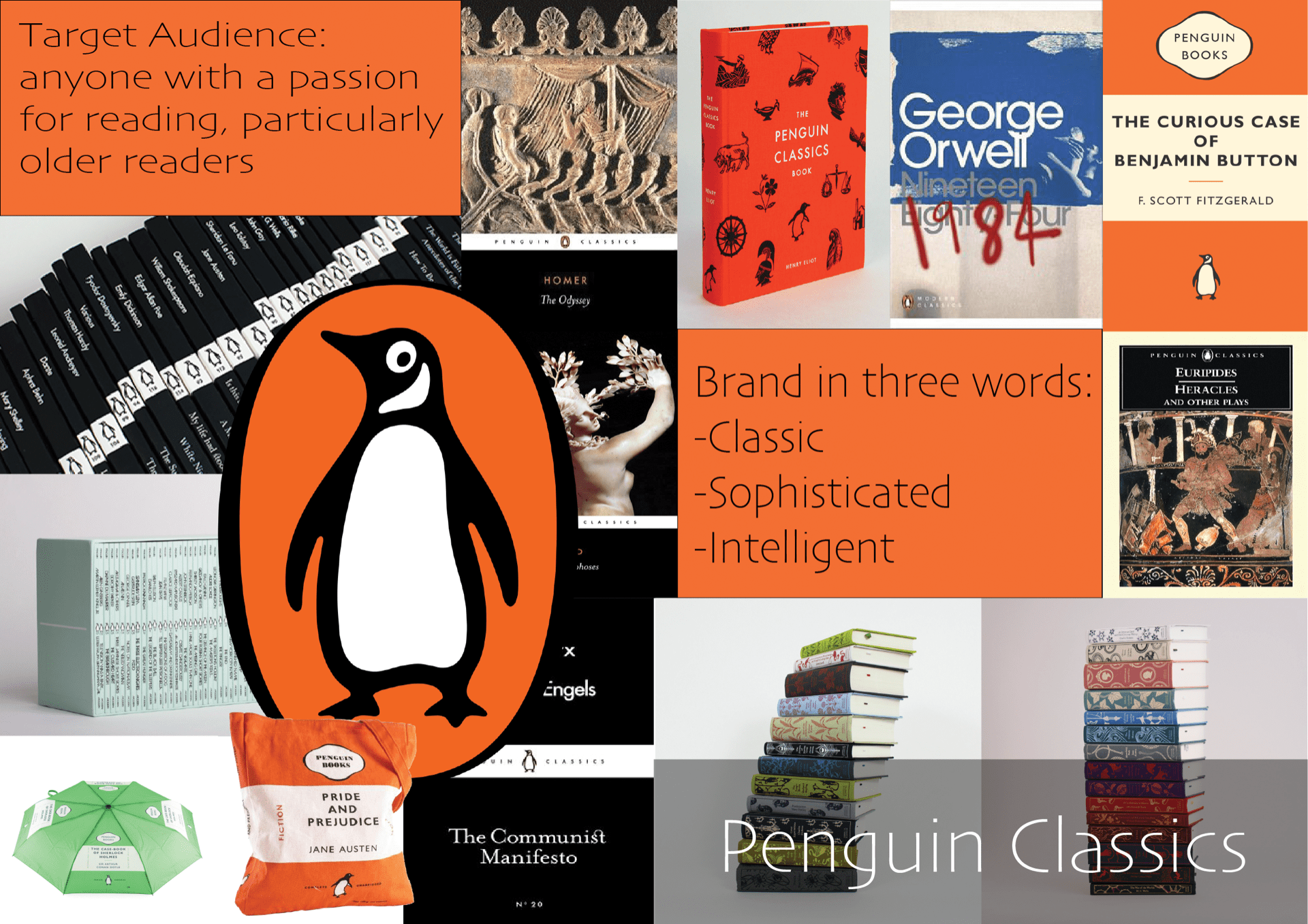
Category: VIC107
Week 5: Animated GIFs of our Icon

We were shown how to make our icons into animated GIFs using Adobe After Effects, and then we could try it out for ourselves. As I was not yet confident using After Effects, I chose to try and animate it using Procreate on my iPad. This was hard to get used to at first, but I used the ‘animation assist’ tool which showed me a timeline and helped me to duplicate and remove layers as needed. I found this task quite difficult, but it will be useful in the long run and I am pleased with how it has turned out.
Week 4: Iconography picture/sketches
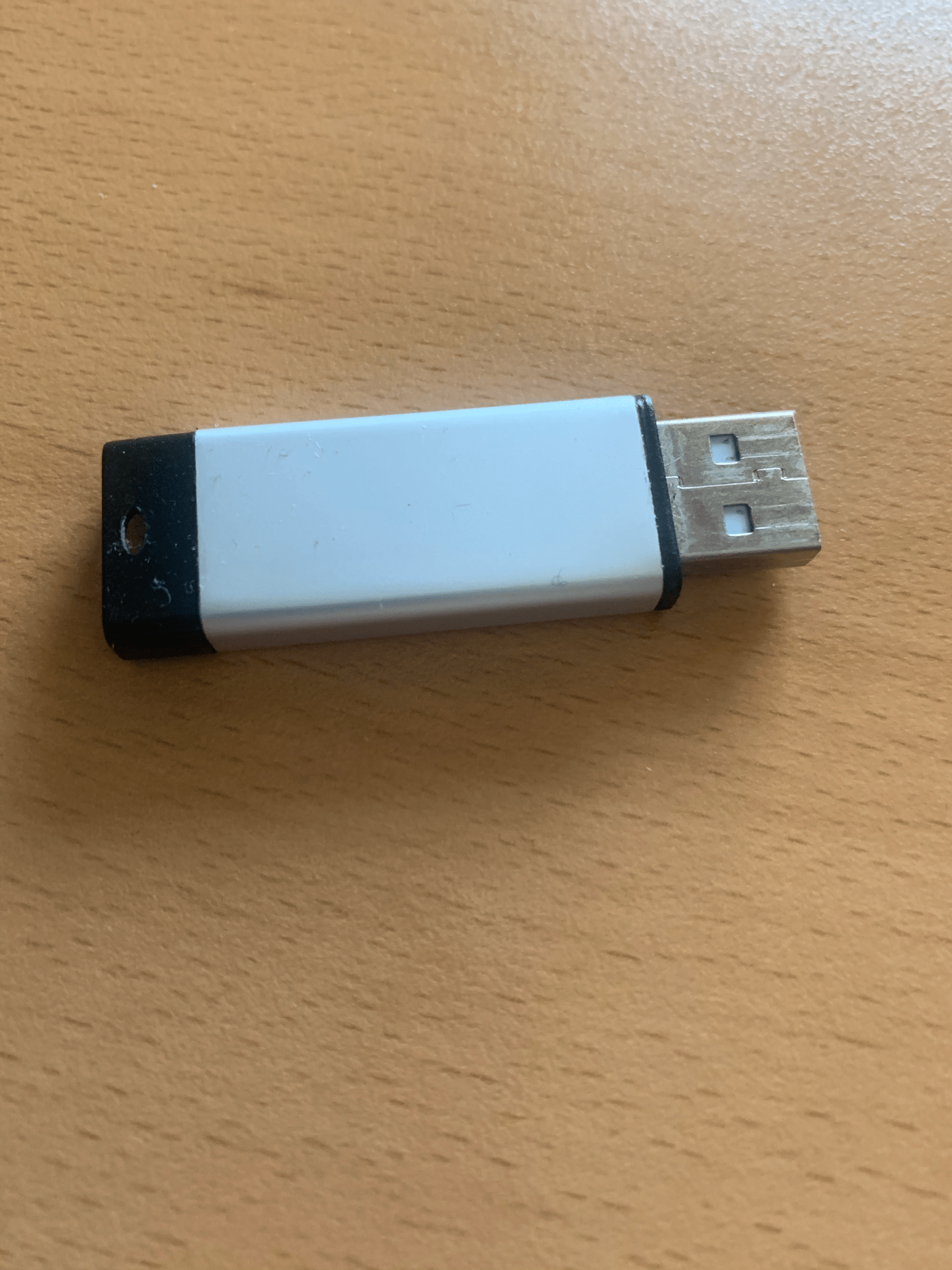
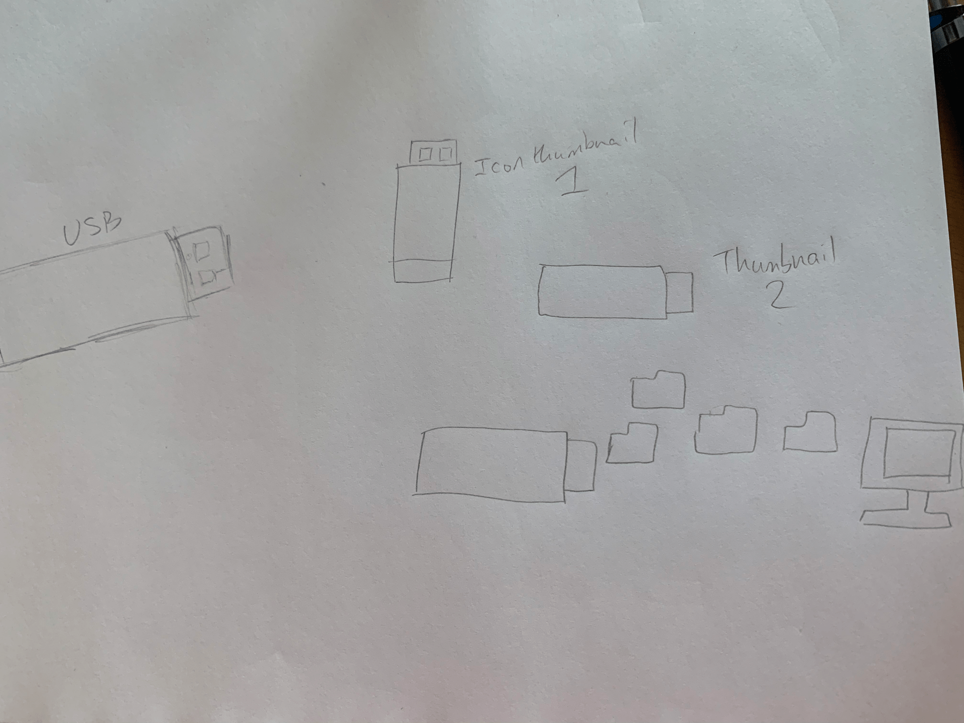
Our next task was to take a photograph of an object with a function. I chose a USB stick as it was nearby and I felt it would work well. I drew some basic sketches, both of the USB and of some icon ideas, from which I would like to develop further into an icon, as they are very simple as they currently are. I like the bottom icon, with files ‘flying’ into the computer, but this would be better as a GIF or animation than an icon, as it is too large and detailed. I found this task somewhat difficult at first, but it became more enjoyable as I sketched more ideas.
Week 3: Brand Research (Task 4)
My chosen commercial brand is Penguin, specifically the Penguin Classics imprint of the brand. The reason I have chosen this brand to research is because Penguin is an iconic brand amongst readers and is often chosen by universities for set books for their courses. There have been several cover design changes throughout the years. The current design consists of the cover image taking up roughly ¾ of the cover, with a thin white bar underneath (with Penguin Classics and the logo on it), and below that is the title. This book cover design is arguably one of the most iconic features of the brand, as it is recognisable as Penguin, and is sleek and minimalistic. The main colours of the brand are black and orange, and are used widely throughout both the covers and marketing materials, and of course, in the logo itself. Their children’s imprint, Puffin, has a lot of the same features in the logo, with a puffin instead of a penguin. Penguin have also released a set of beautifully designed clothbound hardback classics, which have an audience amongst collectors or people looking for gifts. The main target audience for the brand would be anyone interested in reading, but mostly somewhat older readers, as younger readers would be more likely to read the Puffin imprint. The brand connects with its audience by presenting well designed covers which are simple yet effective, and often use paintings or statues as the cover images, showing the class of the books. Penguin is on multiple social media sites, to update readers using these sites as to release dates or book announcements. They are also found in essentially every bookshop, allowing them to reach multiple age ranges, as some people might not shop in physical bookshops often, choosing instead to buy books online.
(300 words)
Week 3: Inspirational Brand Research (Tasks 1-3)


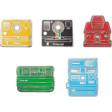
My chosen brand to do quick research into was Polaroid/Polaroid originals. I chose this brand as I believe it to be a very iconic brand, at least in terms of photography. Their logo and brand imagery use a lot of colours but the actual name is in black, and the choice of typeface is simple but reliable, showing its status as a household name. Polaroid is such a well-known brand that other brands of instant-development cameras are often referred to as Polaroids, in the same way that image-manipulation programs are referred to as Photoshop. Polaroid make non-camera products as well, such as apparel and enamel pins, which help to advertise the brand and make it even more well-known. I don’t think that there is an age range, as it is a household brand, but the target audience is for photography enthusiasts, no matter how amateur or professional. They advertise on social media such as Instagram and Twitter, but they also have an email newsletter for those wishing to keep in touch in that way.
If I were to use three words to describe the brand, they would be: iconic, pioneering, and fun, and to describe the target audience in three words, I would use the words: family, photographers, or playful.
Week 2: Music Graphics Task
The piece of music-related graphic design I have chosen is the album cover of the 2014 Off-Broadway (later National Tour and Broadway) musical, The Lightning Thief, based on the 2005 book, ‘Percy Jackson and the Lightning Thief’ by Rick Riordan. The album was released in 2017 for the rebranding and rewriting of the musical, using the same design they had been previously using for the marketing materials and posters. The poster depicts a lightning bolt which has been spray-painted over a blue background. There are white circles spray-painted as well, which seem to resemble clouds, and provide another contrast for the blue and yellow, but also make the title of the musical considerably easier to read, as the text is in the same colour as the background. The title is very easy to read, as it is in what appears to be Arial Bold or a similar typeface, and it is fully capitalised, so it grabs your attention. The limited colour scheme works very well, as it is eye-catching, and the colours interact well with each other. The spray paint may be used to suggest youth, which is appropriate as the musical is aimed at younger audiences (but is suitable for all ages). The lightning bolt design is, as the title suggests, an incredibly important motif, so it works very well as the icon for the poster and materials, as it gives an idea about the theme of the story, as well as looking very interesting. It is a contemporary design and definitely gives off a modern impression, and the CDs and vinyl records stand out because of this intriguing cover design. The design is simple but recognisable to fans of Broadway musicals, as many musicals prefer to use a basic or minimalist approach to their posters or marketing materials.
(300 words)

Week 1: Typography in Signage
We had a task to go out and photograph examples of signs in our local environment. Our categories, from which we had to try and take at least one relevant photograph, were:
-Shop/commercial signs
-Wayfinding/directional signs
-Ad-hoc signs/posters/stickers, etc.
-Street signs
-Regulatory signs
-Architectonic (architectural) signs
-Graffiti, tags, murals, stc.
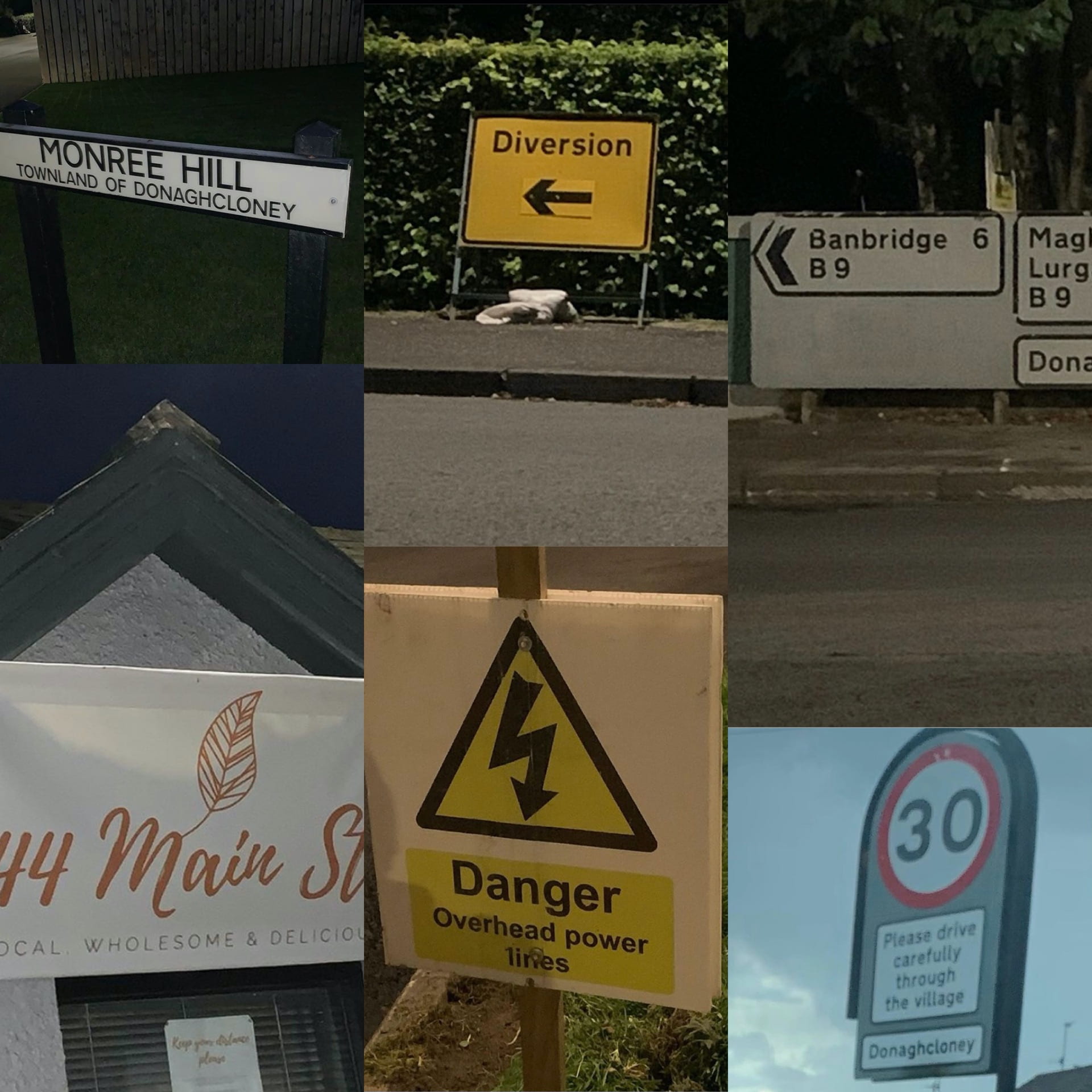
The commercial sign (left, bottom) I chose was a cafe near my house, 44 Main St, which had a nice, inviting style of text to encourage people to go in.
The wayfinding sign (right, top) was a detailed road sign showing various directions in which to go. Using standard typography shows that it is reliable and trusted.
The ad-hoc signs (middle, top and bottom) are temporary diversion and electricity signs. The black and yellow used in both are warnings to people to grab their attention and warn people that certain routes are unavailable, or that there is danger of overhead power lines.
The street sign I chose (left, top) was of a street near where I live. The text is in a trustworthy and simple style, and there is varying size to show where the street is located.
The regulatory sign (right, bottom) I chose was a speed limit sign, warning people to go 30mph. It also shows location, coming into a village. The red around the signs shows that this is a more urgent warning, as something drivers must be aware of, as opposed to standard yellow warning signs.
I was unable to find any graffiti or architectonic signs but will continue to keep an eye out any time I am out of the house.
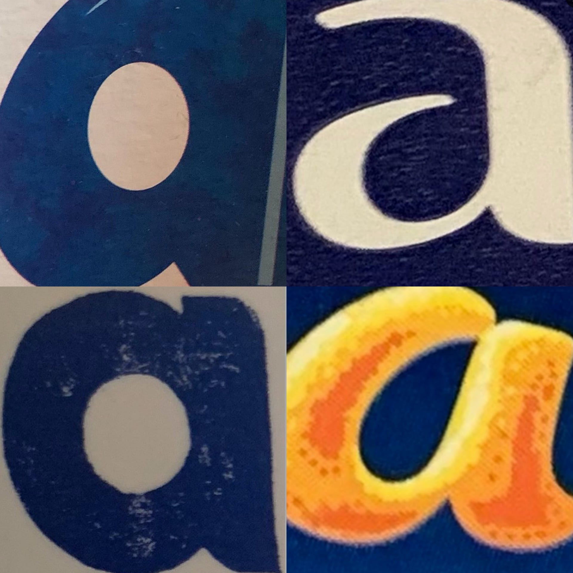
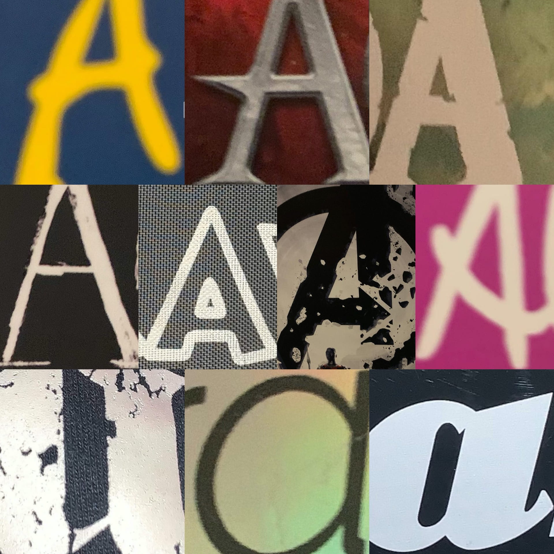
Week 1: The Letter A on Branding/Books

One of our first tasks was to take time to look around our environment at home and find interesting examples of our chosen letter. My three collages above show the letter A I found on Star Trek books and DVDs, on packaging, and other miscellaneous As.
Two of the Star Trek ones are actually the Starfleet logo, which is called a Delta, but despite this association with the Greek letter (the equivalent, of course, of the Latin alphabet’s letter D), the book which features the first one uses it in place of the letter A in Picard. It fits well and it is immediately clear what the word says, despite a symbol being used in place of a letter.
The packaging As are from Fab ice lollies (top left), Carex hand sanitiser (top right), Alpro soya milk (bottom left), and a Terry’s Chocolate Orange. My favourite of these is the chocolate orange one, as I like the contrast of the dark blue and the orange, and the fact that the A resembles orange peel is very effective advertising.
The other As are from a range of book and video game covers. I really like the first one, as the colour scheme, despite the book’s location being Italy, reminds me of the Swedish flag. I like this collection of images as they show a range of typefaces being used, from sans serif and serif to script typefaces.