After a group critique of the type specimen screens, I made mostly minor adjustments to each screen. For all the posters I reduced the amount of text I had describing Baskerville, as there was simply too much when it only needed to be a brief description.
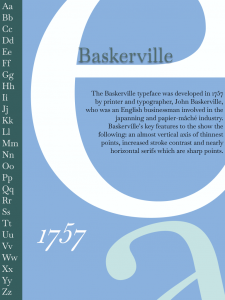
For the first poster I made some small adjustments to the layout of it, as pointed out to me the letter ‘N’ didn’t really do anything for my type specimen screen, hence I removed it which allowed me to move the year to that position instead. Before the adjustment where made I wasn’t happy with the Baskerville text and year inside the Letter ‘e’ as I wanted the Baskerville to align with the stroke of the ‘e’ however I couldn’t as the year being above didn’t look right hence, I had previously opted to put the year below the Baskerville text. However, now with the ‘N’ removed I could place the Baskerville text where I wanted and move the year into a spot where it didn’t look out of place. Another change I made was changing the colour of the letter ‘e’ from the dark blue to white, as this created a nicer contrast to the text as well as the vertical column on the left. Also, with making it white, the specimen screen seems less busy as it was pointed out to me that it was quite crowded with all the dark colours together.

For the next poster, I made a personal choice to change the colours, as before the critique I did everything in greyscale and was told whilst working on them to add some colour, hence I did. However, when adding colour to the second poster I was nice completely satisfied with how it was looking with colour. I was happy enough with the green and pink, however the looking at it during the critique I still wasn’t happy, hence I made the decision to change it back to greyscale as I felt it works with the piece more in my mind.
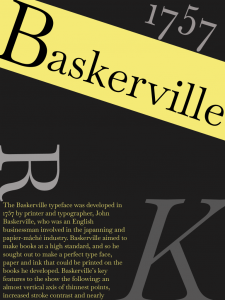
The last poster is the weakest of the three, which I knew before the critique however I wanted to do something different compared to the other two posters, however it was never worked as well. The only change I made was changing the Baskerville text to follow the yellow diagonal line and make the line small to make it a bit cleaner. I didn’t