During this project, I had to change direction when something wasn’t working right on the page or was unnecessary to include.
In the early stages of my Figma prototype, I originally planned on including an introduction to my site. This would be a plain screen with words fading on-screen, in an attempt to establish mood and atmosphere. I was partly inspired by ‘Apollo 18’ – a found-footage horror film on the fictional Apollo 18 mission, and I was originally going to make my site contain fictional elements as well – such as a conspiracy theory section. However I felt like incorporating fictional elements into the site didn’t fit the design brief, and so I decided to stick with the real events of the Apollo 11 program.
Also, my classmate Stephin – thought this introduction screen to the site was unnecessary as well. It could be annoying for the user having to click for the words to come on-screen, and so I decided to scrap this introduction to my site.
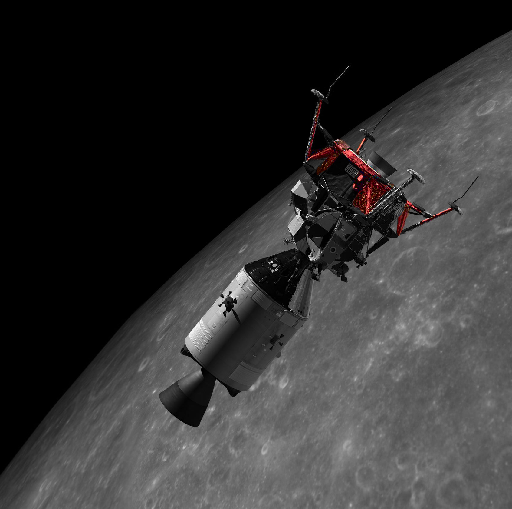
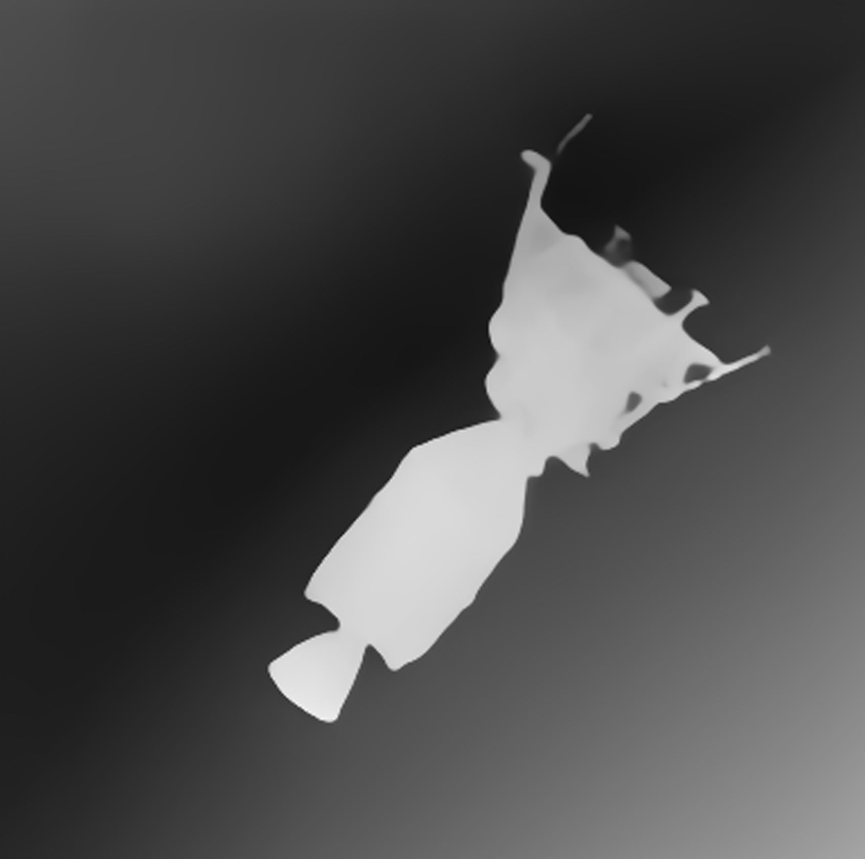
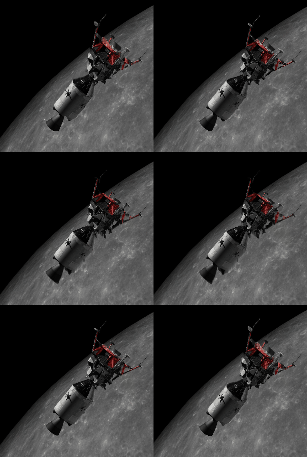
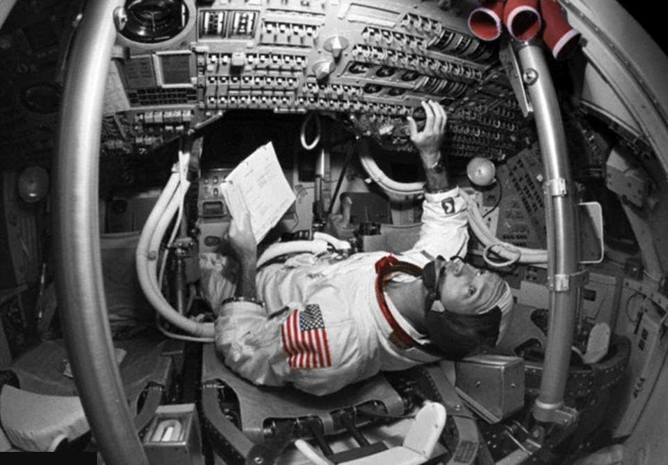
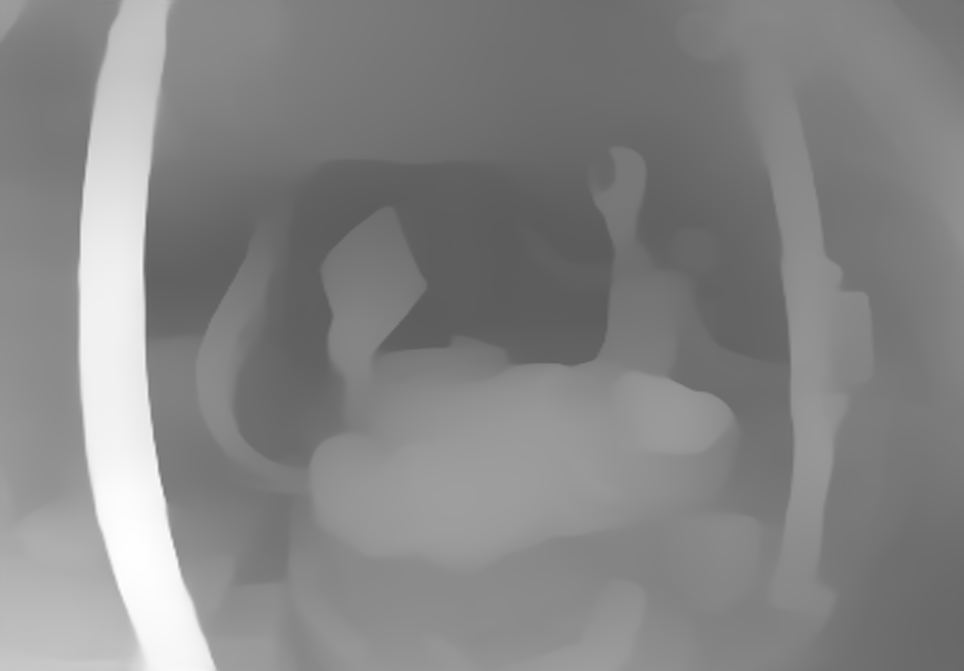
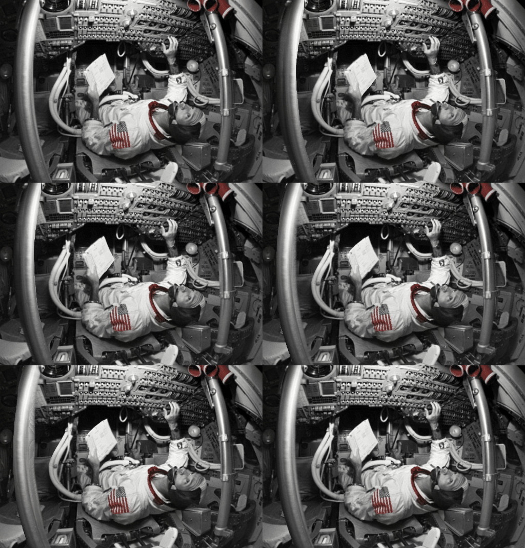
I wanted to incorporate more types of animation techniques into my site for more variety, and discovered depth map animation. This involves taking an image and converting it into a depth map image – with the lighter parts in the foreground and the darker parts in the background. I used an online AI tool to convert some sample images and test it out. I then used an online depth map viewer which would take the images and depth maps and convert it into a custom animation, where you could change the speed and direction.
These were good results, however – they weren’t as polished enough to include in my site. I would have to edit the depth maps more to avoid any glitches which would be too time-consuming. It would also be tedious to make these animations into Lottie animations so they would play as the user scrolls down the page, or when the user hovers over each image. So I decided to scrap this idea for my final site design.


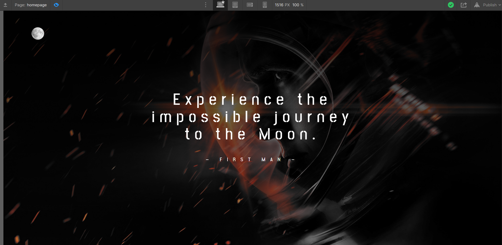
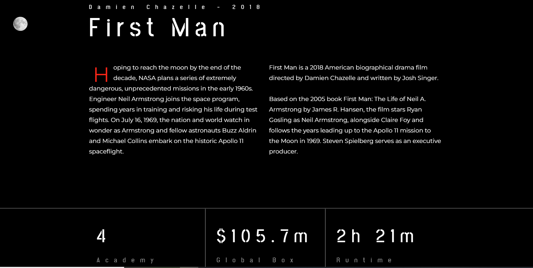
In my original Figma protoype – my silver screen section was a little bland. So for my final site design, I decided to make it more professional looking, with more content on the page. I believe this section looks a lot better designed.

