Manifesto research – Jessica Hische

Jessica Hische

To improve my manifesto I done some research on Jessica Hische was an American letterer, illustrator and type designer. I turned to her page for inspiration and to see if her work could influence mine in a way. She is best known for her personal projects and her own books that have the most beautiful illustrations and types on them. These are some of my favourites.

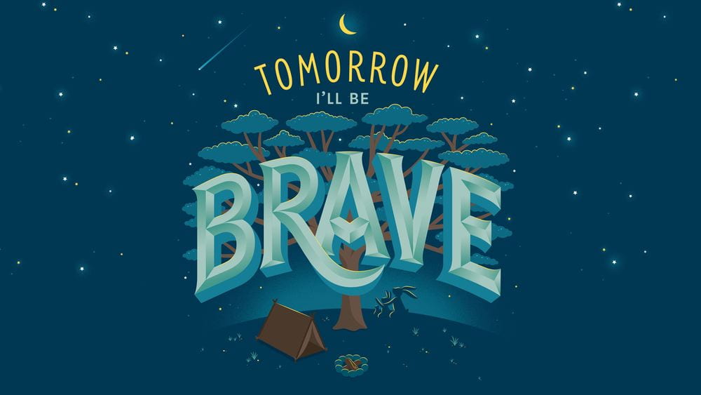
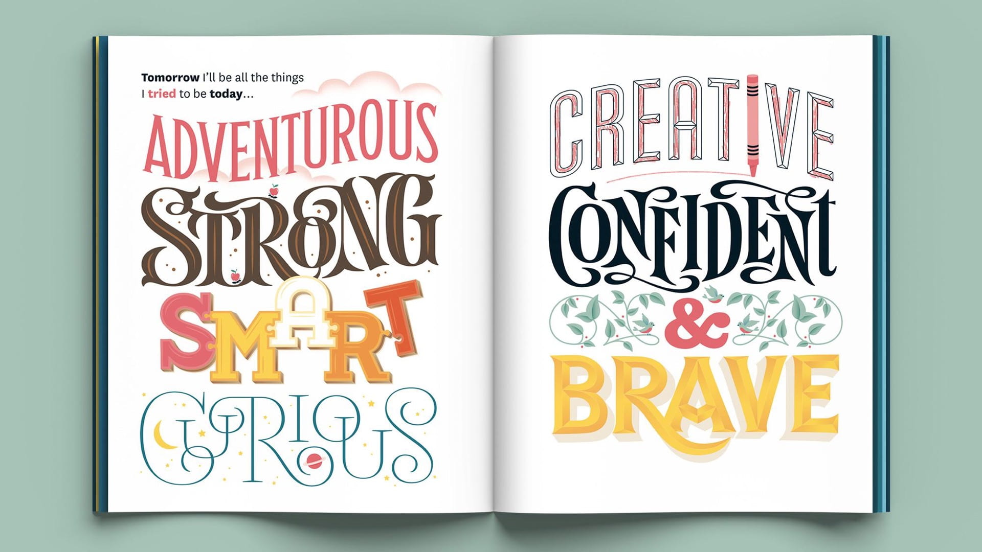
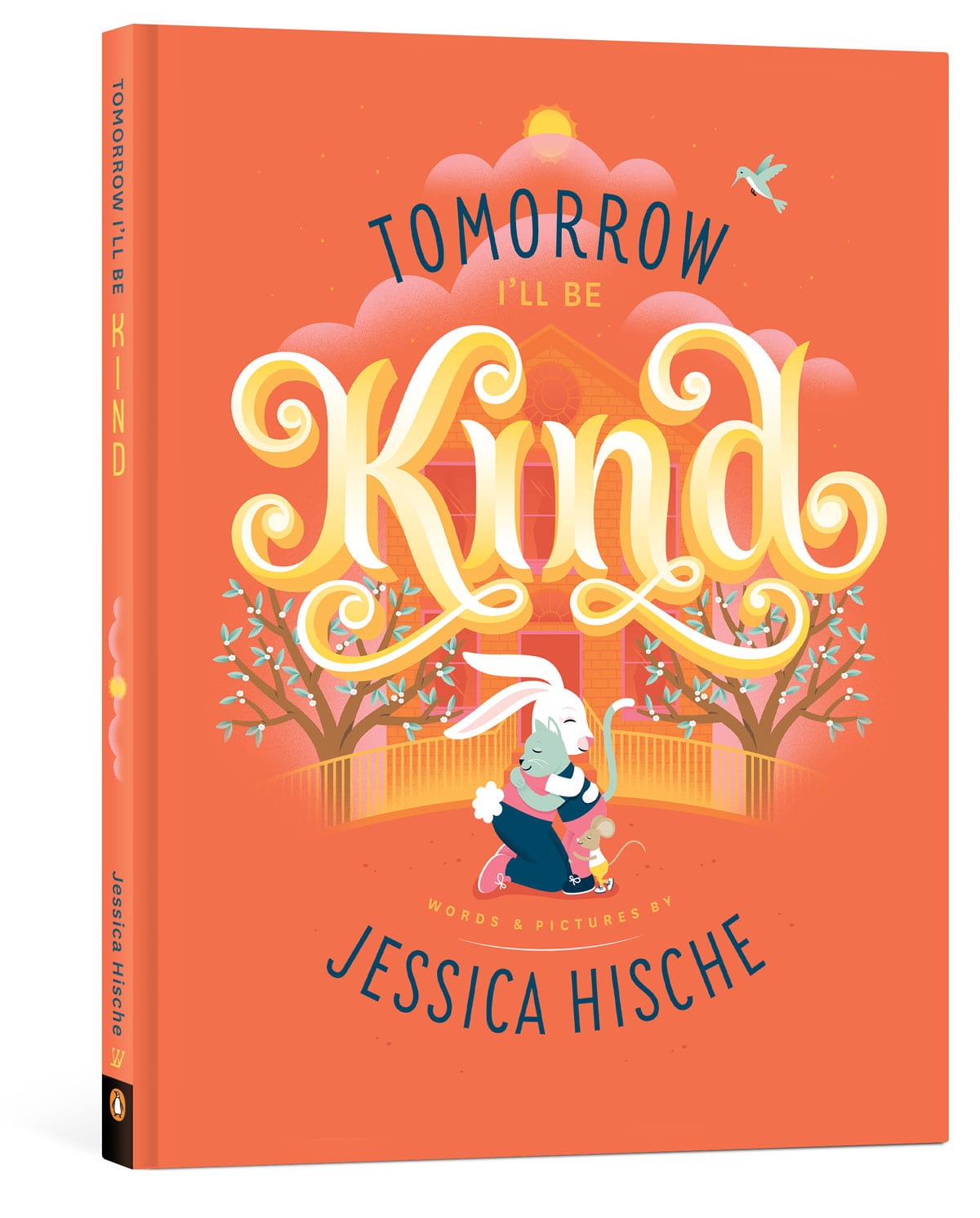
I chose her to look at because not only is her work beautiful, she is also very successful in her line of work. She has designed book covers for Dave Egger, has been featured on Forbes for the ’30 under 30′ and together with Fii has designed the well known ‘love’ stamp for the US postal service which ended up selling over 250 million stamps. On her website she states that ‘I specialise in redrafting, reinvigorating, and restoring logos for established brands—enhancing their beauty and legibility through sensitive and subtle updates’. So not only does she create books and illustrations but she is known for her new and innovative logos and type.

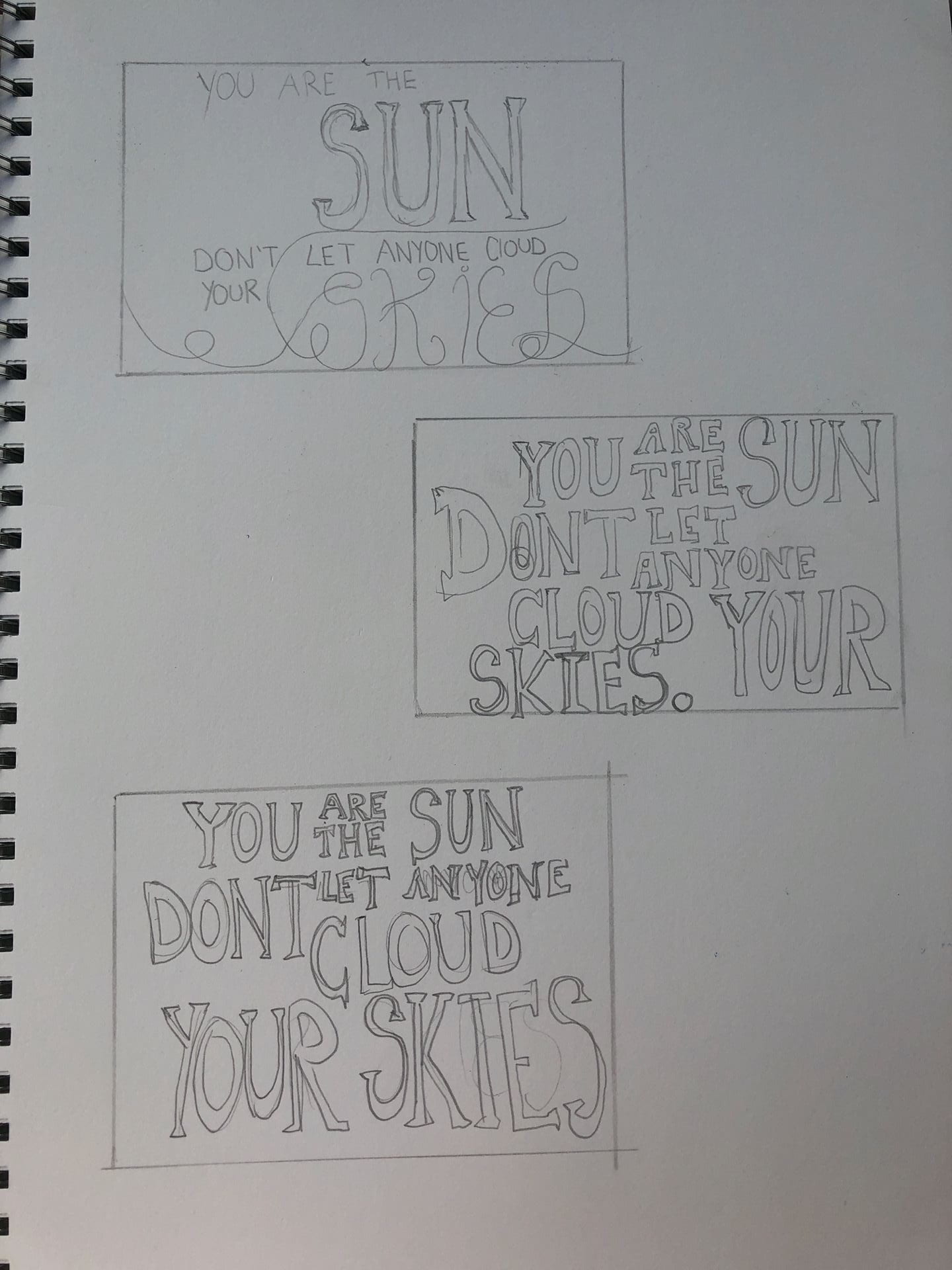
From looking at this information I then took to my sketchbook and began recreating her designs and fonts with my manifesto.


I wanted to design a manifesto that resembled her bright and eye-catching colour palettes. I think I have achieved this in these designs. I like the text with the swirly tails and elongated curves, this is something I think I can develop and perhaps draw out and scan into adobe xd and use my own typeface.
These are some designs I came up with that have been influenced by Jessica Hische. I like the bright colours but I feel like some of the fonts are not legible, for example the last design, I used the font ‘Affair’, although it is quite like Jessica Hische’s work, I find it too hard to read. I want to continue to use these playful colours like Hische but I need to work on the fonts more.


100 Iterations – 9 chosen images

My group chose point, and within this we decided to look at a range of circular objects for example, coins, clocks, oranges and even books on the moon.

These are some of the images I considered and found interesting.


Even though I found these points intriguing, these are not the images I wanted to take forward and experiment with. I wanted to focus on one area – coins. I chose coins because they are an everyday object that everyone needs and uses. I find them to be very intricate and the markings to be quite beautiful. Some images I found on Pinterest and Tumblr were rather fascinating and I liked how the background made each coin look different. I like how the placement of a coin can be erratic and can change the look of an image or can tumble a tower of coins. I find it interesting that in these images the where I placed the coin mattered and changes the overall outcome of the image itself. These are some images I liked and I recreated them myself.


I recreated some of these with the coins I use everyday. I also added in records and c.d’s to add a different element and texture of ‘points’. I found these coins form different places around the world interesting and I loved how they can be made into something else, for example the Mona Lisa. Furthermore, showing that even the most peculiar of ‘points’ can be transformed into something beautiful.

This was my first attempt but I wasn’t very happy with it so I decided to try a different approach. I enjoy drawing and illustration so I thought I would incorporate it in this exercise. I started with sketches in my sketchbook on the composition of my images. I still wanted to go with circular objects, but I wanted to do more than coins, so my narrative revolved around composition.

I wanted to use coins, cd’s and records. I chose these three because I wanted the ‘points’ to be progressively getting bigger and then somehow coming together as one.