Portfolio Inspo
Before beginning my portfolio wireframes and sketching I have decided to get some sinpriation by looking at portfolios that I like the design off or I am fond of the chosen layout etc. I decided to look at some student portfolios as well as this is what I will be making so I think that looking at this type of work will be very beneficial for me.
Jane Song
I really like the simplicity here and the use of grid work. There are a few portfolios that I have seen where they make great use of grids to show off work and I think that this is a method that is organised and looks clean and professional so this is something that I want to look at when wireframing my own site.

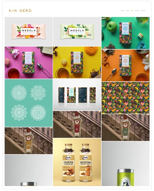
Kim Dero
This graphic designers portfolio features large dynamic grids that accentuate the beautiful imagery of Kim’s work. He has used lots of negative space, consistency in the style of portfolio images, and an understated, simple portfolio therefore making Kim’s online portfolio a winner in my opinion! As soon as I saw this portfolio I thought it was so fresh and simple but also the end result is really effective. From my research I have noticed that grids are really popular within portfolio design at the moment.
Some more grid layout inspo…
Stephen Calvillo
He has made good use of dark mode and another grid layout here. I am a big fan of his introduction it is straight to the point and no messing around which I like. From looking at this I think that I want me portfolio to be brighter and more fresh looking so I think I am going to steer clear of dark mode for now. I have noticed that all of these portfolio sites are only two or three pages at most, I think I want to keep my site relatively small and focus on my case study pages.
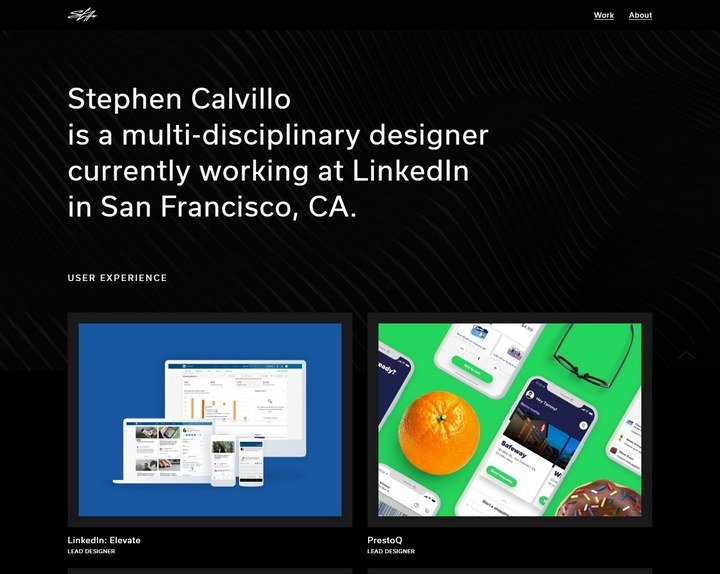
Illustration use?
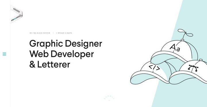
Alex Coven
I like Alex Coven’s chosen approach- the main page has his titles as well as a simple graphic illustration on the side. I enjoy the use of white space here and I think that is something that I want to use for my own portfolio- I don’t want it to overwhelm the user, I want to use my white space to engage them and narrow their focus directly to my work.
So should I include my own sketches and illustrations on my portfolio? Or will this take away from ym portfolio work and projects – e.g. visual noise I don’t need?
What did I learn?
From looking at all of these portfolios I have gathered that I think I want to go with a grid style layout for my home page to display all of my work. I think that this will look clean, simple and professional and that is my main goal- to show my work clearly and make it very accessible to the user. I don’t want them searching for ages for my work I want it right there in from tof them in an organised style. I also like the idea of my name and what I do above my work- it is straight to the point. Perhaps I could say something like – I am looking for a placement grabbing employers attention right away. I will take this inspo and begin my wireframing.