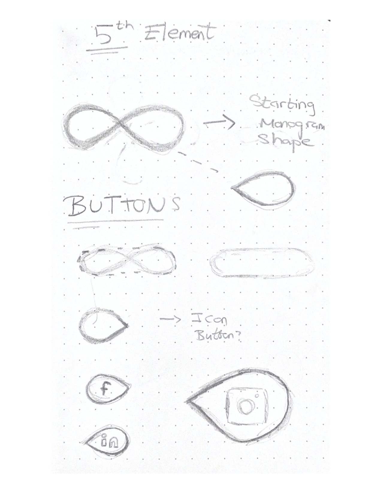
Brand 5th element possibilities
I have been experimenting with possible 5th elements that I could create for my brand. This could include a list of things such as animations, illustrations, an app and the list goes on. I want to add some more personality to my brand and creativity so I began this process with sketching out some ideas that felt like the right fit for my personal brand.
Sketches
Looking at developing buttons
I began this project with sketching some possible ideas for buttons, I feel like this could be a nice added feature to my portfolio website. I wanted these buttons to be made from my visual marque, this would add to the consistency of my brand and keep elements the same size and width etc. I have illustrated and sketched out how this would look below. I was also sketching some ideas for social media icons, I think that this could also be a nice feature to include on my Contact Me page for my upcoming portfolio too. These would be created from the shape inside my visual marque, again adding to the consistency, I could rotate these shapes or scale them up or down.
Experimenting with patterns
After seeing the nice shapes that can be taken for the inside of my visual marque I decided to explore the idea of a brand pattern. I have sketched out various patterns and ideas below, I explored this by rotating the shape, increasing and decreasing scales and also repeating the shape. For every pattern the same teardrop shape has been used, it has just been modified slightly.

Header and footer design
The shape of my monogram and visual marque makes the nice ‘swoop’ shape, I feel like this could be another added feature for my brand, and I thought I could add this motion into my brand in some way. I could use this shape for text or printed information about my brand, e.g. business cards or posters etc. I also thought that this could be used as a header or footer container for my portfolio site too so I sketched some ideas and what that could look like below.

Digital development
I began the digital development for these ideas and used Illustrator to bring my ideas and sketches to life. Firstly I isolated the shapes inside my visual marque and began to explore how my different pattern ideas would look on screen. I also began to add some colour, specifically my main brand colours which are purple and orange.


Pattern development
I chose a few of the patterns from above and began to develop them further, I added my colour palette and repeated the shape I was working with to give the illusion of a pattern. I really like the image below, the pattern placement looks good however I would prefer a purple background with orange accents, I think that the orange background is too much, and too over powering.

With the pattern below I rotated the shapes and made them horizontal, I don’t like the way this pattern turned out as I think that it resembles an older fashioned curtain or table cloth design.

For this exploration I simplified the shape right down to just the two shapes that are made from my visual marque and I laid them out in a horizontal style. I think that it is just too plain and it isn’t giving off the fun and modern vibe that I want for my brand.

The pattern below is my favourite and I think the this sequence could work for my brand. It is modern and isn’t too much for the eyes to look at. I think I could dissect this pattern and break it up and use this for differernt elements to my brand, e.g. on merch or social media images etc.

Different opacity

Different colour
My brand has a main colour scheme that is orange and purple however I have a fun side feature were users can choose a colour scheme for example, for one of my business cards. Therefore my entire brand colour palette is an extended one and the colour options are of a wider range and I decided to experiment with one of the options that I make available to my consumers which is a mint and grey and I think this colour combination works with this particular pattern too. However to increase consistency and to make me more easily recognisable I will end up going for the orange and purple coloured pattern for most of my brand elements, I think that it links more successfully to the other elements.
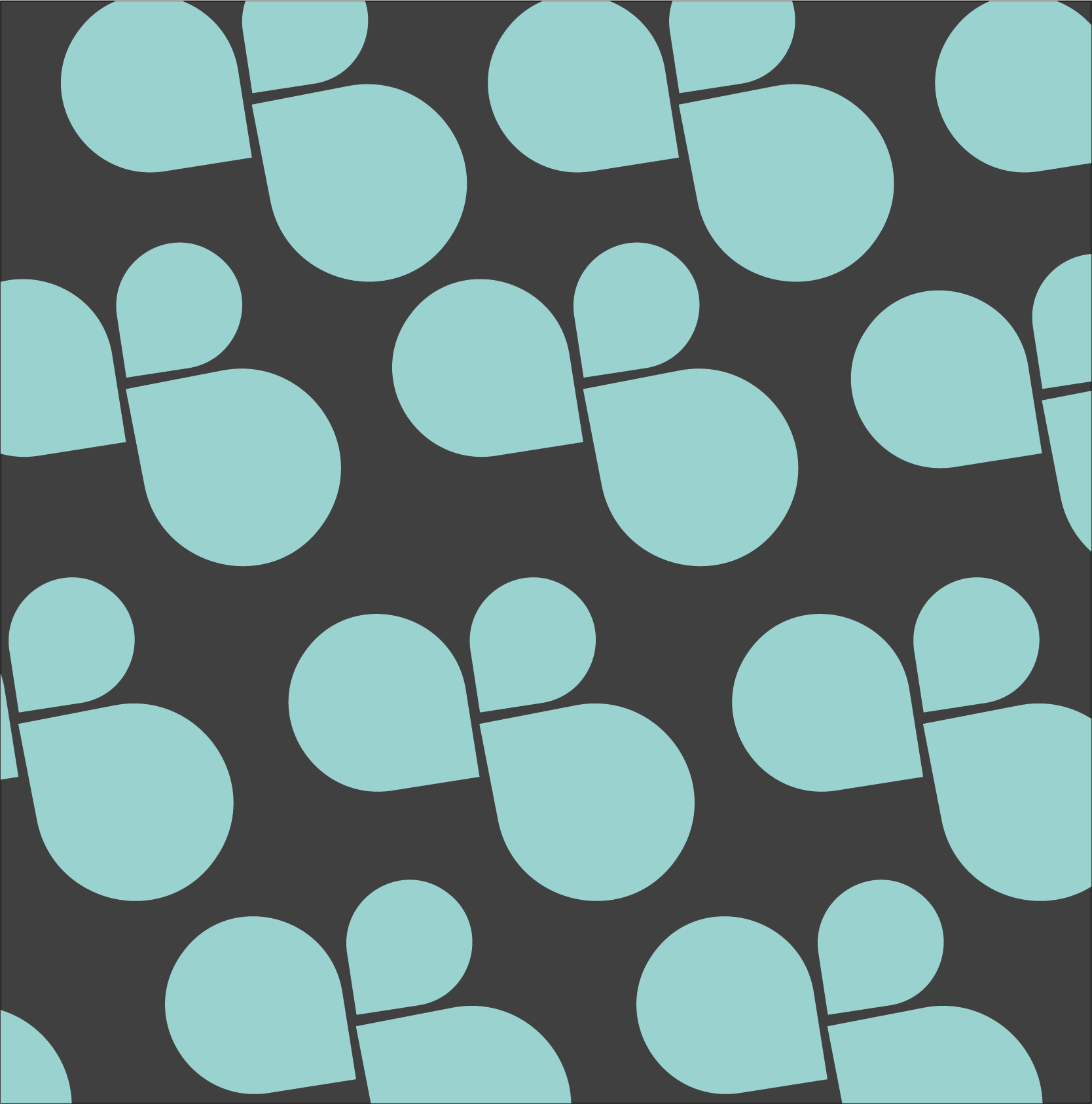
Final pattern choice
The below image is my final pattern choice, with three shapes rotated and in a fun but modern composition. I could use this on my social media, printed works, e.g. the inside of book cover or brand merch, the list is endless! I will explore some of these idea in the very near future.

Buttons- digital development
I have included an image of how I created my buttons digitally, using Illustrator. I took my initial visual marque and used that as a base for my buttons, this gave me a nice curved rectangle, perfect for a portfolio button! The inside shapes also make more unique button ideas which I had explored at the right hand side of the page, however for clear and good ux design I have decided to go for the standard rectangle button shape as it is more widely known as the traditional shape of a button.

Original button design
I decided to go with an all cap text on my buttons and the image below shows my initial final set.

Final design choice- revisited
After some careful consideration I decided to go with the lowercase text on the button, it is more subltle and not as ‘demanding’ in comparison to the all caps option that I had originally wanted to go for. I am very happy with how these turned out and alongside the white font I think they are striking and inviting to use!

I decided to change the font from all caps because nothing in my portfolio site has all capital letters, this therefore made the buttons feel out of sync and. This slight change will make a big difference in my portfolio site and this has helped tie everything together and make it all look more consistent!
Header and footer digital development
I included screenshots of my practical work and how I have actually created this head and footer style containers on Illustrator. I took my final monogram shape and used the shape builder tool to create the same ‘swoop’ motion on the container. I did this because I wanted this elect to tie in with my other brand components and carry my brand image in a subtle but still visually appealing way.


However after seeing how this looks digitally I am not sure if i will add this into my portfolio site, I think the swoop is too exaggerated and might take way from the professionalism that I want my brand to radiate.

Social media icons digital development
My Illustrator process
Like my buttons I have included an image of my process of how I created these icons for my social media links. I took the inside shape and began to explore how it would look if I rotated this and added colours and icons on top of it. I experimented here with the scale of the social media icons to see if a large Facebook logo would give off a more modern and fun look, however I decided to stick with a standard size icon that is centered within my shape.

Final design

I am really happy with how these icons turned out, I think that the will work great in my portfolio site and I will continue to develop this project and add more to this list of social media icons. I think the alternating colours are working well together and I am a big fan of the orange on white so I think that I will make some icons with that colour combination.
Reflection
I am very happy with how this project turned out, this wasn’t a necessity for our brand project but I felt like my brand needed a little something extra and I wanted to add some more personality to it. I am very fond of how my pattern element turned out and I am excited to add this throughout my brand, for example in some brand merch products, this is an area that I will explore further soon. I am excited to add these elements throughout my brand and in my portfolio website in the coming weeks!