International Typographic Style
Within this lecture Pauline taught us all about The International Style or the The Swiss Style that originated in Switzerland in the 1950s. I had some knowledge on the subject as I have been researching April Greiman and Wolfgang Weingart for my group presentation but this lecture gave me a deeper understanding of the topic.
The International Style movement has a number of noticeable features, including:
- Negative Space
- Sans-serif fonts
- Blocks of text
- Strong geometric shapes
I have learned that this style pioneered the use of sans-serif typography, grids and asymmetrical layout, also emphasising typography and photography as a holistic approach to visual communication.
The main principles of this movement are:
- Objectivity
- Cleanliness
- Readablitiy
We looked at key designers including Armin Hoffmann, Emil Ruder and Josef-Muller Brockmann, and it was beneficial to look at their work and how they influenced this movement and style. these particular artists their work stood out to me the most as I have looked at Ruders work previously.
Here are some pieces of work that I was particularly drawn to:
Emil Ruder-

I have researched Ruder perviously for my typeface poster and this particular poster- Emil Ruder Blogpost
Josef-Muller Brockmann-
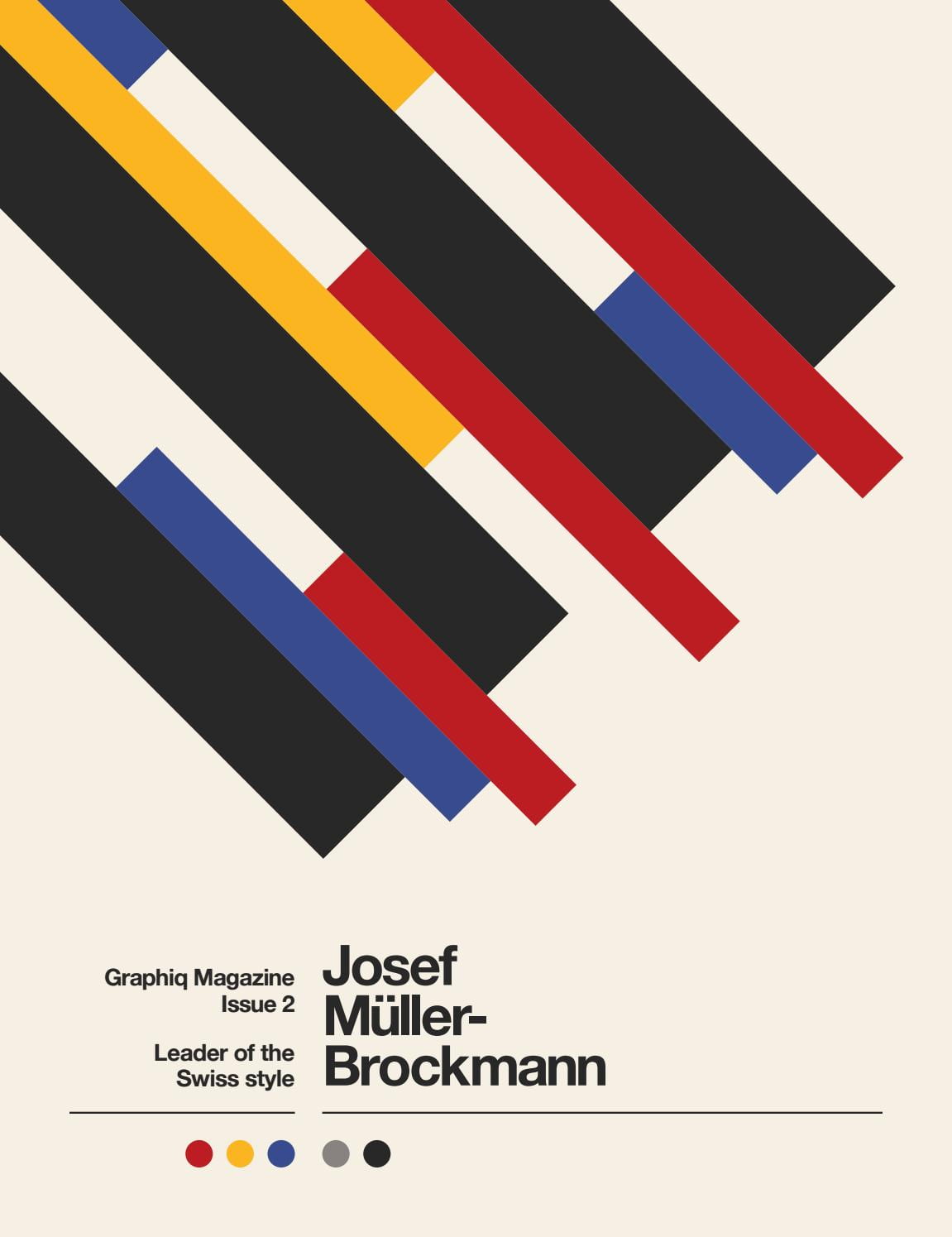
I liked the use of primary colours here, and with the blocks of rectangles, they compliment each other nicely. Brockmann has a lot of interesting work with clean typography and simple shapes, this technique is timeless and its something I think I will return to his method in the future.
Within this lecture we looked at typography and in particular- Helvetica. I have watched the Helvetica film and some documentaries on type and typography and it is a subject that interests me greatly, I wrote a blogpost talking about this typeface that is linked below.
Dutch design
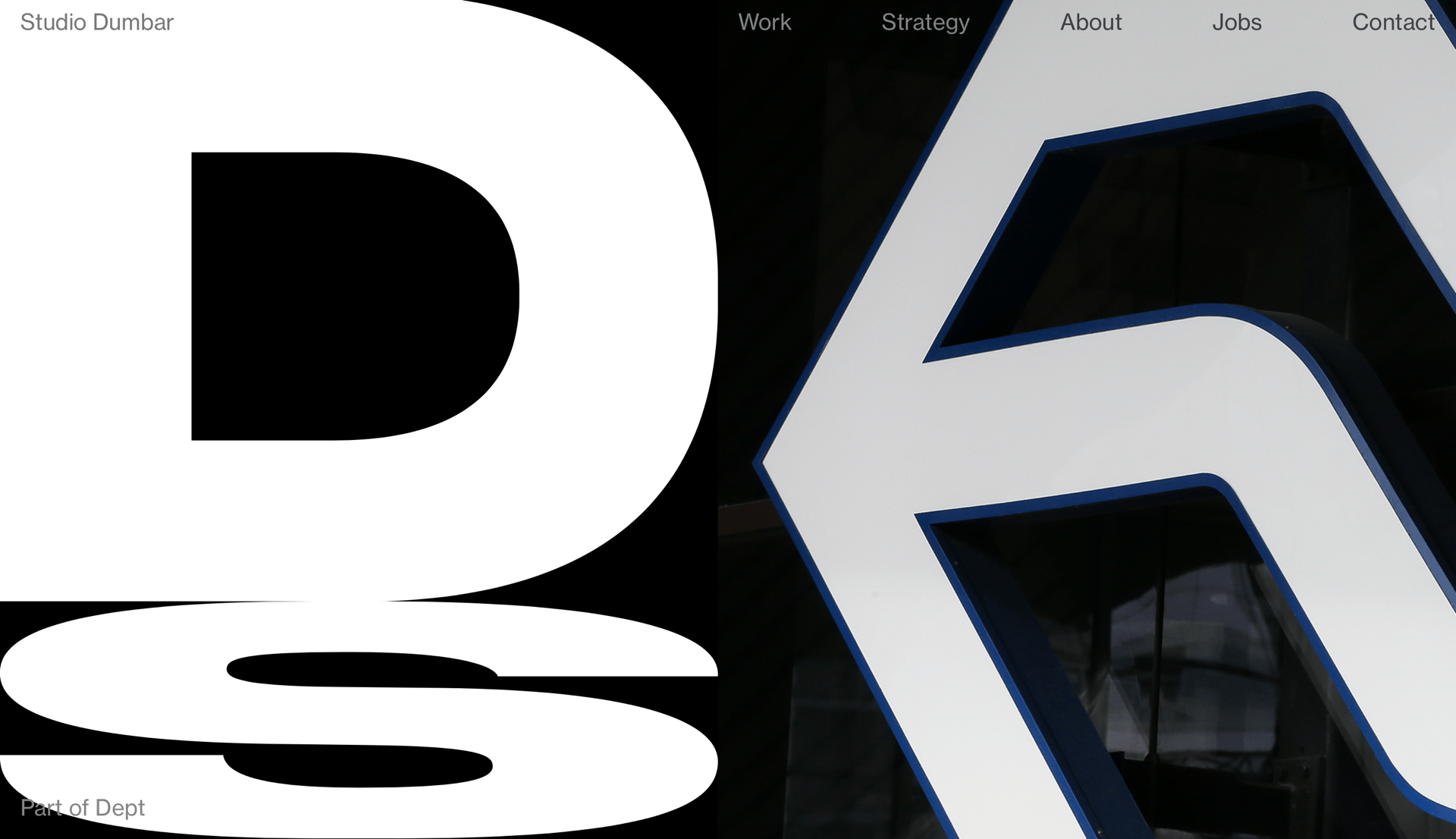
We looked at Dutch design and in this lecture and I came across a company I wanted to take a further look at which was Studio Dumbar.
Studio Dumbar
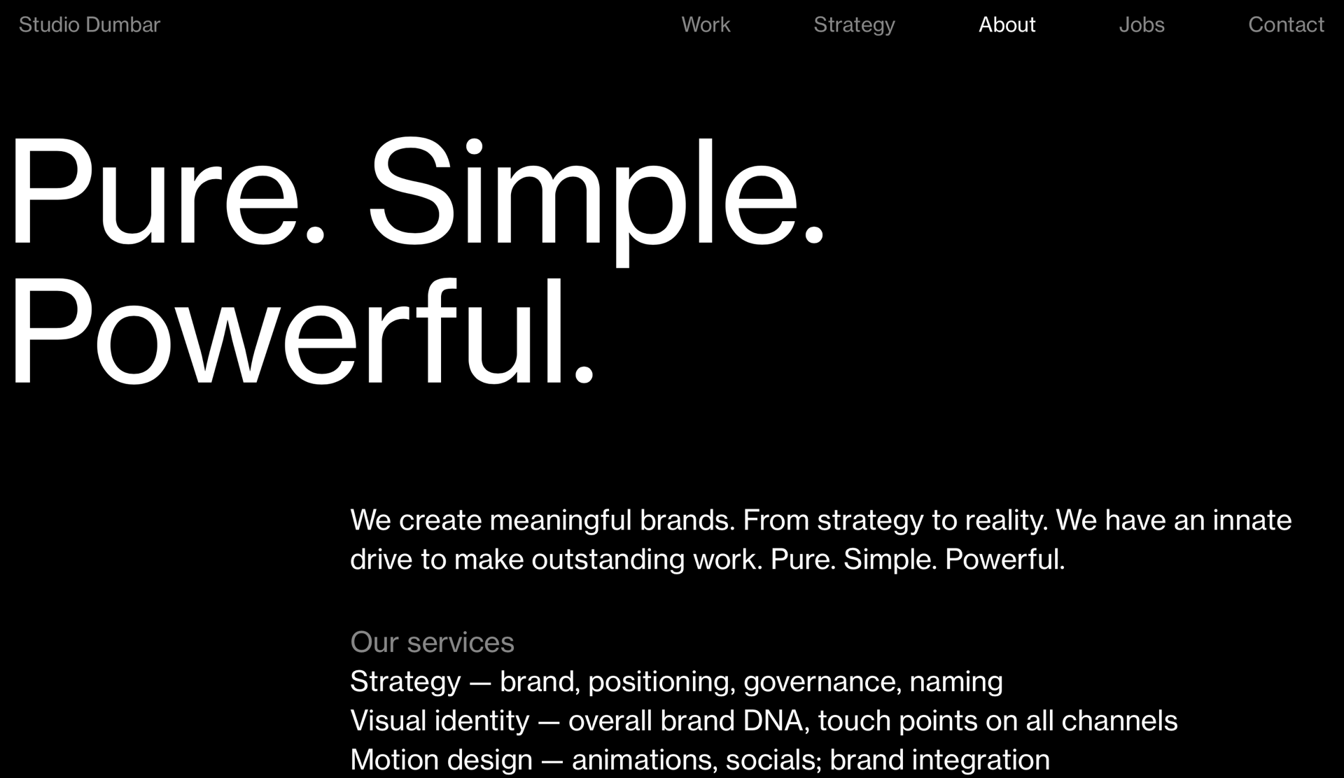
Studio Dunbar is a company that create meaningful brands, they are a highly influential Dutch graphic design agency. They work with brands and develop idneiteis and naming. I particularly liked how they made their motto and manifesto obvious and clear to the audience, their motto is pure, simple and powerful. I have took a screenshot of this below.
From looking at their website and their work, I have observed that they have taken the dutch design to the next level. Their work has shaped not only dutch design but international design and they have been doing this for decades. The characteristics of dutch design are:
- minimalism
- experimental
- unconventional
- innovative
- a sense of humour
Researching Studio Dunbar I can clearly see that their work promotes these characteristics as they state on their webpage-
‘Creatively, the possibilities of design are limitless.’
Reflection
Reflecting on this lecture I have gained good knowledge on important graphic designers and the movement that is ‘International Typographic Style’. This is some of my favourite work that we have looked at so far within the lectures, I am interested in simple but striking graphics and the work I have included in this blogpost highlight that certain style. I enjoyed learning about this particular time in history, it has given me a lot to think about design wise and ideas to try out…