December 17

2D Animation Studio – My Development and Reflection

My Animation – A Brief Development

I did a character sheet for the Porg creature and looked into a rough sketchy style over a block colour. After doing this I realised I would have to take the rough sketchy look off as it would be too hard to animate the movements smoothly without a rough jarred look on the sketch lines. For my background I wanted to use very neutral natural colours and I looked into anime style backgrounds as I wanted to use a similar theme.  I designed everything in Procreate and for the grass I used pre-set stencils I had on the software.

I’ve been using Procreates animation mode to get the onion skins and be able to draw frame by frame and see how the movements look.

I kept the same style background in the scene with the main character but I wanted to add mountains into the background so that it made the world setting feel more complete. For the main character the design was created by Rebecca, so I focused on keeping all the features of that character but drew it in my style. I tried to use the similar shades and tones that the environment had in the character so that he wasn’t too out of place and standing out too much from the overall scene.

I looked into anime styles for my backgrounds and watched a few tutorials on the techniques of drawing rocks and clouds and this is something a didn’t have much skill in. I found these tutorials very useful and was able to apply my own style to the techniques to make them fit into my scenes. I used Whimsical to create quite a few reference mood boards looking into perspectives and lighting. I know with anime styles they can sometimes be a bit flat in their shading and its mainly created using block colour. I wanted to keep that anime style with a touch of realism so looked at photography scenes as well as hand drawn artworks.

Using After Effects I am able to retain layers which is very important to me in getting the details right on my backgrounds and allowing me to add subtle movement to make them feel less stagnant.


I had to re-do the storyboard due to getting the extra scene at the beginning of mine to get the main character to fall into the starting position of my initial storyline.


Reflection:

I have found this class easy enough to manage, the only thing that I didn’t quite like was focusing on worlds at the beginning and moving teams. I felt this stumped me a bit in wanting to put my all into each task at the start due to knowing I was going to be moving groups and this wasn’t going to be used in my final animation development. I think if we had of been in the same group from the start I would have been able to apply myself each week and develop everything more to have a better animation. I find that the timeframe I was left with in my final team/world was limiting my ability to fully develop my creative ideas in my animation. I had to go back to our previous tasks and re-do my character designs, storyboards etc to fit the new theme of the world of my group. This took up valuable time I could have been using to start applying to my animatic and cleaning up the animation. I did find this all quite stressful but I was persistent and I managed to get everything done that was required. I do feel my animation isn’t as smooth as it could be but that was due to not having enough time to really perfect the smoothness of each movement but I am still happy with what I was able to achieve in the time limit I was given. I was given additional things to animate the week after we pitched our Animatic to Aodhan as Sophie in my group had too much to animate and she was to animate our main guy falling so he arrived in my channel having already fallen. So I ended up having to animate the main character coming into my channel standing up scared, and falling to the ground as I had already animated from that point and would have had to redo the entire animation if he didn’t fall.

I feel like this class has allowed me to develop my skills in working as a team and planning an animation as a team. It was nice to build an animation in a group as we had loads of different views and ideas inputted. Although having animating experience, I have found this topic quite difficult and definitely felt a little out of my depth. The animating and processes was easy enough but I have struggled with trying to independently learn outside of class, manage my time and be prepared overall for the deadline. I definitely feel like due to swaying more into realism that I try to perfect my art too much and this ends up being time consuming and leaving me more limited on being able to animate more intimately and thoroughly. I need to focus more on simplifying down my art style and building a better understanding of frame by frame animating, because as I become more experienced in this I will be able to do it quicker and therefore allocate more time to the details within my artwork.


December 17

Week Ten – Line Clean up and Colouring

This weeks class was done remotely at home due to a public transport strike. The exercise was to use the flour sack animation we had done in the previous week and clean up the sketch lines and colour it. This was an easy enough task to complete.

In the afternoon we went into a voice chat on discord with our teams and Aodhan joined us to watch our animatic and give us feedback. On my part it was fairly good, the only critique was on the scene with the Porg creature I had drawn the rock over most of the scene and the Porg appearing to the left, Aodhan said it would be better to move the Porg creature into a central position on the screen. This would be easily rectified.

Our homework was to just focus on cleaning up our animations and starting to finalise it all to be ready for the hand-in deadline.


December 17

Week Nine – Animatic

For class this week we looked at using After Effects to set up a scene and animate it. I have used After Effects in the past and I found this exercise easy to follow and understand.

I was easily able to layer the images correctly and get the movement timing and speed set. I then pre-composed each scene when I was finished.


For homework we were tasked to create our own animatics and input sounds.

I wasn’t able to access After Effects from home so I actually put my animatic together in Cap-Cut and used the sounds on there. These are not the sounds I will use for the final animation but were just a basic generic sound that I was wanting to happen at each part of the animation.

We were also asked to piece all our animatics into one, so Charlie in our group offered to put it all together in the right order as one animatic.


December 16

Week Eight – Storyboarding


For the class this week we looked into animating forms and storyboards. For the workshop we looked at animating the jump of a flour sack.

I first did a rough sketch of how the sack would move and squash/stretch.

I then went in and looked at the sack tassles at the top and bottom and how they would move with the sack in motion.

I didn’t struggle too much with this exercise, the main bit was getting the sack twisting correctly before it launched itself into a jump.

After doing this exercise we looked into storyboarding a set described scene but we had to animated the scenes as we felt appropriate.

This exercise was fun to do and I learnt how to express a still image of a character with poses within the scene. I found it hard to show emotion through the flour sack as it has no face to show expression on. However, I felt like through the flour sack poses I portrayed very well the expressiveness of each scene.

For homework we were to look at storyboarding our own animations. Due to moving into my new team we had discussed about the storyline to our plot in the previous week and came up with the idea of each individual member animating their own TV show in their own style and a main character being glitched between our channels. I chose to base my channel off a star wars theme, but was unsure what exact storyline I wanted to go with. We discussed in our group about how we wanted our timeline to go and where we wanted to be placed in it. Our group now consists of Rebecca, Karl, Sophie, Charlie, Kennie and myself.

My initial idea was to do two Jedi in a lightsaber battle, when our main character glitches in he sees a void coming towards him so he gets up and runs through the lightsaber battle. This causes shock and confusion in the two Jedi, and they stop and watch the main character run on and glitch, eventually glitching to the next scene. The two Jedi then look around to see the void the main character was running from and they turn and run away from it only to be eventually consumed. The animation would then cut to the next members channel.


When I started to plan my animation and getting it finished within the timeframe given, I decided I had overloaded myself with too much to do and animate to the standard I would want in that given timeframe. Therefore, keeping within the theme of star wars I replanned the story of my animation to allow me to make it smoother and of a higher standard.

This storyline would show the main character glitching into a scene, dazed and confused, he would look around and spot a creature. The scene would cut to the creature looking at the main character in confusion. It would then cut back to the main character, who is terrified on the creature and starts to scream, cutting back to the character again which also begins to scream. The scene will finally cut back to the main character who is still lying there, screaming, he starts beginning to glitch and he glitches so much he disappears into the next persons channel.


December 16

Week Seven – Animation – Bouncing Ball

In week six we presented a pitch of our worlds to the class and then afterwards we were allowed to choose what world group we wanted to work with for the final animation. I chose to move into the TV-Multiverse world as I really liked the concept of porting a character between tv channels.


This week class exercise was focused on the 12 Principles of animating. We looked at timing and spacing and how this changes the animation flow.

For the first workshop we looked at animating a ball. We were doing the class workshop in Krita but as I’ve never used the software before and felt more comfortable working off my iPad, I asked could we use other softwares and got confirmation we could. Therefore, I used the animation feature in Procreate to do the frame by frame animation of the bouncing ball.

For the second animation we can to create a side profile of the ball and home gravity effects it as it continues to fall. I did this animation in 12fps.

As I had come from studying animation in college, I found this exercise extremely easy and I knew to add the squash and stretch to the ball to create the smooth bouncing to the animation. I create this with 24fps but usually work in 12fps depending on how i want the animation to feel with fluidity.


December 16

Week Five – Character

This week I swapped groups into “Rats, sweets and skeletons”. This group was very organised with a very concrete storyline and a good idea of what characters and designs they wished to include.

For class we focused on character design and creating character reference sheets. We focused on shapes and creating characters from a shaped armature.

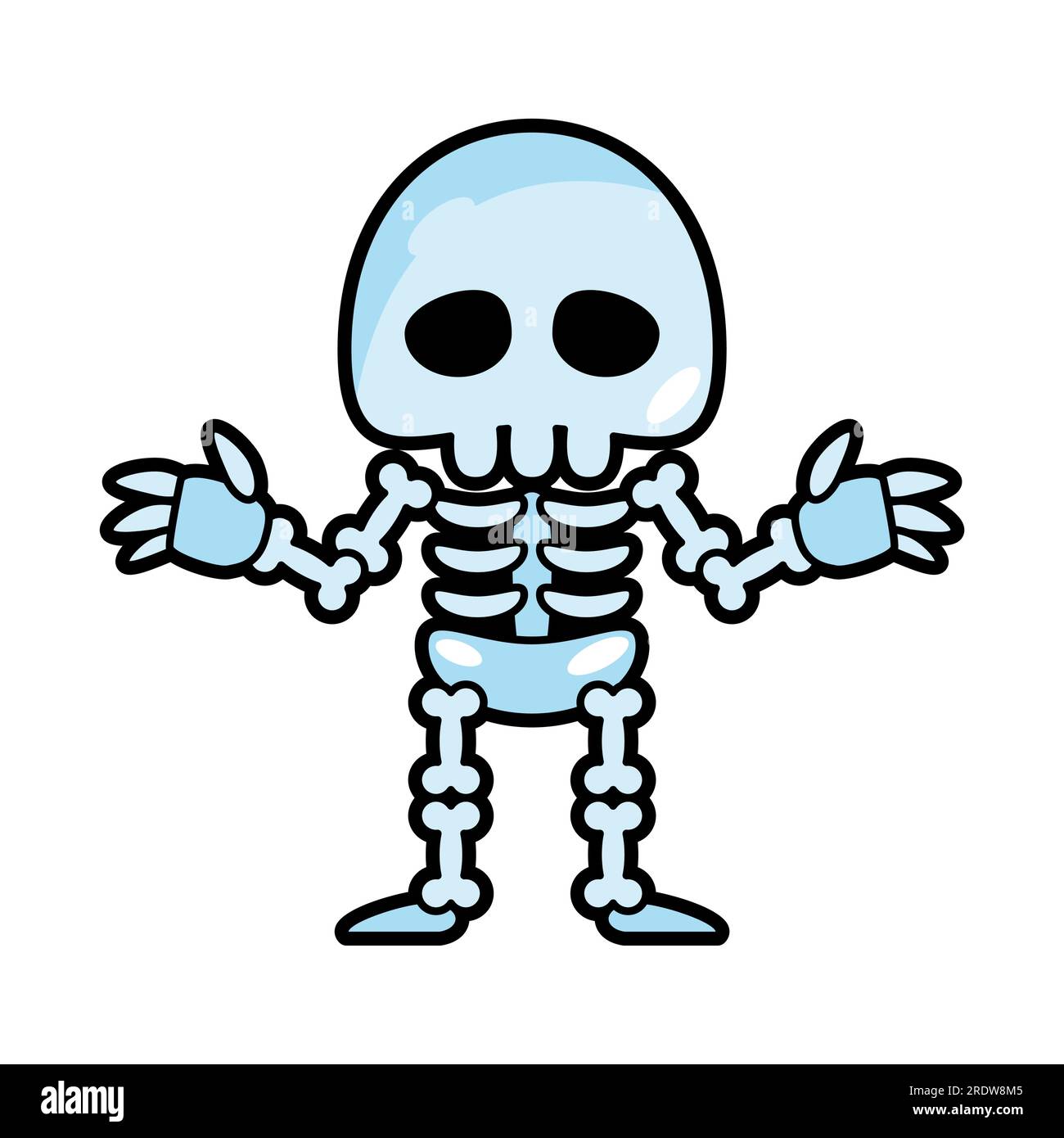
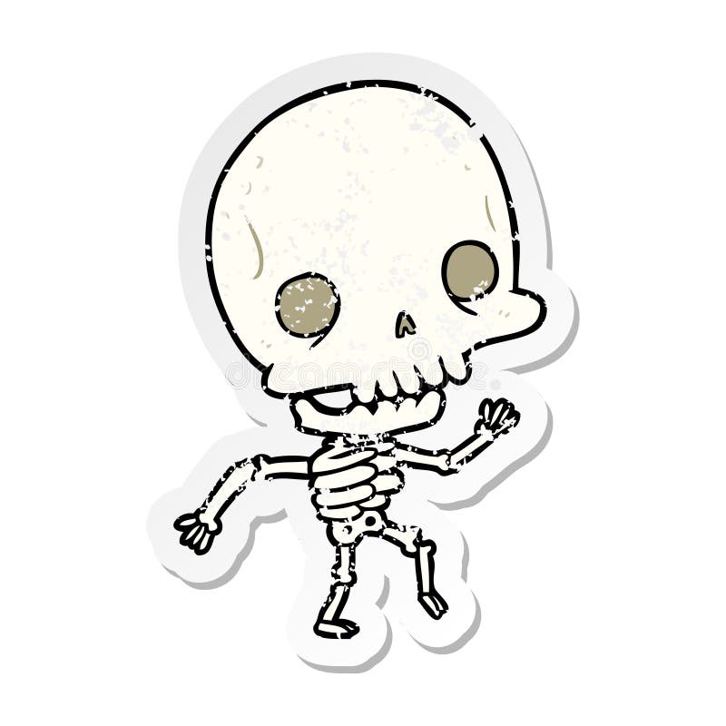
Skeleton ghost . Halloween cartoon characters . Vector Stock Vector Image &  Art - AlamyCartoon Skeleton Stock Illustrations – 45,655 Cartoon Skeleton Stock  Illustrations, Vectors & Clipart - DreamstimeSkeleton ghost cute halloween cartoon characters Vector Image

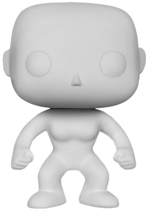
diy pop vinyls Online Sale, UP TO 53% OFF

I based my character design on FunkoPop’s and I looked at different cartoon skeletons as reference for the design.

For homework I focused on different styles and characters to create for my new groups theme.

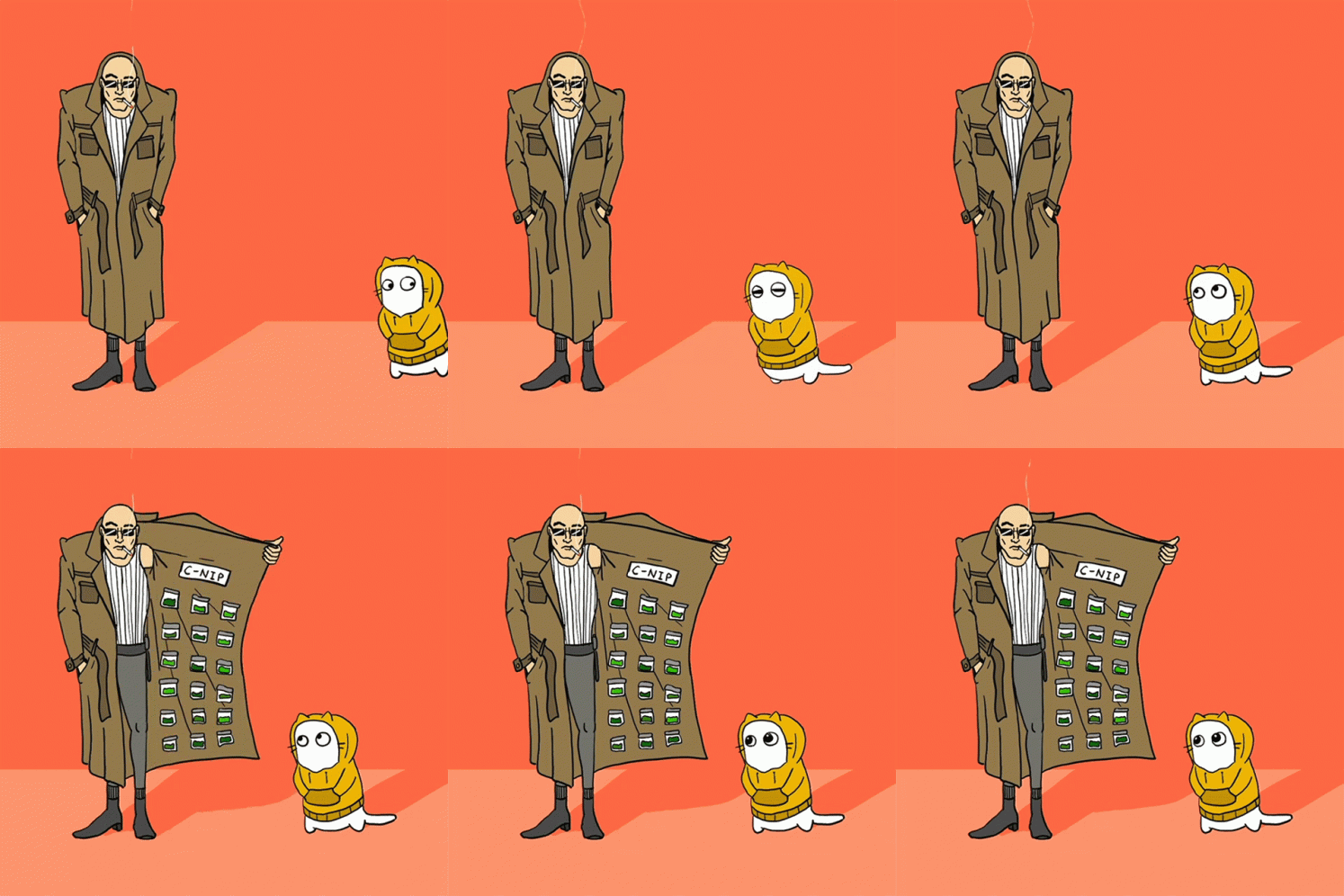
Alex Geerken Geerken GIF - Alex Geerken Geerken Animator - Discover & Share  GIFsDevil Drug Pusher Stock Illustration - Download Image Now - Trench Coat,  Selling, Drug Dealer - iStockRed Flag: Your profession is “I have one” | The Jig Is Up - I'm on an  online dating website.

210+ Scary Rat Drawing Stock Illustrations, Royalty-Free Vector Graphics &  Clip Art - iStockDownload Ai Generated Mouse Evil Royalty-Free Stock Illustration Image -  PixabayPremium Vector | Hand drawn cartoon evil rat illustration

I first looked at rat designs, I initially looked at general anatomy of a rat and looked at some shadow silhouettes for shaping interesting poses. The rat character was to be a rough and dodgy looking character that was basically giving the girl character a “sweet” that was a drug. Therefore I looked into creating a a “drug dealer” look with a trench coat and kept the character features quite sharp to give him a more villainous look.

I also looked back into the FunkoPop design. I created the girl character and the skeleton character with this style. I also looked at a turntable of the skeleton character to see how he would look at different perspectives within the animation.

December 16

Week Four – Colour & Character Design

For this weeks class we focused on colour and how colour creates a setting for the scene.

Our group decided that we wanted our animation to keep a cold mysterious vibe throughout so we focused on green/teal shades and purples for our scenes.

I then used one of my thumbnail background designs to apply these colours and see if it gave the required “feel” within the scene. I felt like the blues and purples worked very well for this scene as its a derelict underground train station so my scene was very dark but light was being emitted from a distant passageway and the light shining from the robot characters screen face.

For homework we were assigned to start looking at designing characters for our world. Our groups characters were based off a world with tv head characters.

I also focused on another scene as at this stage our group hadn’t fully nailed the storyline to our world. This scene I created was a human character consumed by a void of Tv screens. I used the colour palette we had agreed on and I feel like it worked very well with this setting. The colours create a very sad and depressed feel to the scene and thats the kind of atmosphere I wanted it to portray.

October 23

Week Three- Tone & Value

This week was all about focusing on shadows and lighting for our worlds!

For the first workshop we were asked to pick an object from our world and add tone and value to it. At this point my group hadn’t discussed much about what was going to be in our world so I just chose my object to be a TV.

We were then tasked to take one of our thumbnails drawn in the previous week and add more tone and value to it to create the mood and atmosphere we wanted that scene to portray. I chose to do our robot character in an unused and derelict under-ground train station. I really wanted to focus on the lack of lighting and kept it very dark and neutral in value but emphasised the light coming from the characters tv face and an eery light coming from a corridor up ahead. I wanted this scene to be eery and creepy.


For this weeks homework our group focused on creating a mood board for the colours and feel we wanted our world to have. I created my mood board with a big focus on the neon lights of Japan streets and the contrast of blues and pinks within the environment.

Andressa in our group created the mood boards below which we all agreed on it being the kind of colour palette we wanted for our world environment. I feel like the blue and purple colours used in this mood board give the environment the eery feel we wanted our world to have.


October 10

Week Two – Perspective and Composition


This weeks class was focusing on perspective. I have a little bit of experience with this but I do still struggle with getting proportions correct. I started with practising on one point perspective and drawing cube shapes.


This workshop was great for refreshing my memory with perspective, however I definitely felt a little rusty so will need to keep exploring avenues with different perspective points to get some practise!

I also spent time looking at different compositions from animations. Composition is very important in scenes for drawing the viewers attention to what you want them to see. There would be no point in having a character dramatic scene but the audience get lost in looking at an over technical or detailed background. That’s why composition is important to understand, wether it be the golden ratio or rule of three, it’s important to know when and how to use these!


For this weeks homework we had to draw 6 thumbnails of scene setting for our group world project. For these I really wanted to focus on perspective points and lighting. With our world as tv/sci-fi, I really focused on keeping the scenes based on city/apocalyptic settings. The scene tone is very dark as the group wanted a more spooky feel for the world. I tried to keep the thumbnails basic, but as someone who loves realism art I always find it difficult and end up going a bit overboard with details! However I’m happy with the end result and feel like I have managed to capture the vibe our group wanted but also show my understanding of perspectives and composition.

October 10

Week One – Form and Shape

For week one we were tasked for homework to find references some of our favourite characters and look at the way they are composed.

For my first reference I chose Tengen from the Demon Slayer anime. His character build is very bulky and muscular, and when looking at his composition you can see that everything has a bit more “beef” to it. When looking at his composition I realised that his shoulder blades are actually very spherical in shape to show the definition of his upper body. His proportions are very in keeping with the standard human form as there isn’t any exaggerated bodily parts as even the muscular tone is very in keeping with human anatomy.


My second character I chose to look at was Wall-E. I adore the way his character design is, and upon studying his shape I realised that there is a lot more shapes that make his form! When you first glance at him you see a very boxy cube with arms, but when studying his shape I found that he’s made of more than just cubes and cuboids but also triangles and circles. I love how all these shapes are composed as they work well together to form his character.


And lastly I chose Jake from Adventure Time. The animation style of this show in general is one of my favourites due to its simplistic but fun design. Jakes form is basically a bean with arms and legs, his character design is so simple but it works very well and you can instantly tell when looking at him that he is a dog.


Doing this workshop allowed me to look at how some of my favourite characters where designed and pieced together, in a way that I hadn’t really taken notice of before. I feel like this has been and will be very useful in future when character creating and looking at how different shapes compose to make an appealing character design.