Overview
For this project we were given a task to design a brand for a pizzeria within one week. I have the option to either choose an existing brand or create my own.
The deliverables are to produce a minimum of three pages which will consist of:
- Page 1: Logo (wordmark and symbol) and bio/story/description
- Page 2: A physical touchpoint (can be a box, a uniform or a requirement for the business)
- Page 3: A digital touchpoint (delivery ordering page, home or menu page, app screen)
The purpose of these pages is to introduce the brand and also demonstrate is usage clearly.
Research
Before jumping into designing the brand, I need to research competitors in the same industry. I chose 6 different pizza companies. I tried to pick out brands which are somewhat different from one another. This will expand my research into other brands and how they differ from each other within the same area. I a am going to mainly focus on the colours used in the brands and how that conveys message to the audience.
 Domino’s is the biggest pizza chain. Their logo is iconic and well known around the world. It is made up of the two colours, red and blue. Each colour has its own meaning and message that can convey through it without the use of words. The colour red is associated with energy, bold, ambition, confidence, strength, power, determination, passion and love. Whereas, the colour blue has a much different meaning. It is associated with depth, stability, trust, loyalty, wisdom, communication, dependable and openness. With just the combination of these two (nearly) complimentary colours, we already gain an understanding of what message the company is trying to illustrate. They are trying to say that they have a passion and confidence for the pizzas they make and that they can be dependable and trustworthy. These bold colours make the logo stand out from the rest.
There is also a reason why the logo has three dots on the domino. The three dots symbolise the three original Domino’s locations which were open at the time. They had planned to add a dot each time they opened at a new location however, that never happened.
I think Domino’s logo is great because it is bold, memorable, iconic, simplistic and has a good message along with some personal history of the company within it.
![]()
Papa John’s is also another classic pizza chain. Similar to the Domino’s logo, it uses two complimentary colours, red and green. The logo is made up of these bold colours along with a bold serif font. The colour red conveys the same message as the Domino’s logo. However, the colour green has a different meaning. Green is associated with growth, freshness, fertility, harmony, health, peace, nature, positivity, equilibrium and stability. The word ‘pizza’ is in a bold green banner which portrays the message that their pizzas are made freshly with natural ingredients to provide high quality pizzas. ‘Papa John’s’ is a bold, red serif font which represents pizzas are made with passion, energy and determination.
Papa John’s logo is good because it is bold, legible and conveys a good message through their logo.

The Pizza Express logo stands out from the other competitors due to its design and lack of bold colours, unlike the two previous examples. The logo was originally designed by an Italian designer. The use of black in a logo symbolises power, elegance, formality, strength, professionalism and accuracy.
The design of the logo and the font used in ‘Pizza Express’ is very similar showing consistency throughout the logo. It also shows the date which it was founded, also in the same font as the wordmark.
I think the logo for Pizza Express uses elegance and professionalism through the use of its design which what makes it a great, recognisable logo.
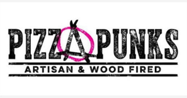
Pizza Punks is a less known pizza chain worldwide, however, they still are recognisable in Belfast, Newcastle and Glasgow. Similar to Pizza Express, there logo/wordmark is black but with a hint of pink from the circle around the ‘A’ in pizza. Their theme is very much centered around anarchy, ‘not playing by the rules’ and are advocates of freedom and expression and making your own choices. Within their logo, they have incorporated the anarchy symbol which really pushes their message.
I think the logo for Pizza Punks is great because the use of black shows strength and power while the pink expresses youth and intuition. They really express what their message is, loud and clear, just from their logo which what makes a good logo.

Pizza Hut is another very well known pizza chain across the world. The image shown is their current logo. They have changed their logo a few times since they were first founded. However, they have consistently kept a similar font and the iconic roof. They stated ‘the best pizza under one roof’, which makes sense as to why there is a roof in their logo.
The bold red circle is eye-catching. The red symbolises the passion behind their pizzas. It can also be said that the red circle looks like a tomato base that was spread on a pizza. On boxes, they only include the roof in the circle.
This is a good logo because it is bold and symbolises what they do, and the consistency with the iconic roof is also great.
 Little Caesars is another well known pizza chain, especially in the USA where it was founded. The colours used in the logo are orange and black. Orange is associated with freedom, social, warmth, motivation, impulse, friendly, cheerful, confidence and joy. With the mix of black it adds a sense of professionalism and formality.
There are also hidden letters spelling ‘LC’, on his toga, for ‘Little Caesars’.
I like this pizza chain logo because it not only stands out from the rest by using a bright colour like orange but they also have a character as their logo which can also act as a mascot for their company. The font is also kept the same since it was founded which keeps it consistent (it’s recognisable).
Reflect
After doing research on other pizza chain companies and seeing what their messages are and how they portray them, I am able to start to come up with my own design for a pizzeria. However, before designing it, I need to establish the tone of voice and a word bank to base a design from.
- Tone of voice
- professional
- friendly
- trustworthy
- informal
- confident
- Word bank
- tasty
- affordable
- fresh ingredients
- enjoy
- vegetarian/vegan
- flavour
- high quality
- traditional
- make your own