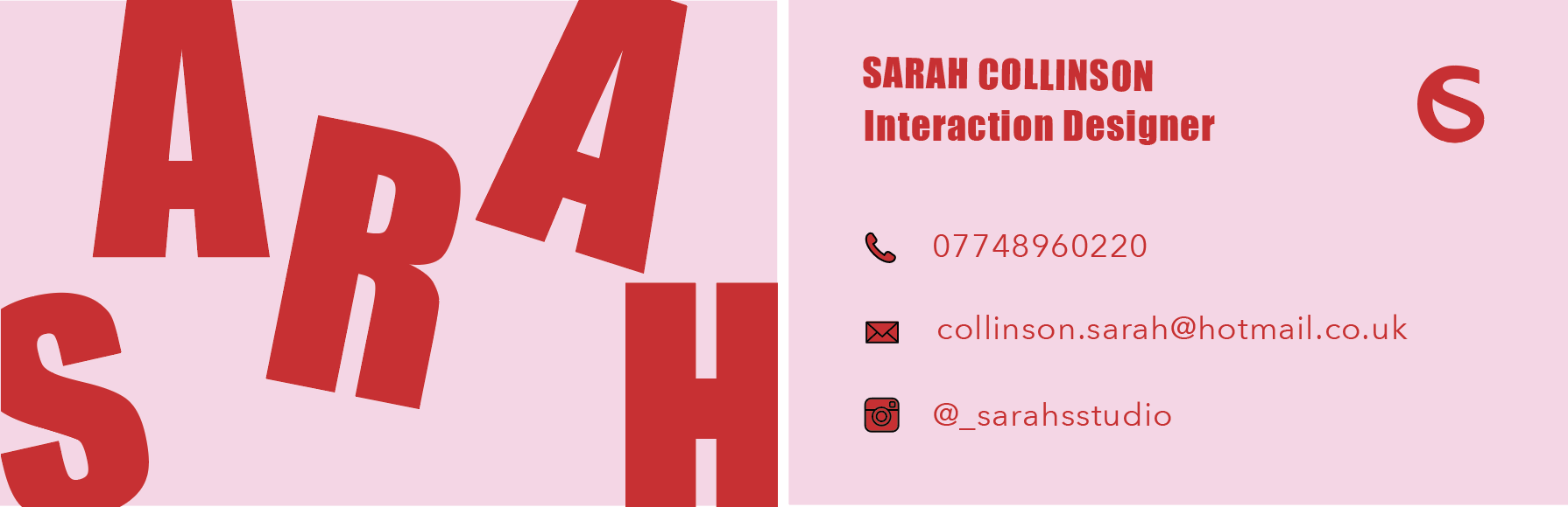
Whilst designing my portfolio site, I realised that I wasn’t happy with it as I felt it didn’t match the rest of my brand.
I wanted my portfolio site to match my monogram and business cards so that they all tie in together, making my brand more stable and consistent.
![]()
With this colour scheme and typography in mind, I went back to my sketchbook to re-design my portfolio site.
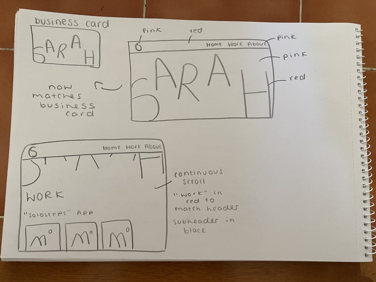
Happy with this outcome, I went on to Adobe Illustrator to digitise the wireframes to see if I like the structure of this portfolio site better.
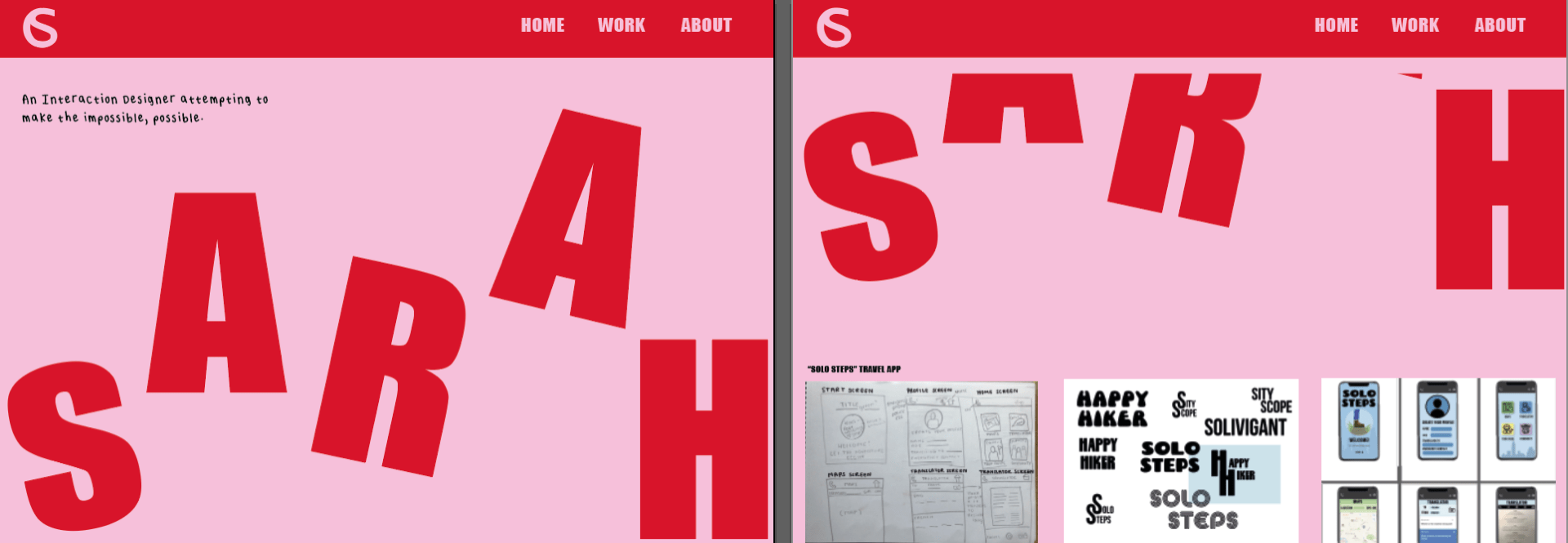
Overall, I am so much happier with the look of this new portfolio site as I think it fits my brand so much better and makes it more consistent as a whole. The continuous scroll of the site also makes the navigation process very easy and “clean” and there is no breakages in the background colour so it runs very smoothly.
I also then wanted to create a new stop motion as my other one no longer fitted the look of my brand either. I wanted to take the livliness of the “Sarah” and animate it so you can actually see it bouncing.

I am so much happier with the outcome of this stop motion as well as I think it flows better and makes a lot more sense to include in my brand. I think my portfolio site runs a lot smoother now as everything relates well to each other and is consistent which is crucial when creating a brand.