What is a type specimen?
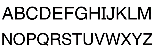
Traditionally, the purpose of a type specimen sheet was to provide the designer with visual examples of how a specific font performed in a variety of point sizes, weights and leading measurements. It also displayed how the Upper and Lower Case settings, numeral and punctuation styles looked.
For this task we were given the option to make a type specimen screen on either of the following typefaces;
-Futura
-Gill Sans
–Helvetica
-Palatino
-Times New Roman
– Baskerville
I have decided to focus my attention on Helvetica
THE HISTORY OF HELVETICA
Helvetica is one of the most popular and most commonly used typefaces because it works well when used in a variety of ways, for every typographic project imaginable.
BACKGROUND OF HELVETICA
The first version of Helvetica was created in 1957 by Max Miedinger, a Swiss typeface designer. His goal was to design a new sans-serif typeface that could compete in the Swiss market with the goal to create a neutral typeface that should give no additional meaning. Miedinger wanted a font that was clear to the eye and could be used in a variety of ways. It was originally called Neue Hass Grotesk. In 1960, the typeface’s name was changed to Helvetica, which means “Swiss” in Latin. This was seen as more marketable internationally.
In 2007, director Gary Hustwit developed a documentary film about Helvetica detailing how this typeface has shaped the culture of typography and design. After its release, the film was featured by MOMA for nearly a year, was nominated for the “Truer Than Fiction Award” at the 2008 Independent Spirit Awards “and was given an 88% rating by Rotten Tomatoes. Little did we know that a simple font like Helvetica can have such impact in the world today.
VARIATIONS OF HELVETICA
The Helvetica variation continued to grow as the typeface grew in popularity. Some of these variations include:
Helvetica Light: Designed by Erich Shultz-Anker and Arthur Ritzel.
Helvetica Compressed: Designed by Matthew Carter.
Helvetica Rounded: Designed in 1978 and incorporates a more rounded stroke.
Neue Helvetica: A redesign on Helvetica in 1983 which gave the typeface a more unified height and width.
WHAT SETS IT APART?
Helvetica can be commonly mistaken for other san-serif fonts, such as Arial, but there are more details within Helvetica that sets it apart from other fonts.
Helvetica’s characters have vertical or horizontal terminations in the stroke.
Helvetica focuses on the space surrounding the letters.
Helvetica has a monotone stroke weight.
Helvetica is easy to read while in motion, which is why you will often see this font used for airlines or automobile logos.
WHY GRAPHIC DESIGNERS CHOOSE HELVETICA?
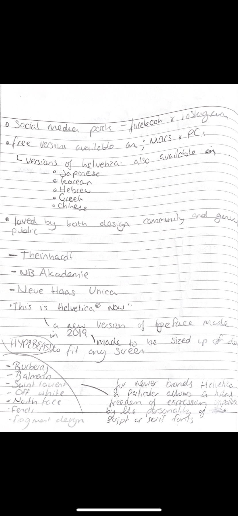
With its sleek lines and modern look, Helvetica is used in many company logos and other marketing materials that we see today. Some corporations that use Helvetica in their logos include, Apple, Microsoft, 3M, American Airline, Jeep, Verizon and many more. Apple gravitated towards this typeface so much, Helvetica was even used on all iPod and iOS platforms.
This typeface is the most commonly chosen by graphic designers because of its neutral design that makes it compatible with most types of content and design projects without drawing attention away from the message. You can see Helvetica used online, in printed materials and as a chosen logo typeface. Helvetica is also a good choice when thinking about your signage designs. If you are looking to get your message to your audience, they will see your content rather than being distracted by the font you’ve chosen.
Helvetica isn’t original—it’s based on an 1896 typeface called Akzidenz-Grotesk (known as Standard in the US), which was popular in Switzerland in the early 20th century.
The ‘Helvetica’ name was given to the typeface in 1960 to make it easier to sell abroad (it was originally named Neue Haas Grotesk). ‘Helvetica’ means ‘Swiss’ in Latin, in homage to its country of origin.
Helvetica is meant to be boring—its designers were striving for a neutral and versatile design that lacked personality.
In my own words have summarised the information researched to create a short paragraph, which is appropriate to include in my type specimen;
“Originally named Die Heue Hass grotesque, Helvetica is a Swiss font that was designed in 1957 to be a neutral typeface with no specific meaning or references . Recognised for its minimal aesthetic, Helvetica is a sans serif font, this means it lacks serif details. For newer brands, Helvetica in particular allows a total freedom of expression unpolluted by the personality of script or Serif fonts.”
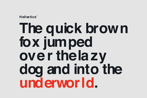
Some examples of Helvetica type specimen screens that have inspired me are included below. I like these because they are minimal and have been made in black and white. They are cluttered with anything unnecessary, just to fill space. Less is more.


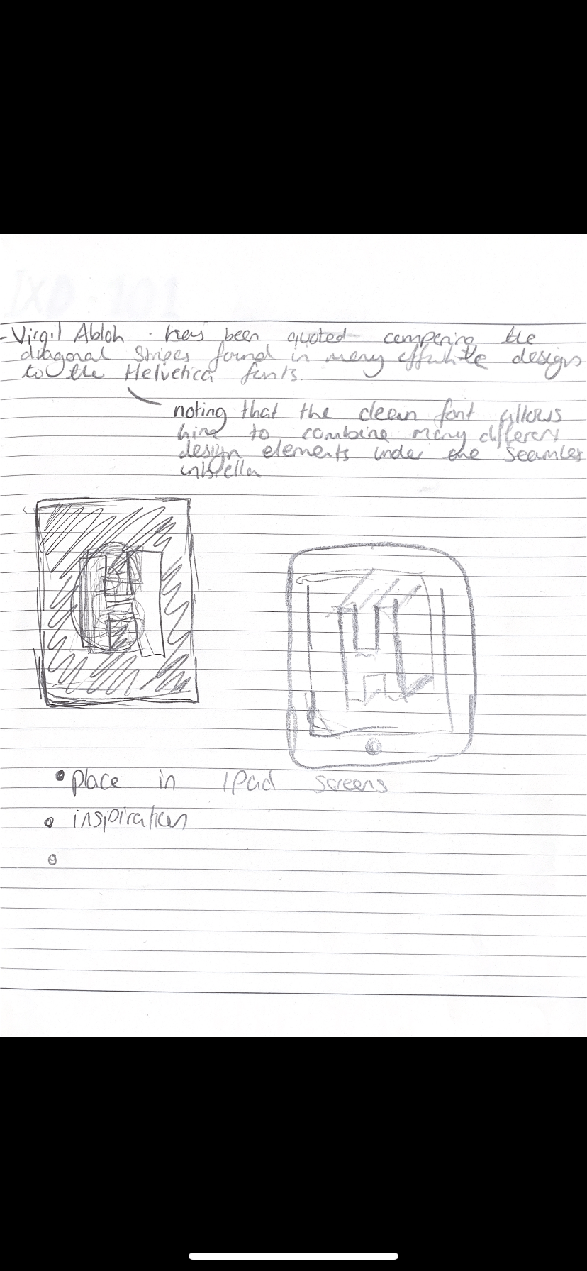
Inital ideas and sketches
 First ideas developed 30/09/20 – given feedback in campus
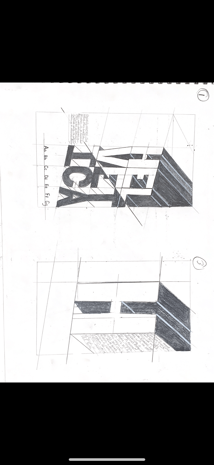
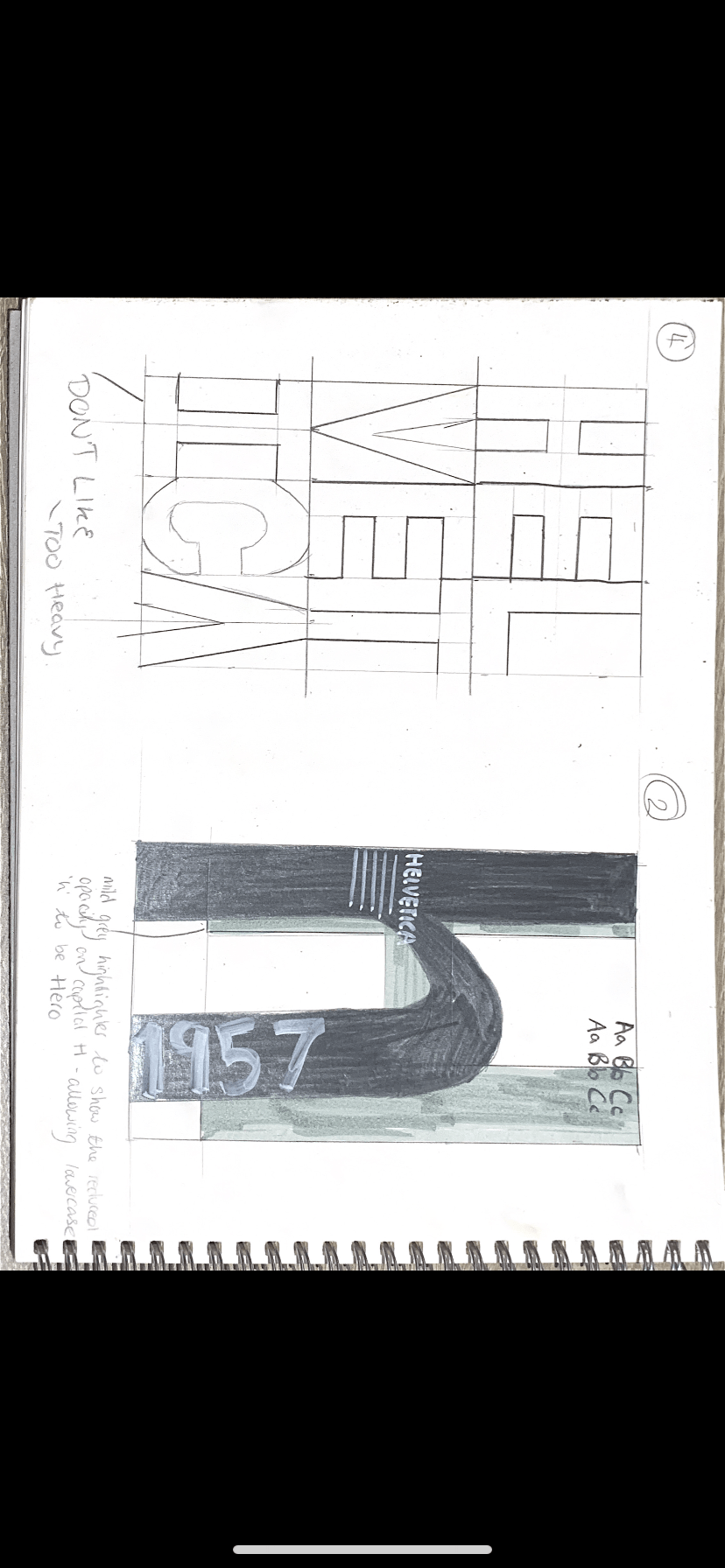
Developing my ideas on paper, making them more refined and choosing my favs to design digitally.
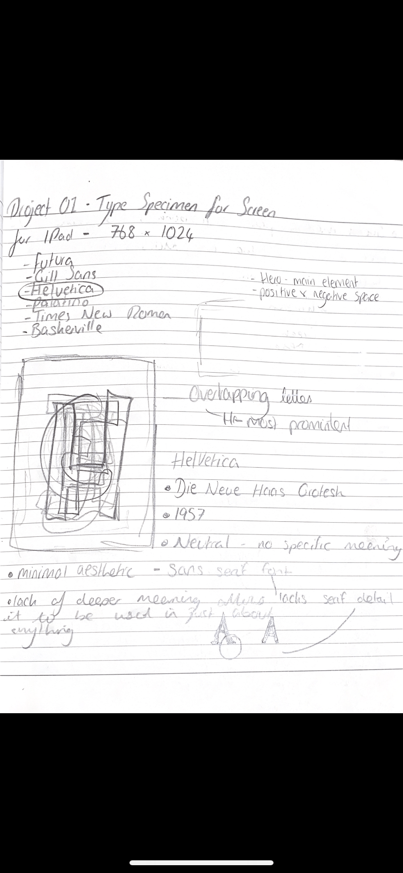
Quick notes taken in my notebook, which I have later used as research.
Designing my Type Specimen Screen
I wanted to keep the design of my Type Specimen Screen pretty minimal, and have one main focal point. I have planned to keep it all in B&W as not to distract from the actual design itself. As a person I would consider myself a minimalist, so I wanted to reflect that in my work.
Initially I was having some issues with Illustrator, so began to design with Figma. This proved to me a slight issue as I was unsure of how to create 3D text on this software. After doing some research I was able to find an application called Vectary, which allowed me to import text from figma and make it 3D. After some time working and getting used to the software I was able to create some prototypes which are shown below.
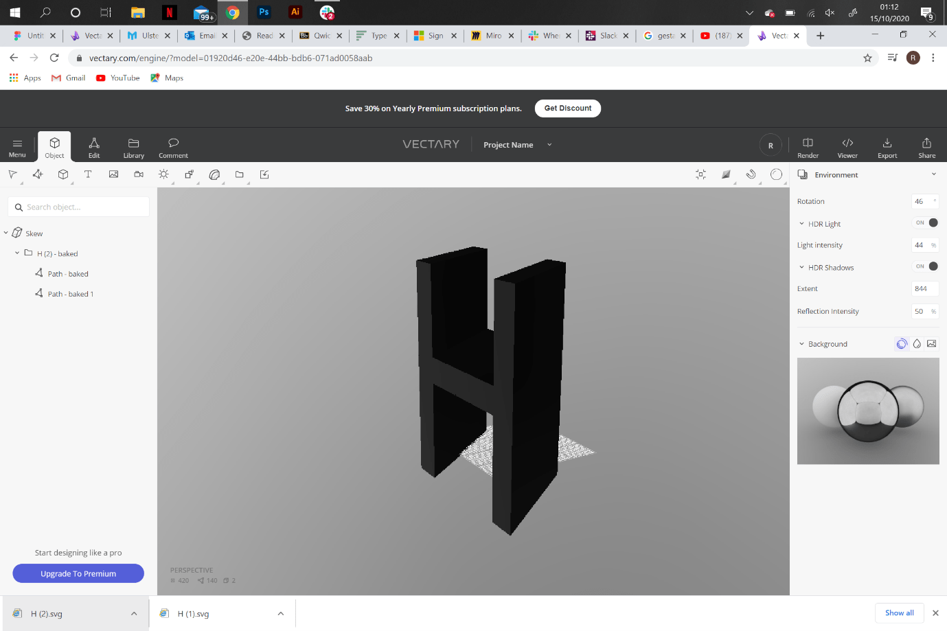


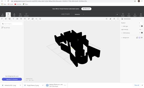
Unfortunately when I exported them onto Figma, they included a watermark which I had to pay a monthly subscription to remove. So I had to think of an alternative way to create my desired design.
I went back to Illustrator and managed to get it to somewhat work. I am happy with what I have created so far, and looking forward to feedback to allow me to improve them further. I know with more time working and getting used to Illustrator that ill be able to produce a Type Specimen Screen to a standard I am truly proud of.
Below I have included 3 designs which I have digitised;
(1 figma)
(2 &3 Illustrator)


