This week we went back over HTML and CSS. As I am happy with my foundational understanding of HTML and CSS have decided to review specific portions of HTML and CSS that I find tricky. My top difficulty when creating a webpage is producing the top nav. So this is an area I’m going to look at now in more detail.
I found a great video on LinkedIn learning by Jen Kramer. It uses CodePen to allow you to follow along. This is a great resource as you can code and see your changes as they happen. I have included screenshots of my work as I have followed the tutorials.
. 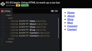
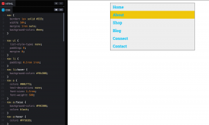
Rule 1 every nav bar should be the same when it comes to HTML. While I am happy with how to write HTML code for navbars it never hurts to get a reminder. Above is how the HTML should look for all navbars. What Kramer does next is in my opinion simply genius. She puts a 1px border around all the nav elements using CSS, shown below.

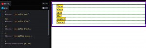
Kramer describes this as a great debugging method. By adding red borders it is much easier to visualise how to move and style the nav links. Kramer then adds a blue border to the nav tag highlighting that the nav fills the with of the page. The nav tag is a block-level element which means it is as wide as its containing elements i.e. the body tag.
By highlighting the <nav> element in blu it became clear that there was some padding/margin attached to either the <nav> element or the <ul> element. This was automatically set my HTML5 to the <ul> element however this could be discovered by adding margin and padding 0 to each element to see where the space was coming from. It is also worth noting that <li>s are also block-level elements however <a>s are not. <a> elements are inline elements which mean e.g. only as large as their content this is all demonstrated through borders and background elements as shown below.
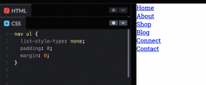
The next video deals with removing unwanted preset styling that comes with the above HTML. This essentially means removing the bullet points, margins and padding as follows.
Kramer then quickly rinds through the various states that can be applied to links. These are as follows and must be used in the below order:
Five possible link states, in order:
:link — before you’ve visited the site
:visited — you’ve viewed the site before
:focus — when the element is selected
:hover — when you hover over it
:active — after the link is clicked, before the next page loads
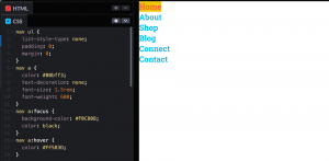
Adding basic styling is then covered. Here you can carn remove the line beneath the link by including text-decoration: none; and include focus and hover effects etc. as shown above.
Addin space around the nav element is kicked off by adding a border around the Nav element. As nicely put by Kramer “if you can’t see it you can’t style it”. This is very solid advice in my opinion as I have often found myself fumbling around my CSS struggling to style elements only to find it’s being applied to the wrong element. Space can automatically be generated around the nav by adding width: 50%; to the nav element, this means that the nav will only take up 50% of the available space. It can then be centred by adding margin: 1rem auto; 1rem applies to the top and bottom of the nav while auto applies to left and right (i.e. divide evenly and apply to the left and right side. This is a helpful tip as I was not aware you could centre an element using CSS like this. Other styling elements are applied such as padding and additional hover states as shown above.
HTML & CSS design and build websites
To refresh my knowledge of HTML and CSS I also reviewed HTML & CSS design and build websites by Jon Duckett.
When looking at the chapter on text I noted some tags I am less familiar with and I have listed these below:
The <q> tag. This is used for shorter quotes that sit within the paragraph. This should put quotation marks around the quote however not every browser supports this so it is often avoided.
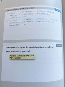
The <abbr> tag. This is used to add an abbreviation/ acronym to your webpage, see image below.
The <dfn> tag. This is used to note the defining instance of a new term. Some web browsers will present the element in italics however this does not include Safari or Chrome.
The placement of images is also covered as well as the three rules for creating images. These are:
Save the image in the right format- This topic was also covered in this weeks lecture looking at JPG, GIF, PNG, SVG. The general rule is to stick with JPG unless the image has translucent elements in which case a png would be applicable. A GIF is used in instances where movement is included and an SVG is used for logos and branding. SVG has a vector-based format and can be scaled up and down without losing quality.
Save the image at the right size- while this can be changed using code by doing so you generally end up distorting the image and it is, therefore, better to have the image sized correctly before adding it to a website. Another point to consider is file size in relation to load time. By adding a very large image with a large file size you will slow down the load time on the website and the image may not load at all. To avoid this I like to use the export for web tool on photoshop and illustrator which automatically reduces the file size by 60%.
Measure images in pixels- as pixels shown per inch can vary depending on the device being used it is important to measure and save images in pixels and not other metrics e.g. cm or mm to avoid distortion.
CSS
The book also covers all of the basics of CSS beginning with an outline of CSS selectors, properties and values. Colour and text are then looked at in more detail. This followed with how to style boxes, lists, tables and forms. Here I want to look at styling Layouts in a little more detail as this is an area I have found myself struggling with in the past.
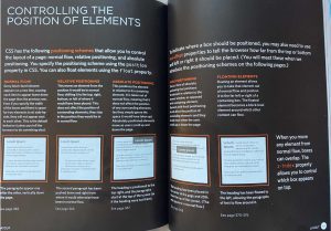
This portion of the book discusses 5 CSS position schemes. There are:
- Normal Flow
- Relative Positioning
- Absolute Positioning
- Fixed Positioning
- Floating Elements
Normal Flow (position: static)- This is the default behaviour of a webpage. It positions every block-level element on a new line.
While you do not need to indicate that a normal flow position as it is the default setting in all browsers the syntax would be position: static.
Relative Positioning (position: relative)- This works alongside normal flow and only impacts selected elements. By using relative positioning you can move an element by shifting it to the top, bottom or left of its normal flow position without impacting the surrounding elements.
In a style sheet this might appear as:
p. example {
position: relative:
top: 10px;
left: 100px;}
Absolute Positioning (position: absolute)- This positioning takes an element out of the normal flow and its placement does not impact the rest of the normal flow. An example is provided in the third box above.
In a style sheet this might appear as:
h1 {
position: absolute;
top: 0px;
left: 600px;
width: 300px;}
Fixed Positioning (position: fixed) – This is a form of absolute positioning. This places an element in a fixed position in relation to the browser window. It doesn’t impact the normal flow and does not move when the user scrolls. This can be helpful when creating a fixed nav.
In a style sheet this might appear as:
h1 {
position: fixed;
top: 0px;
left:opx;
padding: 10px;
margin: 0px;
width: 100%;}
Floating Elements – This takes an element out of the normal flow and allows you to position it to the far left or right in a containing box. This floating element becomes a block-level element that other content can flow around.
In a style sheet this might appear as:
blockquote {
float: right;
width: 275pc;
margin: 0px, 0px, 10px, 0px;
padding: 10px;}
It was very helpful to get a better understanding of what styling effects these positions have. I have used them in the past through trial and error to get the effect I was after without having a real understanding of what styling was being applied. I can now apply these position more intentionally in future and hopefully save time in achieving the correct result.