HeadSpace
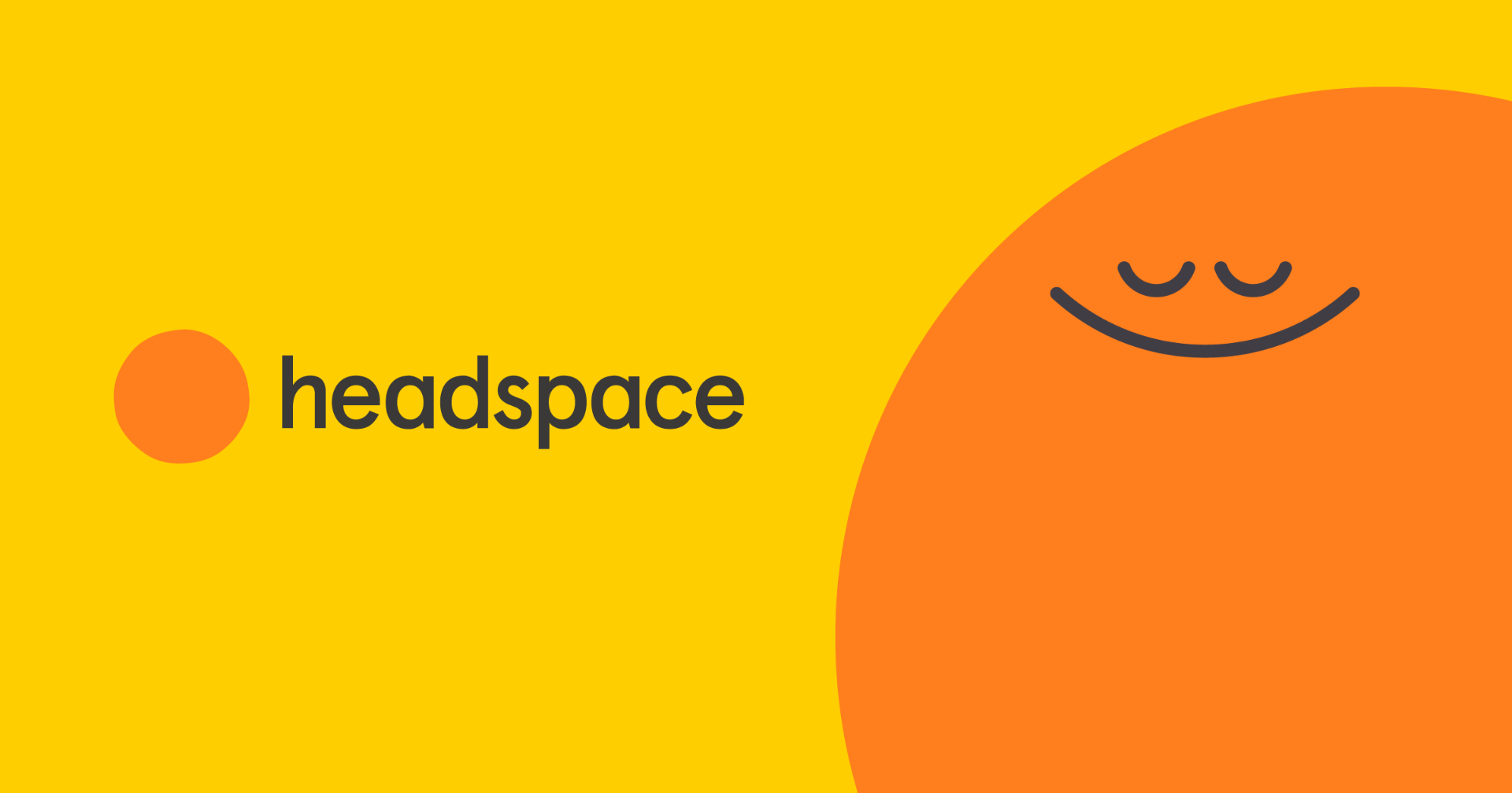
Headspace is a meditation and mindfulness app created by Andy Puddicombe. Andy Puddicombe left the UK in his early 20s and trained for 10years in meditation before returned to the UK with the goal of teaching people meditation and mindfulness. Headspace officially launched in 2010 with the mission to improve the world’s health and happiness. Studies have shown Headspace is shown to reduce stress and aggression as well as reducing symptoms of anxiety and depression.
As headspace tackles issues of mental health I have looked to it for visual inspiration for my infographic. As mental health is such a serious topic I think it would be nice to balance this out with a bright a pleasant colour palette and style. I want to evoke calmness in my audience and where better to find campness than meditation.
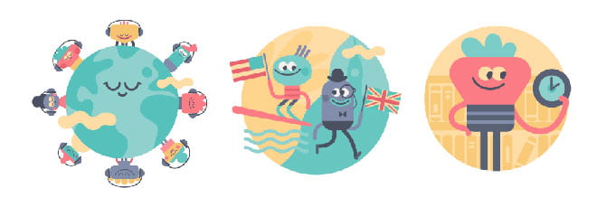
Headspace uses a bright colour palette as well as softer more pastel tones. It includes little faces in shapes that it turns into people and objects as shown above. It also incorporates little animations throughout its site.
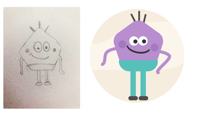
As an illustration exercise, I have designed and drawn my own headspace character to see if I could capture the illustrative style. I am really happy with the outcome as feel it fits with the style created by Headspace. While I wouldn’t want to include this in my infographic as I feel it references the app too strongly I do feel that including a similar colour palette and even a similar typographic style could be really effective in setting a bright and pleasent tone.
Atypical

Atypical is a Netflix series that focuses on Sam Gardner an 18-year old boy with Autism Spectrum disorder. He dealt with this by sketching and is particularly interested in penguins drawing several infographic style outcomes relating to penguins through the series.

I really loved this reference throughout the series and was particularly impressed with the series opening sequence. I thought this hand-drawn style had the potential to be really impressive in an infographic outcome and experimented with the style.

I created the majority of the above digitally and only the people were hand-drawn to match the illustrations in Atypical. I really like this approach however I feel that to make the outcome authentic the entire infographic would need to be hand-rendered and as a lot of my content is quite abstract e.g. it may be difficult to include background illustration this would mean drawing out graphs and figures and I don’t think the visual would be strong enough.
While this approach is not something that has worked on this occasion sketchbook style illustrations are definitely something I want to continue to experiment with.
What have I learnt?
- It can be helpful to practice master-apprentice when trying to work in a new style of illustration.
- Influence can be taken from a number of sources and it can be helpful to take the time to make quick style boards to get a feel for an idea and see how it might play out.
How can I apply this to my work in future?
- In future, if I am struggling to decide between different approaches I will make a style board like the one shown above to help me decide.
- When I am branching into new areas I will try to complete small master-apprentice exercises to get me started.