In this weeks lecture, we covered a number of topics including the death of words. Here we looked at the rise of social media apps such as Instagram and the growing focus on images above words. However, as stated by Edward Tufte (one of the fields modern leaders) “Infographics help fill the gaps between words and pictures”.
Charles Minard
It was also Tufte that is said to have shone a light on the work of Charles Minard’s work referring to Napoleon’s March as likely being “the best statistical graphic ever produced.” Charles Minard was originally a civil engineer however on retiring at 70 years old Minard dedicated his time to making maps that showed the flow of numbers.

In Minard’s Napoleon’s 1812 march on Moscow shown above Minard combined flow lines and a map to present the loss of life that Napoleon’s army suffered in 1812 and 1813.
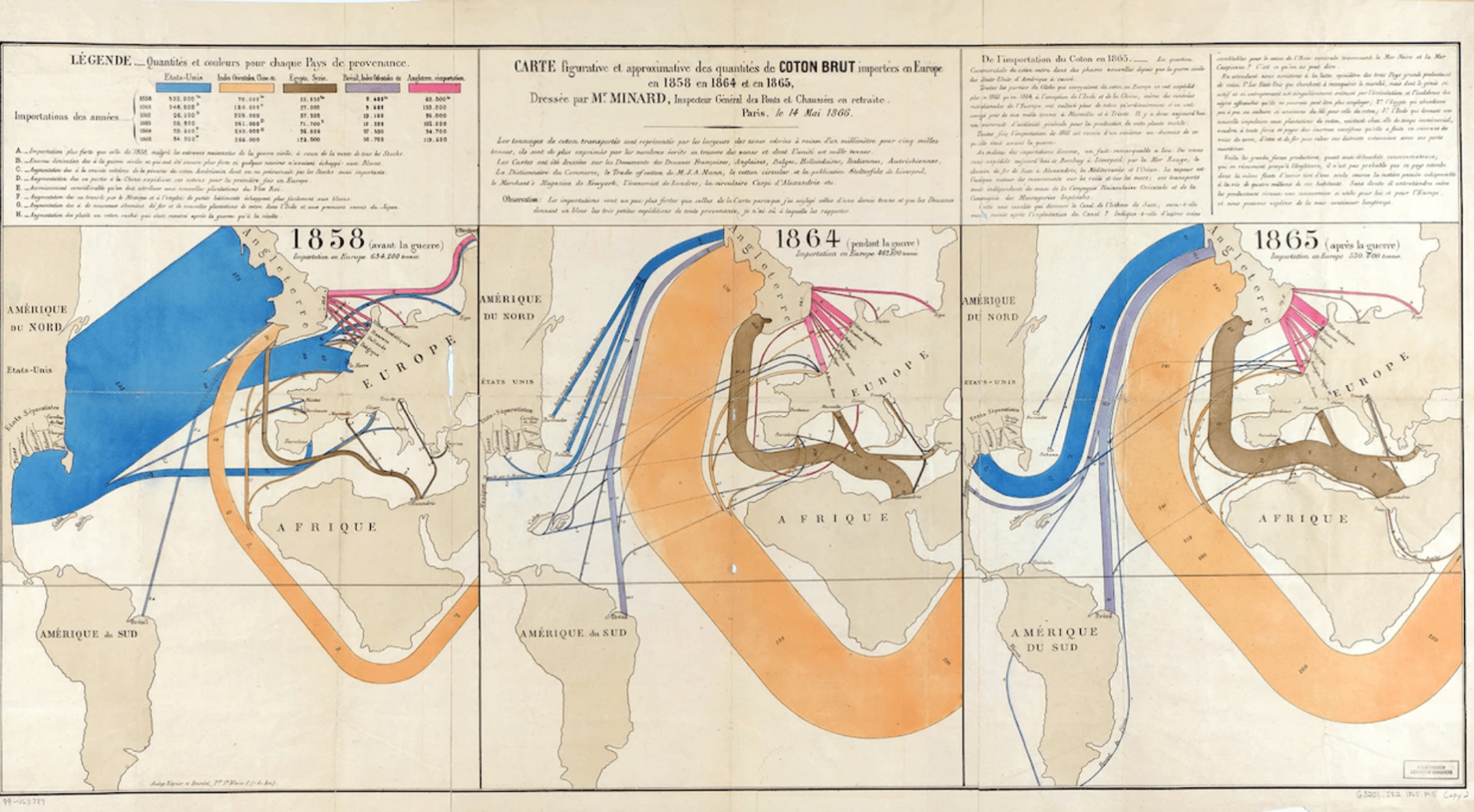
In the above depiction of the amount of cotton imported into Europe in 1858, 1864, and 1865 created by Minard, he presents where and how much cotton was imported into Europe. I love the colours used by Minard and the simplicity of the drawing of the map and if I’m being honest that probably one of the biggest draws for me. However, what is probably a more interesting fact about the above depiction is that it tells a story. The three outcomes showing annual data relating to the growth of the cotton industry and revealing a story of civil war as seen through the flow of cotton as detailed in the graphs accompanying note. Including a written interpretation of the data really enhances the outcome in this instance and brings the data to life as read aloud by R.J. Andrews in the below video.
What infographics can display
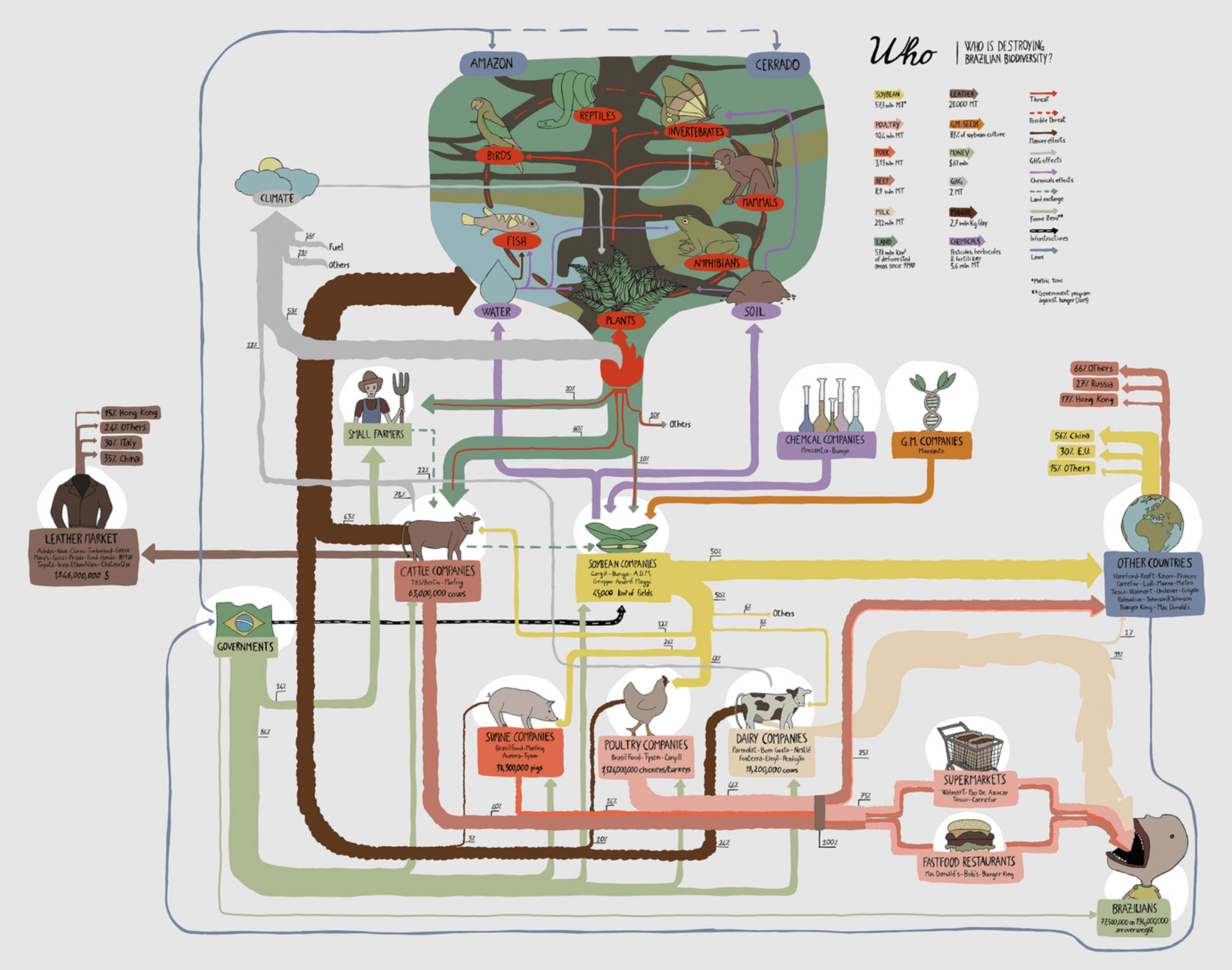
We also looked at a number of examples displaying infographics on a variety of topics including the development of the business/app Airbnb which included a flowchart style outcomes, US Elections which included maps and icon figures and poverty, again including maps. However, the primary take away for me in this weeks lecture was the role of storytelling in infographics.
This was not something I had ever really considered before, yes infographics provide the viewer with data and information but I had never considered to be a story until now. This has also been greatly emphasised for me by the storytelling element of Minard’s Cotton Maps.
Other important factors to consider when creating an infographic include the soundness of the information being presented, the incorporation of illustrations.
Steps to creating an amazing infographic
We were also given steps to create a great infographic which I felt covered everything when it comes to making an infographic in great detail so I have included the steps below so that I can use them as a check and balance as I make my infographic.
- Process your Data
- Check your sources
- Create a wireframe
- Have a story
- Set the Tone
- Consider your type
- Control Colour
- Utilise white space
- Take a break
- Proofread x3
- Test along the way
- Make Revisions
Titanic by Numbers

Data Vis Project

Master-Apprentice Exercises
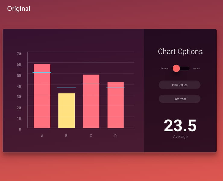
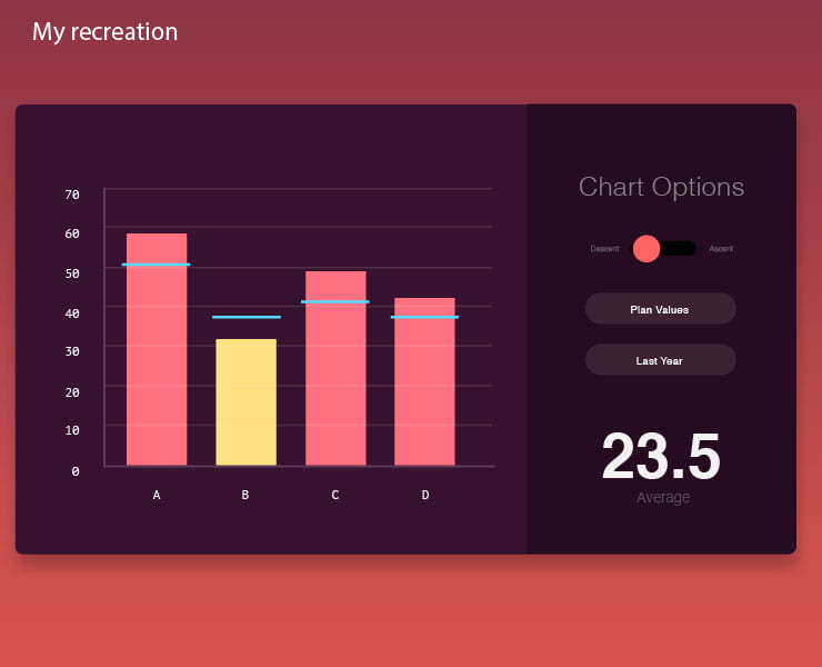
I found this weeks master-apprentice exercises to be really helpful and feel that I am starting to get to grips with the graphs and diagram tool on illustrator. However, it is disappointing that illustrator does not allow you to style the graph without ungrouping it meaning you can make data changes once you begin styling. Overall I found recreating the above graph to be relatively manageable though I did have trouble matching the correct typeface.

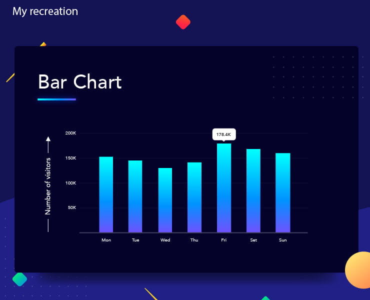
For this outcome, I had fun playing about with the gradients and recreating the background, though I know this isn’t something that was required. Again the graph tool is becoming a feature on illustrator that I am beginning to feel more comfortable using.

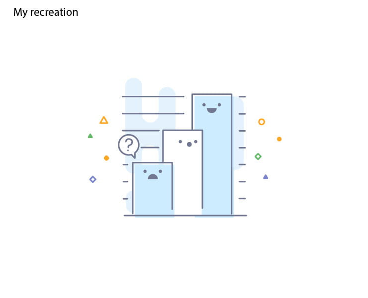
As there were no figures attached to the smiley face bar chart I couldn’t recreate the above bar chart outcome using the graphs tool in illustrator. However, it was fun to create the playful facial expressions and consider how human emotions can add an additional communicative element to the outcome and reflect responses to data.
What have I learnt?
- Infographics tell stories and it is important for me to remember this when creating my own infographic.
- It is possible to incorporate multiple mediums to present data.
- I now have a better understanding of the process that should be followed when creating an infographic.
- Important factors to consider when making an infographic are the soundness of the information being presented, how the data is presented and the incorporation of illustrations.
- It’s important to guide people through the information this can be helped by creating clear sections, numbering and adding titles.
How can I apply this to my work in future?
- The first point of impact for me in an infographic is the colour scheme therefore this is something I want to strongly consider when creating my own infographic.
- Finding interesting and engaging ways to present information can be really helpful in encouraging viewers to be impacted by data. Therefore this is something I would love to achieve in my own work.
- I think guiding the viewer through the information being presented in an infographic is really important therefore I want to make sure I include lines, section or other visuals aids to help guide the viewer through the information.