In this weeks lecture, we looked at various diagrams, data visualisation and reviewed how data is everywhere from bus time tables to weather reports to election results. I have looked at a number of data visual artists and their work below.
Made from Data- Paul Button
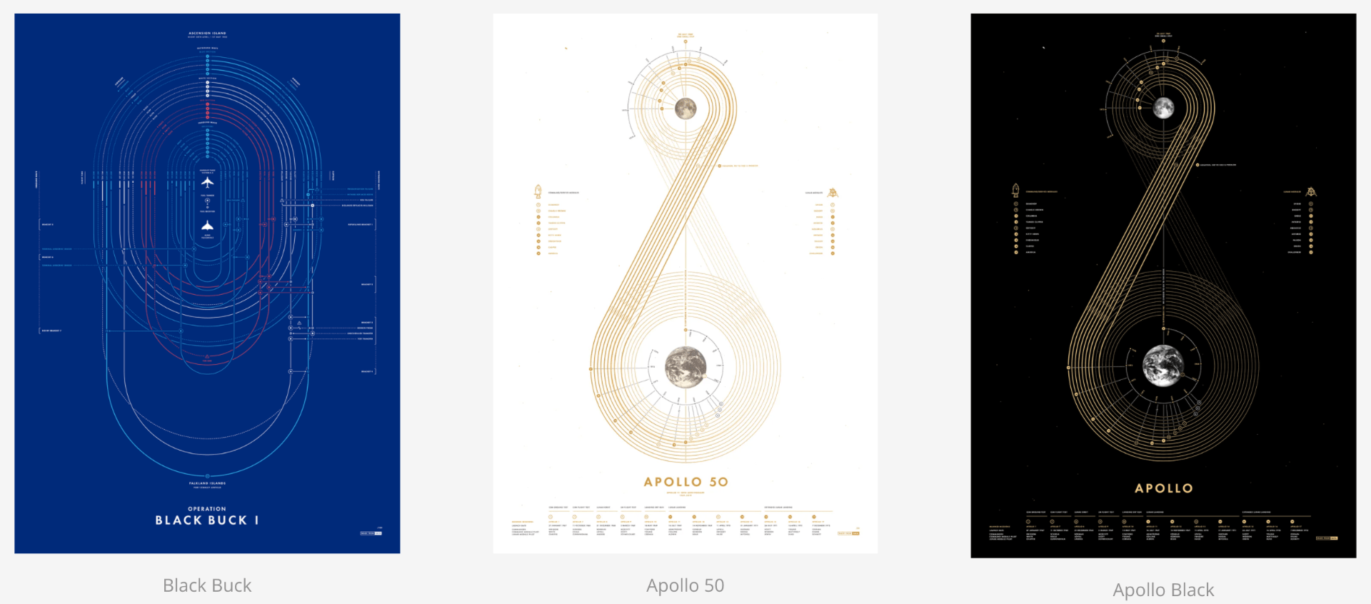
In the above outcomes, Paul Button demonstrates data primarily through line work. The blue poster to the left shows visual documentation of Operation Black Buck. Button describes this as one of the most ambitious missions carried out by the RAF. I love the use of line to represent multiple air-to-air refuelling missions and how when presented together along with the colour choices it almost appears like blueprints for a stadium or a detailed line drawing. Similarly, Button demonstrates a history of every manned Apollo flight in the following two outcomes. In these outcomes, the end results almost appear like treble clefs. I love the minimalism used in these outcomes and how the information is simplified by the use of a key. I think this is an interesting approach and would like to experiment with incorporating a key into my own infographic if possible. I also like the combination of linework combined with images of the earth and moon as well as the minimal colour palette.
Information is beautiful- David McCandless
On the site, Information is Beautiful David McCandless has created numerous data visualisations in an attempt to communicate data more clearly and to help the viewer make more informed decisions about the world. The fact that McCandless’s approach is all about making the information more accessible immediately draws me to his work as while Buttons outcomes are beautiful I would be concerned that clarity might be lost in fully adopting his approach to date visualisation as found them a little trickier to understand.

In the above infographic McCandless demonstrates the global hotspots of the COVID-19 Coronavirus. What’s really interesting to note here is once again the use of a key and colour coding on a gradient from yellow to deep red (in keeping with the idea of heat but maintaining a nice colour palette by not throwing in a blue at this point). I love the use of a map and think it is likely that Iw will incorporate a map in my own infographic at some point as it provides a nice clear overview.

The above dashboard is perhaps not just as interesting in its presentation of data however it does display a very clear hierarchy of information with a nice animated load element and strong colour scheme. While my infographic will not be made virtual it is interesting to note some of the click options here with the data being presented in the same way for top country cases, deaths and vaccinations with a menu below.
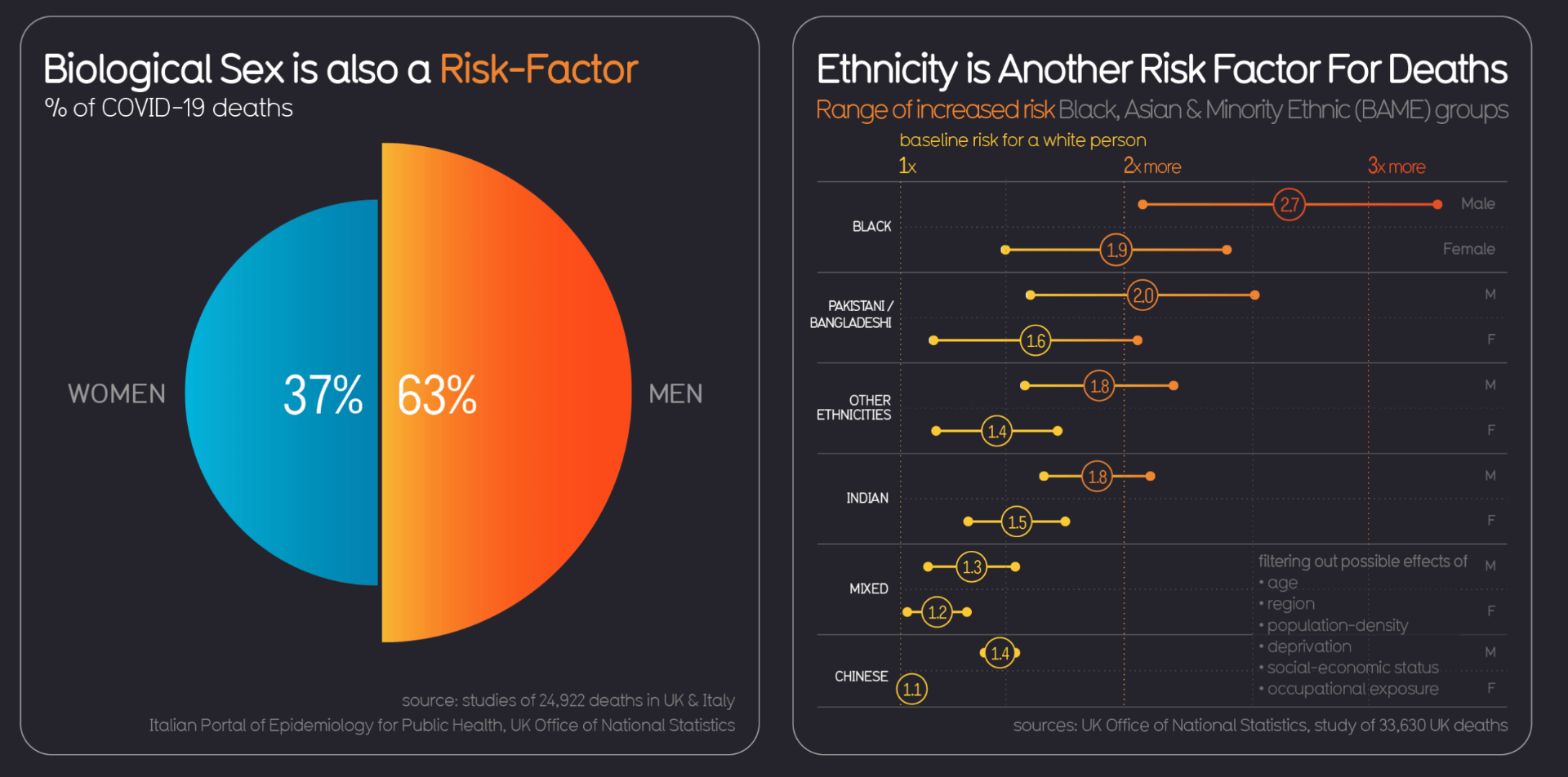
I also really liked how McCandless put a slant on the idea of the proportional area chart being used to show the difference in statistics proportionally in half-circles rather than using a more traditional pie chart outcome. I also like the use of a Gantt chart style outcome and how the decimals are positioned within the line. A further aspect I found to be very effective was the consistency in the use of colour with blue generally relating to low risk, more affected areas and increased risk etc demonstrated through a scale of yellow to red.
Nicholas Felton
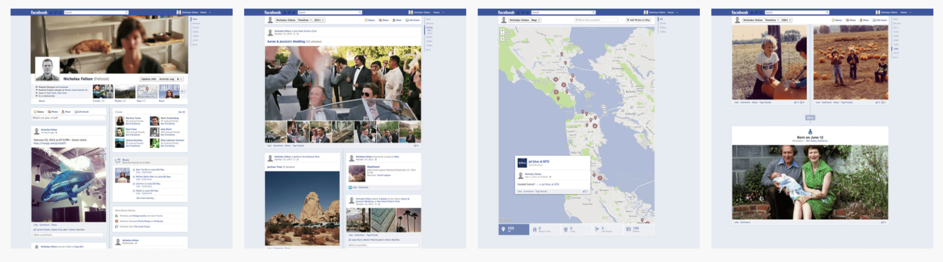
Nicholas Felton is a designer/artist whose work focuses on translating quotidian data into meaningful objects and experiences. He has completed a series of annual self-tracking reports detailing the events of a year which became part of the ideology behind Facebook’s timeline which Felton was one of the lead designers on. I think this displays the incredible scope and applications of data visualisation and how it can lead to a great variety of career opportunities. While working with Facebook Felton changed the structure of the timeline to showcase an entire life resulting in redesigned elements such as the addition of cover photos and styling attributes like typography and map styling. This had a massive impact on the functionality of Facebook leading to the social media platform still in use today.

A second project I want to take a little time looking at is Felton’s Elemental Project. This ongoing effort displays 118 known elements in 3d while displaying the periodic table in the background. I love the minimalist and even futuristic feel of this project. I think the outcome and presentation of the 3D elements are incredible and love how they are combined with the periodic table, their symbols, numbers and anatomy resulting in a really engaging, informative and downright cool outcome. I would love to be able to include or even just experiment with 3D illustrations in my own infographic in a manner similar to the above.
Giorgia Lupi

I really love the use of layering in the above outcome produced by Giorgia Lupi. While the white writing does reduce readability slightly it gives the outcome a collage feel as though it had been produced on newspaper. This parallels nicely with the idea that the stats are shocking and newsworthy. I also love the use of imagery and how the cloud of smoke sits nicely behind what appears to be a combination of a stacked bar graph, stacked chart and sunburst chart and a dot, bar, x pictogram providing information about countries with nuclear weapons. What I love about Lupi’s work is that it presents the narrative in a beautiful and intricate visual e.g. the data is presented in the formation of an explosion and disperses around the edges. However, a concern for me would be the level of readability particularly with the inclusion of overlapped writing. Yet I would still love to experiment with this style in my own infographic to see what elements could be incorporated without disrupting the readability of the outcome.
Lies, damn lies, and Steve Jobs Keynotes
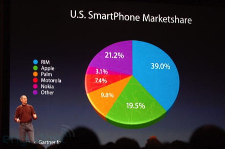
We also looked at how data can be hidden or even misrepresented. An example of this can be found in Steve Jobs infamous Keynotes presentation. As can be seen in the above example the pie chart above at a glance would suggest that following the blue portion the next largest segment is the green portion, which represents Apple. However, this is not the case on closer inspection the purple section reads 21.2%. The graph is made 3D and placed at a slant to give the allusion of Apple’s market share being larger than what it actually is. On top of this, the breakdown of the market is by brand rather than by operating system further skewing the true data. This is definitely not something you want to be doing when presenting data as it actively misleads the viewer and is pretty deceptive. When working with data visuals I hope to always have a clear and valid representation of what I’m presenting at the top of my priority list.
Master-Apprentice Exercises

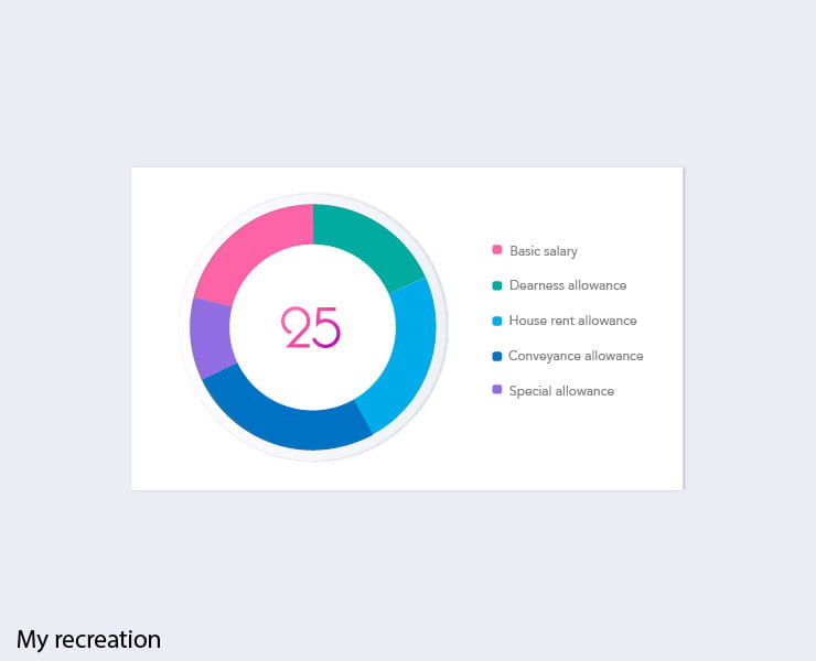
For this week’s master-apprentice exercise, we used the graphs tool on illustrator to produce pie chart outcomes. I really enjoyed this exercise and actually found the most difficult aspect of the above outcome to be achieving the bevelled effect on the border around the pie chart. It’s interesting to consider elements like these as they can really add to the aesthetic of a piechart or graph.

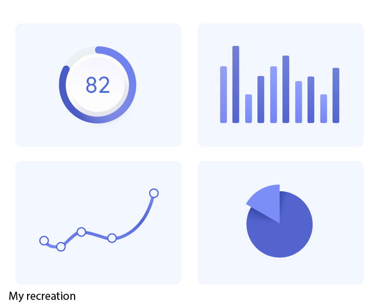
In the above recreation, I only used the graph too to present the 82 bar as I didn’t have exact figures on the other outcome and used the original image of the graphs and charts to guide my sizing instead.
What have I learnt?
- The aesthetic of data visuals is really important for grabbing the viewers attention and getting them to look more closely at the information being presented.
- It is important to strike a balance between an interesting presentation of data and the data being readable and easily understood by the viewer. I feel this is very much tied to the reason for the presentation of data in some cases making information easily digestible is not the goal and an interesting authentic is.
- It can be interesting to present data in less common forms such ad by sing a proportional area chart rather than a pie chart.
- It’s really important to ensure that data visualisations are an accurate representation of the data.
How can I apply this to my work in future?
- When working with data visuals I need to always ensure I am presenting a clear and valid representation of the data.
- When presenting charts and diagrams I can include interesting aesthetics such as borders and interesting typographic pieces to draw attention to the figures and charts.
- I always need to consider the purpose of data visualizations when producing them and the target audience and use this to guide my design and presentation choices.