Research
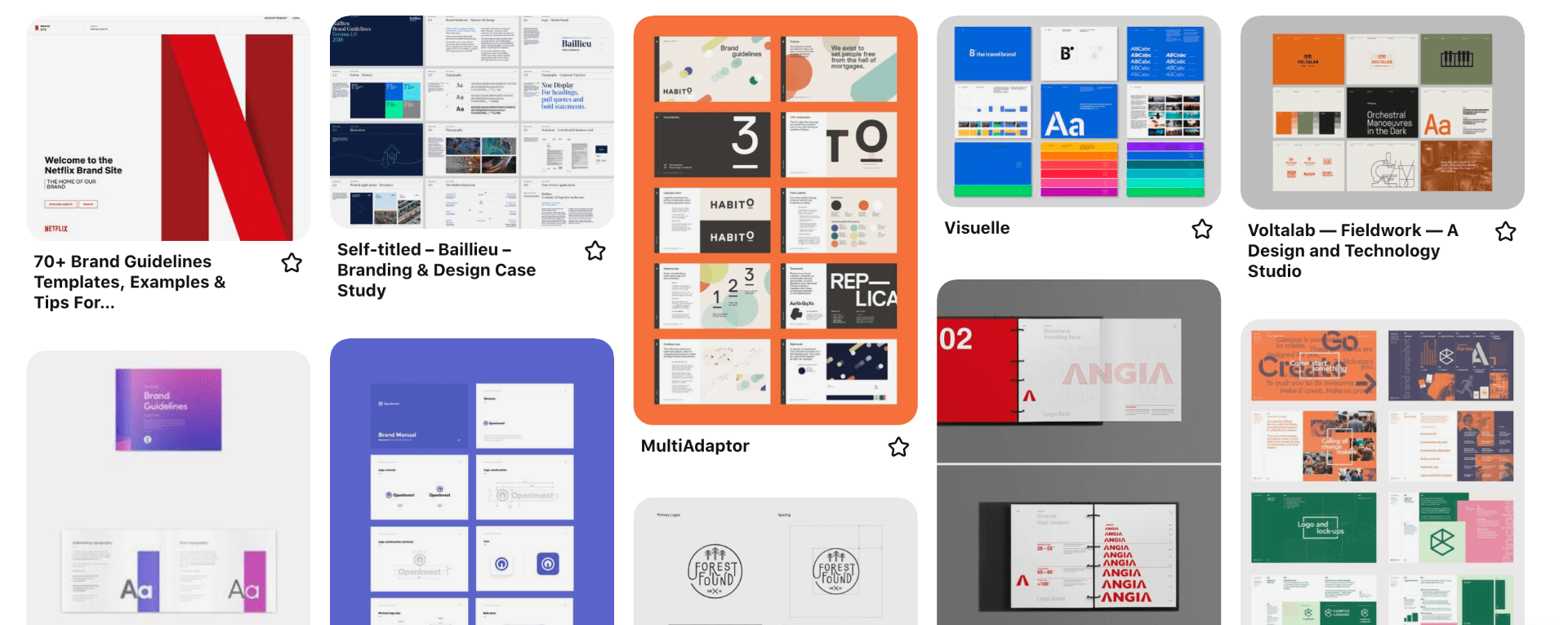
I began my visual research by generating a Pinterest board of various examples of brand guidelines with strong athletics. What struck me was the effectiveness of grid layouts and the use of columns. This helps to break the information up into manageable chunks and makes the document as a whole more visually pleasing.
NJORD

I also took a little more time to look at a few brand guideline examples and NHJOR really jumped out at me. I love the minimal outcome of the brand guidelines and how they have covered the colour palette in such great detail. While this is not as relevant to my brand as I very minimal colour palette this is definitely something I could refer to when working with a number of tint’s, shades or tones. I also love how they have laid out the various logo composition and included digital and physical mock-ups of products such as the bag shown above.
Scrimshaw Coffee
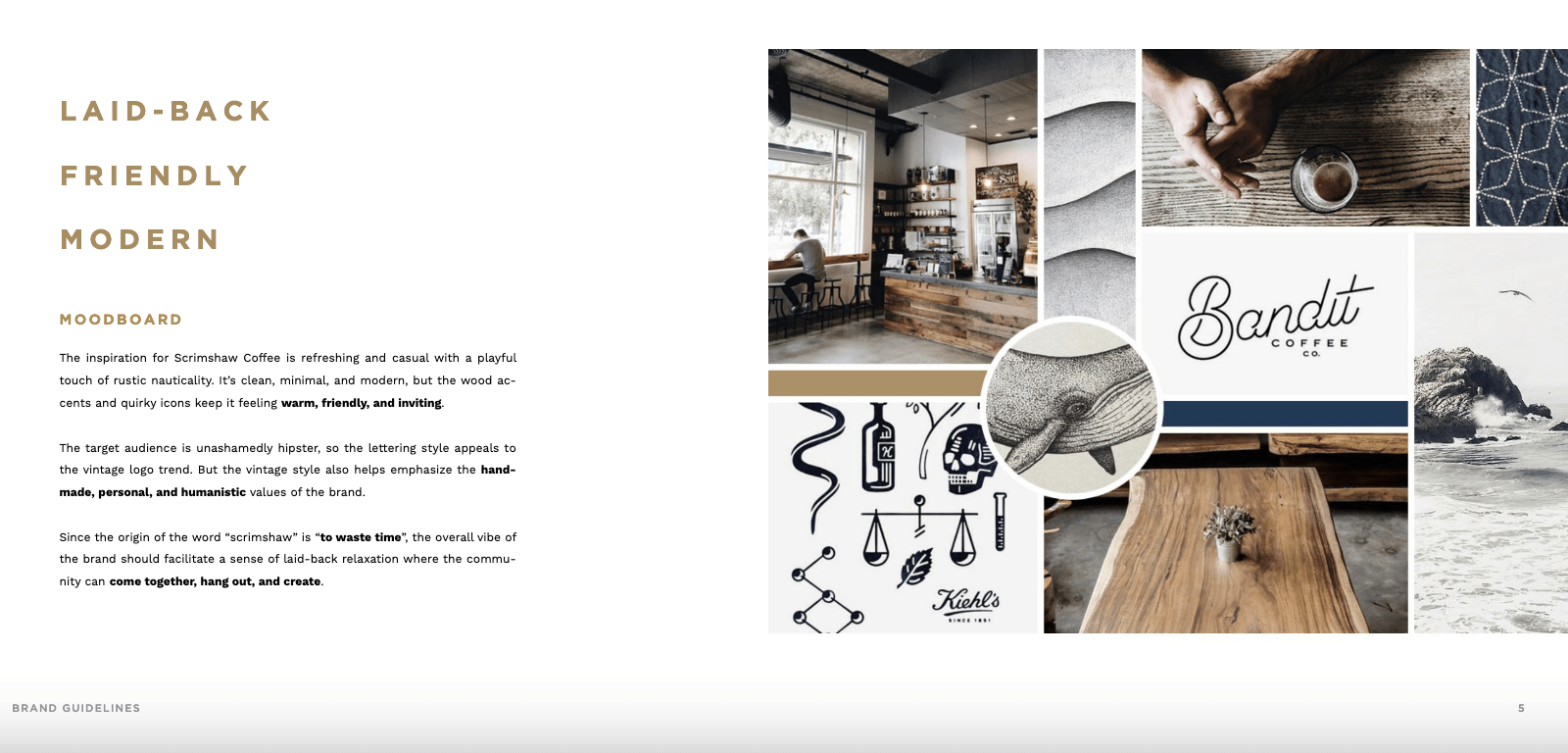
Similarly Scrimshaw Coffee also presents its brand guidelines in a really nice minimal outcome. I love how Scrimshaw have included important items relating to tone of voice in bold as presented in their brand mood board shown above. The guidelines also include interesting features like how small the logo can be presented, information on secondary logos and how they have set colour usage in the logo separately from logo dos and dont’s. While again my colour palette is very minimal this is something to be considered if working with a brand that incorporates numerous colours in their logo.
Sketches
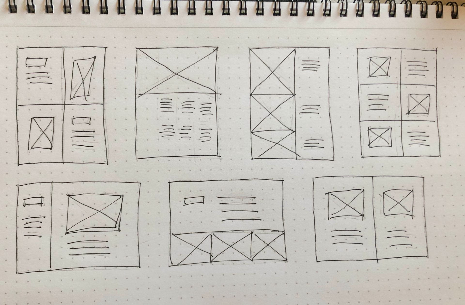
Above I have included sketches I complete of potential layouts for brand guidelines looking at both portrait and landscape options.
Outcome

For my brad guidelines, I began with a visual motif on my cover but feel it cluttered the cover and decided to remove it in order to maintain the clean minimal style I want to run throughout my brand. I then move to a contents page, this isn’t something all brand guidelines include however it was something I wanted to include in my brand as it is in keeping with the structured feel of the brand.

I then decided to present my brand story followed by logo spacing. I considered following my brand story with my tone of voice and brand dictionary. However, I didn’t want the star of my brand guidelines to be too text-heavy so I decided against this. For the clear space section in relation to the logo I used the approach found in Netflix’s brand guidelines and took the leg of the ‘R’ to demonstrate how much spacing should be left around the logo at all times.

For my do’s and dont’s I primarily focused on how to place the logo in relation to colour and not to distort it. As my brand developed I would also consider adding a page about how the monogram and wordmark can be placed together and how they can’t however until I establish how this will work I have left it as placed vertically with a central alignment. I have also included a page on my word mark to highlight that both Rachel’s Design Lab and Rachel Donaldson can be used in the customer typeface in relation to my brand.

Next, I discuss colour and detail hex, RGB, CMYK and Pantone values. I also explain appropriate usage. I then move onto typography. I have detailed typography is for headings and body text however I left sizing out at this stage as I want to establish specific rules around sizing for web and responsive design when I have a full understanding of how this will work.
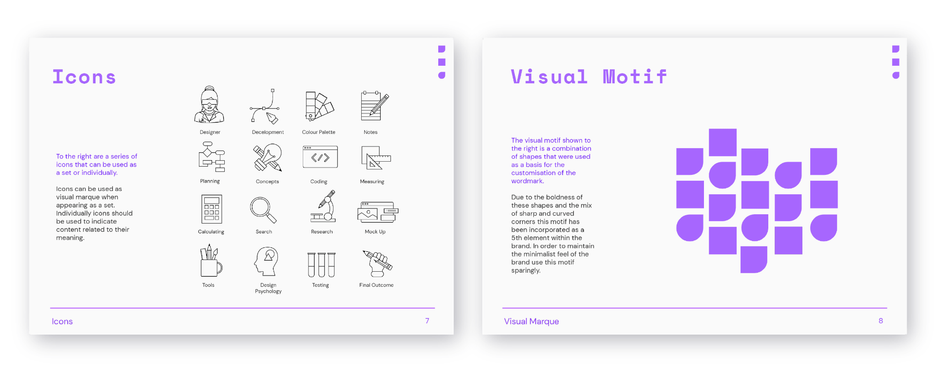
I also detail the appropriate use of icons creates for the brand and my visual motif as seen above.

Above I have detailed instruction around image placement and formatting. I then have broken up my tone of voice into voice and tone and detail how I would like my brand tone of voice to maintained across all touchpoints.
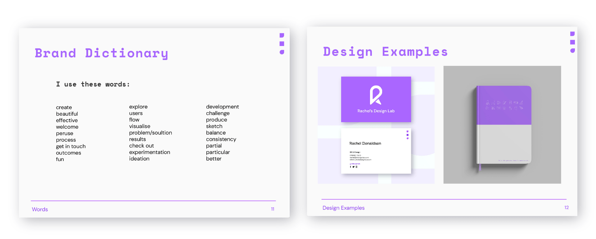
Finally, I have included a brand dictionary and design examples. I had originally included a words I like and words I don’t like page however I found this to be a stumbling block as I ended up having to use words that I had placed in the words I don’t like category. I, therefore, removed this and replaced it with my brand dictionary. I finished my brand guidelines with design examples of my business card and a mock-up of a notebook to show how my brand would be displayed in physical touchpoints.
Overall I am really pleased with the outcome of my brand as a whole and my brand guidelines. I am pleased that I was able to present the minimalist outcome I wanted to achieve. I feel I have presented a good level of detail in my brand guidelines however I am aware that there is a lot of room for me to developed and a lot more information that may need to be added as I continue my brand.
What have I learnt?
- It is important to consider the content and use of your own brand when reviewing examples of brand guidelines and only including what is relevant to your work.
- Using an interesting structure can make information that could be considered dull a lot more engaging and therefore this should always be considered when producing brand guidelines.
- There is an endless amount of information that could be included in brand guidelines however it can be important not to limit the brand too much.
How can I apply this to my work in future?
- I should always develop a plan and structure for a brands guideline based on the individual need s of the brand rather than simply following a template.
- Structuring content within brand guidelines in an engaging way that breaks text up is important and I should consider this when working on brand guidelines in future.
- It is good to have a certain amount of content for a brand and therefore when I am creating a brand in future I should try to include as many prototypes and brand examples as possible to demonstrate how the brand is able to be used consistently in multiple forms.