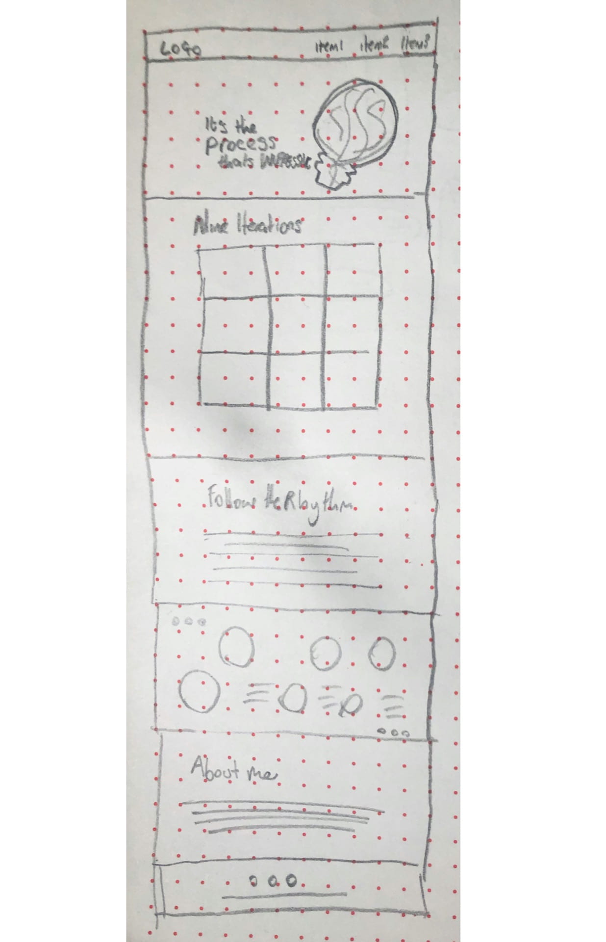
Wireframe
While we were provided with the general structure of our portfolio website I thought it would be good practice to wireframe out my website with my own assets including the manifesto I created which will sit in the hero section of the website and the rhythm and lyrics section which I now intend to restructure and place horizontally, see below.
Colour Palette
I used the below colour palette to select the colours for my website which I had produced we redesigning my manifesto and rhythm and lyrics outcomes.
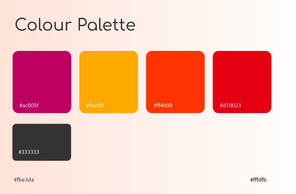
This was a very helpful guideline and made styling my website a lot easier. I also made decisions like font choice, choosing Comfortaa for my headers as it features in both my manifesto and rhythm and lyrics outcome along with the sans serif typeface Poppins for the nav and body text, I was drawn to this text as it contrasted Comfortaa nicely without looking too blocky.
Adding manifesto and rhythm and lyrics
For my manifesto, I wanted to include the text as text and not as an image so I removed the text from the outcome and dropped the lightbulb in as a background image, see below

As can be seen in the top image I had some difficulties with structuring my text and with the lightbulb moving off-screen. To fix these issues I applied additional padding around the text adjusted the line spacing and the text intent. I also amended and entered my background image to make the full but viewable. I considered using a background image gradient and placing the lightbulb in as a separate image element however I was not sure how to do this while keeping the gradient and the drop shadows creating the 3D layered effect I was after. I, therefore, stuck with keeping the background image all as one.
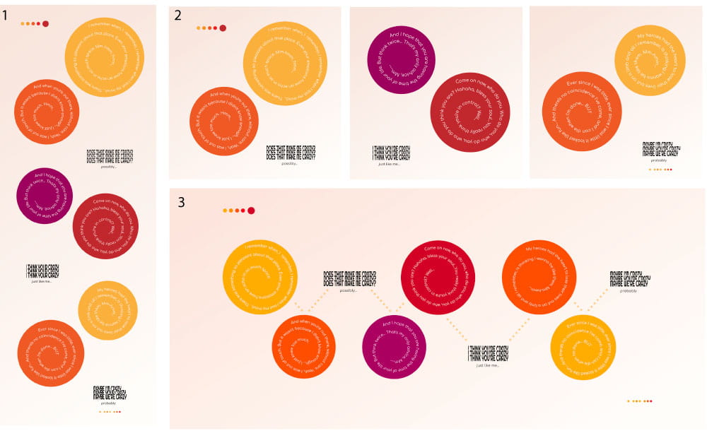
For rhythm and lyrics section I new when building the structure of the website that I was not going to use the vertical layout I had intended to (see above outcome 1) and therefore used the separate images I had created to display my post on Instagram (see outcome 2). This lead to outcome 3, shown above. I was very pleased with this outcome and have discussed the process of creating it in more detail in my Rhythm and Lyrics blog. However, in mobile view, the lyrics will become illegible therefore I would like to use outcome 2 for this reason however only on mobile view as I think outcome 3 will appear stronger on tablet and desktop. I struggled to make this work in my coding however I will update the site with these changes once I can.
Formatting and Spacing
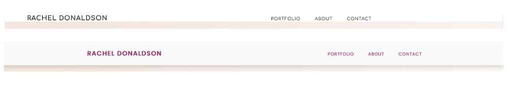
The first formatting and display issue I tackled was in relation to my nav which was showing as text height and I didn’t feel contrasted the below layer strongly enough I also felt that the links and logo were placed too far left. As shown in the above top outcome.
I changed the width from 90% to 100% which fixed their alignment and added 2em padding at the top and bottom. I also added a drop shadow and made it a sticky nav so it clearly stands out against the rest of the site, see html5 coding below.
nav{
box-shadow: 0em 0em 1.5em 0.3em rgba(0,0,0,0.2);
position: fixed;
z-index: 99;
}
I also altered the colour to dark magenta #ac1065 and made the typeface Poppins as I felt Comfortaa was too stylised for a nav font. Overall I am really pleased with this outcome and feel that the navbar stands out well against the rest of the site and by having it fixed at the top also making the page easier to navigate.
Interesting fact: when scrolling past my CSS grid images they appeared on top of the nav, dropping z-index: 99; fixed this.
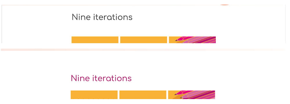
I then moved on to look at the size, colour and spacing of my headers. I was happy with their size at 2.75em however as shown above in the top outcome the grey #333 was a little dull and the heading was too close to the section above and too far away from the images below. I, therefore, changed the colour to dark magenta and changed the top and bottom margin to 2em and 1em respectively to both on the header to both the nine iterations and rhythm and lyrics headers as the about me header was displaying well.
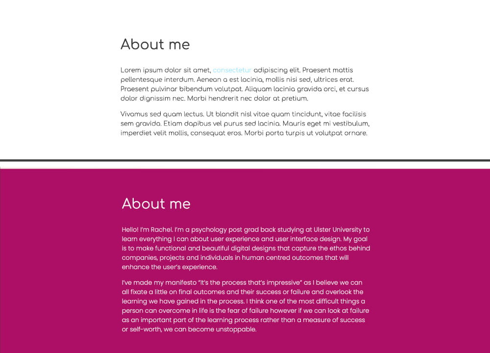
Finally, I added background colours to various sections as seen above making the About me section dark magenta and the footer dark grey.
Adding a song on Spotify
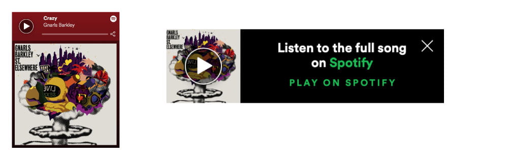
Finally, I thought it would be fun to link the song I had produced my rhythm and lyrics section about. I, therefore, decided to take the code from Spotify and drop it between my description and image. However, it was originally displaying quite largely as shown in the above-left outcome. This was impacting on the aesthetic of my page so I found a converter which allowed me to display the more compact version shown above to the right. I was able to centre this in my layout using the HTML5 code <center> </center> around the iframe element
Link to websites that converts code to present Spotify songs in a compressed form: https://developer.spotify.com/documentation/widgets/generate/embed/
Final Review
Overall I am really pleased with the outcome of my portfolio website and how I was able to blend my manifesto, 9 iterations and rhythm and lyrics outcomes together to create a cohesive theme throughout my webpage simply through a clear colour scheme and matching typefaces.
To view my full website follow the link below:
https://racheldonaldson.github.io/ixd101/index.html
What have I learnt?
- The importance of creating a colour palette when producing a design for a webpage.
- How to apply background images and effectively place behind text.
- The importance of considering how a website will appear on multiple devices and generating images and assets on that based.
- How to make a sticky nav and add a drop shadow to a navbar.
- How to add Spotify tracks and albums to webpages and how to compress their view in order to not disrupt the aesthetics and format of a web page.
How can I apply this to my work in future?
- In future when creating multiple assets for a webpage I will create a colour palette that I will draw from in order to produce a cohesive aesthetic for my web page as this was an effective approach for my portfolio website.
- I will be able to apply background images to webpages and will have a basic knowledge of applying breakpoints when the image will drop in size depending on the size of the screen it is being viewed on.
- I now have a better understanding of the various ways I can present nav bars however I would love to further my understanding in this area and perhaps look at getting a basic understanding of JavaScript in order to be able to apply better formating in mobile view etc.