The International Typographic Style also known as the Swiss Style emerged in Switzerland in the 1950s. Its object was to produce design that was content-focused similar to the modernist view that form follows function. Closely linked with the Swiss Style is the typeface Helvetica designed in 1957.
The Helvetica documentary film
In the Helvetica film the typeface is repeatedly described as neutral and designers such Wim Crouwel talks about the importance and desirability of this as it means that the focus is on the content of the type, not the typeface. Crouwel talks about the modernist approach and its constant strive for clarity and order, a reason he gives for his proclivity for using grids as a means of creating order.

The documentary also looks at the contrasting work of David Carson, his disregard for the rule and use of as many different typefaces as possible with legibility being of no concert in some instances as Carson talks about publishing an article he found boring in Dingbats. The contrast between Carson’s grunge approach and the Swiss Style could not be higher! Carson’s grunge style became quite dominant throughout the 1990s particularly in America and the documentary finishes by looking a number of current designers that are returning to the rules and restrictions of the Swiss Style as major influences in their work. I think it’s amazing to see the impact that a typeface can have not just in a country but globally and how recognisable the typeface Helvetica has become. While those such as Carson describe Helvetica as being boring for me it really is a brilliant canvas and what I love about its use in the Swiss Style is that it is stopped from being boring by really simple and effective points of interest. As a designer, one of my biggest struggles is being faced with a client that wants everything on the page to stand out and my internal response if generally if everything stands out nothing will. I think this is what really draws me to Swiss Design as the outcome is functional and structured, guiding the viewer through the content in a deliberate and clear way.
Josef Müller-Brockmann
Josef Müller-Brockmann said to be the father of Swiss graphic design was born in Switzerland in 1914, Interesting Müller-Brockmann has described himself as becoming a graphic designer by accident trying to pursue an artistic career before apprenticing as a retoucher at a printing house and then apprenticing under architects both lasting only a number of weeks. Finally Müller- Brockmann contacted a number of graphic designers and asked them what they studied which led him to the study of graphic design and architecture in Zurich School of Arts and Crafts.
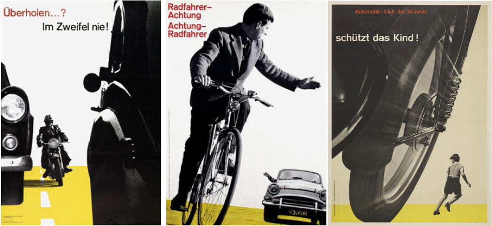
His work was influenced by the Bauhaus and constructivist movements and this can be seen above in the three posters produced by Müller-Brockmann for the Triple-A, an automobile club in Switzerland promoting safety and the use of hand signals. I really love these outcomes and their cinematic feel indicative of movement throughout. This is achieved by Müller-Brockmann’s use of perspective created through scaling and showing only fragments of images with the rest ‘moving out of frame’.
It is interesting to note that there was a general preference for photographs over illustrations among the Swiss designers as the outcomes were felt be more documentary in style however in posters such as the above Müller-Brockmann would have created the compositions through fragments of photographs brought together to construct the final outcome. Yet the above outcomes remain structures and deliberate as indicative of the style along with its classic use of a sans serif typeface.
I really love the above outcome and notion of movement being communicated through still images. I think is particularly impressive given the resources at this time and how all of the posters would have been composed and layered by hand.
Armin Hofmann
Armin Hofmann was another Pioneer of the Swiss Style and like Müller-Brockmann was a teacher and heading up the Graphic Design department in the Bazil school of Arts and Crafts.
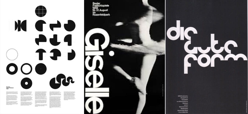
Hofmann’s input into the Swiss Style is said to stem from his dedication to visual resolution. Like many Hofmann believed that design could impact on social issues and cultural values which are said to be addressed in his design. Hofmann’s work is distinctive in the way it deals with stutter and space.
However, what I find particularly drawing about Hofmann’s work is his use of shape as seen particularly in the above-left poster design with it’s incredibly interesting and almost code like pattern, primarily formed through the use of point, line and plane. Again I feel that Hofmann turns his typography into shape through cut out elements in the above right poster with repeated circular forms in the lettering throughout producing a very impressive outcome. While in the very distinctive Gisselle poster-like in the above work of Müller-Brockmann movement is capture, a recurring theme in Hofmann’s work, and is offset beautifully by the bold sans serif Giselle which runs vertically along the right-hand side of the composition with the top of the lettering being aligned with the ragged right end of the above horizontally placed type. Again I find the work of Hofmann to be incredibly impressive and distinctive which is what I find somewhat peculiar about many of the Swiss Designers as while their design is often very standardised each features their own unique elements causing their work to be identifiable within the style.