Research
For this project we were split into groups to chose a topic and generated our research as a group, we did this using a shared Pinterest board. I found this to be a great way to begin the project and it was brilliant to begin working with others and experiencing what it is like to negotiate ideas and subject matter within a group setting. As a group, we decided to use line as our focus and chose pencils as are subject matter.
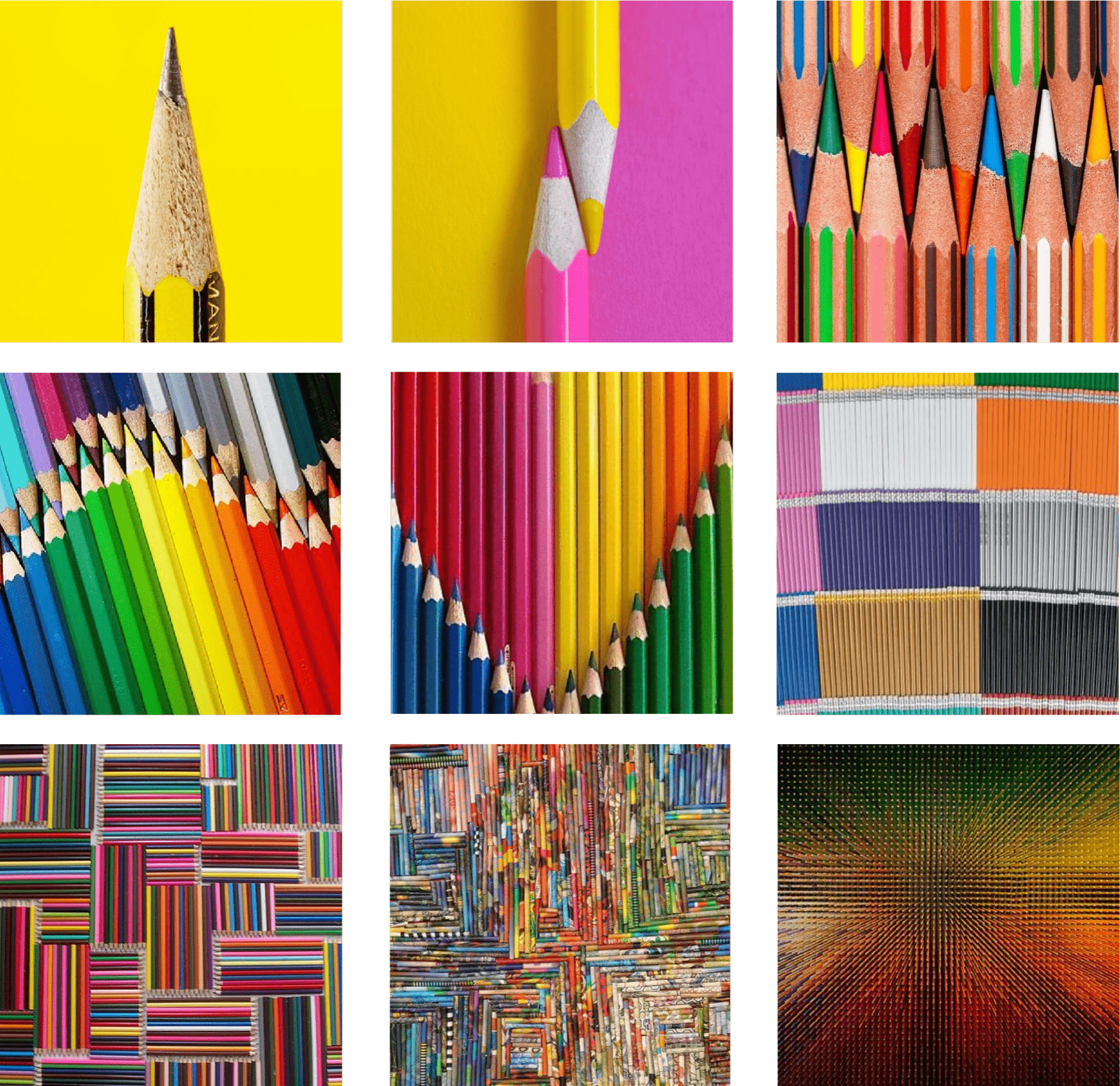
Below is a sample of the research we produced as a group using Pinterest and finding over 100 different images of pencils.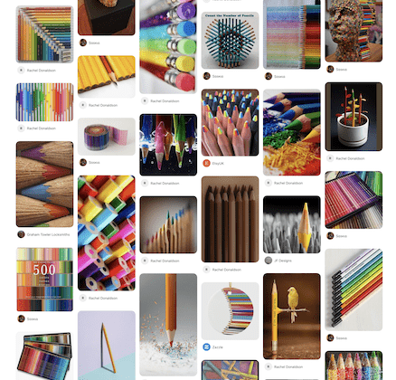
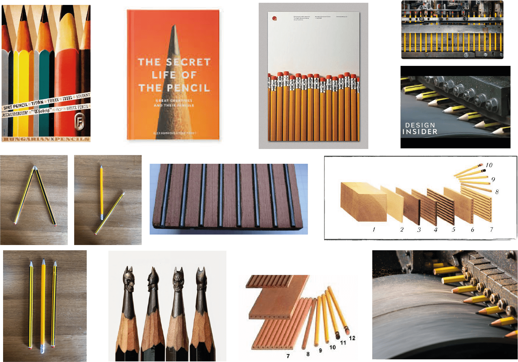
I then went on to take a more in-depth look at pencils myself photographing pencils trying to create shapes and hierarchy, looking at books on pencils, pencil posters and how pencils are made as shown in the mood board below.
Once I had gathered all my research I started to mind map out ideas for stories I could create, prompted by the images taken from the group research we had created.
 From the above idea’s I had brainstormed out I decided to generate a story about the apple pencil.
Image Choice

I then developed a premise around what makes the apple pencil special and how it is so different from the ordinary pencil and produced the above storyboard. I really enjoyed this part of the process. I felt this was an opportunity to be very creative and had fun developing and writing my story. I wanted to develop a sense of anticipation in my story about the apple pencil. By using the images to guide me through the story I was in some ways restricted yet I felt this pushed me to be more creative in my approach and was even able to develop the anticipation I was after by describing the feature of the apple pencil and only revealing at the end of the sequence that this is what was being described. Overall I was very please with the final outcome.
Design Research
I began my research by looking at established designers such as Saul Bass and Milton Glaser who’s work I am particularly drawn to in order to see how they dealt with line in illustration as I wanted to create 9 illustrations for my final outcome.
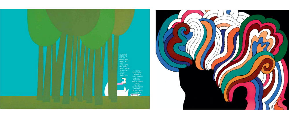
The above left is an illustration by Saul Bass taken from the children’s book Henri’s Walk to Paris. What drew me to this specific illustration was the use of line for the tree trunks along with Bass’ signature minimalist style and that the illustration featured a pencil. It’s unsurprising that there are childlike elements in this illustration as it is for a children’s book however I still think it’s really interesting how Bass’ flattens the illustration, particularly in relation the pencil in which the bottom which is not visible from side profile is fully included in an interesting combination of point and line.
I also wanted to look at Milton Glaser’s work as I am always blown away by his outcomes and have decided to look at his Bob Dylan poster in more detail as he incorporates a really interesting flowing use of line to represent Dylan’s hair with interesting and beautifully contrasting colour combinations. I would love to be able to incorporate something like this into my own work.
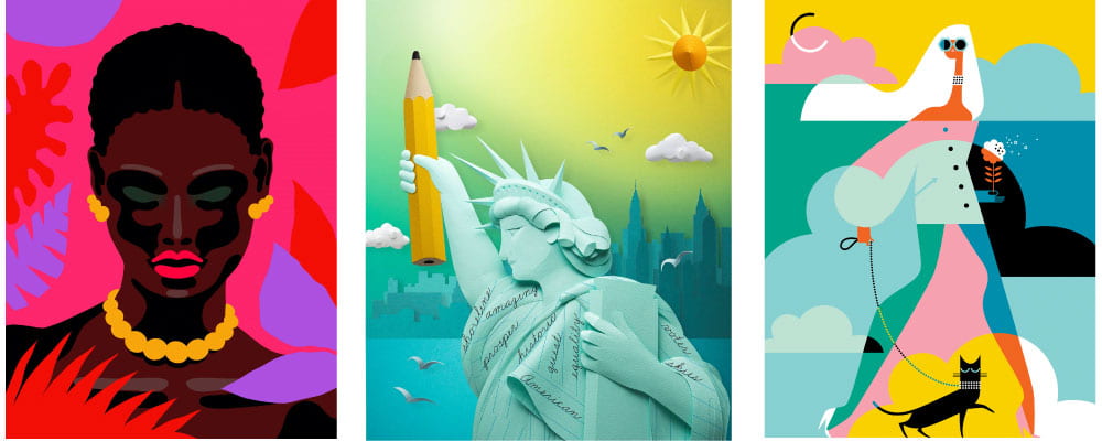
I then decided to look some more current illustrators and their work to see what new design trends are coming our way and might be interesting to include in my own work. The top left is the work of the award-winning German Artist Lies Madsen, the centre is the work of Gail Armstrong who created illustrations using paper with her handcrafted sculptures featuring in National Geographic and the top right is the work of Morten Morland a Norwegian graphic designer and political cartoonist for The Times. I was particularly drawn to the work of Madsen due to his deep rich colour pallet and how demonstrates form through line shape an colour as seen in the woman’s face above.
I also wanted to look at Armstrongs work as it is just so inventive and interesting, it can be hard to pull yourself away from the digital programme and go back basics with pencil and paper but Armstrong takes this a step further by making the paper her art. Of course, I was also particularly drawn to this peice as it features a pencil with shading adding to the 3D effect of the outcome, this is definitely something to consider in my own work.
Finally I wanted to look briefly at Morland’s work due to his clever use of layering through shape and colour creating really interesting pattern like outcomes.
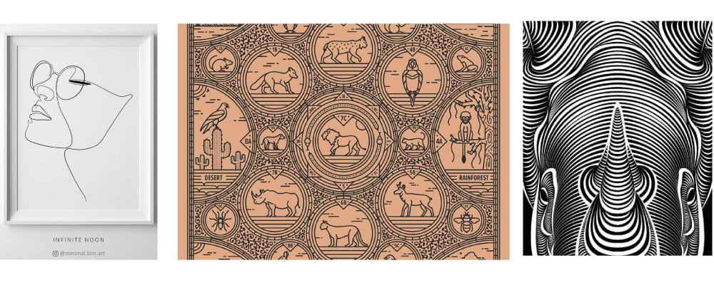
Above are further illustrations with a very strong focus on line. I wanted to look at a variety of outcomes here as my group had chosen line as our overarching theme and I wanted it to have a really clear and strong presence in my outcome. The above centre and right outcomes are full of detail and are very impressive particularly once again in the above right outcome (the rhino) that uses line to display form. However, there is something about the simplicity and minimalist feel that really draws me to the top left outcome, while I do not feel I will adequately be able to present my panel using this approach it is a really interesting outcome. I love the illusion of the pencil never leaving the page and would like to experiment with this at some point in the future.
Apple Promotional Campaigns
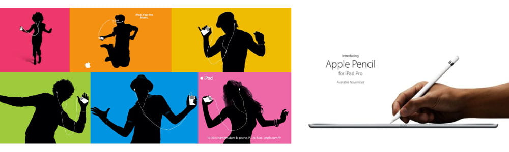
As my narrative has essentially turned into an advertisement for the Apple Pencil I thought it would be useful to look at how apple promotes their products and how they have promoted the Apple Pencil themselves. I began by looking at my personal favourite ad campaign for apple promoting the apple iPod. I love the use of block colours, silhouettes and pop art feel to the outcomes and feel this was a very strong and fun campaign. I would love to apply this to my own work in some way. The current Apple Pencil outcome is, as always with apple, very minimal and this is definitely something I should consider when producing my illustrations.
Sketches
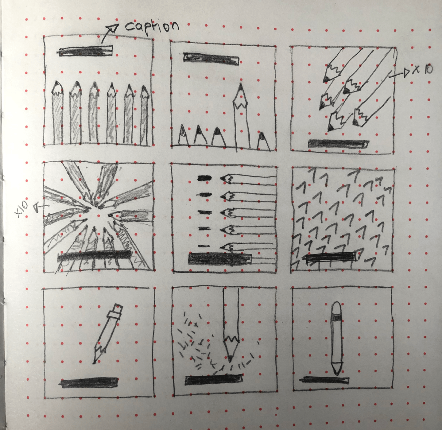
I then used the storyboard to make a series of sketches and drawing a black box to represent text placement as shown above. From here I decided to create digital outcomes using illustrator with the hope of applying some of the learning taken from my design research and incorporate the theme of line very clearly.
Digital Illustrations
First Outcome
The below illustrations are my first attempt at digitising my outcomes. I kept the colour schemes very similar to that of the images I found in the research phase of the project and added in background shadows and darker shading on the pencil giving a sense of light which I felt really added to the final outcome. However I was not entirely pleased with this piece and therefore reproduced the above board in a slightly different style.
Second Outcome
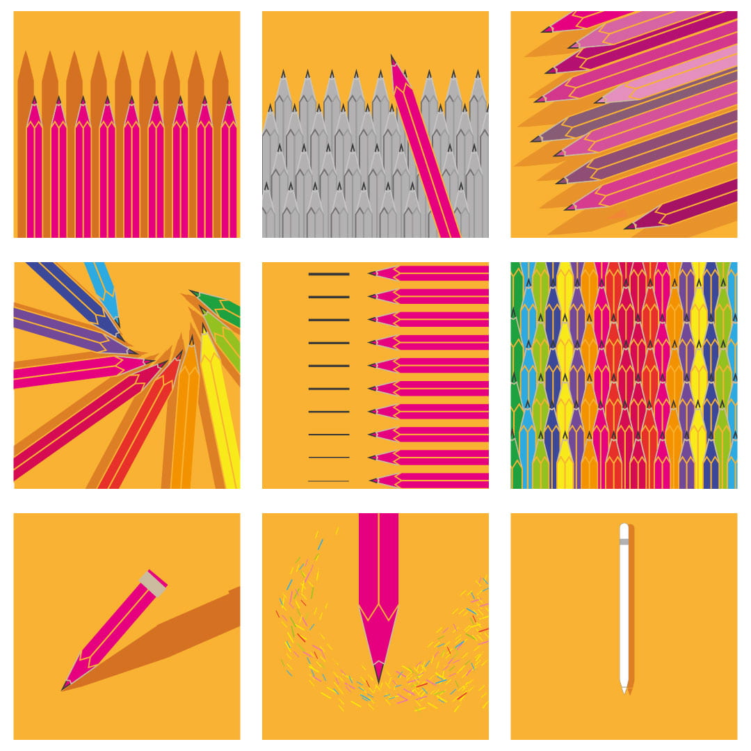
In the below outcome I wanted to highlight the lines that made up the illustrations of the pencils more clearly as line was the chosen theme. I did this by increasing the stroke size and changing the colour in the fill to highlight the stroke. For this series I wanted to create a more pop art feel inline with apples iPod silhouette advertisements. I am really pleased with this outcome however I wanted to push this one step further by creating a series entirely made up of lines.
Third Outcome
In the below outcomes, I stuck with pop art style colour theme of the second outcomes however I reduced all my illustrations down to line only. I thought this might not be possible and might create an outcome that was unable to clearly present pencils however I feel that the outcome has achieved a relatively clear representation of the story I wished to present. However, it was not possible to use only straight lines in the final illustration of the apple pencil the pencil is distinguishable by its curved edges.
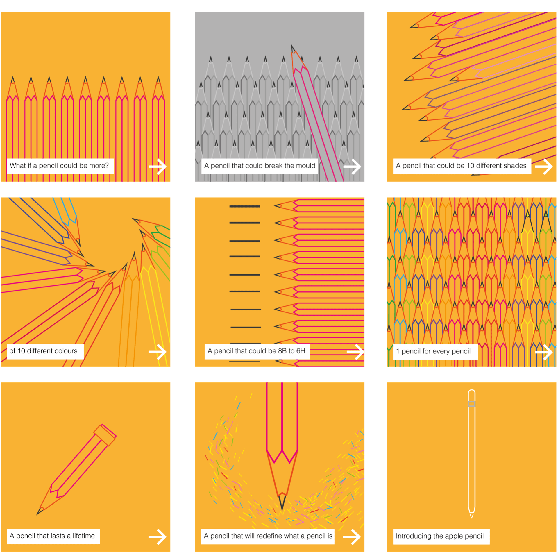
Of the three outcomes, I was most please the second as I felt it presented the most vibrate and interesting outcome and therefore decided to post it on my Instagram page.
Response to Peer Outcomes
After having reviewed the work of my peers it began to think I had moved off-topic in my approach to this project generating a narrative about pencils and creating illustrations using line rather than looking at how pencils have been used to create impressive patterns and works of art as representations of lines themselves. I, therefore, returned to the group research a selected 9 further images to demonstrate how pencils have been arranged into amazing compositions producing intricate line based outcomes.
The caption below this would read Pencil work: a progression of line based outcomes.
I am very pleased with this outcome as the topic of the pencil is so simple and I am happy that achieved a flow throughout my panel of work.
Feedback and Final Outcome
On gaining feedback on my work I had actually chosen a pretty strong approach originally and had completed the task as required generating my own outcomes on illustrator. It was highlighted however that I should change my grey background on the second image to help it blend more seamlessly with the rest of the panel. On reviewing this I can see how the second outcome really stands out which was not my intention, I was more focused on creating the outcome to convey the message that I wanted to without thinking about how it fit with the rest of the panel.
Other changes suggested were removing the text and arrows– this could be added in independently if displaying on Instagram or my portfolio website. I am now really pleased with the above outcome and love the flow that has been created through the colour scheme, using the same background colour throughout as well as the hot pink creating a really strong and cohesive panel.
What have I learnt?
- I feel this project was very helpful in developing my group work skills within design
- This project helped me to explore a simple topic in a lot of detail improving my research skills and helping me to broaden my search beyond Pinterest and Google.
- By limiting my output to what I could find in an image I feel this pushed me to produce a more creative and effective story about pencils
- I have learnt how to simplify my illustrations and how this can be helpful in creating a more stylised and interesting outcome.
- That anything can represent a line and be used to produce very interesting line outcome.
- It’s important to step back and look at work as a whole and not focus on items independently.
How can apply this to my work in future?
- By listening to others and observing their work and input into projects I can push myself to broaden my own ideas and try new approaches to design challenges.
- By focusing my search on a specific topic I can find ways to broaden that topic that I otherwise may never have thought of
- Keeping it simple can be the key to producing really interesting and creative work, so when I’m struggling with an outcome I can maybe try simplifying it removing elements limiting myself to fewer colours, shapes, lines etc.
- Anything can be used to represent a point, line or plane and this can be applied to any outcome created an original and interesting visual beyond drawing a line on a page.